
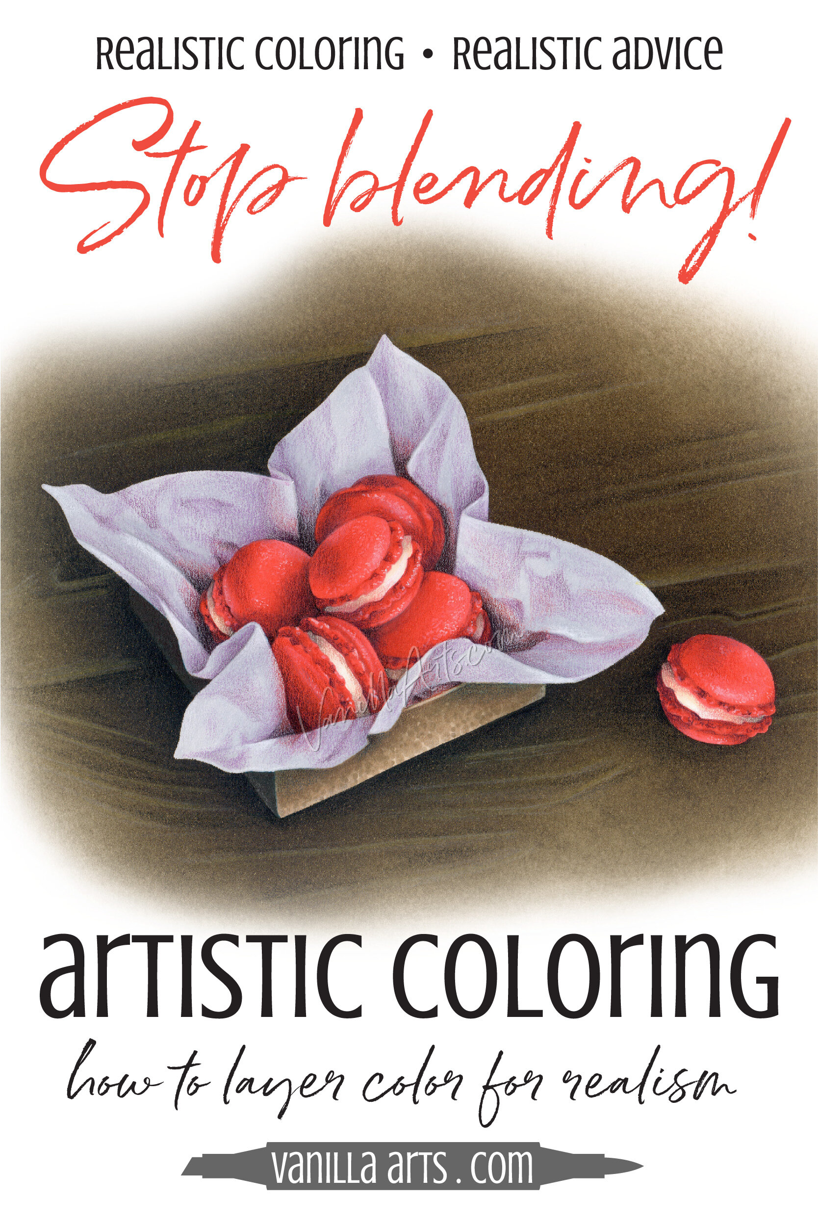
Real Color Theory: Skip the Blending Combinations! Layer Color with Realism by Glazing
The reason why your Copic Marker or colored pencil projects look flat and cartoonish?
The reason why you never color anything that looks remotely realistic?
It’s because you’re using the blending technique instead of layering colors the way artists do. How to glaze colors for realism…

Color Palette: Copic Marker + Colored Pencil Combination (Blue, Gold, Beige)
Blue and tangerine make a sunrise color palette for your next project.
Today’s color palette pairs complementary Blue and Yellow Orange Copic Markers to make a beautiful color scheme for your next project.

Color Palette: Copic Marker + Colored Pencil Combination (Blue, Teal, Yellow)
Navy blue and turquoise combined with yellow Copic Markers make a fresh color palette for your next project.
Today’s color palette pairs complementary B, BG, and Y Copic Markers to make a fresh color scheme for your next project.
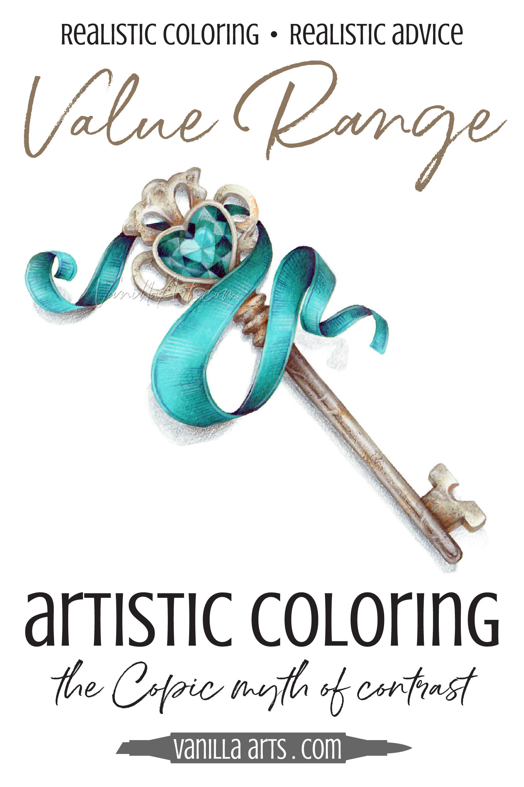
Real Color Theory: Improve Your Coloring with Smart Values Rather Than Contrast (Copic Marker, Colored Pencil)
Is contrast the secret to amazing coloring?
Many Copic Marker and colored pencil tutorials make it sound that way. Add contrast for depth and dimension, so you darkened your darks and lightened your lights. Now your coloring looks… uhm… it’s very interesting?
Psst… Contrast doesn’t add dimension. Let’s look at how to control contrast to color with greater realism.