Improve Your Coloring: Bad Color Palettes Ruin Good Coloring

Improve Your Coloring: Bad Color Palettes Ruin Good Coloring

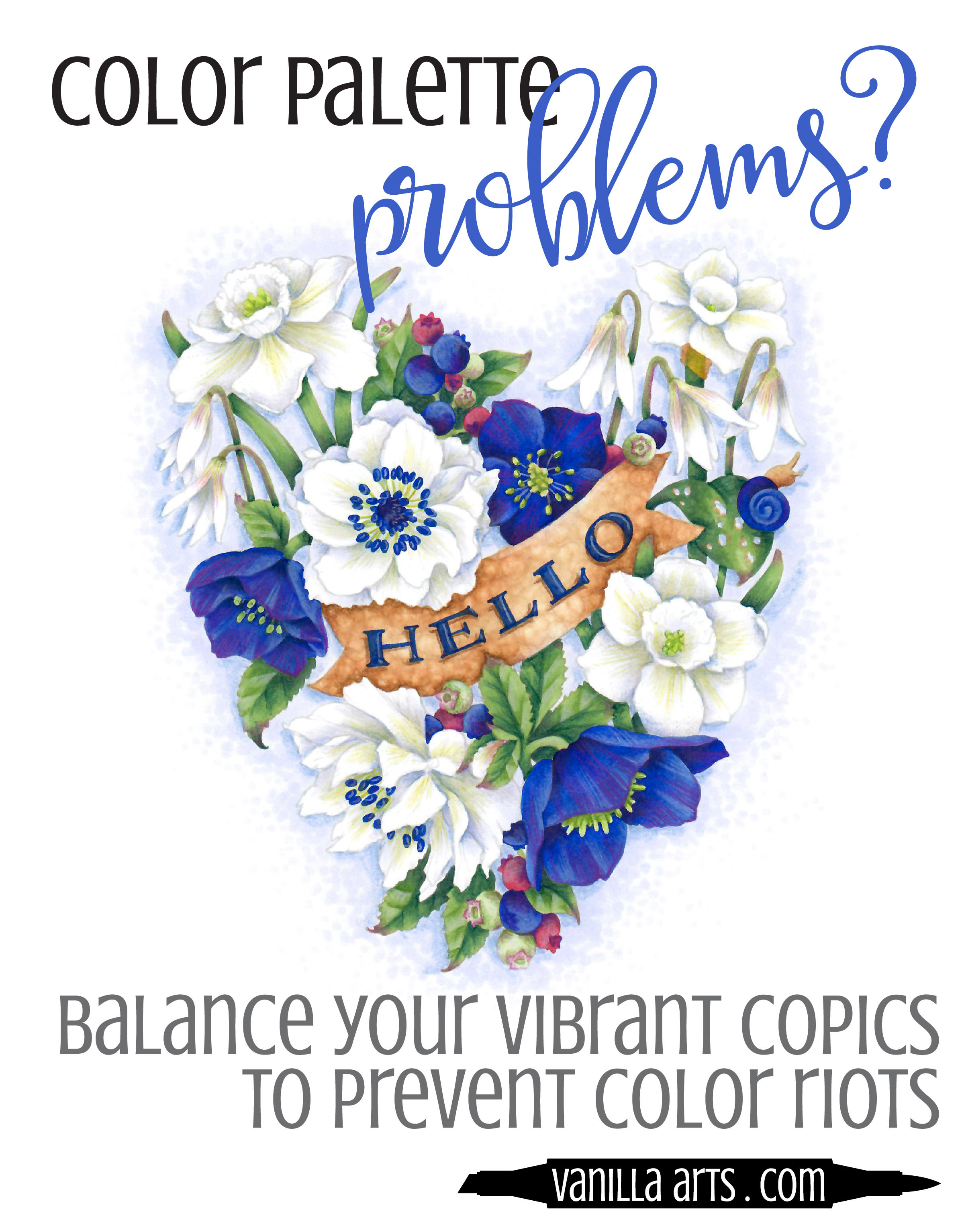
Do you wish for Talent?

"I wish I could color like that artist on YouTube!"

All adult colorers have coloring heroes, inspirational Copic Marker or colored pencil geniuses whom we'd gladly trade places with. We love the look of their coloring projects and oh man, if only we had that kind of skill!

We'd give anything to be that talented, to be kissed by the coloring gods.

Talent. We chalk it up to talent. "That person is talented."

But you're wrong. It's not the talent you admire.

It's the color.

What you love in someone else's coloring usually has nothing to do with…

Improve your Coloring: How to Keep Copic Marker Projects Lightweight & Delicate

Improve your Coloring: How to Keep Copic Marker Projects Lightweight & Delicate

Do you have a weight problem?

Sorry, not that kind of weight problem. Do you have a Copic weight problem?

You are not alone. You color something like flowers and your blends are flawless. You use your best techniques and all of your skill. Basically, the stars align and it might be the best coloring you've ever done.

And yet your flower blossoms look like they each weigh about 90 pounds. There's nothing light or delicate about your project. It's leaden and heavy….

Improve Your Coloring: Add Zest to Neutral Copic Colors

 
Neutral color palettes do not have to be boring. Learn how to add artistic touches to improve your Copic Marker and colored pencil projects. | VanillaArts.com


Are Neutral Colors Bland?

Copic Marker fans love color. Colored pencil people love color.

That's why you color, right?

For most of you, it's rainbow, rainbow, rainbow all the time.

Bright reds, brilliant blues, verdant greens... bring on the color, baby!

Because I teach a lot of classes and I want my presentations to be unique, I do a lot of internet surfing; looking at other project photos and tutorials so that I'm not repeating tired concepts and techniques that have been done to death.

Beige or gray doesn't have to be boring! 4 tips for adding life and zest to neutral coloring palettes with Copic Markers or colored pencils. | VanillaArts.com

In that research, I see a lot of bold and vivid colors being used.

But not a lot of neutrals.

It seems that many colorers are afraid of the toned down and slightly muddy colors.

So you write them off as unimportant.

Bland and boring. Browns and beiges and foggy grays.

Zzzzzzzzzzz

What a snoozefest!

I think that's really sad.

Neutral colors are only boring when you treat them that way!

Neutrals are some of the most interesting and complex colors available to artists. Many artists spend years, even decades learning to hand mix perfect neutral colors. If a whole bunch of artists are spending that much time studying one specific thing? Well, that's a sign. There must be something pretty darned important about neutrals.

So why aren't you using them in your coloring projects?

It's not that neutral color palettes are boring, it's that you're using them wrong!


Are you sick of Kiddie Color Palettes?

Do you want to improve the look of your coloring projects?

Are you searching for that polished professional look?

Are you tired of coloring like a circus clown or a 12 year old Disney Princess wanna-be?

Do your coloring projects have a childish look? Learn to add maturity and sophistication to Copic Marker or colored pencil projects with the use of neutral colors. | VanillaArts.com

Neutrals!

Neutrals are the solution!

Neutral colors can add the sophistication you are looking for.

Adding more neutrals to your projects is not hard.

Don't build it up to be more taxing than it ought to be.

Four simple keys...

Just four? Yep.

I have four little tricks that I use to add life and zest to my neutral color palettes!

  1. Expand your definition of neutral - supplement the palette with near-neutrals like violet grays and dusty yellows.

  2. Use a full range of color values - don't get stuck at the zero end of the Copic color set!

  3. Don't skip texture and pattern - smooth & plain is boring no matter what color you use!

  4. Add some spice - find pop colors to provide some kicky interest


Happy Coloring!

2 Signature Teal.jpg
 

Supplies used in "Cup of Columbine":

(partial list, contains affiliate links to Amazon and Dick Blick)


Vibrant Copic Color: Finding Balance for Bold Colors

 
Vanilla Livestream lessons for Copic colorers. Ultramarine Blue is a bold and vibrant color which can easily overwhelm your projects. Learn to balance gem tones to make mature and sophisticated color palettes. | VanillaArts.com


A clown Car crash?

We've all been there.

You pull out your favorite color marker for a brand new stamp. Maybe it's Ruby Red, Emerald Green, or Ultramarine Blue.

Oh, glorious color! So yummy.

Vanilla Livestream lessons for Copic colorers. Ultramarine Blue is a bold and vibrant color which can easily overwhelm your projects. Learn to balance gem tones to make mature and sophisticated color palettes. | VanillaArts.com

But the stamp image has lots of little pieces and elements to it, and every one of those things needs another color.

So you end up grabbing lots of other markers, just to make it work.

And when you're done, it looks like the aftermath of a Crayola factory explosion.

Color riots happen to the best of us!

They're a bit embarrassing because you're not an eight year old girl. Adults are supposed to have better color sense and mature taste...

...right?

A simple color like Ultramarine Blue can take over and dominate any image. It's so loud and attention hogging that suddenly all you see is glowing blue.

"Gem tones" are the nice name for vibrant extroverted color.

"Obnoxious" is a little closer to the truth though.

I suspect this is why Copic sells so many 0, 00, and 000 markers. People want to use bolder colors but they can't figure out how to do it with sophistication and taste.


But the world is full vibrancy!

And darn it, we want to use our favorite color!

Finding balance is the key to using extroverted color. Balanced color palettes add serenity and restore order to lively color.

Vanilla Livestream lessons for Copic colorers. Ultramarine Blue is a bold and vibrant color which can easily overwhelm your projects. Learn to balance gem tones to make mature and sophisticated color palettes. | VanillaArts.com

But color palettes can be intimidating. You've seen pre-made color palettes on Pinterest and other websites... but creating your own color palettes? That sounds hard!

So let me ask you...

How's that grabbin' colors at random method woking out for you?

Four simple steps...

Yes, I use four simple steps when I design new color palettes for student projects and those for my professional artwork.

And it's not hard. You don't need an advanced degree or a genius I.Q. to do it.

  1. Minimize

  2. Neutralize

  3. Balance

  4. Desaturate

That sounds fancy but I can show you how to do it in just one lesson!

You can learn to balance your vibrant Copic Markers and Colored Pencils to create mature and sophisticated coloring projects!


Take the next step!

Vanilla Arts Company is everything that comes after blending lessons.

Perfect for card-makers, paper-crafters, stampers, and colorers who dream of coloring with realism.

Vanilla Livestream lessons for Copic colorers. Ultramarine Blue is a bold and vibrant color which can easily overwhelm your projects. Learn to balance gem tones to make mature and sophisticated color palettes. | VanillaArts.com

For almost a decade, Amy Shulke and her Vanilla Arts support team have made fine art techniques accessible and understandable to marker and colored pencil hobbyists. People like you who want more than follow-the-leader style tutorials.

We help students to improve their technical skills and powers of observation. Most VAC students do not realize they're secretly learning how to draw and paint. We live for the light bulb moments, when a student finally sees the world not just in color but with light and shadow, line and form.

Let’s tap into that talent you’ve been hiding. It’s there, waiting for you.

Become the artist you were always meant to be!


2 Signature Teal.jpg