Thanks for taking the jump to read today’s newsletter. If you landed on this page by accident, subscribe to the Vanilla Beans Newsletter here.
Our last Color Theory lesson was in video format.
I taught you step-by-step how to use the Color Palette Picker tool.
If you missed it, here’s a link.
We’re running an experiment this week and you’ll want a printed version of the tool.
BARBIE NEEDS GLASSES
If you were to ask me to boil down the difference between crafty coloring and artsy coloring…
And I’m not making judgements about either kind of coloring.
I’m here to support all’z y’all. You do you and I’m here to help when you need it. But we’d be blooming idiots if we didn’t notice a distinction between the different styles of coloring.
So anyway, back to what I was saying…
If I had to draw a line between easy marker coloring and realistic marker painting, it all comes down to this:
We use completely different colors.
You’ve probably heard me use the word “hue” before. When I explain hues, I always use the same fanciful example…
A hue is a special kind of color. If you were to reach up into the sky and grab a handful of color from a rainbow, the stuff in your hand would be pure, fully saturated hues.
“Saturated” means 100% clean and pristine. No additives, no preservatives, no artificial fillers, and produced in a peanut-free facility.
There’s a reason I resort to metaphor when I speak about hues and saturation.
Because Eve ate the apple.
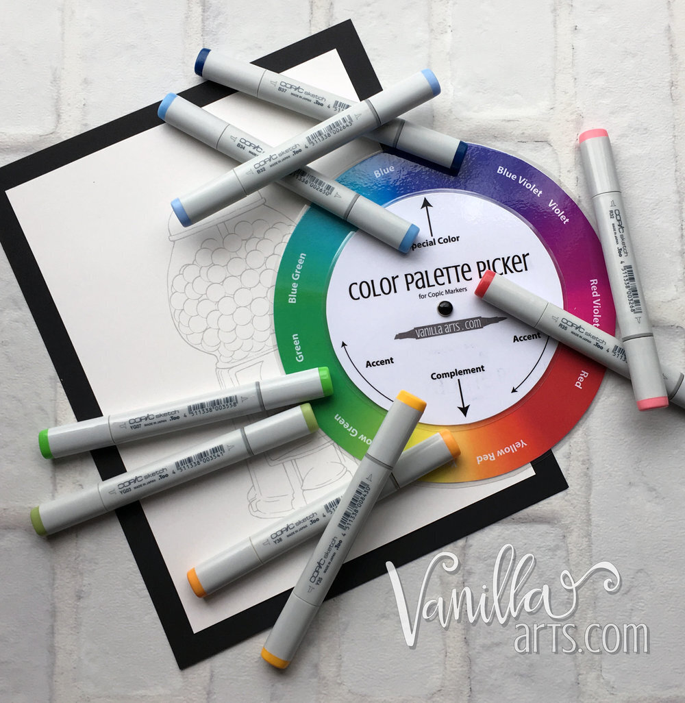
You printed the Color Palette Picker tool, right?
(Everyone is nodding yes but half of you didn’t. I know you.)
See the colorful bottom circle?
That’s the spectrum of hues— you’ve got your red, your orangish red, your reddish orange, your orange-orange, then the yellowy orange and the orangish yellow… I’m not going to walk you through every hue. You get the idea.
Here’s the catch: assuming your printer isn’t a janky floor model from 2003, then the hues you printed are all fully saturated hues.
Remember, “saturated” is the crisp and clean with no caffeine part.
Okay, so now I want you to take your Palette Picker and walk around the house looking for objects, stuff, and thingamabobs to match each of the various hues on the Picker.
I’ll wait here until you get back.
You’re back?
I’m sorry. I played a dirty trick on you.
Literally dirty.
Finding hues was harder than it sounded, right?
And I’m really awful because I did this to you on purpose. Bad Amy.
See, I know what happened. You compared the Picker tool to about fourteen-thousand things. The only saturated hues you found were plastic or painted— and even then, you had to walk right up to the object, hold the tool really close, and angle it just right to see if it matched.
Because even the few things you own that are pure saturated hues don’t look like pure saturated hues unless your nose is pressed up against them.
Even the hueiest hues don’t look hueish from a distance.
Saturated hues are incredibly rare in real life.
So why do you always color with them?
I love color! I’m a color nerd! I love coloring because I love color!
In crafty coloring, loudly announcing your undying love of color is instant street cred.
But you don’t really love color.
You love saturated hues.
So if you ever wanna know why your coloring doesn’t look dimensional and realistic, grab your Palette Picker and take another walk around the house.
The pink plastic flamingo in your yard may be pressed out of a cheerful RV13 plastic…
But the actual flamingo only looks RV13 in a few spots. The surface is rounded and has little feathery divots which catch hints of light. As soon as the surface turns a bit, the color changes to something more mysterious and lavendery.
Here’s a simpler example:
You take your B02 marker to the hardware store and they create the perfect B02 paint for your living room. You paint the walls pure B02.
But as soon as you take two steps back and look in the corner, you’re not seeing B02 anymore.
(We pause here for a brief moment while you stare at the corners like a total weirdo.)
The difference between crafty coloring and artsy coloring is the color.
Crafters color in a Barbie dreamland where everything is saturated.
It’s all plastic. There’s nothing real about it.
BTW: I’ve used this Barbie analogy for years. No, I haven’t seen the movie but I’ve seen clips and photos. The way they made Barbieland look like Barbieland was to saturate all the colors.
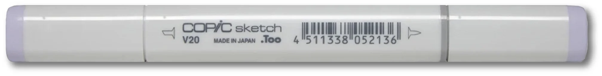
The reason why I shun the Zero Copic groups (BV0x, Y0x, YG0x, RV0x, etc.) and the reason why I layer the heck out of all my other marker groups is because I’m fighting the Barbie-ish saturation levels.
Realistic coloring uses realistic colors.
Barbie isn’t real.
We’ll talk more about saturation and desaturation in the upcoming weeks but for now, I want you to spend some time observing and absorbing the real colors of real life.
Because if Barbie wants to add more depth and dimension to her coloring,
She’s gonna need a better pair of glasses.
IF YOU LIKED TODAY’S BEANS & VIDEOS, YOU CAN SUPPORT FUTURE FREE LESSONS:
LATEST VIDEO
(click to watch at YouTube)

APRIL LIVESTREAMS

STREAMS FRIDAY, APRIL 12
“Cherry Blossom” runs through May 1st. Full coloring demo video available for 6 months.

STREAMS SATURDAY, APRIL 13
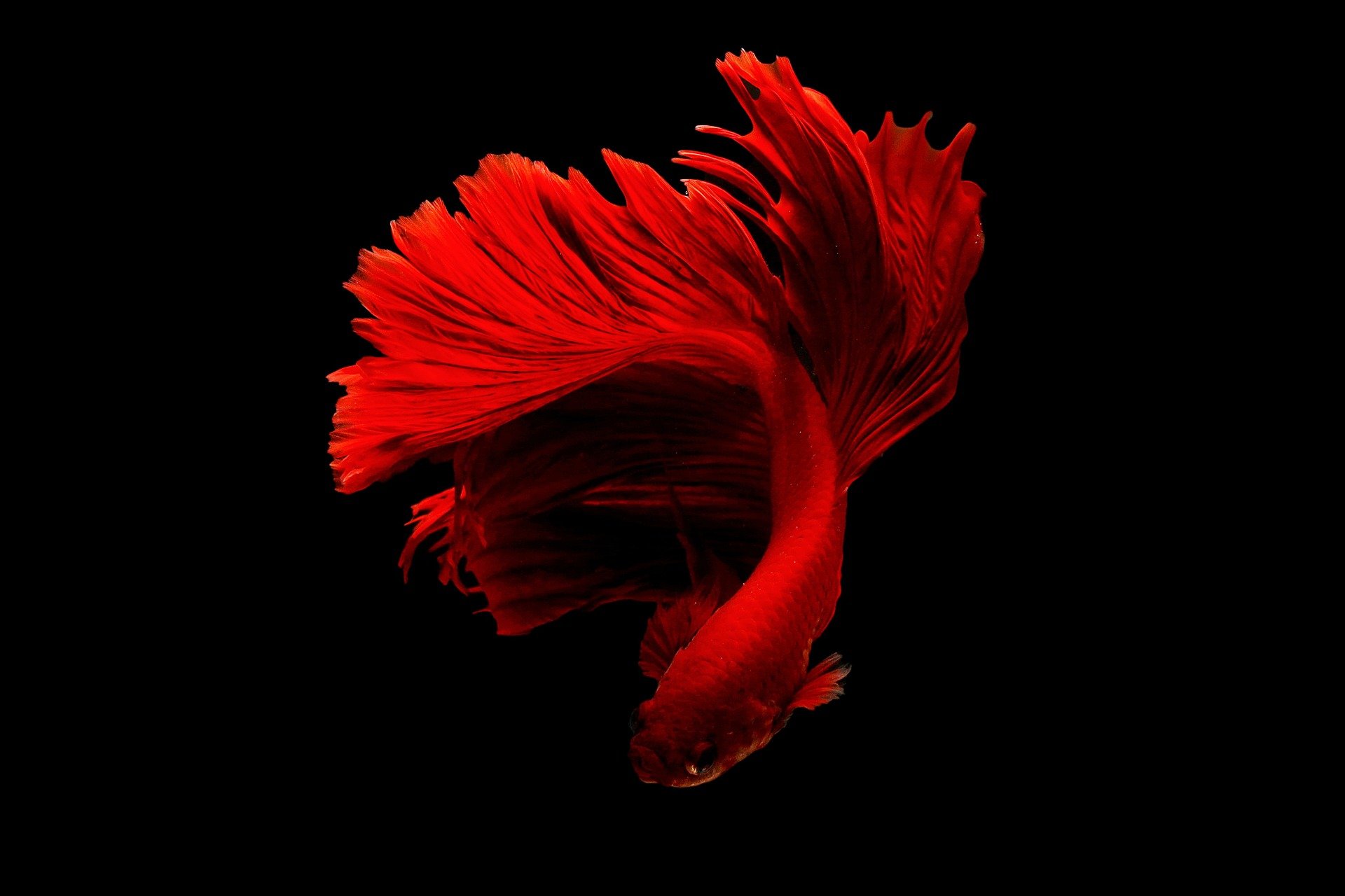
“Fire Betta” runs through May 1st. Full coloring demo video available for 12 months.

STREAMS TUESDAY, APRIL 9: Set notification here.
WATCH NOW: Amy draws and colors a still life scene

WATCH NOW: 6 Secrets for Smoother Blends
MARCH STREAM: Best/Worst Paper for Markers

Background image: “Butterfly Shadows” - online workshop here

NOW AVAILABLE FOR PURCHASE
“Speckled Eggs” was the March project in The Underpainters.
Now you can purchase the Workshop version. All the same downloads and video materials minus the monthly membership and forum system.
And yes, this is the Forever Access version.
PRODUCT OF THE WEEK:

Color Swatch Tool
Someone, can’t remember who but I know it was in the comment section somewhere… I wish I could be more precise…
Anyway, someone gushed about this tool and as I read the comment, I looked at the hook by my desk where my 3-in-1 hangs. I don’t hang many tools within reach, so you know it must be good if I keep this handy.
Pantone Swatch Decks are amazing but they’re like 800 bucks and even then, it’s just a bunch of swatches.
This has been my go-to Pantone substitute since gosh, the late 1990’s when I no longer had access to studio owned decks.
The value finders in the back are always a hit with students too.
And it’s a quilting tool! See? Color is color!

Remember, when you shop using my link above, any Amazon purchase over the next 24 hours supports the free content here and at YouTube.
THIS WEEK IN COLOR


CURRENT PASSWORD: PumpkinSpice
SPRING, SPRING, SPRING
click for more info


GET IT BEFORE IT’S GONE…

The Verdant Spring workshop will be permanently retired on April 30th, 2024. Here’s one last discount before it leaves the shop.
Use code PINKPEONY at checkout to save 15% on Verdant Spring. Special discount ends 04/3o/2024.
NOTE: Verdant Spring is a forever access class. Once you’ve purchased the course, you will continue to have anytime access. I’m only removing it from the public Workshop menu, not ending your access.
LOOKING FOR LAST WEEK’S BEANS?


RECENTLY MENTIONED PRODUCTS