Thanks for taking the jump to read today’s newsletter. If you landed on this page by accident, subscribe to the Vanilla Beans Newsletter here.

Last week’s article was in video format, teaching you how to use the Color Palette Picker tool.
You can catch up on that topic here.
This week, let’s shift gears for a bit while I explain something that’s color theory tangential.
It’s not part of our weekly CT lessons but I’ll end it with a good exercise to check how much theory you can apply on your own.
Enjoy the diversion.
REBEL BLENDS: THE ORIGIN STORY

I’ve been doing rebel blends for so long, my head kinda hurts to think about a time when I didn’t do them.
Because honestly, when you’re sketching with a random collection of 100 Xylene based DeSign art markers, you’re flat broke but it’s 2am anyway, and the assignment’s due in five hours…
Then you realize you don’t have the right colors for skin, sky, or tree bark?
You gotta make it work.
Which means layering the heck out of some crazy color combinations.
Necessity is the mother of invention and in art, inventions can be pretty darned pretty.
Fast forward a few years and I’m teaching basic design concepts to a bunch of high schoolers in an after-school enrichment class.
One of the students— don’t ask me how but this darned kid had access to more Copics than I’d ever seen before.

So I’m talking about balance and compositional flow as I doodle some lettering with my piddly collection of Classic Copics plus a sad and motley collection of half dried other-markers.
And Little Miss Own’EmAll says out loud…
“I’ve never seen a blend like that before.”
To which I replied,
“That’s okay. It works. We’re all rebels now.”
So this is officially the very first rebel blend in recorded history. It never had a name before that. Umber Browns into a lovely Carmine color and one of the flesh tones plus what I think is Y21.
Note that whatever I used on the “u” has not stood the test of time.
To be honest, I don’t know any other way to blend.
I don’t see the point in pretending things are always three versions of the same color. Light-Medium-Dark blending has never made sense to me. In the shade, things go murky. The sun adds kisses of warmth. And don’t even get me started about how surface colors morph and change as the surface bends, folds, or waves.
I’ve been trained to use the colors I see and Rebel Blends have always been the colors I see.
As a instructor, I submit to the Light-Medium-Dark expectations of my students, but from the start, I’ve always ended every beginner course and the last thing I teach before moving a local class to intermediate level is to finally reveal how I actually color.
Rebel Blending is always the capstone on my beginner lessons.
I’m giving you a piece of myself.
I’m sharing what makes me me.
Underpainting is something I borrowed from the Dutch Masters. I learned it in school and it felt completely natural to do it with markers, but underpainting was never mine. I’m 300 years too young to claim it.
Rebels, on the other hand are my contribution to the marker world.
And I think it’s okay to claim a little something for myself. Especially since it’s a piece of my soul.
Rebels are the Amyest way you could possibly color.

The secret of Rebel Blending isn’t a secret to the students who have been though my beginner classes.
I tell them all and I’m telling you now:
Every Copic Marker can blend with every other Copic Marker.
All it takes is:
good quality ink (hint, knock-off markers can’t do this)
good quality paper which facilitates blending (hint, rando paper can’t do this)
an understanding of solvents
an understanding of staining inks
an understanding of color theory
My job as a teacher is to help you get to the point where you can blend like this too.
As color theory students, please take a few moments today to study this blend.
I won’t lie, it’s not easy. Took me three stabs and a lot of BG53 to make it happen.
But think about why I’m shifting between colors in this order.
Would you need a few helper colors between some of mine? It’s okay if you do.
The free photo is here. Do you see the colors I see or would you have picked others?
IF YOU LIKED TODAY’S BEANS & VIDEOS, YOU CAN SUPPORT FUTURE FREE LESSONS:
LATEST VIDEO
(click to watch at YouTube)

NEW AT SKETCH-GARDEN

Whew! I finally found time to work on the Carrot Seeds digital stamp.
Normally my turn-around time is pretty fast but mid-March is Birthday-rama in our family and now that the inlaws are getting older, everything has to be done once on the day and again at their house.
No more cake for me, thank you.
Anyway, Carrot Seeds was drawn live during the March 2nd Tuesday Livestream as part of a FREE lesson on still life objects. I’ve improved the image and the lettering for the digital version and I can’t wait to see y’all color it!
And hey. a big hat tip to Jodi for her help in finding some vintage inspiration for the caption and style, plus the puffy envelope idea.
MARCH LIVESTREAMS
I’ll be fiddling with the April schedule a bit. Details next week (hopefully).
LAST CHANCE- DOWNLOADS END APRIL 2ND

IN THE ARCHIVES: “Easter Egg” demo runs through April 2nd. Full coloring demo video available for SIX months.
LAST CHANCE- DOWNLOADS END APRIL 2ND

IN THE ARCHIVES: “Speckled Eggs” runs through April 2nd. Q&A lvideo available for TWELVE months.

WATCH NOW: Amy draws and colors a still life scene
FEB. STREAM: watch “Shamrock Field” here
WATCH NOW: Best/Worst Paper for Markers
FEB. STREAM: watch Breaking the Copic Code here

Background image: “Red Macarons” - coloring kit here

NOW AVAILABLE FOR PURCHASE
“Speckled Eggs” was the March project in The Underpainters.
Now you can purchase the Workshop version. All the same downloads and video materials minus the monthly membership and forum system.
And yes, this is the Forever Access version.

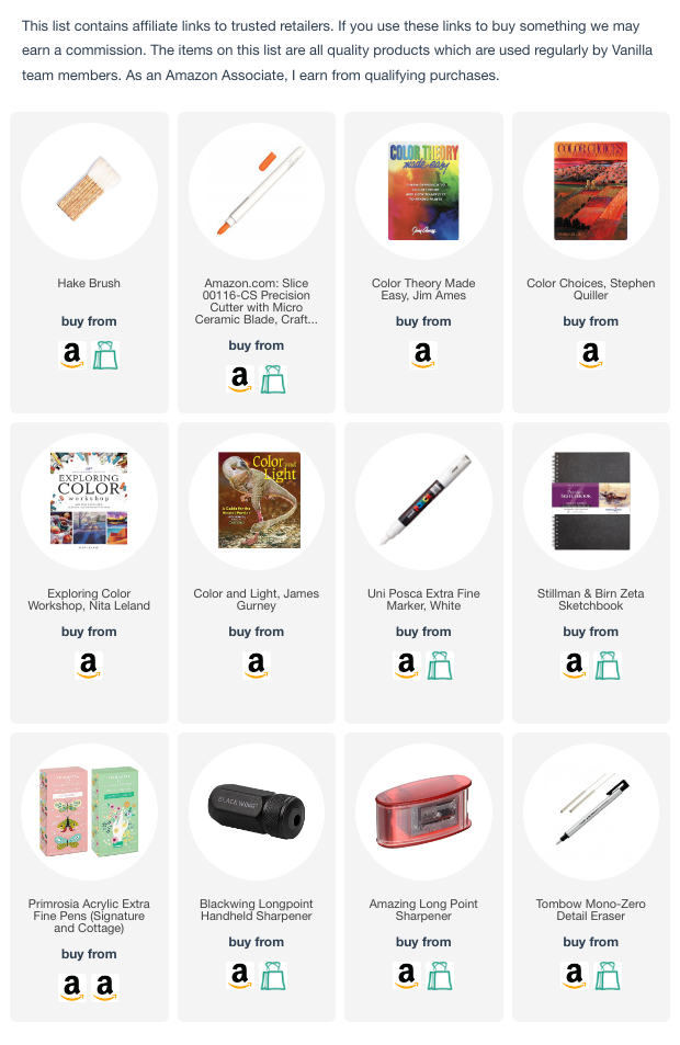
Click the logo above to shop for Copic Sketch, Ciao, Classics, refills, and replacement nibs.
PRODUCT OF THE WEEK:

METALLIC WATERCOLOR
By far, the best metallic watercolor I’ve ever tried is the FineTec Pealescents.
When I’m looking for silver or gold, this is my go to product.
The Champagne color (2nd from right) is featured in my “Niagara” Rebel Blend splashy color study. Silver (far right) is my most used color. I’ve barely touched the Arabic Gold (3rd from right) as it’s the only one which doesn’t look like a real metal.
The only downside is it’s a little translucent. I always use 2 coats.

Remember, when you shop using my link above, any Amazon purchase over the next 24 hours supports the free content here and at YouTube.
THIS WEEK IN COLOR


CURRENT PASSWORD: PumpkinSpice
EASTER IS SO EARLY THIS YEAR!
click for more info


ENDING SOON!
MARCH DISCOUNT

Use code JELLYBELLY at checkout to save 15% on Jellybeans. Special discount ends 03/31/2024.
LOOKING FOR LAST WEEK’S BEANS?


RECENTLY MENTIONED PRODUCTS