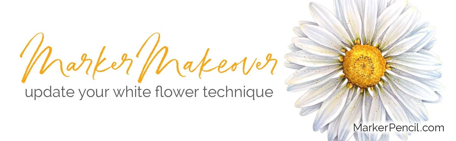
Are Your White Flowers Flat? (Copic Marker Makeover)
Supply list and project resources for “Marker Makeover: White Daisy” below
Hey, creative colorists—
Do you struggle to color realistic flowers?
Especially white flowers?
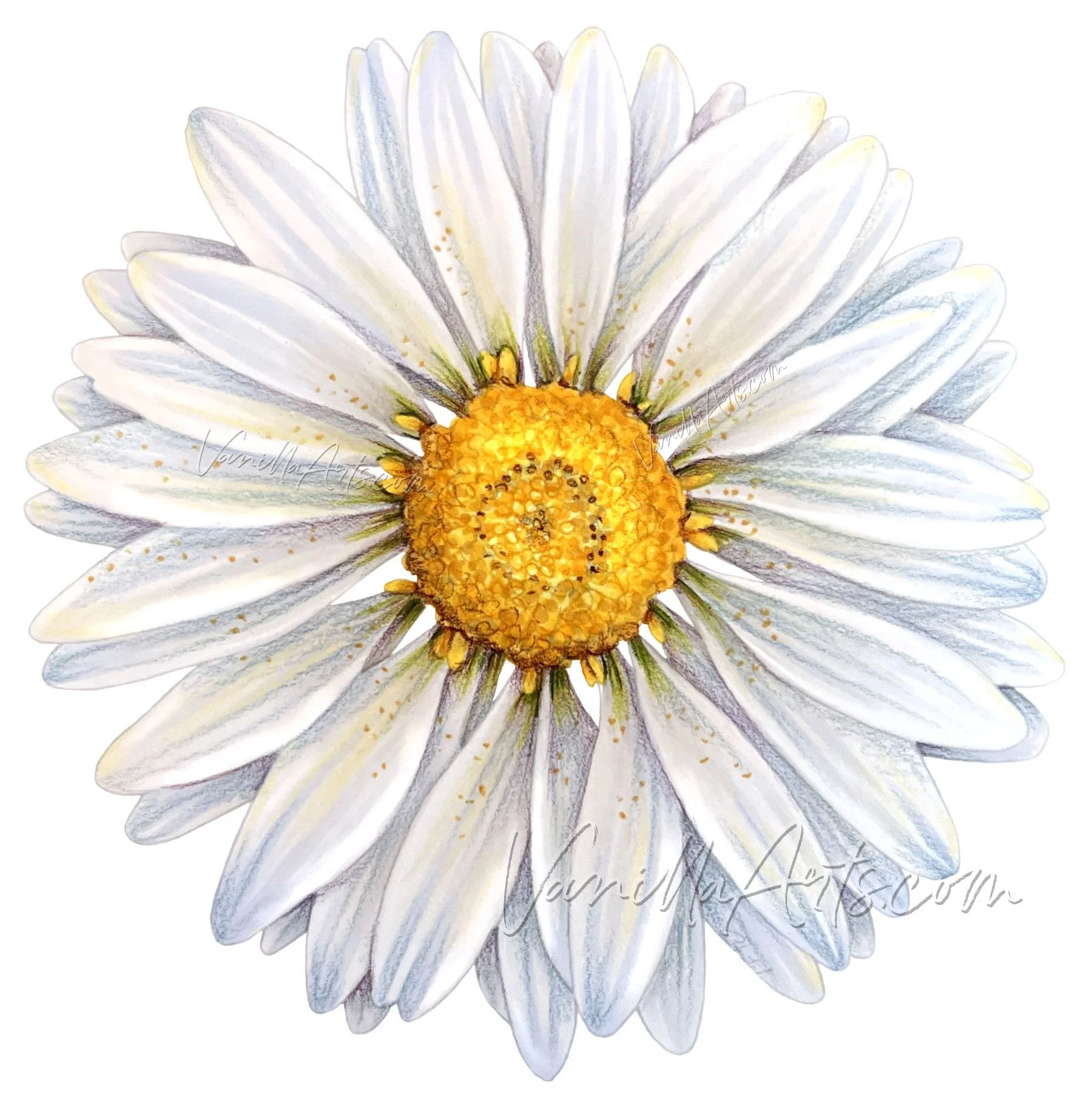
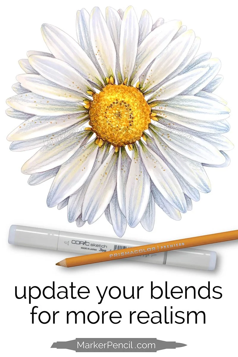
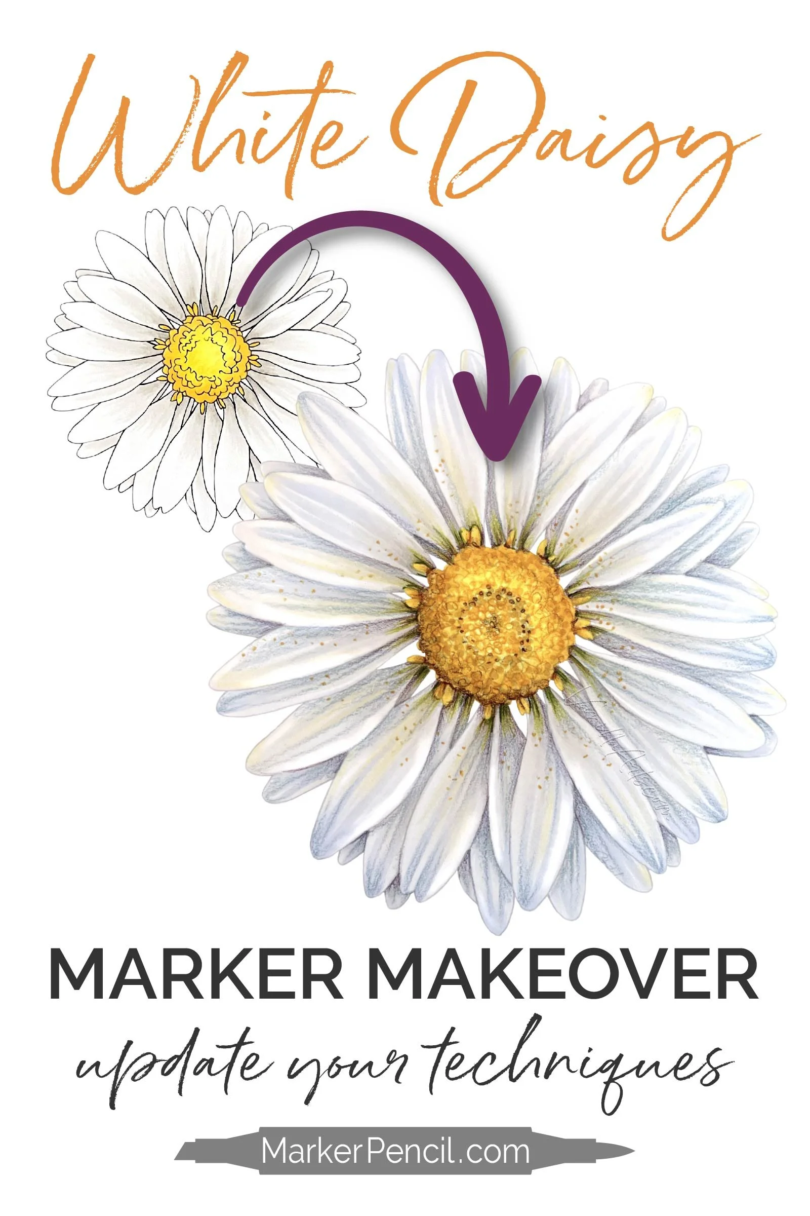
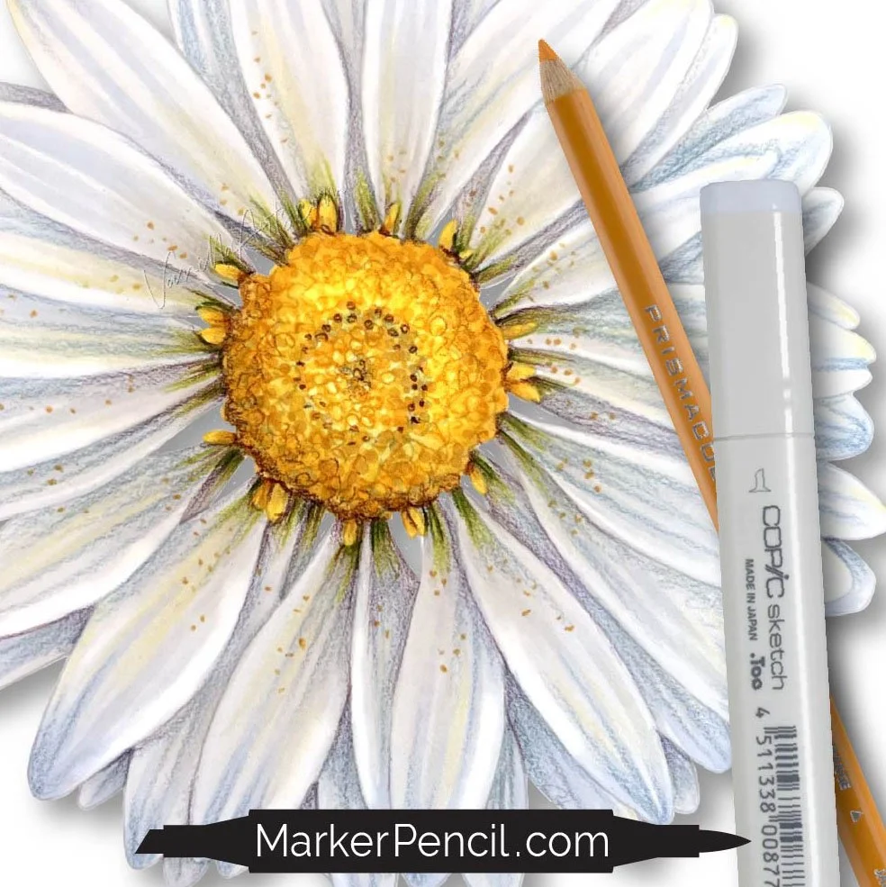
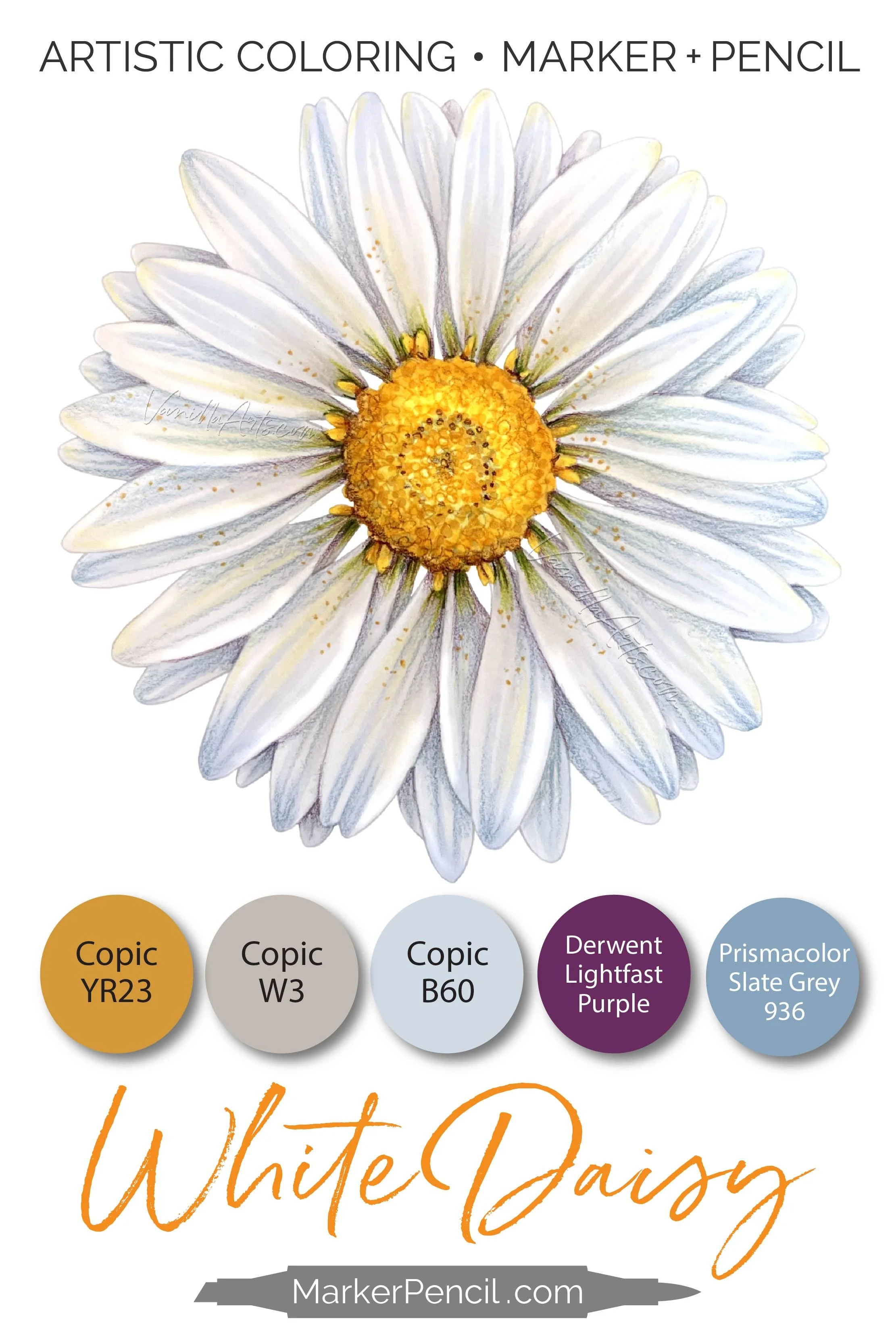
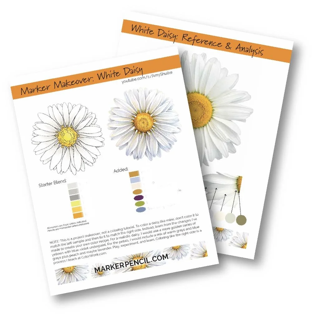
“White Daisy” by the author, Amy Shulke. 6×6” on Bristol with Copic Markers and Prismacolor Pencils. Supply list and resources below.
ARE YOUR WHITE FLOWERS FLAT?
You’re not alone!
I’ve heard about the flat white problem from many colorists— people who stumble upon my marker and colored pencil classes when they’re frustrated with popular coloring tutorials.
We blame ourselves when our coloring doesn’t look as dimensional as the tutorial.
But hang on a minute—
If hundreds of people are all having the same problems with depth and dimension…
Is it really you?
Or is it the tutorials?
COLOR WHITE FLOWERS
LIKE AN ARTIST
IN TODAY’S VIDEO…
We look at the problems with white blending combinations, gray markers, and your favorite white tutorials.
Your coloring skills are not the problem.
Let’s look at why white flower projects look flat.

Video not playing? Click here to watch directly at YouTube.

MORE WHITE DAISY TIPS:
Copic B60 is essential for dynamic white flowers. This color is easily in my top ten markers and it’s probably the marker I refill the most. B60 isn’t dark enough to shade white flowers all by itself but it adds an essential touch of clean, cool color which enhances the look of white. (Purchase B60 at DickBlick)
Don’t erase your darks with aggressive blending. YouTube is full of coloring demonstrations where the colorist blends-away the realism. In the video, I digitally sampled the dark values at the base of every petal, these deep colors are essential to creating realism. But what if I had gone over the darks several times with lighter and lighter markers?
The blending process lightens your darkest darks, especially if you color Light to Dark. No dark marker can withstand a heavy flood of light ink!
Sadly, sometimes you choose an excellent dark but you kill during the blend.

3. Colored pencil is very helpful for depth and dimension. As mentioned in the last point, the blending process can accidentally lighten your values but also, I find most colorists avoid dark markers and underestimate the values required for shade and shadows.
By the time you sense the flatness of your coloring, it’s often finished and nobody wants to go back and re-blend all their blends.
Colored pencils are a lifesaver in these situations. Instead of re-wetting your blends, you can add the missing values with light layers of pencil.
BONUS, light layers of colored pencil are also erasable— if you add too much, you can adjust your adjustments.
This is why I teach most of my classes with a combination of Copic Marker and Prismacolor Colored Pencil. (Purchase my recommended set of Prismacolor at DickBlick)
CAN YOU MAKEOVER YOUR OWN COLORING?
Absolutely! But not every project is a great candidate.
Unfortunately, most colorists use office cardstock or mixed media paper which will not tolerate heavy amounts of ink. Some of the papers marked especially “for markers” are the worst for makeovers.
Even excellent paper can only hold so much ink. The less ink your paper holds, the fewer corrections you can make.
Do not assume dried ink is safe to color over. Ink is made up of colorant plus an alcohol solvent. The alcohol evaporates but the colorant stays locked between the paper fibers taking up space. In the video, you’ll see me check the backside of my coloring to confirm that the paper can still hold more colorant.
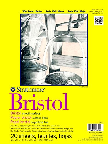
Smooth Bristol is very friendly to the makeover process. I teach all my intermediate and advanced classes on Strathmore Bristol 300 Smooth because it holds a ton of colorant and allows many corrections.
Bristol is a style of paper, not a brand. While I like Strathmore a lot, it’s not the only marker-friendly Bristol. If you can’t find Strathmore in your country, test other smooth Bristols to find a local brand which works.
Full supply list for White Daisy plus free downloads below.
Good coloring happens between your ears - it's not about your hands
When you’ve tried all the tutorials…
Easy coloring has a limit and if you sense your coloring is flat, you’re at that limit.
You can keep rearranging the furniture— different blends, different step-by-steps…
Instead, let’s change how you think about coloring.
Learn to think like an artist.
And that’s what I’m here for—
I teach the art beyond basic blending

COLOR WONK


ARTISTIC MARKER + PENCIL
Color Wonk is a next-level coloring school full of projects similar to White Daisy.
My intermediate and advanced online workshops are based on fine art techniques, distilled into fun and friendly lessons for colorists and shy artists.
We’re not coloring with ye olde blending combinations— we’re thinking, growing, and learning.
WHITE DAISY: PROJECT RESOURCES
Full color and supply list at end of this article.
SKILL LEVEL: Intermediate
LINE ART: “Sunny Gerbera” by Amy Shulke
SIZE: 6x6”
TOTAL COLORING TIME: 20 minutes
MARKERS: Copic Sketch Markers (colors listed below)
PENCILS: Holbein Colored Pencils (colors listed below)
PAPER: Strathmore 300 Bristol, Smooth finish (listed below)
PRINT DETAILS: Gray line PNG digital stamp printed onto Bristol with the Canon Pixma Pro 100
Get the Color Guide - White Daisy Makeover
After confirming your subscription, you’ll receive a link to the latest issue of Vanilla Beans. The FREE Download Library link and password is about halfway down the page in every newsletter issue.
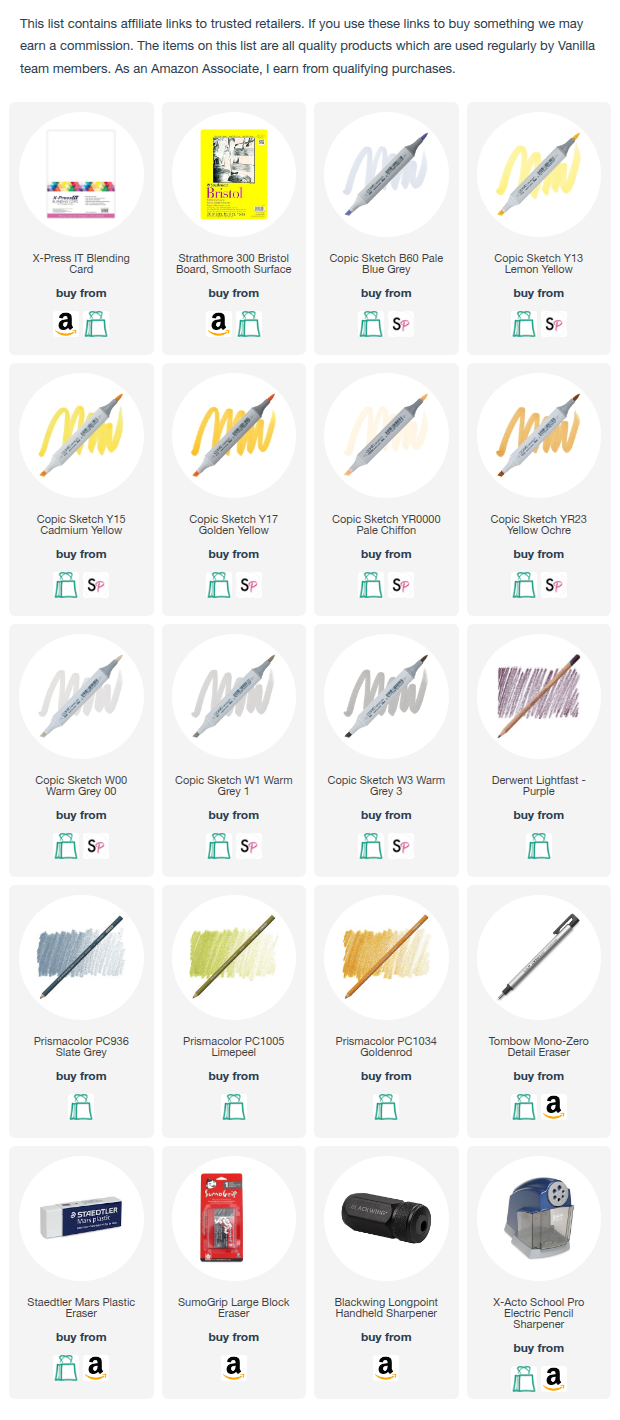
SUPPLY LIST: “WHITE DAISY”

Other Resource Pages: