Introduction to Marker Underpainting (alcohol markers + colored pencil)
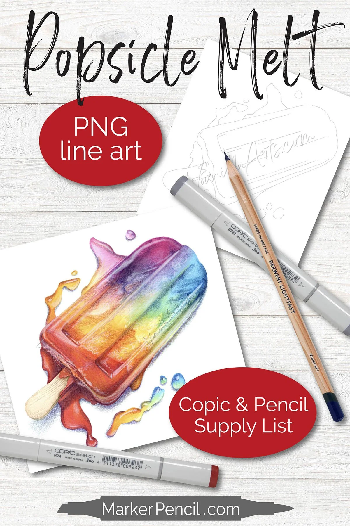
Supply list and project resources for “Intro to Underpainting” below
Are you a frustrated colorist?
Your coloring looks dimensional but not realistic.
There’s gotta be something you’re missing, right?
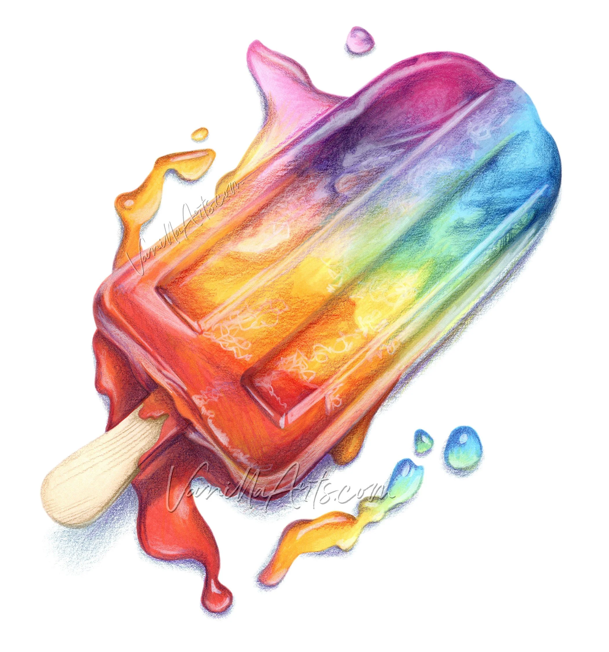
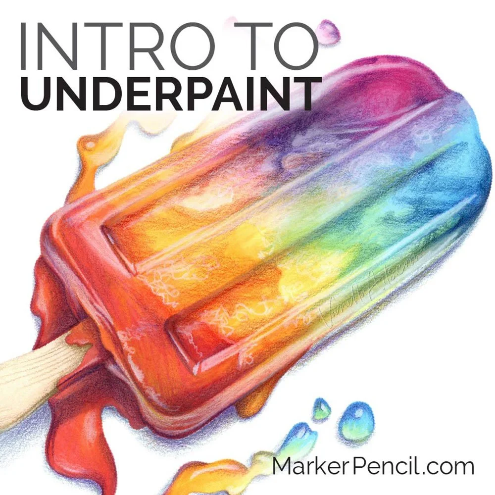
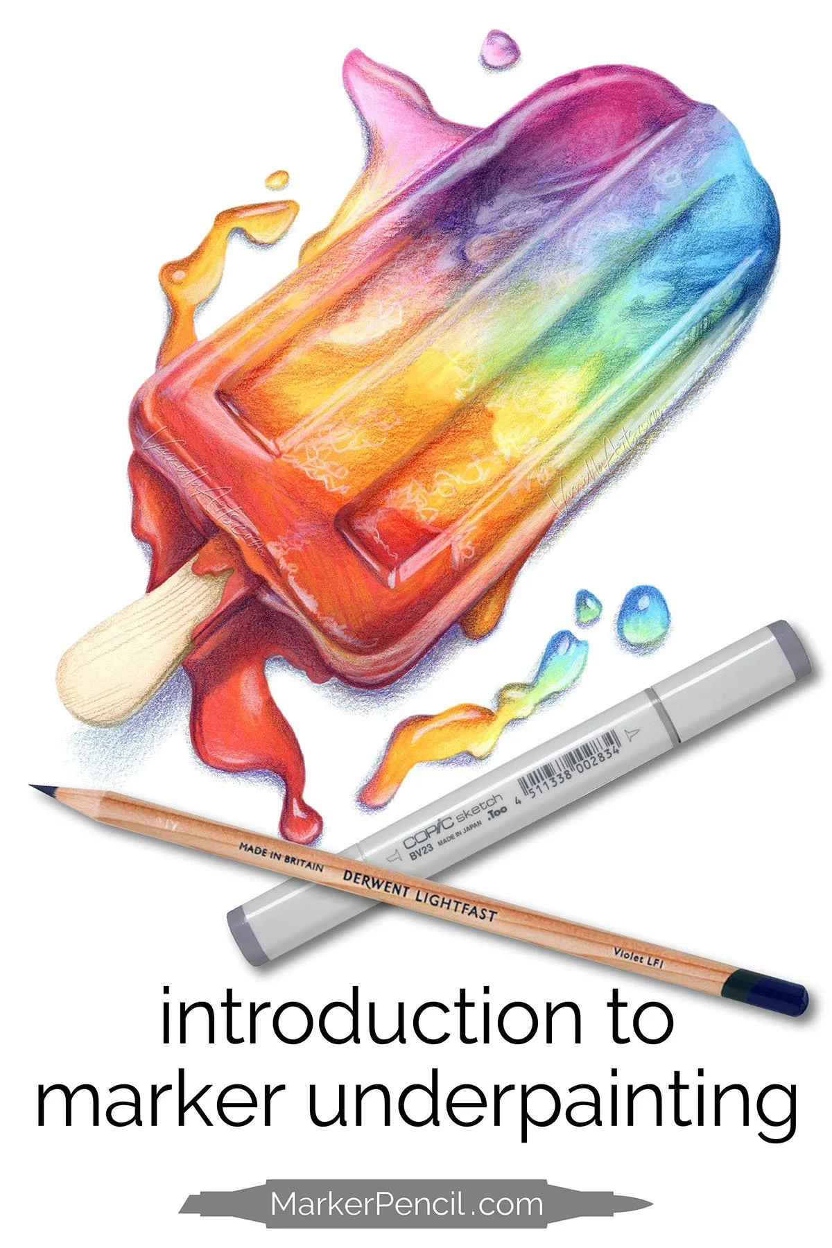
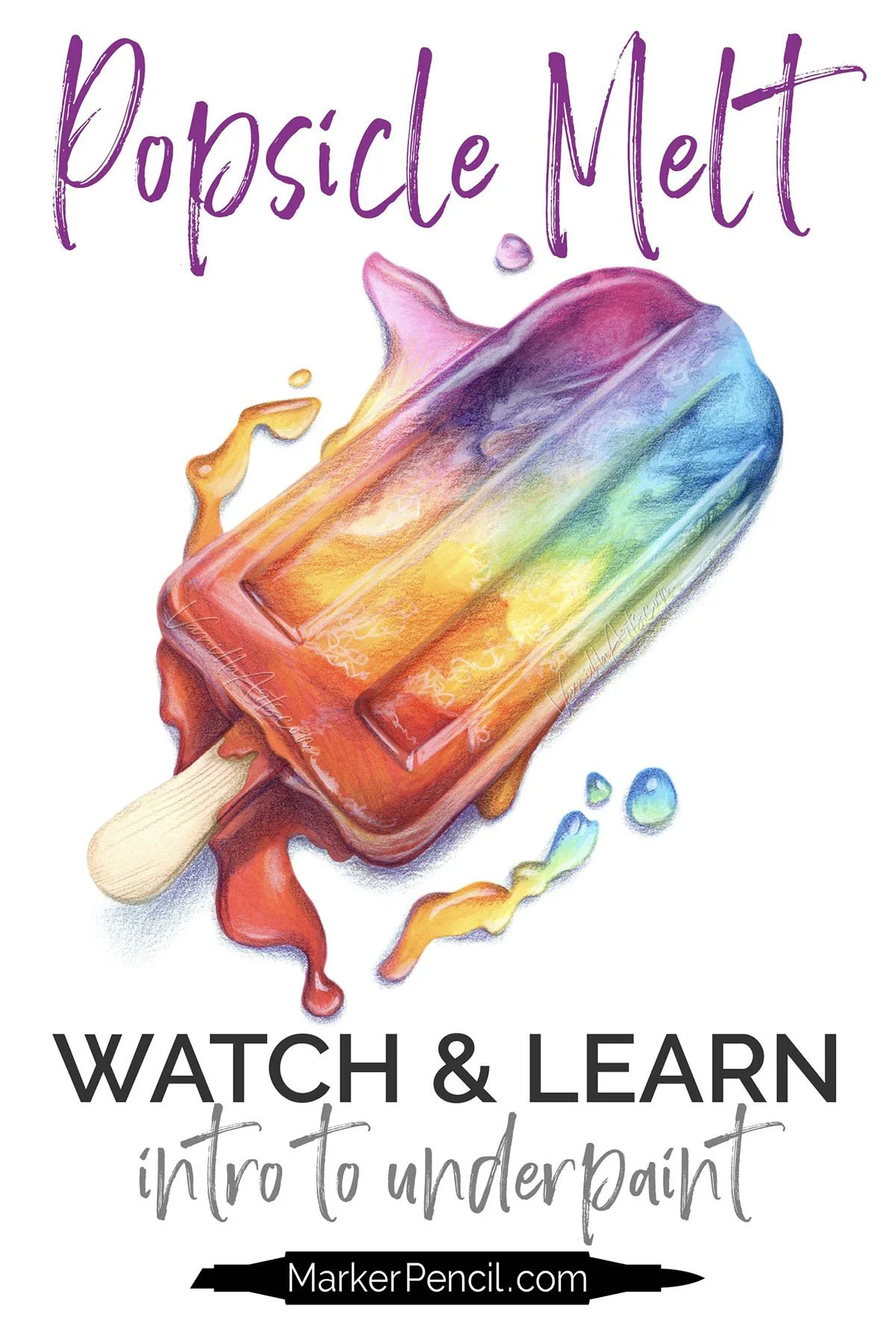
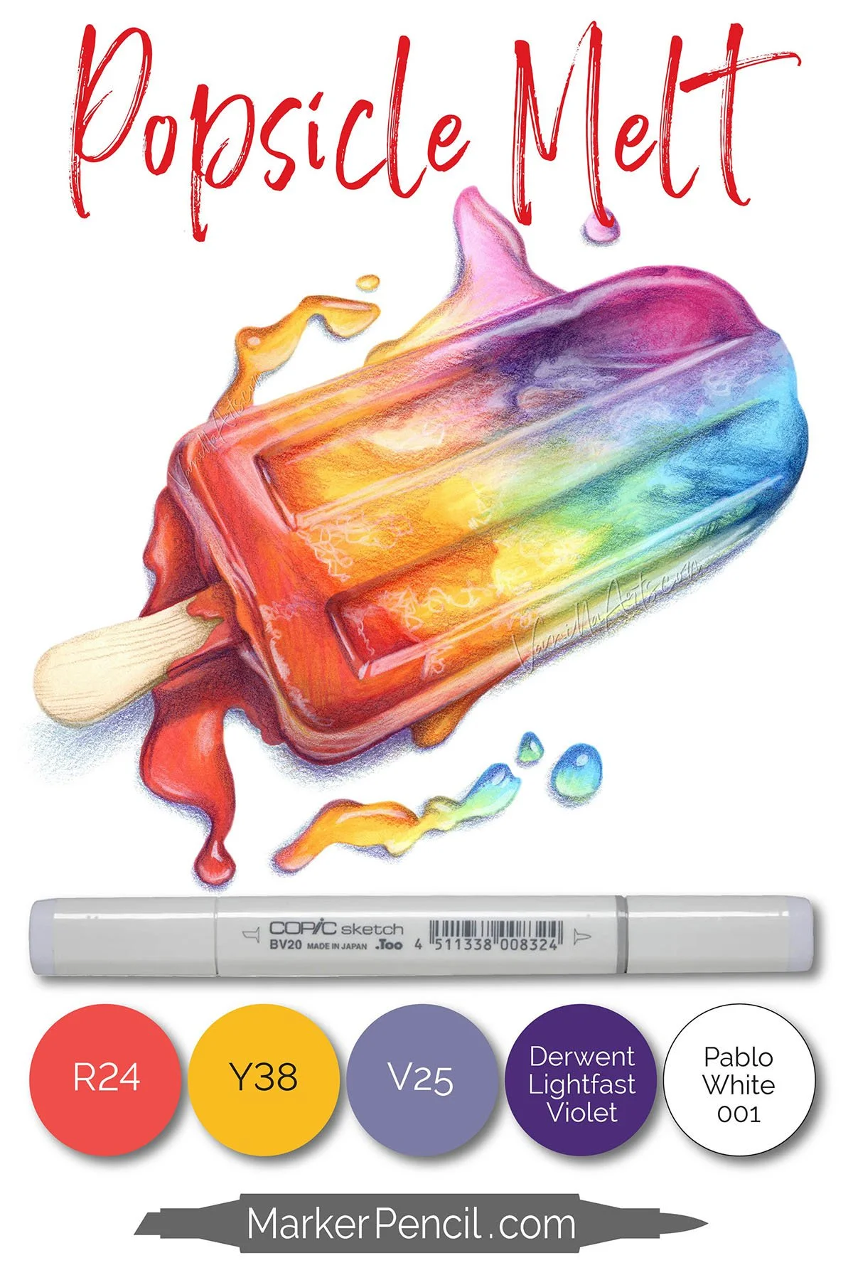
"Popsicle Melt" artist grade realistic line art for use with alcohol markers, colored pencil, or mixed media. | VanillaArts.com
DIMENSIONAL COLORING TECHNIQUES WILL NEVER LOOK REALISTIC…
Because dimension is just one small element of realism— it’s not the whole shabang.
You’re ignoring the most important aspects of realism in favor of the small thing that’s easy for one colorist to teach another colorist.
If we could change one little thing about your current coloring technique, to instantly add more realism?
SHADE WITH REALISTIC COLORS.
The problem is, the marker companies don’t make realistic shading colors.
Real shade is deep, dark, and dirty and guess what?
Ugly markers don’t sell well. When was the last time you got excited to buy yucky colors? Nope, you splurge on beautiful markers, it’s all about the pretties, right?
So if we want realistic shade, we’ve got to make it on our own.
SHADE WITH REALISTIC COLOR
LIKE AN ARTIST
IN TODAY’S VIDEO…
We look closer at the underpainting technique for alcohol markers.
Why, when, and how to make colors Copic does not make.
Your coloring skills are not the problem.
It’s the color of your shade.

Video not playing? Click here to watch directly at YouTube.

RECOMMENDED UNDERPAINT COLORS
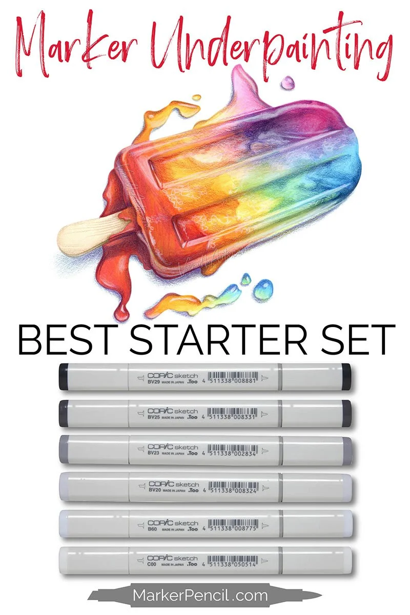
If you’re underpainting specifically for realism, I highly recommend using one color family for the entire project.
My entire popsicle here was underpainted with grayish blue-violet.
Using a consistent color helps create realism. This rule holds true no matter how many elements are in the image. If there was a napkin under the popsicle or a hamburger sitting next to it— everything would be underpainted with the same blue-violet.
Unfortunately, we can’t underpaint everything with just one marker. For example, BV23 is far too dark for yellow and yet it’s not dark enough to shade blue. So I use a series of the same color, giving myself the right BV value to fit every color in the project.
Gray markers are good but I think this BV set looks richer and more artistic. B60 and C00 can extend the value range to underpaint very pale colors (like the yellow ice and the popsicle stick).
CAN YOU LEARN TO UNDERPAINT?
Absolutely!
But you’ll need to break a couple of bad coloring habits…
First, you probably learned to color light to dark. This is because light to dark is easy to teach.
But underpainting works best when the underpaint marker is the first color to touch the paper. Underpainting requires coloring dark to light, a process which instantly reveals all the flaws in your blending technique.
With underpainting, you can’t scrub the paper to force the markers to blend and you can’t reblend something 4 times to finally get it smooth.
Good marker technique comes first. Underpainting doesn’t work without it. I teach basic marker techniques here.
You also can’t underpaint on just any ol’ paper. Too many colorists spend big money on markers and then color on cheap mixed media paper— or even worse, copy paper.
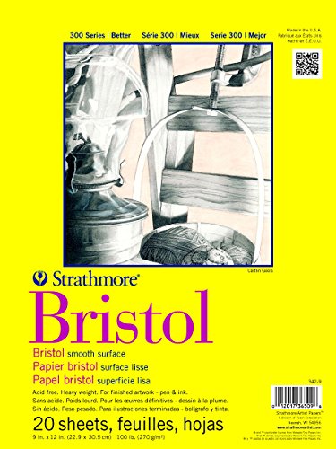
Smooth Bristol is a better choice for marker underpainting. I teach all my intermediate and advanced classes on Strathmore Bristol 300 Smooth because it holds a ton of ink and works beautifully with dark to light blending.
Note: Bristol is a style of paper, not a brand. While I like Strathmore, many other companies make excellent Bristol. If you can’t find Strathmore in your country or if the import price of Strathmore is outrageous, test other smooth Bristols to find a local brand which works.
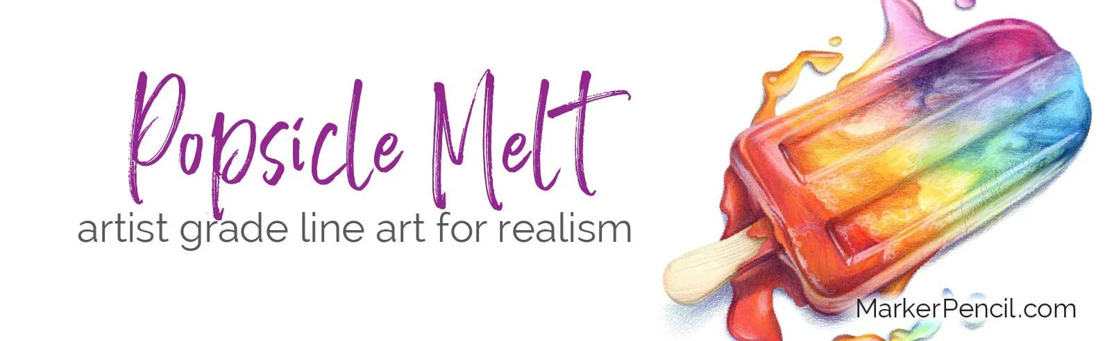
Full supply list for Popsicle Melt below.
Good coloring happens between your ears - it's not about your hands

You’ve tried all the tutorials…
When you sense your coloring is flat, you’ve reached the limit of what easy coloring techniques can do.
You can keep rearranging the furniture— trying new blends, different step-by-steps…
Instead, let’s change how you think about color.
Learn to think like an artist.
And that’s what I’m here for— I teach the art beyond basic blending.

COLOR WONK


ARTISTIC MARKER + PENCIL
Color Wonk is a next-level coloring school full of projects similar to Popsicle Melt.
My intermediate and advanced online workshops are based on fine art techniques, distilled into fun and friendly lessons for colorists and shy artists.
We’re not coloring with ye olde blending combinations— we’re thinking, growing, and learning.
POPSICLE MELT: PROJECT RESOURCES
Full color and supply list at end of this article.
SKILL LEVEL: Intermediate
LINE ART: “Popsicle Melt” by Amy Shulke
SIZE: 8x8”
TOTAL COLORING TIME: 2 hours
MARKERS: Copic Sketch Markers (colors listed below)
PENCILS: mostly Prismacolor Premier Colored Pencils (colors and brands listed below)
PAPER: Bristol, smooth finish (listed below)
PRINT DETAILS: Gray line PNG digital stamp printed onto Bristol with the Canon Pixma Pro 100
FREE COLOR THEORY LESSONS

After confirming your subscription, you’ll receive a link to the latest issue of Vanilla Beans. The FREE Download Library link and password is about halfway down the page in every newsletter issue.
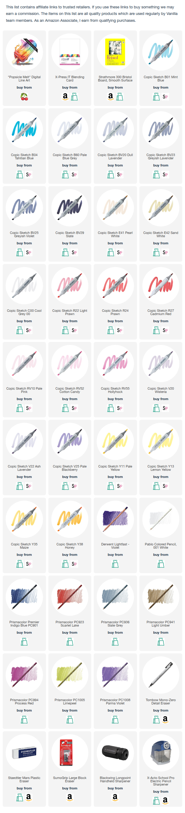
SUPPLY LIST: “POPSICLE MELT”

Other Resource Pages: