
Artistic Coloring: Add Life to Cast Shadows with Beautiful Color (Copic Marker)


Do you skip the shadows?
You’re not alone.

People sign up for Copic Marker classes and read tons of tutorials, desperately wanting to blend better. Smoother blends, easier blends, prettier blends.
They think blending will make their coloring look more realistic.
Then when it doesn’t work, they sign up for shading classes. The merry-go-round starts all over again.
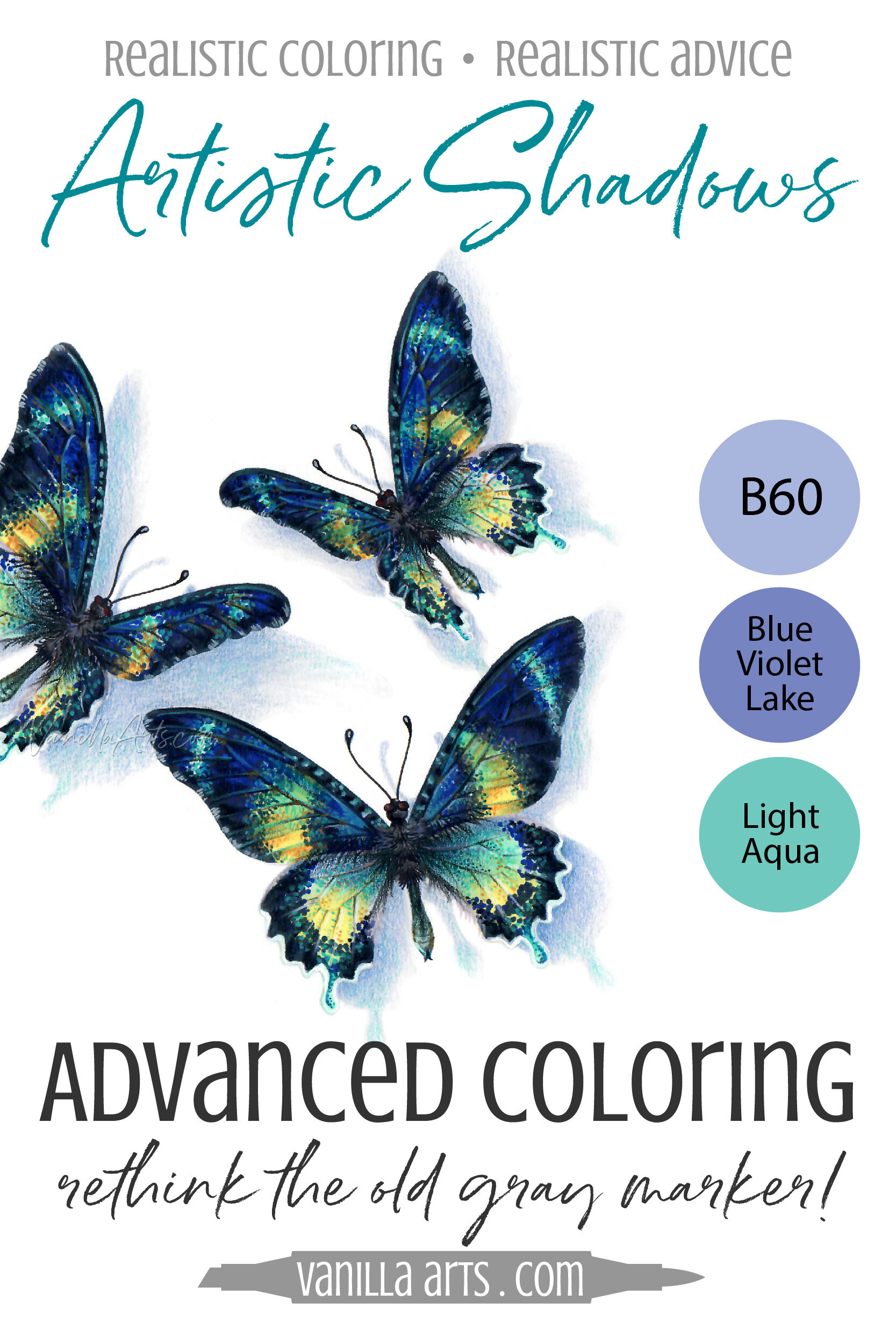
Let me ask you, how lifelike are my butterflies here? Do they look like they’re fluttering on the page?
Now let me tell you a secret…
I did not blend anything.
And I did not shade anything.
Blending and shading do not add life, presence, and realism.
For this butterfly project, the life comes from the cast shadows.
The secret to dimensional and realistic Copic Marker art is not better blending or prettier marker combos. Cast shadows add life and reality to your coloring. Don’t skip shadows or add them half-heartedly with a dull gray marker. Let’s cover a few tips for better cast shadows plus Amy’s favorite Copic shadow colors.
More Cast Shadow Info
I’ve got a few good resources here at Vanilla Arts:


Quick pause… do you understand what a cast shadow is?
I see confusion between shade and shadow in the coloring community. The two words are NOT interchangeable.
Shade is the natural muddying (desaturation) of color as our eyes travel around the surface of an object. Think of a sphere and how the color goes a bit ugly as your eye moves from the center of the sphere to the edges.
Our brains use shade to determine the three dimensional form of an object. Without shade, a sphere is just a circle.
Shadows, specifically cast shadows, are when the sphere blocks light from hitting something else. So if you set the sphere on a table, you’ll see a cast shadow where the sphere is interrupting light waves, preventing them from reaching the table.
Our brains use shadow to determine where an object is in relation to the world around it. Without shadow, the sphere appears floating and weightless.
Now as I said, there is a lot of confusion about shade/shadow, even in the art world. How you use the words depends upon the accuracy of the person you learned from, how well you listen, and how carefully you speak. But even those artists who do confusedly talk about shadow on the surface of an object will still treat cast shadows completely different than shade. Ultimately, what we do is always more important than what we say.
Best Cast Shadow Tip:
My Secret of Shadows article featuring the Rustic Maple Leaf project has five really good tips in it. Don’t miss the tips.

But the best tip I can give you today is simply this—
Do not freak-out over cast shadows!
I’ve seen students avoid shadows for years. When they finally work up the guts to try a few, they often wonder, “This is what I’ve been worried about?”
Cast shadows are not as hard as they look, especially for overhead views and flat-lay compositions.
And cast shadows are everywhere!
If you’re coloring a banana, it’s not difficult to grab a real banana and see what a real shadow looks like.
The more you look for cast shadows, the more cast shadows you’ll see. The more you see, the more comfortable you’ll be with trying a few.
Like any fresh concept or skill, it’s going to feel foreign and unnatural until you explore it.
We resist new things, not because they’re hard, but because they’re new.
The trick is to push through the starter nerves and then to practice creating cast shadows until they don’t feel foreign anymore.
As I said, the Rustic Maple Leaf article and video above are there to help you observe and recreate realistic cast shadows.
In today’s article, I want to dive more into the physical colors I use for beautiful and artistic cast shadows.
The rest of this article contains affiliate links to trusted retailers like Dick Blick and Amazon.
Vanilla Arts Company is a participant in the Amazon Services LLC Associates Program, an affiliate advertising program designed to provide a means for use to earn fees by linking to Amazon.com.
Artistic Copic Shadows
In my classes and workshops, we do a lot of coloring on white paper with white backgrounds.
No matter what you color, if you don't add a cast shadow, your object will look weightless and floaty. Cast shadows give your objects a sense of realism by grounding them, even when it's just an uncolored white paper behind them.
So what are my go-to cast shadow colors?
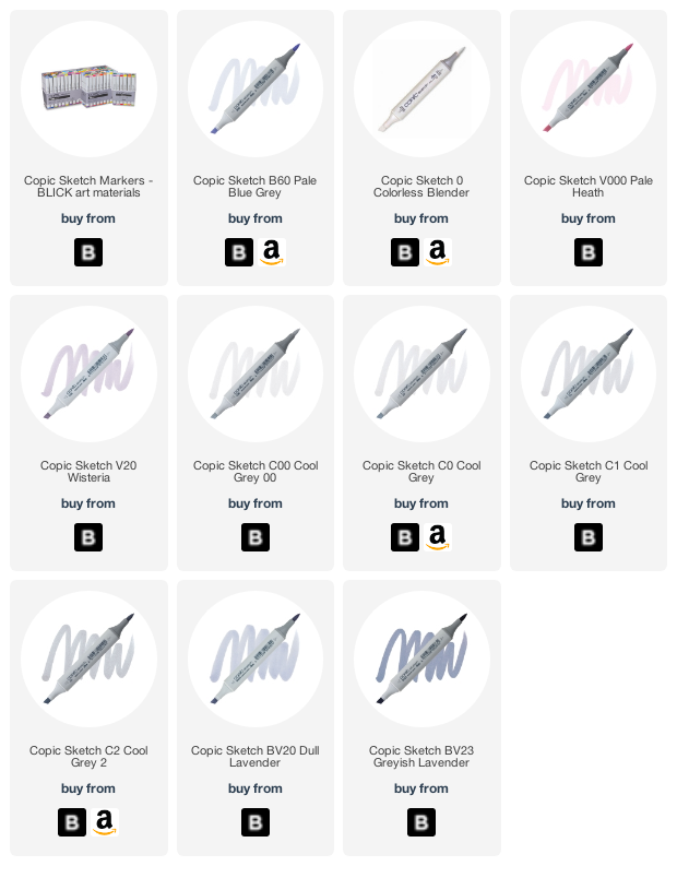
B60 + 0: I use this combo with beginners a lot. B60 for the shadow, then soften the ends of the B60 flicks with colorless blender.
The Butterfly Shadows project in this article uses 2 coats of B60 to develop a lovely cool blue. Then we added hints of Blue Violet Lake (PC1079) and Light Aqua (PC992) Prismacolor pencil over the top.
V20 + V000: This one looks great with red, orange, yellow, or green objects. Start the shadow with V20, then flick over the top and slightly beyond with V000 to soften.
To see V20 in action, see the Sunburst project here and the Hints of Spring project here.
C1 + C00 or C2 + C0: I'll admit, this one bores me… but if you’re going to use gray, at least make it a cool gray with some personality. I tend to use C markers in classes when there are tons of markers on the supply list. I hate asking students to buy lots of markers for one class and almost everyone owns some low Cs. The second marker goes over the top and slightly beyond to blend the first.
But folks, this one is so yawn-worthy that we always put a pop of bright colored pencil over it.
BV23 + BV20 + 0: I use this when I want a little drama. BV23 makes for a bolder shadow, the BV20 over the top and slightly beyond starts the blend. Then when you hit it from the outside with a colorless blender, the BV markers shatter, revealing subtle splashes of pink and aqua. Beautiful!
To see BV20 at play, see the cast shadows or reflections in Annabelle’s Heart here and the Cheers! workshop here.
Beautiful Butterfly Shadows
Join me for a fun Copic Marker + Colored Pencil lesson in the Vanilla Workshop
Butterfly Shadows was recorded live, now it’s available as a Marker Painting Workshop with anytime access.
Art of Coloring is a live demonstration program from Vanilla Arts.
Edited classes with perfect narration tend to make the coloring process look faster, easier, and smoother than it really is.
Stop comparing yourself to the supermodel version of an artist!
Real time coloring with real mistakes and real fixes.
Class Printable Pack Includes:
Class syllabus with detailed recipe guide
Full color project sample
Guide to Copic base
Detailed color map
Project inspiration references

Amy’s Favorite Cast Shadow Colors:
Vanilla Arts Company is a participant in the Amazon Services LLC Associates Program, an affiliate advertising program designed to provide a means for use to earn fees by linking to Amazon.com.


