
Coloring Tip: The Secret to Beautiful Colored Backgrounds (Copic Marker, Colored Pencil, Distress Ink)

Coloring Tip: The key to beautiful single-color backgrounds is not to use just one color. Professional illustrator Amy Shulke shares how artists layer multiple colors for subtle shifts in tone and temperature. Improve your Copic Marker or colored pencil projects by adding color variation.

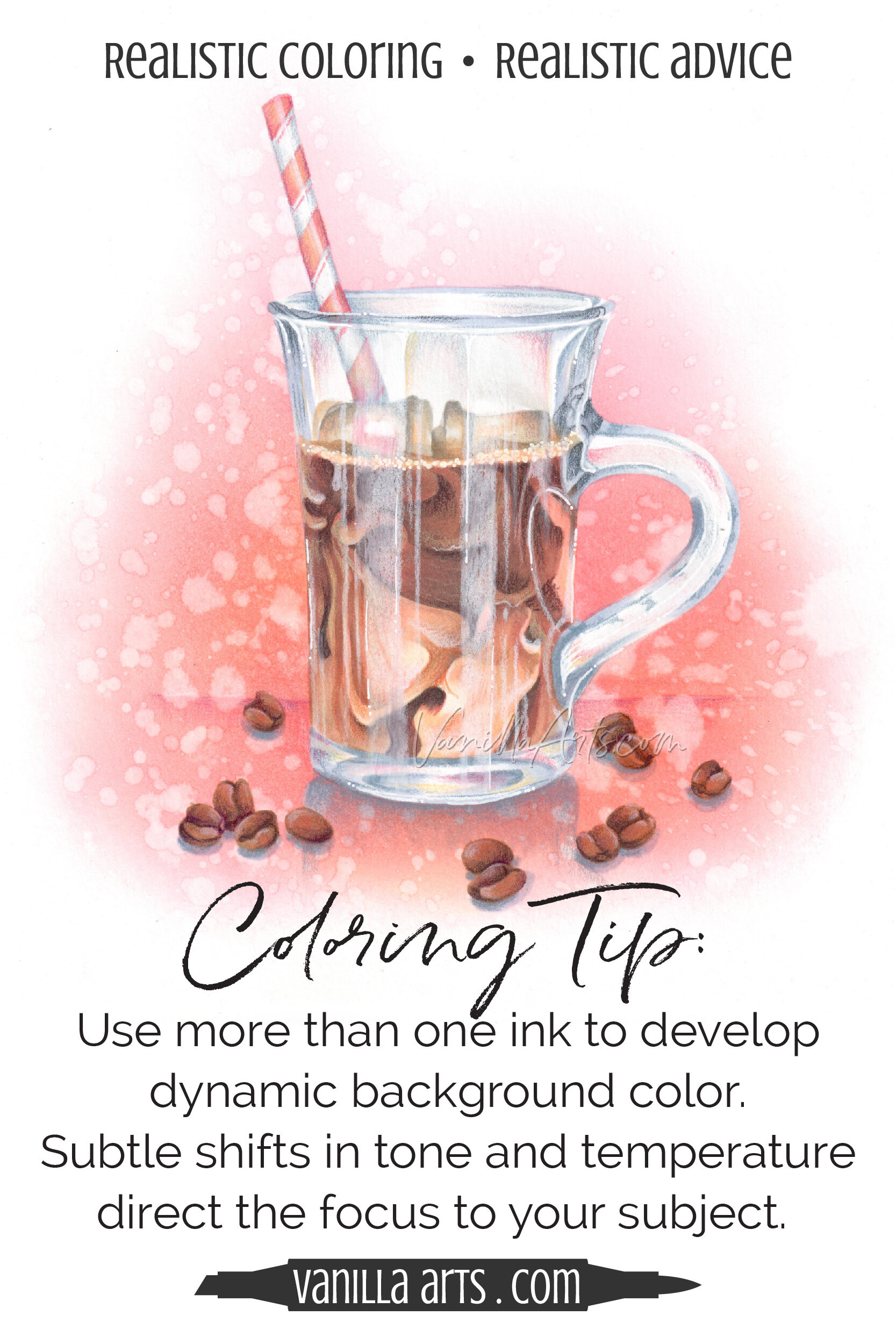
“Iced Coffee” by the author, Amy Shulke. This original line art was colored with Copic Markers, Prismacolor Premier Pencils, and the background uses classic Distress Ink.
Are you a fan of simple backgrounds?
I am too.
If I’ve spent hours coloring with my best Copic Marker and colored pencil skills, I want people to see the coloring.
If they say “ohhhhh, look at the background” then they’re not looking at all my hard work.
So I keep the backgrounds simple.
But simple doesn’t have to be boring.
Today, let’s look at how to create attractive backgrounds with basic color— backgrounds which always place the focus on your focal point.
Read more about color and backgrounds here:


Single colors lead to flat and lifeless backgrounds
Do you want to make a simple background?
Simple sounds so easy.
The simplest of all simple-treatments would be to use one color to cover the entire page or canvas. Just one marker, one pencil, or one color of Distress ink? Color it all smooth. What could be easier?
And yet it looks… well… it looks a bit ho-hum, doesn’t it?
One-color backgrounds always look a little flat and uninteresting.
Why is that?

Because simple isn’t as simple as you think.
There’s some psychology and physiology to doing simple right.
The human eye is constantly wandering, searching around for pretty things to look at. We crave new and novel visual stimulation.
Artists take great care to think about the composition of their project. Composition— where we place objects and how we organize the arrangement— composition is all about leading the viewer’s eye through the artwork, making sure the viewer stops to look at the focal points.
But a plain, single-color background does nothing for the viewer. Plain color doesn’t entice the eye and it certainly doesn’t entertain the brain.
One-color backgrounds do nothing to move the viewer’s eye around the artwork.
With no eye movement and no encouragement to wander and explore, the human brain interprets this as flat and boring.
You’ll see this problem a lot with card makers. They color a really cute stamp but it’s on plain white paper. So they die-cut the image and slap it on a sheet of colored paper. But the plain color doesn’t help so they add a sentiment. Then they add a border. Then something with a pattern. Then they shush it up with a little ink edging. Then a few sequins and glitter glue and stickers and pearl spray and fake antique brass doo-dads…
Sigh.
All of this to entertain the eye.
On plain paper (even if it’s a pretty color) you can sense the project is “missing something”.
The something missing is eye flow.
Single color backgrounds look boring because they lack flow.
A good background draws your attention to the focal point
In my Iced Coffee project here, most people notice two things about the background:
It’s a pretty color of pink
The splatters look kind’a cool
But there’s more going on in this background than you realize.
First of all— yes, it is a pretty shade of pink. A cup of iced coffee in a clear glass on a plain white background wouldn’t draw your eye nearly as much as this bright clear pink background does. The color is warm, saturated, and intense which contrasts nicely with the neutral browns of the coffee.
So that was mission number one: I used pink to grab your attention when plain old brown markers won’t.

But now that I’ve got your attention, I want to draw you in deeper.
Notice that I didn’t take the pink and run it all the way to the outside corners of the paper? Instead, the pink forms a gentle halo around the coffee. It’s a vignette effect.
I’m using the color pink to capture your attention but then I created the vignette to keep your eye from wandering away. As soon as the pink starts to fade, your eye gets the signal to reverse course and head back to the center, where the focal point glass of coffee sits.
Try it. Let your eye roam around the image. Notice how when the pink stops, your eye travels back inward?
Tricky, eh?
I’ve got more tricks too.
Look at what happens to the pink as you get closer to the focal point. See the golden glow? That’s me purposefully drawing your eye to the coffee. You’re getting warmer, warmer, warmer…
And to keep the coffee from floating in outer-space, I've added a soft horizon. With just a faint purple line, I’ve created a sense of gravity.
Then there’s the cast shadows. Add a few shadows and now it feels like there’s a table or a counter underneath the coffee. Suddenly we’ve got an environment.
I haven’t even mentioned the splatters. They were 100% pure whimsy. I figured you’d like a little bit of texture to look at since the coffee has been colored so smoothly.
See what’s going on here?
It’s a simple background but there are lots of ulterior motives going on.
The background entices and entertains you, all without overshadowing the coffee itself.
Use multiple values of the same color for subtle visual interest
If you’re trying to spice-up the background, your natural inclination would be to add a few accent colors to the background.
What might match the pink? Green? Yellow? Lavender?
Nooooooooo! Hold on! Stop!

Think about what would happen if I added green or lavender splashes to this background.
Would you even notice the coffee if I created a circus all around it?
Instead of introducing a totally new color, spend time developing the color you already have.
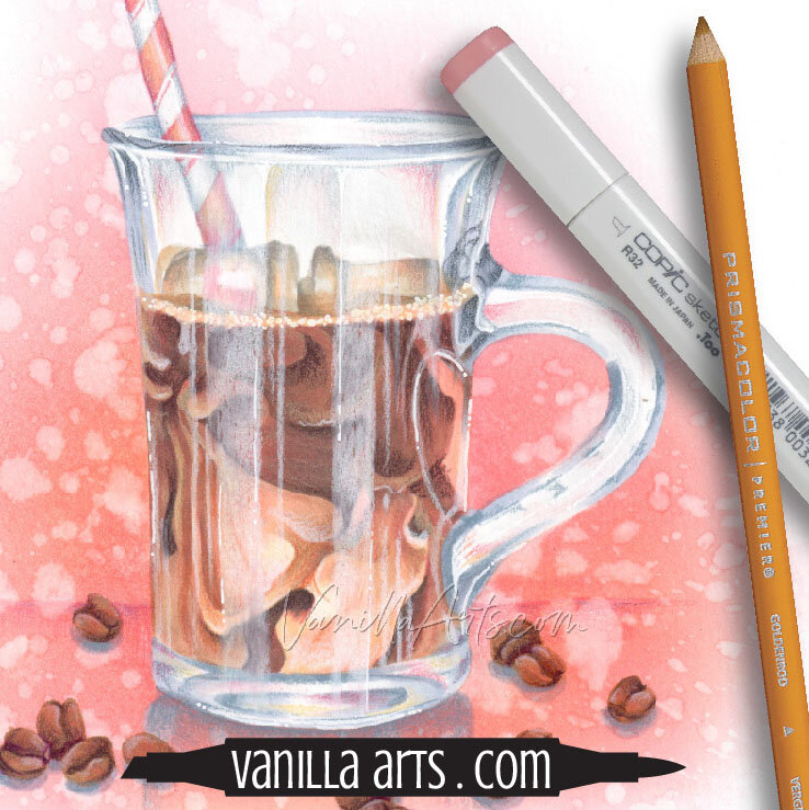
In Iced Coffee, I used Worn Lipstick Distress Ink on a Picket Fence Life-Changing Brush for the background. Distress Ink makes it very easy to create multiple values of the same color.
To make the pink darker and more intense, we add a few more layers and I press a little harder with the applicator.
For lighter areas, I work very lightly and make fewer passes.
I created a whole range of pinks with just one ink.
People easily forget that every color contains hundreds of different values.
By varying the values, you add more color without adding new color.
You can do the same thing with colored pencil or pastel. Press firmly and use many layers for intense color. Go lightly and let more of the paper shine through for soft and gentle color.
With watercolor, you can change the amount of water in the paint.
Copic is a little harder because you can’t just press harder. With markers, I’d use a range from the same first-number family for a smooth gradient. How about RV04 - RV02 - RV00 - RV0000?
Value variations always match the original base color so there’s no guess work or clashing.
And values do not create a distraction the way a new color would.
Everyone’s a winner!
I do not recommend Distress Oxide Ink for this background technique

My Iced Coffee project uses the classic original formula Distress Ink pads.
I know a lot of crafters dumped their classics as the Oxide versions were introduced but I do not recommend Oxides for use with Copic Marker or colored pencil.
This has nothing to do with compatibility, it’s about the color.
Oxide inks are opaque. Opaque products give you very reliable color.
Too reliable.
See the color of the spongey inky pad inside the Oxide container? That’s the color you will always get from Oxide Ink. It doesn’t matter if you apply one coat of ink or 82 coats of ink, it’s always going to be exactly this same color.
Meanwhile the classic inks are transparent. See the color of the felt pad? If you apply 82 coats of classic ink, you’ll get something this dark. But just one coat of classic ink could be a faint hint of a whisper.
Classic Distress Ink allows you infinite control over color value and concentration.
They’re the smart tool for custom artistic backgrounds.
Use analogous colors to add subtle temperature shifts
I mentioned before that I created a slight golden glow to the pink around the coffee cup.
Look closely, it’s soft. It’s not a big honkin’ yellow circle around the coffee. Very gently, the pink makes a subtle warm shift as we approach the focal point.
Where did that come from?
I added an analogous color.

I know, I just got done telling you not to add new colors…
Now I’m ignoring all that and tossing in a new color anyway?
Actually no, I added a shift in temperature.
If you look at pink on the color wheel…
Pink. Yes, pink is on the color wheel. No, I’m not crazy, I know there isn’t a pink space. But if you dilute magenta, you’ll get pink. Pink is a value variation of magenta, so look at magenta on the color wheel.
Okay, so if you look at magenta on the color wheel, the colors to the left and right of magenta are called analogous colors. They’re neighbors, they have things in common, they work well together.
If you travel towards yellow, you’ll see the warm analogous colors for magenta. Red to orange, all the way to yellow.
If you travel from magenta towards the cyan space, you’re looking at the cool analogous neighbors. Purple to violet, all the way to blue.
Analogous colors can be layered with your base background color to create warm or cool temperature shifts.
Read more about the color wheel and download a free wheel in my article here.
Temperature shifts add interest by encouraging the eye to wander around the artwork more. Remember, when the eye stands still and stops exploring, your art feels boring.
In this case, I created a slight aura or halo around the coffee with a soft layer of Wild Honey classic Distress Ink. Remember how classic ink can be just a whisper? I used that whisper ability to make the vignette effect around the edges AND to make the golden halo. Classic ink makes this easy and effective.
If you look closely at any of my Distress backgrounds, they always include hints of 2-3 analogous colors.
Temperature shifts add soft beauty.
The White Background Paradox
Wait a minute, Amy— when I look through your all your classes and projects, I see a lot of them have white backgrounds. Just plain white. White doesn’t have any of the value or temperature shifts you’re recommending in this article. So are white backgrounds bad?
Nope. Plain white backgrounds seem to be the exception to the rule.
I think because the brain is used to seeing white paper, we think of white backgrounds as nothing. They’re not really a background because they’re not really there.
So on white, you’ll see me working extra hard to ground the object and create an environment with cast shadows and sometimes a horizon. Otherwise it looks like an unfinished project.
And how about black?
Black is not nothing. Unlike white, black has a definite weight and presence. The same rules apply to black as to the pink in this article. Improve the look of your black backgrounds by adding shifts in value and temperature.
In summary:
The key to beautiful single-color backgrounds is to use more than one color
Improve the composition of your artwork by directing the viewer’s eye around the artwork.
Introducing new hues and contrasting colors will create a feeling of chaos and clutter.
Keep the background simple by using value versions and temperature shifts of the same color.
Lead the eye with vignettes, halos, horizons, and cast shadows.
Use a soft layering technique to create subtle shifts rather than abrupt color transitions.
Remember: eye motion adds the feeling of life.
Use color to add motion, interest, variety, and beauty.

Swirls of Coffee Color
Learn to color realistic food and beverages with Amy’s mixed media techniques
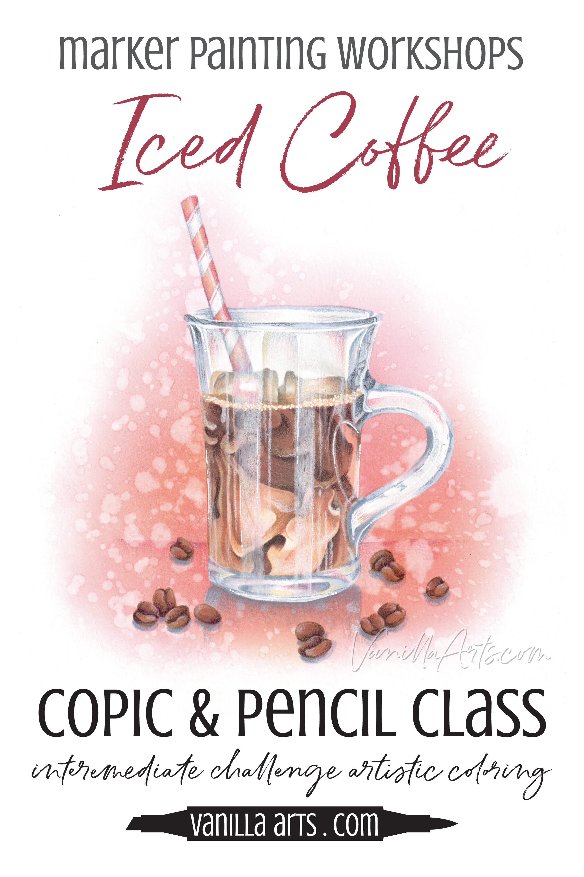
Ready to try challenge level coloring?
Iced Coffee an Intermediate Challenge level Marker Painting Workshop
Learn how to read photo references to capture the most important details while simplifying the minor details. This concept will help you move beyond tedious coloring, relaxing into an artistic style that’s more intuitive and less exacting.
Real time coloring, recorded live
Live Workshops are unscripted demonstrations which provide students with a real look into the authentic coloring process. You’ll see mistakes being made and corrected. It’s just like visiting Amy in her home studio.
Log in and color with Amy at your convenience. Anytime access, no expiration dates.
Class was recorded in October 2021 and featured a live student audience. Amy answers questions from the students and offers many tips for better colored pencil art.
Select supplies used in Iced Coffee:

Vanilla Arts Company is a participant in the Amazon Services LLC Associates Program, an affiliate advertising program designed to provide a means for use to earn fees by linking to Amazon.com.


