Copic Multiliner vs Pigma Micron: Does It Matter?

 
Multiliner vs Micron- Does it matter which you use? | VanillaArts.com


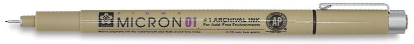
Most of my beginners bring Micron pens to class

Even though the supply list specifically states "Copic Multiliner".

Does it matter?


It matters to your artwork!

Micron Pen.jpg

I'm not a one-tool-works-for-everyone kind of teacher but there is a reason why my Copic Multiliners are worn and well loved while my Micron pens gather dust in a bottom drawer reserved for pencil stubs, old Bic pens, and stray paperclips.

Now I don't rant and rage if someone pulls out a Micron pen in class. I get it- most beginners have used Microns for previous projects and why should you buy a new black pen when you have a bunch of 'em already?

And frankly, it's rare to find a craft shop or art store that carries more than a few stray Multiliners; meanwhile the Microns fly out the door like Olympic sprinters being chased by rabid cheetahs. If you want a Multiliner, you've got to go the extra mile to hunt 'em down.

But in my experience, the two products are not interchangeable. It matters which brand of pen you use.

copic multiliner.jpg

Four reasons why I do not use Micron pens:

Mulitliners vs Micron Pens- Does it matter which brand you use? | VanillaArts.com

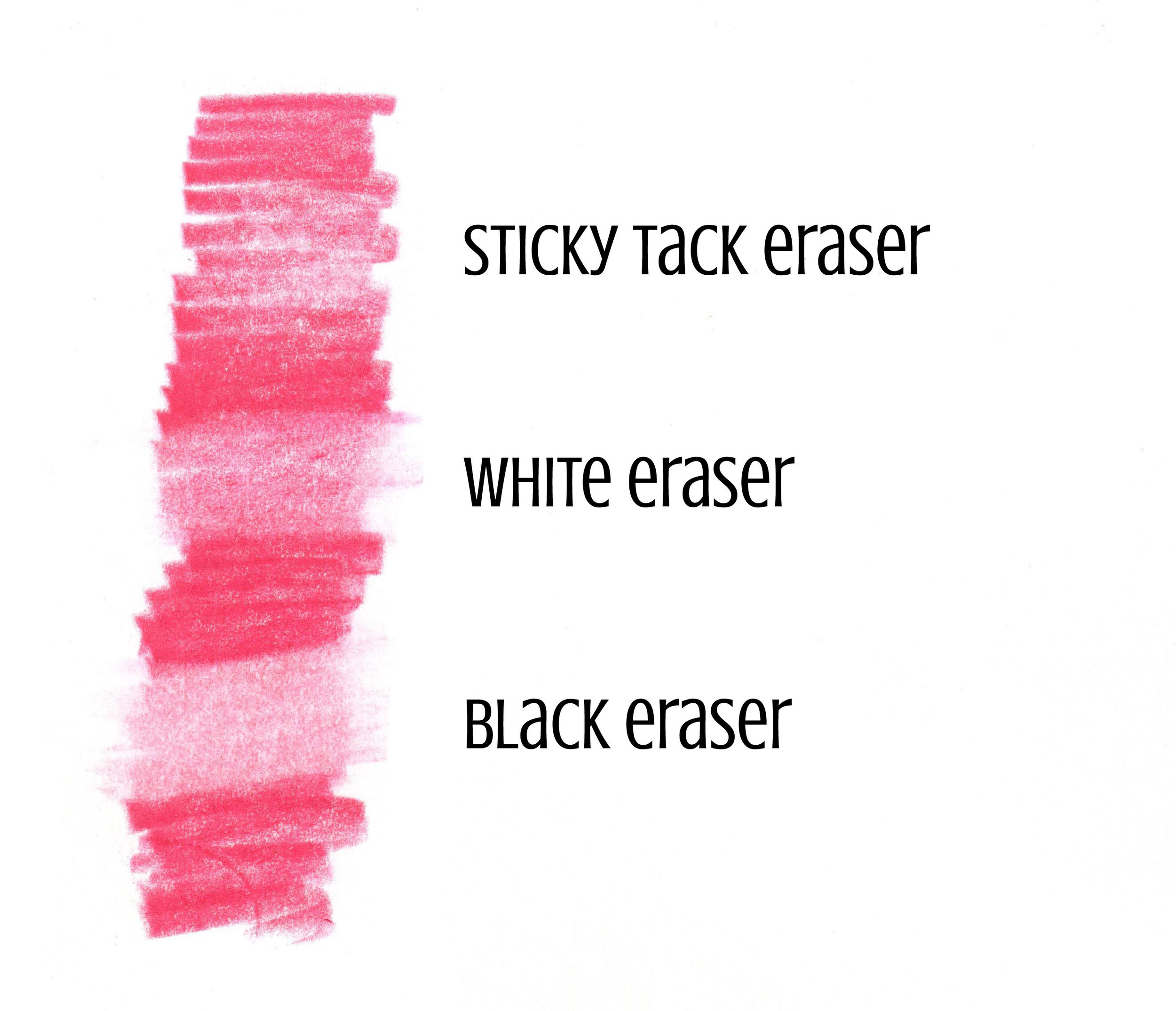
1. Erasers can lift Micron ink

Admittedly, if you never draw & ink your own images, you may never notice this flaw. But trust me, I've banged my head against the wall on more than one occasion.

And it happens on the kind of smooth papers markers like best.

See that light zone down the center of my inking? That's not a creatively placed highlight. That's what happens when you run a white eraser over an area inked with Micron pen. That was 3 passes with a Pentel Hi-Polymer Eraser, a very gentle type of eraser.

With Micron pens, an inker who erases their pencil guide lines has to go back and re-ink the erasure sites to build back up the solid color.

NOT FUN.


2. Copic Ink can cause Micron to bleed

I've seen a few blogs and YouTube videos that claim otherwise. But here's the catch- what paper and what Copic ink are they using?

Multiliner vs Micron inks- Compatibility tests for colorers | VanillaArts.com

The brand of paper matters a lot for ink adhesion.

While you can sometimes get away with coloring over the top of Micron ink with your Copics, the Microns really will bleed. It's not a Napoleonic War kind of bloody mess but a bleed is a bleed and it's not a good thing.

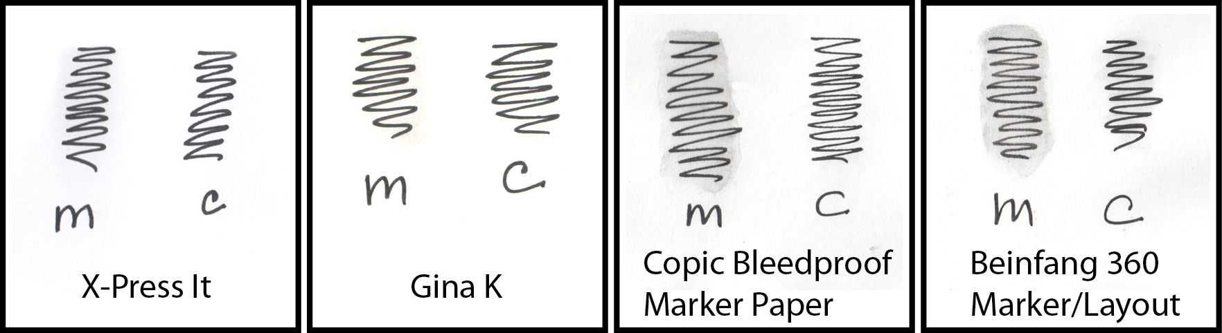
All 8 test swatches received 4 passes with Copic colorless blender. The blending solution was loaded into a water brush because I knew what was coming and I didn't want to ruin my colorless blender nib.

The bleeding on both X-Press It and Gina K cardstock was minimal. You can only see it on close inspection and the bleed would be easily missed if I were using a colored Copic ink instead of clear. But the tip of my waterbrush was dark gray which means that your Copic nibs would pick up the Micron ink too.

The bleed was pretty significant on both brands of marker/layout paper that I own. And because I draw all my digi stamps on layout paper, this means no Microns for me!

So if you're using a Micron pen to touch up your stamp or add details, don't run the risk of ruining your project with ink incompatibility. Save the Micron work for dead last!


Multiliners vs Micron pens... ouch! | VanillaArts.com

3. I hate the grip on Micron pens

Okay, this is a personal problem and given that I actually have been struck by lightening, I'll admit that my life has challenges which yours may not.

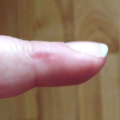
Whiny baby time: Microns have a sharp ridge right where I hold the pen. That ridge digs into my finger, even though I do not use a death-grip. Call me a wimp but Micron pens hurt!

I signed my name six times on scrap paper and this is the dent it left. That was less than a minute of work. It usually takes me about 20 minutes to ink an image.

No way I'm holding a Micron pen for that long. Not happening.


Multiliner vs Micron- does it matter? It does if you want gray! | VanillaArts.com

4. Zero Shades of Gray...

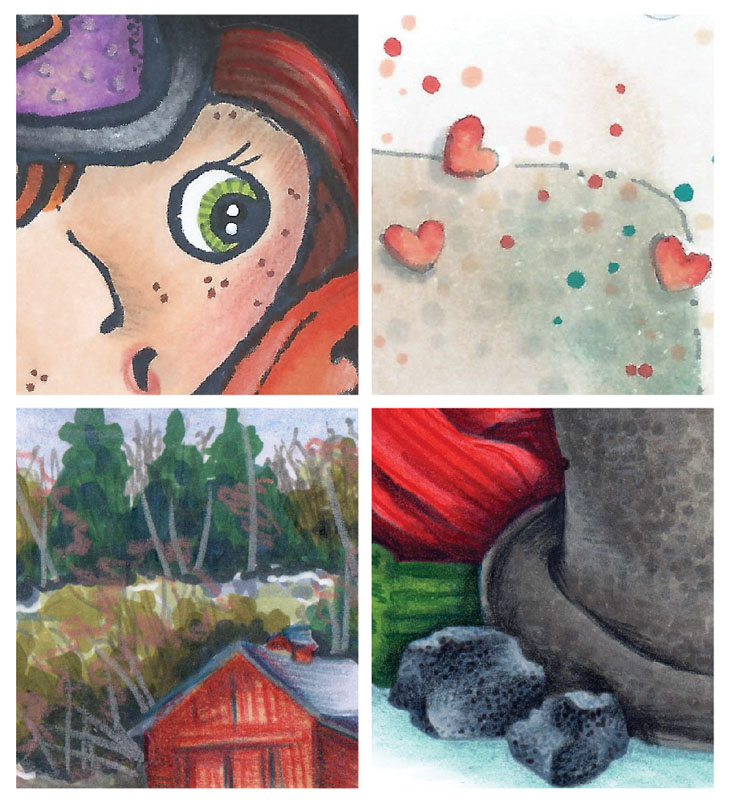
I'm not a fan of black coloring book type lines on my coloring images and even when I do work with a black stamp, I almost always add my own details using a gray Multiliner rather than a black one.

Gray is magical ink; it's a chameleon color. Use a gray pen to add veins to a green leaf or stripes to a green eye and it looks like you used a green Multiliner. Use it over something blue and it looks like you used a blue pen. Gray morphs and changes based upon whatever color is underneath it.

For adding subtle or gentle details, gray is king. It's the only color I grab for drop shadows. Black is harsh and detracting while gray sings beautifully, on key- no matter what the key, every single time.

And guess what?

Micron doesn't come in gray.

<face palm>


Different inks. Different adhesion. Different compatibility. Different housing & grip area. Different color palettes.

This is why I own 28 Multiliners and only 4 Micron pens.

And this is why my class supply lists always specifically call for Copic Multiliners.


You can find my newest favorite Copic friendly fineliners here:


Black Erasers: Erase Mistakes Without Damaging your Paper

 
Black Erasers- Remove mistakes without damaging your paper | VanillaArts.com


“Which way you ought to go depends on where you want to get to...” 

There's a certain logic to what the cat said to Alice. You need to know where you're going before you decide how to get there.

When you make a mistake with colored pencils, there's not a one size fits all solution. Smart colorers evaluate the damage and decide upon the path that gets them around the mistake without creating a ton of damage in the process.

Erasers are not magical. They can't remove the whole mistake. They can only remove enough to get you back on the correct path.

An eraser is not a time machine, it won't take you back to the day before you made the mistake.

Huh. That's a rather important statement. So let me say that again, in bolder, bigger letters:


It’s an eraser, not a time machine

We're talking about colored pencil here. Just colored pencil. Because if you're here looking for a marker eraser, boy, are you fresh out of luck. You can minimize marker damage with a colorless blender but you're never going to do more than camouflage your marker mistakes.

But back to colored pencil- and for that, I'm sorry break this to you, but there's not going to be a perfect erasing solution here either.

You can minimize the damage but you're never going to take yourself back to fresh clean paper. Erasers are not the stuff of H.G. Wells.

I think part of the problem is because we call them colored pencils. When you hear pencils, you think graphite and for every graphite pencil, there's a pretty good eraser, right?

Now if we were more accurate and we started calling colored pencils what they really are... I'd suggest calling them  freekishly-stubborn-sticks-of-color-that-ain't-goin'-nowhere, but that doesn't exactly roll off the tongue... But if we really did call them FSSoCTAGN, then people would stop expecting to be able to remove every single colored pencil mistake they ever make.

A colored pencil eraser can't take you back to Eden, it can only make you feel a little less miserable about goofing up.


Let's review the most important rule of erasing mistakes:

First, do no harm.

Protect the paper tooth! | VanillaArts.com

Remember, paper has tooth and tooth is essential to good colored pencil coloring. Tooth is what grabs your colored pencil pigment and holds onto it. Colored pencil doesn't work well on glass, does it? It doesn't work well on glassy papers either. Tooth is vital to the coloring process.

ALL ERASERS DAMAGE TOOTH

There's no way to avoid it. Any rubbing, any friction, any eraser will flatten out the paper tooth and thus make it harder to color over the erasure zone.

So when you make a mistake, start with the lightest, most paper friendly eraser you can find. You don't have to pull out a hand grenade when a fluffy bunny will work.

Made a mistake? Start here:

  1. Sticky Tack Eraser- this is your fluffy bunny eraser. It lightly lifts color without damaging your paper. Read more about sticky tack and how to use it here.

  2. White Polymer Eraser- if the fluffy bunny doesn't work, try your new best friend. White erasers are non-abrasive and grit free. That means they rub without sanding away much of the paper surface. Most of your mistakes can be removed with a white eraser. Read about white erasers here and here.

But if the fluffy bunny can't handle the mistake and your new best friend doesn't make a dent in it, what should you do?

That's when you call in the big boy. BUT ONLY AFTER YOU'VE TRIED THE STICKY TACK AND THE WHITE ERASER!

Who is the big boy?


The big boy, the black polymer eraser | VanillaArts.com

Meet the Black Polymer Eraser

They're made by several companies, Factis is the kind that just happens to be at the cash register display of my favorite local art store.

The curse of the black pearl | VanillaArts.com

Pentel, Faber Castell, Staedtler, and Tombow also make good black erasers. The one you want to avoid is the Black Pearl variety.

Just remember the Johnny Depp movie, the Curse of the Black Pearl. That's easy to remember.

A black pearl won't ruin your life but it is way too abrasive for our needs. Save it for the class room.

By the way, that goes for white pearls and pink pearls too. They're all school erasers, not art erasers.


What's special about black erasers?

Well, he's a body builder compared to our other erasers.

We started with the weakest eraser on purpose, but sometimes you need more muscle.

In the eraser world, abrasive grit is muscle. Grit is what's ultimately going to remove the mistake.

But it's a trade-off- grit gets the job done but it'll also damage the tooth. So we want something muscular but with control.

We want a smooth operator; a big guy with some sensitivity. We want don't want the Terminator, we want the Kindergarten Cop. That's the black polymer eraser.

Choose the weakest eraser for your needs in order to save the paper | VanillaArts.com

Here's a sample of each eraser at work on a thick and heavy coat of Prismacolor Premier pencil.

Sticky tack lightens the area. It doesn't erase, it takes the sting off the mistake. Once you've lightened the mistake, you can layer on the correct color. Prismacolor is fairly opaque, this gentle re-coloring process is usually all the correction you need.

But if if isn't enough, try the white eraser. It's stronger than the fluffy bunny sticky tack but you're still preserving the tooth of the paper. Lift what you can and then recolor the zone.

The black eraser is your last resort. It removes most of the color, but it will never get it all. Remember, we are deliberately avoiding the hand grenade in order to keep as much tooth intact as possible.


The black eraser has a slight bit of grit so it can remove most of the color. It doesn't have enough grit to dig down into all the crevices.

Think of what's leftover after a black eraser as the Cheshire Cat's smile... the old pigment is still there but it's not enough to get in your way anymore.

Black polymer erasers remove just enough color to allow you a re-try. The downside is that if you over-rub the area with a black eraser, you will damage the paper. That's why it's the eraser of last resort. You never grab the black eraser first; use it only when the fluffy bunny and the best friend white eraser aren't lifting enough color to control the mistake.

And no, it won't leave a black smudge on your paper. I wouldn't do that to you! Good black erasers erase cleanly.


Here's the rundown on black polymer erasers:

Alternate Names-

Black PVC eraser, black polymer eraser, black poly eraser

Brands- 

Factis, Pentel, Faber Castell, Staedtler, and Tombow

Defining Features-

A rubbery eraser with a slight bit of grit, black in color but erases cleanly

Best used on-

Works great on graphite projects. Good on wax based colored pencil marks and other media that sit on top of the paper surface. Will not work on liquids like ink or paint that absorb into paper fibers.

Price Range-

Prices vary, usually under $4 per eraser. Sold in multi-packs

Available at-

Some art stores, some craft stores, most online art supply retailers


So to recap: No time machines, only fluffy bunnies, BFFs, and Cheshire cats... 

We're either talking in code or we're all mad here.


Why Color Lists and Marker Recipes Hurt your Coloring

 
Marker recipes are not helpful! | VanillaArts.com | Colored Pencil, How To Color, Realistic Coloring


I've got a great recipe to share with you today!

Amy's Amazing Lemon Meringue Pie:

  • Baking Powder

  • Butter

  • Cornstarch

  • Cream of Tartar

  • Eggs

  • Flour

  • Lemons

  • Salt

  • Shortening

  • Sugar

  • Vanilla

  • Vinegar

  • Water


Print this recipe and make a great pie today!


What's wrong with my recipe?

You mean you can't make a pie with my recipe?

But I gave you all the ingredients!

Okay, okay. I'll admit that my recipe might be missing a few details, but you're used to that, right? You're completely capable of filling in the gaps!

What? Wait, you're not?

Then why do you have a Pinterest board that looks like this?

This is useless | VanillaArts.com

Let me get this straight:

  • You have no psychic powers

  • You spend long hours searching Pinterest for marker recipes

  • Some of you have so many recipes that you've subdivided the collection into boards for "Hair", "Skin", "Animals", etc

  • You spend your hard-earned money buying markers from pinned recipes

  • You mentally beat yourself up when a recipe doesn't work, because you assume the recipe is good... therefore, it must be you that stinks

  • When one recipe doesn't work for you, you pin-shop for more similar recipes


Why are you torturing yourself?

Stop.

Just stop.

You are wasting your time. You are pinning the wrong thing.

You are riding a merry-go-round in the third circle of hell. No good will come of this; you're just going round and round and round and round.

The problem is NOT you. The problem is NOT your coloring  skills.

It's the recipe that sucks.

Proportions, application order, stroke quality, and paper saturation are far more important than ink color.

Please go back and read that sentence one more time.

No, really go back and read it again. I'll wait.

Good. Now let me explain.

You and I could have the same 5 markers and the same image stamped on the same paper but we would each produce two completely different looking projects.

Heck, I could run this experiment all by myself and I'd produce a totally different image today than I did last Tuesday.

Clearly then, there is more to great coloring than marker recipes.

Don't believe me?

I just searched Pinterest with the following search terms: "Copic", "Blonde", and "Hair".

The resulting photo wall was 8 wide and 45 pins deep with a "see more pins" box at the bottom.

That's at least 360 different recipes for blonde hair using alcohol markers. Okay, 338 if you eliminate the pictures of Jennifer Aniston that were oddly prevalent amongst the results.

The point is that none of the resulting projects are ugly. They all look fridge-worthy, even frame-worthy.

So assuming some recipe overlap, we can honestly say that there are about 300 ways to beautifully color blonde hair (with or without Jennifer Aniston's help).


It is not about the ink color

Say it with me: It is not about the ink color.

Marker colors are the only information your marker recipe collection gives you. "I used YR27, YR23, E55, and BV01."

(Don't use that recipe, I just made it up a second ago. But yeah, I think I could make it work.)

What information is missing from pinned recipes?

  • Did the author color light to dark or dark to light?

  • Which marker(s) were used to blend?

  • How often were colors blended? When?

  • How many applications of each color were used?

  • What was the dry time between colors?

  • How long were the strokes?

  • Were all strokes the same or did one color receive special treatment?

  • How full were the author’s markers (yes, this makes a gigantic difference!)

  • What paper did they work on?

  • How saturated was the paper upon completion?

  • Does the photo display true color or has it been Photoshopped?

  • Did the author deliberately or accidentally omit a color from the list?

Any one of these factors can drastically alter your final results!

Yet when your project doesn't turn out like the Pinterest photograph, you beat yourself up for being a no-good talentless hack?

That's absolutely ridiculous! Yet every day, someone tries to color something they saw on Pinterest and fails. They get discouraged.

Random marker recipes are a bit evil. They set you up to fail! As the failures add up, they hurt your confidence and damage your spirit.


I met a woman last week at Hobby Lobby…

She had 3 recipes taped into a notebook. She was trying to purchase the markers listed. She asked me (I was looking at erasers, not markers) if I knew anything about substitute Copic colors.

She was prepared to plunk down good money on about 30 markers based on Pinterest recipes and the advice of a stranger who was there to buy erasers.

I helped her but I know she is beating herself up at home right now... because she needed more than a recipe list to reproduce the look of those pins.

Product Shrines- You don't usually find these in artist studios.

Product Shrines- You don't usually find these in artist studios.

The big difference between artists and crafters

A lot of crafters are obsessed with supplies.

Now don't get me wrong, you talk to any artist and they'll tell you about how they have way too many #6 brushes or maybe they have three tubes of every paint Golden ever produced.

But what really excites an artist is using the product- physically getting in, getting their hands dirty, experimenting with the product. Artists are all about the process, not specific colors.

I've been to a lot of artist studios, I work in my own studio every day. Artist studios are generally shrine-free. 99% would make terrible Pinterest porn. 

On the other hand, almost every crafter has a favorite product line proudly displayed on pretty shelves (or has dreams of building a shrine someday).

Those marker recipes on Pinterest? They look a little bit like a Copic shrine to me. “Look at me, I’m an artist because I use lots of markers!”

Crafters get it backwards

Note that a quick search of "watercolor tree" (shown above) gave me a longer list of pins than my Blonde Hair + Jennifer Aniston search.

Did you notice anything? Not a single pin tells me what color of paint the artist used!

Instead, it's all about the look and the technique.

The same thing happened with "acrylic still lIfe pears".

Nobody is swapping watercolor recipes on Pinterest because anyone who has worked with watercolor for more than a few sessions knows that it's not WHAT you use but HOW you use it.

Copic collectors haven't quite made that connection yet. Maybe they will over the next few years, but for right now, most people are still overly obsessed with the markers and not the technique.

You could own all 3,580,000 Copic colors and still not produce good results.

You need to know how to use them.


Good info comes from classes, not Pinterest

If you want to color better, you need a class, not a recipe.

I don't care if it's a live class or online, it could be free on YouTube or a pay-to-download PDF packet. What good classes all have in common is that you are shown what to do with your marker and the instructor also explains why.

The golden egg lies in the technique, not the ink.

I'm not saying you should never pin a recipe. Pins can inspire you to use different markers than you might normally choose.

But they're no substitute for a good lesson. You are cheating yourself if you think you can get an education by spending 20 minutes a day on Pinterest.

Find a class, find a talented instructor, find a video channel, haunt the blogs and websites of good artists who talk about their process. That's a far better use of your time than pinning hundreds of blonde hair recipes and beating yourself upside the head when you inevitably fail.


Why is Art Paper Measured in Pounds?

 
Understanding the weight measurement of paper | VanillaArts.com


Art paper is pretty confusing.

My students will often hear me rattle off poundages, especially when we're working on watercolor paper or illustration board.

We're working today on 100 pound Bristol but you can also do this on 140 pound watercolor. Don't buy the 300 pound stuff because that's a waste for this type of project. And hey, remember that X-Press it is maybe about 110 pounds and Gina K is definitely 120...

I'm sure I've said that exact paragraph more than once in class and reading it back, I now totally understand why they sometimes look at me like I just started speaking in ye Olde English.

But paper thickness is pretty important.

Watercolor, pastel, and colored pencil artists care a lot about paper quality. Thickness is one of many considerations they always look at. Cardmakers and digital stamp enthusiasts need to be just as concerned about paper thickness- you want something thin enough to fit through your printer but not so thin that the final card feels chintzy and cheap.

Paper weight matters.

Understanding paper weight becomes especially important when you're ordering off the internet. It's pretty hard to judge your paper by feel when it's not right in front of you.


Why do we measure paper pounds (a unit of weight) when we really mean thickness?

Don't blame me, I didn't start this nonsense.

First, let's discuss a ream.

If you work in an office setting or you like to buy paper at Costco or Sam's club, you've most likely heard the term "a ream of paper". Basically, a ream is 500 sheets.

Now take a ream of paper and set it on a scale. Let's say your 500 sheets of paper weighs 100 pounds. That is 100 pound paper.

Great! So a ream of watercolor paper that weighs 300 pounds is called 300 pound paper?

Yes.

And 140 pound pastel paper weighs 140 pounds? And it's about 1/2 as thick as the 300 pound pastel paper?

Yep and yep again. You're doing good.

And 70 pound bond paper is half the thickness of 140 lb. pastel paper?

Nope.

Huh?


Here's where it gets confusing.

Not all reams are created equally.

Some reams of paper are cut to 22 x 30 inches. And some reams are cut to 24 x 36. And some come off a really big giant roll and they kinda guess at what a ream would weigh. And if it's a handmade paper, a ream is whatever dimensions come off their custom apparatus. Reams are different from factory to factory.

And notice it isn't 500 sheets of 11 x 14 paper we're looking at, the ream is only seen at the factory, before they cut it down into their preferred standardized sales size. Good luck finding the information on what size ream your favorite paper company uses.

Yeah, I warned you. You should be scratching your head now.

But let us proceed anyway...

The dimensional size of a ream greatly affects the weight of 500 sheets. It's that whole "I can fit a pound of chocolate-walnut fudge in my purse but it takes a wheelbarrow to carry a pound of feathers" kind of problem.

I don't know if you often have that problem, maybe it's just me...

So anyway, unless you're comparing 2 sheets that were both cut to the same size for the original ream, you're not comparing apples to apples. It's more like comparing apples to gorillas. Paper pound weights are not a like for like comparison.


Then why don't we have a better measurement system?

Well, we do. But it's not always printed on the label and frankly, most Americans ignore it because it looks all foreign and full of metric magical hoo-ha nonsense that many of us try really hard to avoid...

Look for "grams per square meter", "g/m2" or "gsm".

This means they cut the paper to 1 meter by 1 meter before weighing it. That 1 meter square is always the same physical size whether we're talking about super thick watercolor paper or the thinnest of tracing paper. A thick paper will always have a heavier gram weight measurement than a thinner paper and we're always talking about the same standard dimensions, no matter who made it.

So bond paper that is listed as 60gsm is 1/2 the thickness of a cardstock weighing 120gsm. It's 1/4 the thickness of 240gsm Bristol board.

Let me stress, we're still not talking about somebody picking up a sheet of paper and using a set of micro-calipers to actually measure how thick the paper physically is, but at least we're doing apples to apples minus the weird guy in a gorilla suit.

So if we could just get all paper distributors and all retailers to list the gsm, we'd be really cookin'. As it is now, when the gsm isn't listed on a store's website, I click on the zoom of the product package photo. Sometimes that'll show you the mysterious metric information that's missing from the specs section. You can also check the paper manufacturer, they frequently list full specifications online now.

And truely, gsm listings are way more common now than they were 15 years ago; so it is getting better. Slowly.


Have you found a confusing art term?

Let me know and we'll try to iron that out in a future blog post.

Now go impress your friends and family with your new-found paper knowledge. You'll be the hit at the next family picnic, I guarantee it!