Vanilla Beans: The Geneaology of BG57
Thanks for taking the jump to read today’s newsletter. If you landed on this page by accident, subscribe to the Vanilla Beans Newsletter here.


This newsletter was pre-written.
As you read this, I’m back from vacation but I gave myself an extra buffer with one last prepared Beans issue.
Past me (which is actually current me) is hoping that today’s me (technically future me to past me) is relaxed and ready to go.
And hopefully, future me won’t be writing many more sentences like that.

I purchase most of my art supplies from Dick Blick. Shop using my affiliate link to support this free newsletter.
THE GENEAOLOGY OF BG57
Hopefully you’r enjoying the challenge of seeing how colors are created.
Or at least how I’d mix the color.
The thing about color mixing is that we all do it a little different and over time, people start calling your difference “personal style”.
Yep, your artistic voice is a reflection of how your brain works, so don’t worry if you see a different way to arrive at today’s color. Odds are, we’re both correct.
And if you’re not ready to think it through yourself, don’t worry. Think through each step I make, trying to figure out why I use what I use. Draft behind me until you feel comfortable leading the way.
Remember, the biggest weakness colorists have is that they think of every color as "purchasable”— meaning you assume the source of your favorite color is Jo Michael’s Lobby rather than something you can create on your own and alter to your needs.
To master color, you gotta know where it comes from.
Today, let’s look at how I’d mix my own version of Copic’s BG57 Jasper—
I love all the BGs but 57 is one of my favorites.
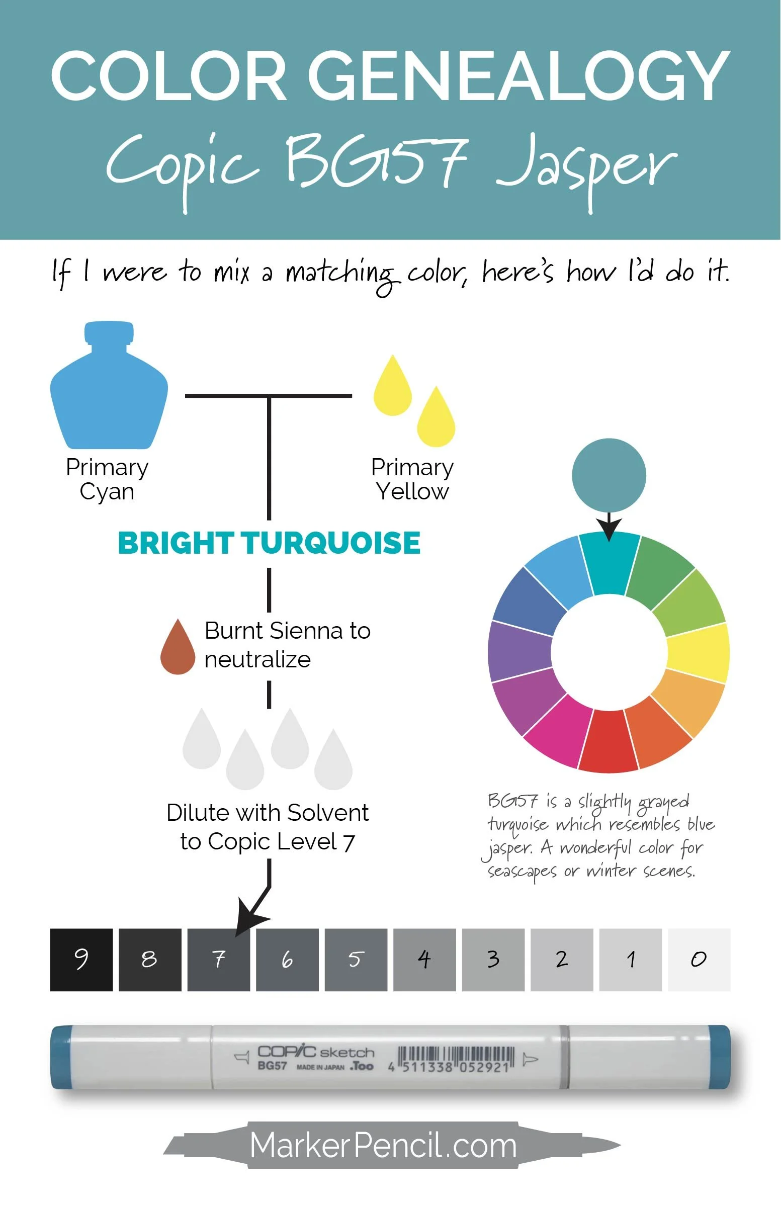
Remember when I said you may spot a different path to BG57?
Well, I argued with myself for a long time when I got to the “Bright Turquoise” stage.
My first instinct was that a dab of Neutral Tint Gray would dampen down the brightness of pure Turquoise and to be honest, I still lean strongly in this direction.
But I ended up using Burnt Sienna for two reasons:
In the real world, I always have Burnt Sienna on my palette and I’m a lazy mixer. I’m most likely to use what’s at hand rather than digging through a drawer for a tube of paint I rarely use.
As an instructor, telling you to neutralize anything with gray feels wrong. People already mistakenly call neutralized color “grayed” which then leads others to believe that the color includes actual gray. Plus, if you start neutralizing with gray, you’ll never see all the gorgeous neutral colors you’ll make along the way.
Let’s talk about mixing turquoise!
The comment section is open below. Let’s hear your thoughts on mixing colors.
Why didn’t I start with green? How would my process change if I started with blue instead of cyan? Do you gray with gray?
We learn when we talk it through!
IF YOU LIKED TODAY’S ARTICLE, SUPPORT FUTURE FREE LESSONS
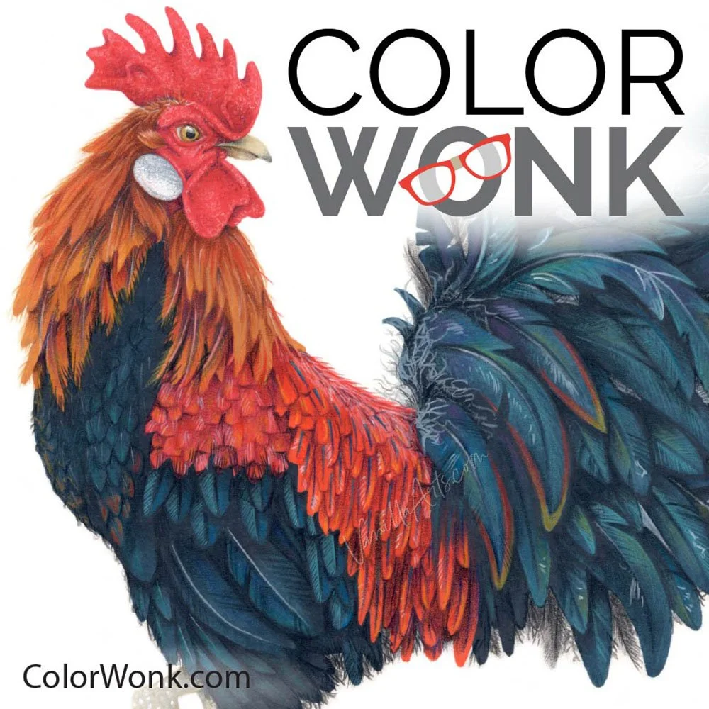
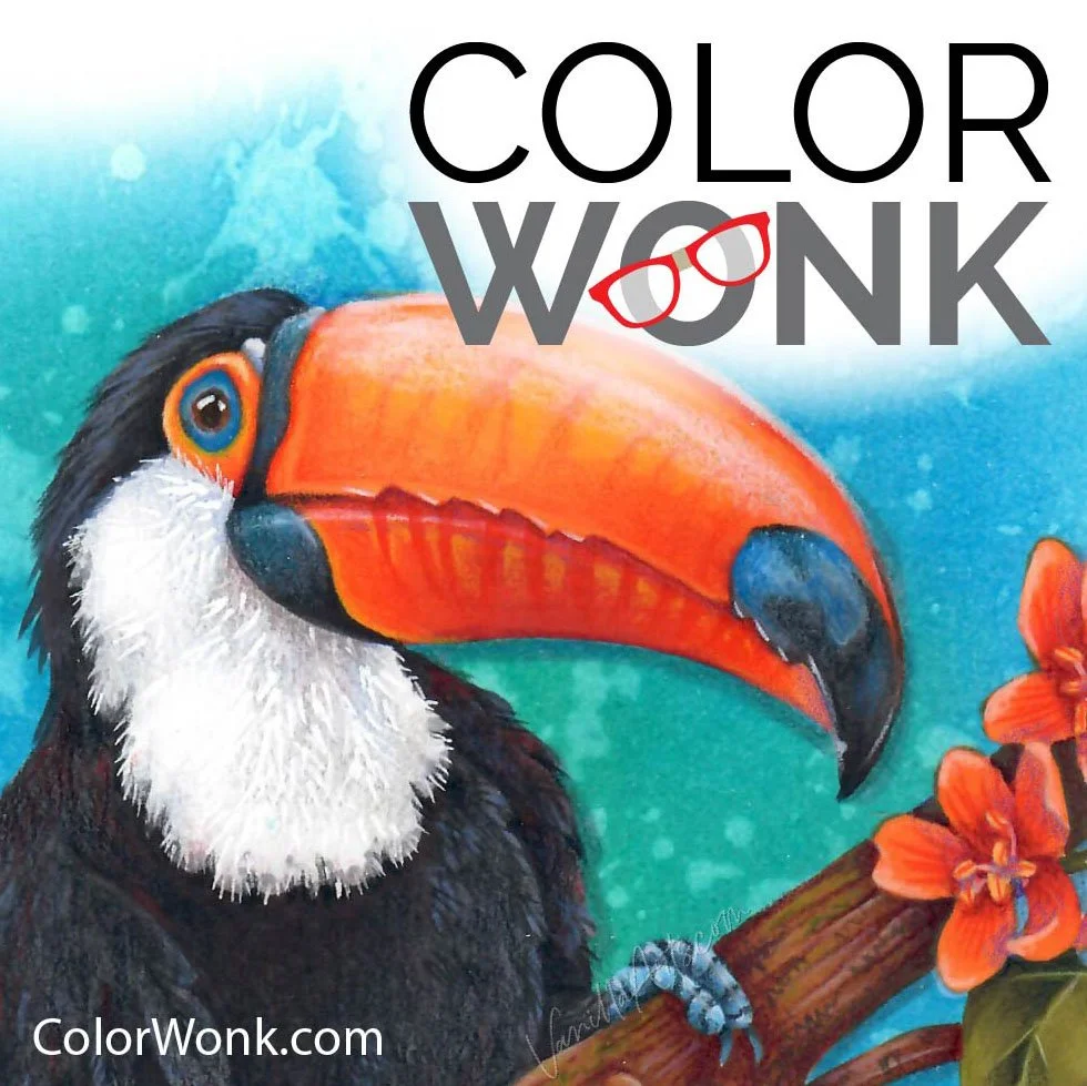
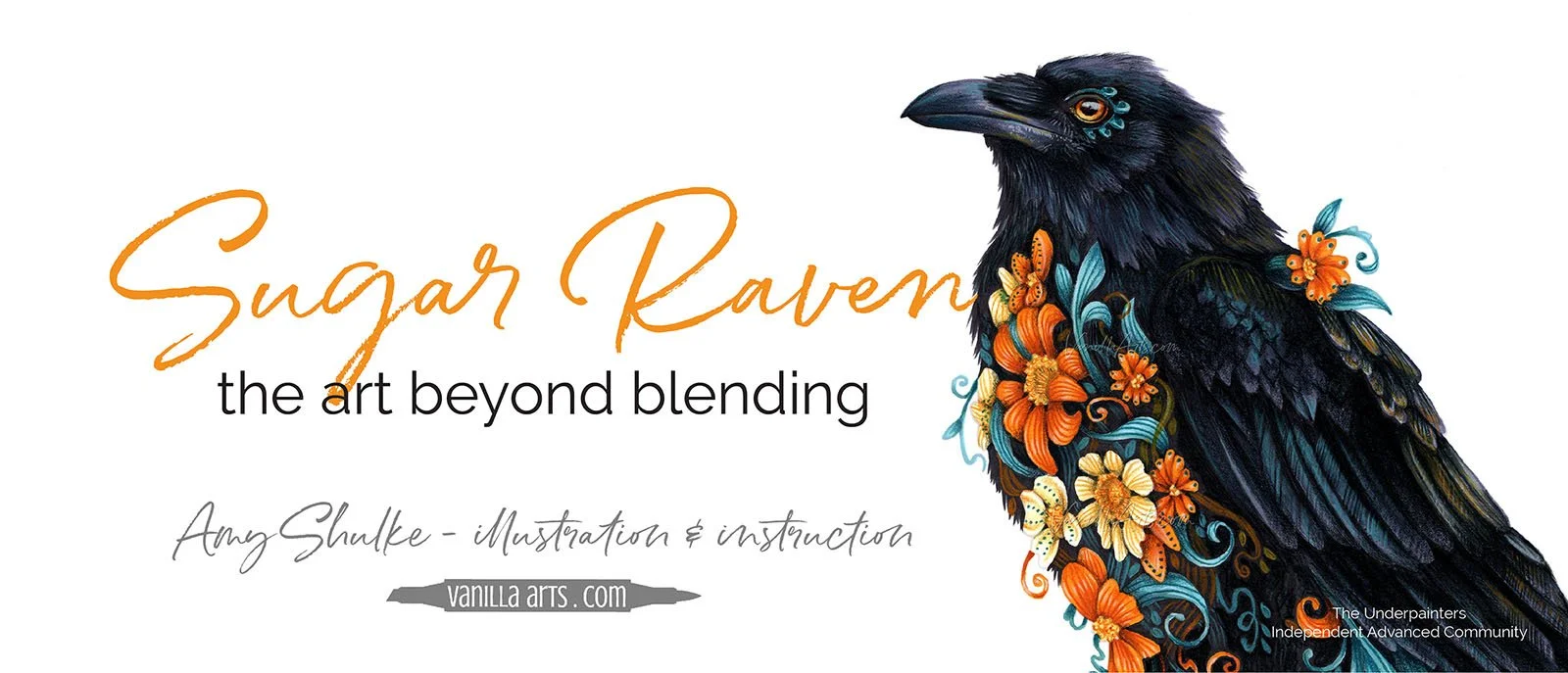
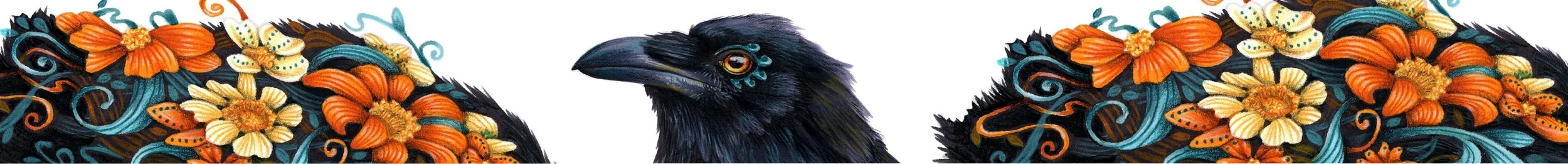
VIDEO FEATURING SUGAR RAVEN:
So you want to color a bird?
Oh, yes! I love coloring feathers. I saved a link to the perfect feather coloring tutorial!
Whoa, hold on a minute. Yes, birds have feathers but on the list of important details, feathers rank wayyyyy down at the bottom.
Sugar Raven is an introduction to coloring realistic birds, not piles of feathers or stacks of roofing shingles— but real, authentic, actual birds.
And for added fun, we’re adding a bit of Dia de los Muertos influence.
Sugar Raven is now available at Color Wonk
Along with dozens of instant access classes and study lessons.

CURRENT PASSWORD: RubberDuckie
SUPPLIES USED IN “SUGAR RAVEN”
Affiliate links help support the free content here in Vanilla Beans