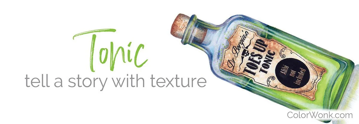
No Good Copic Deed Goes…
Thanks for taking the jump to read today’s newsletter. If you landed on this page by accident, subscribe to the Vanilla Beans Newsletter here.


I’ve been invaded by stink bugs.
I’ve killed more than 100 over the past two days and every time I look out my studio window, there are dozens more hanging around on the outside of the screen.
I tried to film a YouTube video and apparently, they really love the lights over my desk.
And they like dropping down into my hair.
There’s a Happy Halloween thought for you— In. My. Hair!!!
I’m telling ya, I need a good hard freeze, like right now.

I purchase most of my art supplies from Dick Blick. Shop using my affiliate link to support this free newsletter.
NO GOOD DEED GOES…
In 2018, I started a new series of articles which eventually became known as the Undercover Series of underpainting swatches.
These things are all over Pinterest now and people who’ve never even heard of me have my colorful little doo-hickeys saved in their big book of Copic recipes.
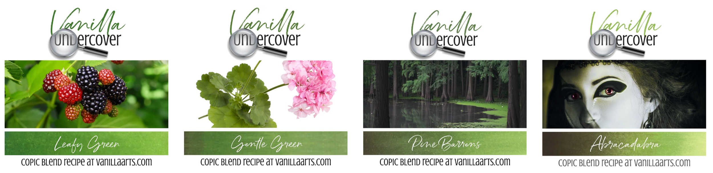
All I was trying to do was show people that you don’t have to shade green with green or pink with more pink.
That’s all. It seemed simple at the time.
But no good deed…
Later— much, much, later; like we’re talking years later— I find out that all along, folks have been kinda using them wrong.
I mean, not wrong-wrong because hey, it’s color. Do what you think looks good.
But wrong as in not-really-how-i-intended kinda wrong.

And it’s not like I blame folks for using them kinda-wrong.
I mean, I just threw these up on the internet with almost no explanation.
The problem is, I’ve been taking art classes since my dad noticed I could draw freakishly well, wayyyyyy back in the third grade. That’s not a brag, I’m just saying it’s really hard for me to remember a time when I wasn’t taking art classes. I’m not normal.
Anyway, I don’t always have a good grasp of what regular people know and don’t know.
And the way y’all were using my Underpainting series was a big smack in the noggin’ for me.
So Amy, how were people using your underpaint recipes?
Same way you use all the other marker recipes on the internet.
See, that’s why I don’t blame you. You want to color a green pumpkin stem, you hop online and find the blending recipe Amy recommends.
I was just flattered you thought of me.
And why is that kinda-wrong?
Because it never occurred to me that you might also look for an pumpkin recipe on the same page and then use that orange recipe WITH the green recipe.
Like I said, I’m not always the brightest bat in the belfrey.
Wait, we’re not supposed to combine underpaint recipes?
Uh, no.
That’s the point I’m trying to make.
So what are we supposed to do then?
Hang on, will ya? You’re getting kinda demandy here. Yeesh.
The problem with mixing underpaint recipes isn’t mixing the recipes,
It’s mixing the underpaints.
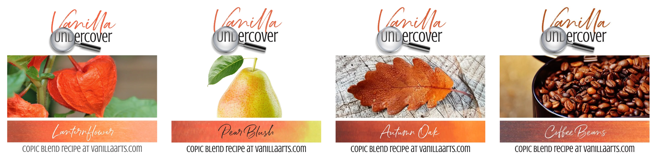
For example, let’s say you used the Calabazas recipe for the pumpkin stem. It has a blue underpaint. Then you combine it with the Lanternflower recipe for the pumpkin. It has a YG underpaint.
Even if you color your bestest-best, that combination of green recipe and orange recipe will never look photo-realistic. It can’t.
The stem is from a planet with blue environment and the squash is from a green planet.
They don’t match.
You can’t have green light shining on part of the pumpkin and blue light shining on another.
Even if you can’t put your finger on why, you know it looks odd. Or maybe you don’t realize it’s weird because Copic has had you mixing-up temperatures for years now. You might be totally blind the problem.
But out here in the audience?
We know your coloring doesn’t look real because the colors feel creepy together.
Confused? Maybe I explain it better in this video
Watch from about 11:55 to 16:00. Different holiday, better explanation.


Back to the pumpkin…
The correct method is to use the same underpaint for everything in the project.
Everything. And I do mean everything in the image— that means the stem, the pumpkin, the dirt, the grass, the moon, and the creepy blanket kid with a dented head waiting for the Great Pumpkin to appear.
You can still use Lanternflower and Calabazas together, but you’ve gotta pick ONE underpaint for them both.
Try the yellow-green from the orange recipe under the green recipe. It probably won’t work because YG is too close to the green recipe. YG won’t make enough mud.
So then try the blue underpaint from the green recipe under the orange, does it look good? Then use it.
Or you could find a totally new underpaint to use with both. Violet would work, so would a dirty blue-green.
When you underpaint an orange recipe with blue, you’re shifting the temperature of the orange blend cooler.
Because blue is cooler than orange.
When you underpaint orange with YG, you’re shifting the blend cool-ish. YG isn’t as cool as blue but it’s still cooler than the orange blend.
If you underpaint an orange blend with something like a rusty brown or golden yellow, you’re shifting the blend warmer.
And honestly, it doesn’t matter which underpaint you choose…
They just all have to match.*
One project with six different temperature shifts looks crazy— and fake.
*And this is what I was trying to warn about in the Popsicle video here.
Okay, Amy. I get that the underpaints all have to match.
But then you started talking temperatures and now I’m lost again!
That’s okay, Grasshopper. We’ll get there. I promise.
More info, next week.
Let’s talk about underpaint recipes!
The comment section is open below. Let’s hear your thoughts and questions about underpainting.
Were you using my recipes kinda-wrong? Did you sense anything wrong or do you think you’re blind to temperature shifts now?
We’ll be talking underpaint for a while here in Vanilla Beans so now’s your chance to suggest Beans topics.
Can I ask a quick question? Do you know anyone else offering this kind of weekly color education FOR FREE?
Today’s article took me four hours to write and edit. I enjoy writing but it’s not fast and it’s definitely not easy. It’s even harder to make educational writing sound breezy.
IF YOU LIKED TODAY’S ARTICLE, PLEASE SUPPORT FUTURE FREE LESSONS
Even better? Treat yourself to a digital stamp or coloring lesson. Then we both win.
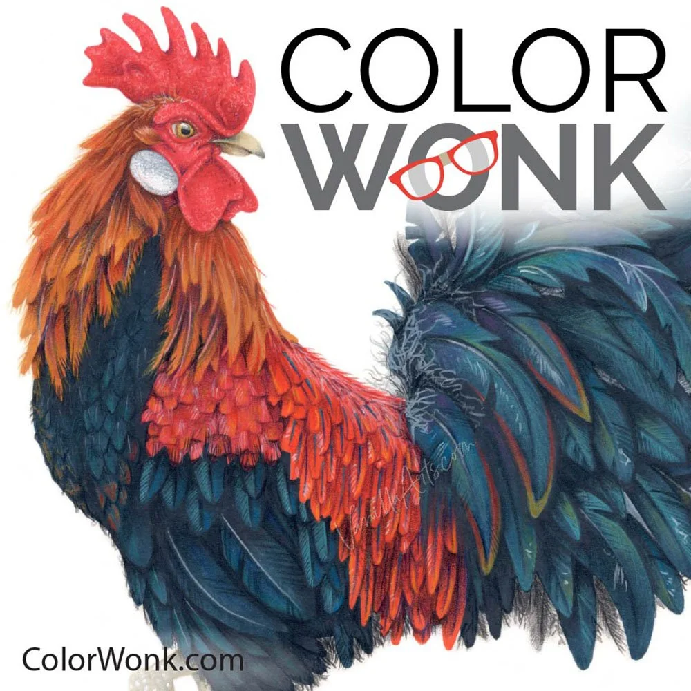
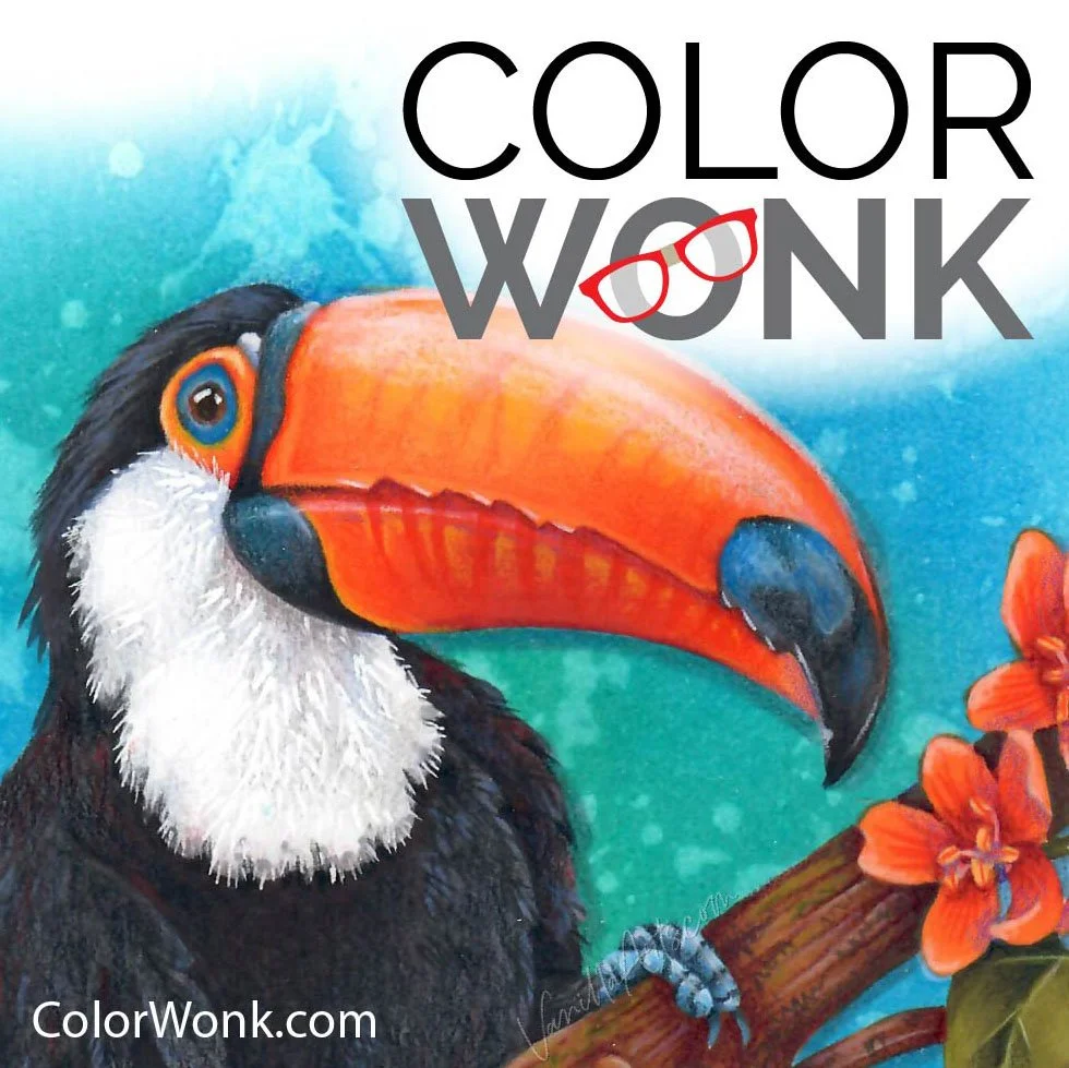
COLOR WONK
- because you could color better with a little help -

CURRENT PASSWORD: RubberDuckie
ESSENTIALS FOR MARKER TEXTURE
Affiliate links help support the free content here in Vanilla Beans