You’ve got that Copic Look!
Thanks for taking the jump to read today’s newsletter. If you landed on this page by accident, subscribe to the Vanilla Beans Newsletter here.


I finished so many tasks this week. I mean, I literally blew through my to-do list.
And yet I’m still scrambling at the last minute to get Beans written and the new membership launched.
So yes, I’m writing this at 10pm on a Friday night which I really hate doing.
Keep your eye on your email inbox this afternoon— I’m hoping to launch Color Coach soon, soon, soon!

I purchase most of my art supplies from Dick Blick. Shop using my affiliate link to support this free newsletter.
PLEASE WATCH THIS SECTION:
Today’s article dives deeper into a small section of last week’s YouTube video.
For some reason, I can’t get the link here to play at the appropriate minute mark.
Please watch from about 11:50 to 13:50 before reading the article below.
YOU’VE GOT THAT COPIC LOOK
Some of you love it. Some of you are a bit bored by it now…
But we all know exactly what it looks like.
It’s that “Copic Look”.
Kinda cute, kinda cartoonish. saccharine sweet, silky smooth. And if you do it well, your blendy-blended-blends look computer generated.
We can all spot an alcohol marker project from a mile away.
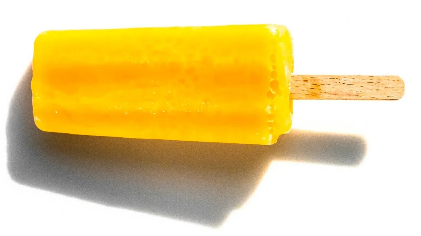
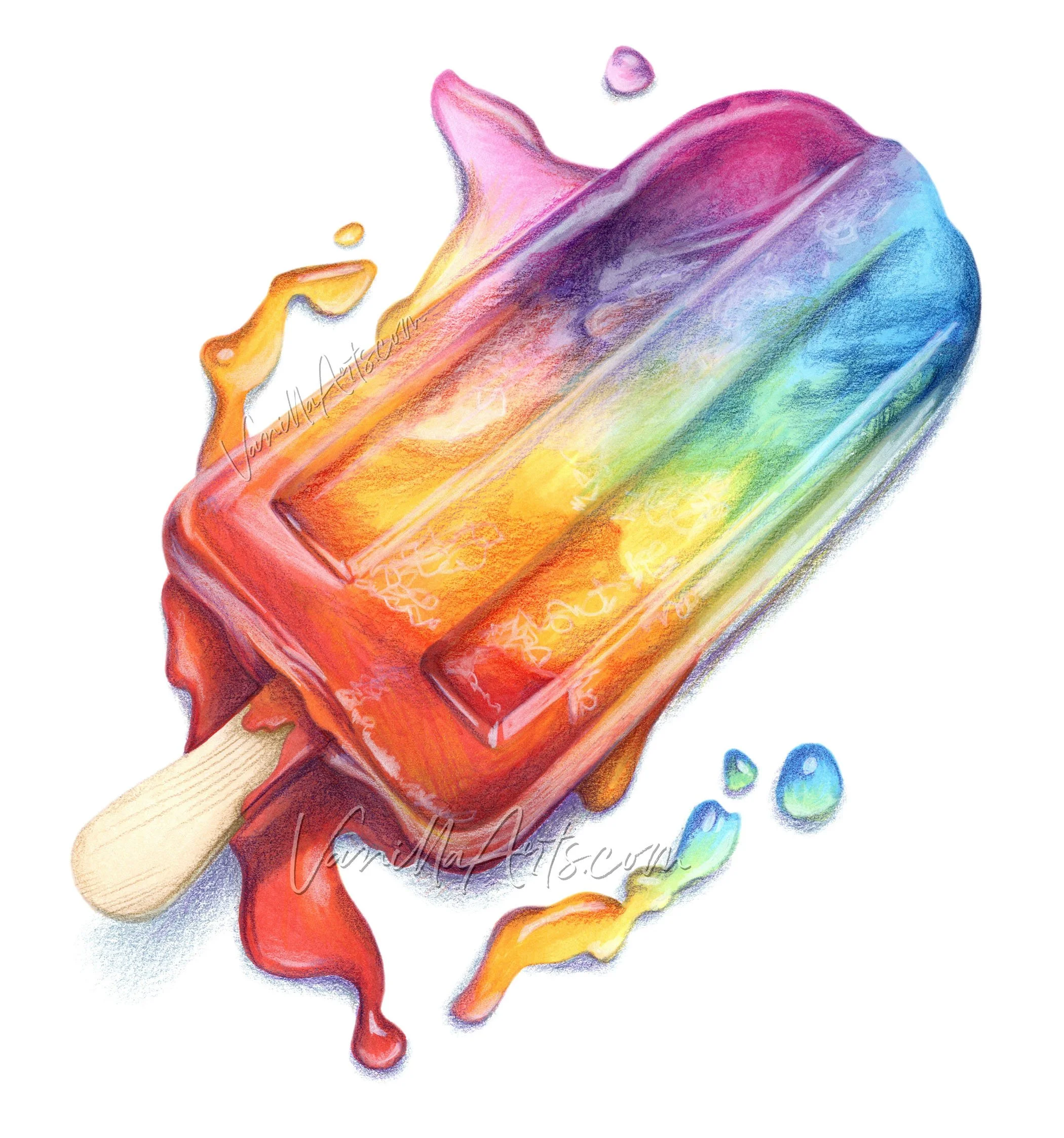
Pssttt… you know you got Blenditis bad if you just looked at my computer popsicle and wished you could blend that smooth.
What makes the Copic Look so distinct?
Most of you would say it’s the blends. I mean, that’s what you spend the most time thinking about, right? So it seems like that’s what your audience would notice too, right?
Right???
Well… uhhhh… not really.
I’m not saying nobody notices your blending but I’ll bet a hundred bucks your husband has never whispered in your ear about your sexy your blends.
We’re just not into blends the way you’re into blends.
Because it’s hard to return to the days when you weren’t steeped in blending technique, it’s very hard to see our coloring the way others see it.
If I’m being honest— yes, we kinda see your blends… but really, what we notice first is your whacko shading.
And that’s the quirk which makes Copic look like Copic.
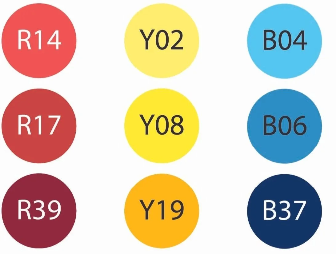
There are many Copic number groups which don’t go dark enough to count as “shade”.
And most people have gaps in their collections, usually at the darker end. This often leaves you hunting for dark markers from other number groups to shade.
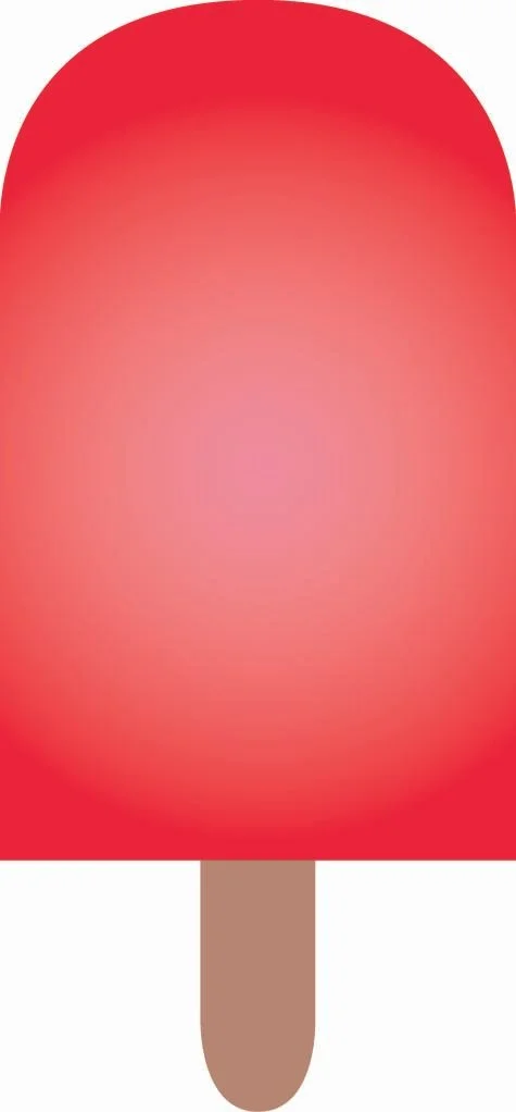
On a brightly colored beachball, these would be very standard blends.
And they’re exactly why your Copic looks like Copic.
In the section of the video above…
Wait, you didn’t watch it? Sigh, it’s 2 minutes. Go back up there and watch it, silly.
I talk about how we choose shady colors without concern for temperature. All we care is that the color is darker and/or dirtier, right?
Which gives you that cartoony Copic Look, every time you try.
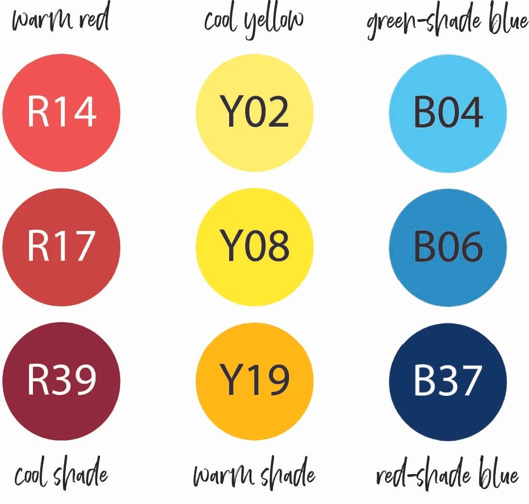
You have a warm red blend and you’re shading it with a cool red.
Fine, no problem.
But then right next to it, you shade cool yellow with a warm yellow
Eeep!
And then just to prove you’re a total Copic G.O.A.T, you shade a green-leaning blue with a red-leaning blue.
Make it stop, make it stop, Sweet Baby Ray make it stop.
These crazy temperature swings simply don’t happen— actually they CAN’T happen in real life.
It’s not that you’re shading cools with warms or warms with cools, it’s that in the same project you’re shading with a random mis-mash of both.
Out here in the normal world, shade always matches. If your walls are painted blue, everything in the room has cool shade, if the walls are peach, everything has warm shade. You won’t find a random object in either room with the opposite temperature of shade.
The temperature of shade must match throughout your entire project.
Otherwise it looks weird. Unearthly. Fake.
In the sample above, the yellow is the oddball. If you’re shading red and blue with cool red and cool blue, the yellow shade should look greenish, not orangish. Or you could stick with the yellow shade but then your red shade should look orangish and the blue shade should feel a bit teal.
Warm, warm, warm or cool, cool, cool. Not a random mix of both.
The problem is, shady temps aren’t even on your radar. When a colorist hits the jackpot and gets warm-warm-warm, everyone takes notes because certainly they must’ve found the BEST blends.
Uh no, they just accidentally matched temps and that consistency looks more real.
Defying the laws of physics and all that’s holy— that’s the Copic Look.
And if you’re one of those pencil people sitting back laughing at the Copic folks,
Hush ya face.
Y’all do this more than the Copic people. This nonsense is all over ColorTube.
Underpainting solves the temperature mismatch issue because as I showed in the video, you’re underpainting everything with the same color…
Like that BV-Twenty set I recommended last week.
Wait, you are underpainting with the same color, aren’t you?
Aren’t you?
Eh?
Meet me back here next week because apparently we need to talk.
Let’s talk about underpainting!
The comment section is open below. Let’s hear your thoughts and questions about the technique.
We’ll be talking underpaint for a while here in Vanilla Beans so now’s your chance to suggest Beans topics.
IF YOU LIKED TODAY’S ARTICLE, SUPPORT FUTURE FREE LESSONS
COMING SOON!
Does your coloring today look the same as it did last September?
Hmmm… Sounds like you’ve stagnated.
You need a Color Coach.
pssttt… there is no popsicle class…
Is that a problem?
Oh, wait. Do you need step-by-step instruction to color anything good?
That my friends, is the real problem.
Look, I know nowadays, people think they need a popsicle class to color popsicles and an elephant class to color elephants…
Uhhhh… that’s not how art works.
COLOR WONK
- because there’s more important stuff than blending -

CURRENT PASSWORD: RubberDuckie
BEST COPIC-SAFE FINELINE PENS
Affiliate links help support the free content here in Vanilla Beans


PSSTTT, MICRON PENS ARE NOT SAFE FOR COPIC!