The Dumbest Color Theory Debate
Thanks for taking the jump to read today’s newsletter. If you landed on this page by accident, subscribe to the Vanilla Beans Newsletter here.


At the end of last week’s article, I hinted about a blue controversy.
Artists actually fight about this issue, especially in college bars at 2am.
Not that I’m speaking from experience or anything.
Anyway, you’ve got to keep in mind that this is all Color Theory. It’s THEORY, not fact. Color theory is not a hard science. Not everyone agrees, especially when beer is involved.
So here you go, straight from the annals of Great Artistic Debate, here’s stupid argument #461.
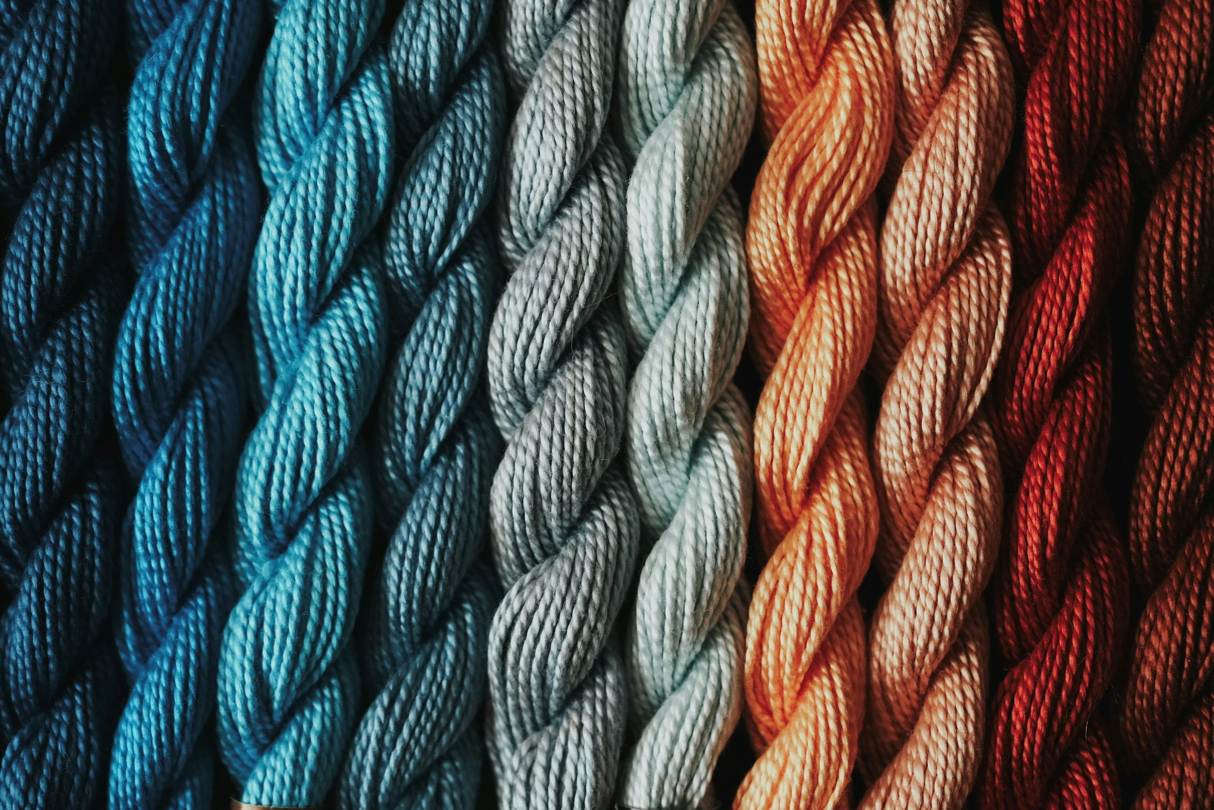
Let’s look at the temperature of blue— a hill many good men have died upon.

I purchase most of my art supplies from Dick Blick. Shop using my affiliate link to support this free newsletter.
THE DUMBEST DEBATE, EVER
You can live a long and happy life without ever knowing about the blue problem.
In fact, when I Googled before writing this, I didn’t see any coloring sites mention this controversy. Colorists are still pointing to half a wheel and calling it warm.
Blue is an artist problem, so don’t feel bad if you’ve ever heard of it.
Blue is how artists pick fights with each other.
I’m not kidding. Have you ever noticed I tip-toe around blue temperatures? I never say “this is a warm blue” or “use this cool blue”.

I’ve learned the hard way, never mention warm/cool plus the word blue in the same sentence.
And if you ever hear me say “warm blue” on YouTube, call the authorities because my account has been hacked. Warm blue is the third rail of color theory. It feeds the trolls.
What’s the problem?
<Sigh> Okay, here we go…
Here are two blue markers— which is the warm blue and which is the cool?
Think you know?
Don’t feel bad if this is breaking your brain a bit. Overall, blue is a cool color but within the blue family, you’ll see a range of temperatures with some blues being comparatively warmer and some generally cooler.
So between B16 and B79, which one is warmer and which one is cooler?
Well, according to last week and Yellow O’Clock, if you put yellow at 12 o’clock position and lay each marker in it’s corresponding spot on the wheel, B16 is a few steps closer to yellow. Therefore B16 is the warmer of the two blues.
But here’s the weird thing:
Some artists will swear up and down that B79, a color which is almost violet and sitting way down at the bottom of the wheel… They will insist B79 is warmer.
Why?

Remember the Newtonian RYB color wheel with red, yellow, and blue as primary colors?
I prefer the CMY wheel but there are a ton of artists who happily use the RYB wheel all the time.
One of the odd quirks about RYB Wheelers is they use red as the source of all warmth.
They don’t do Yellow O’Clock, they do Red O’Clock.
An RYB’er would basically rewrite last week’s warm/cool article, substituting red for yellow. Red is how they measure temperature. Red is their warmest warm color.
Now I disagree with Red O’Clock because constitutionally, I simply can’t see red as a primary color. I mix red all the time with magenta and yellow, so it can’t be a primary. Primaries are primaries because they’re unmixable. This is why I’m a die hard CMY wheeler.

Also, I didn’t mention it before but if a color is the source of all warmth, then the opposite of that color is the ultimate coolness, right?
In CMY, this makes violet is the coolest color which makes total sense.
Meanwhile, the opposite of Red O’Clock on an RYB wheel is Green O’Clock and that’s just stupid. Green is definitely not cooler than blue or violet.
This is another reason why I’m Team CMY, all the live-long day. Use whatever wheel you want, just don’t come crying to me when RYB doesn’t work.

Okay so back to the blue thingie…
Here’s the problem with blue temps but it’s also true about cyan and some blue greens—
If I flip my color wheel to Red O’Clock, see how B79 is now the higher marker? B79 becomes the warmer of the two blues because it’s closest to red.
One more time, so you really understand what’s going on here:
If yellow is the source of warmth, B16 is warmer than B79
If red is the source of warmth, B79 is warmer than B16
Congratulations. You’re now qualified to argue with fine art undergrads.
As I said, this is mostly a paint problem but every once in a while it’ll bop YOU upside the head when least expect it.
Let’s say you’re shopping in an art store. You’re going to see some weirdness in the names for blue art supplies.
Many blue paints, even pastels, and some colored pencils are marked “Red Shade Blue” which sounds kinda funny. I remember laughing when I saw it the first time.
It’s cute but not complicated. Red Shade Blue means a blue which is closer to red on the color wheel. In art-speak, we say “this blue leans towards red.”
And conversely, “Green Shade” blues lean towards green.
Now here’s the real conundrum. In that art store, if you ask two clerks for “cool Phthalo Blue”, odds are, they will each hand you a totally different color.
And no, it’s not because they’re minimum wage flunkies who know nothing about art. Two very experienced clerks with vast amounts of art experience will also hand you different colors.
Both of these Phthalo Blues can be considered cool, depending upon whether you’re a CMY’er or an RYB’er.

If you take a landscape class, many instructors will have you paint the sky with red shade blue at the top of the canvas and green shade blue near the horizon.
And here’s why I think landscape RYBers are total flat-earthers.
They’ll tell you, to your face with a great big smile of authority: “Green shade blue is cool because it recedes into the distance while red shade blue is warm and feels closer.”
It hurts me to even type that sentence because I’m looking at the sky and water here and darned if I can cross my eyes enough to make the water look farther away than the sky.

I mean, I get putting green shade blue down near the horizon but that’s an Earth atmospheric thing. You try the green shade for distance B.S. on anything but a sky and that cow ain’t gonna fly.
How does a color that’s practically violet feel warmer to someone than the blue with a heaping tablespoon of yellow in it? Crazy pills. RYBers are taking crazy pills.
I’m not saying this blue headache is what drove me into CMY-world but it’s certainly a big reason why I stay there.
Seriously, the blue on the left is at least a mile away.
(Amy walks away mumbling about distant blue…)
Confused?
I don’t blame you. The comment section is open below. Ask your questions or tell us your Red Shade/Green Shade thoughts.
We’ll be talking about color theory for a while here in Vanilla Beans so now’s your chance to suggest Beans topics.
Do you know anyone else offering this kind of weekly color education FOR FREE?
IF YOU LIKED TODAY’S ARTICLE, PLEASE SUPPORT FUTURE FREE LESSONS
Even better? Treat yourself to a digital stamp or coloring lesson. Then we both win.
BLUE AT YOUTUBE
COLOR WONK
- useful art lessons rather than coloring demos -
Ghost Pumpkin is exclusive to the Color Wonk library of classes and lessons.
Join today for instant access to dozens of Amy’s best projects with new releases weekly.


CURRENT PASSWORD: RubberDuckie
COLOR CUBES: NEW SETS!
Sarah Renae Clark has two new cubes, #3 and #4 (Black) and updated the previous sets with new tabs and easier access.
I’m an affiliate because I think the cubes are excellent learning tools. Please use my link to purchase, another great way to support the FREE educational content I create.