Vanilla Beans: The Geneaology of R35
Thanks for taking the jump to read today’s newsletter. If you landed on this page by accident, subscribe to the Vanilla Beans Newsletter here.
This newsletter was pre-written.
I’m on vacation and desperately trying to stay offline until September 2nd. Even when I’m back, I’ll be nose deep in another big project.
In the meantime, enjoy this new color theory series.
THE GENEAOLOGY OF R35
You’re a colorist. You’re extremely excited about the use of color but you’re a little lacking in the knowledge of how color works.
Color is your passion and your Achilles’ Heel.
Why does it take forever to pick your own colors?
Why can’t you tell if something looks good as you’re coloring it?
Why do you hate your color selections?
Color is always hard when your taste is greater than your knowledge.
Painters have a definite learning advantage over colorists:
If you want a color, you buy it.
But if a painter wants that same color, they must mix it on their own.
Color theory is kinda built into learning how to paint, meanwhile color theory is completely absent from coloring.
If you want to get better at using color, you need to know how to mix color.
Now hold your horses a sec… I’m not telling you to eBay any marker that’s not a primary color. I’m definitely not offering money saving tips to make Copic refills at home.
This is a MENTAL exercise.
The goal is to eventually look at a marker color and say “huh, that’s a little bit of This mixed with some of That”.
If you can see the This and That, the Thises and Thatses become your guideposts for blends and color palettes and generally knowing which color goes where.
We’re looking at color like a painter. Mental mixes.
Today, let’s look at how I’d mix my own version of Copic’s R35 Coral.
Now some of you just skimmed through that infographic faster than a cocaine monkey.
There’s a universe of information there.
If you want it.
Let’s talk about mixing warm coral red!
The comment section is open below. Let’s hear your thoughts on mixing colors.
Why did I start with magenta? What’s the point of the blue? Maybe you have a better way to make R35?
We learn when we talk it through!
IF YOU LIKED TODAY’S ARTICLE, SUPPORT FUTURE FREE LESSONS
MARKER MAKEOVER: WHITE DAISY
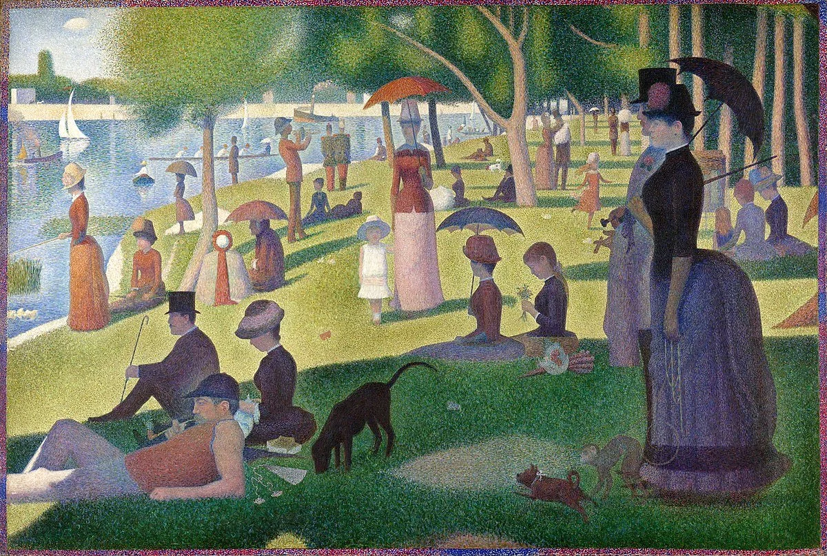
Pointillism is nothing new…
OMG, yes! I love to do the pointillism technique! It looks so cute on clouds and flowers and puppies…
Hang on a minute, pointillism can be fun but the coloring community misses the fact that pointillism can create amazing realism, especially in food illustration.
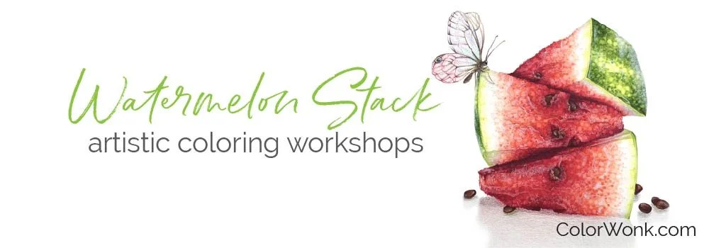
Watermelon Stack teaches you how to make pointillism look real.
Watermelon Stack is now available at Color Wonk
Along with dozens of instant access classes and study lessons.
Learn to color realistic food texture — not just for food but for everything!
CURRENT PASSWORD: RubberDuckie
SUPPLIES USED IN “WATERMELON STACK”
Affiliate links help support the free content here in Vanilla Beans


