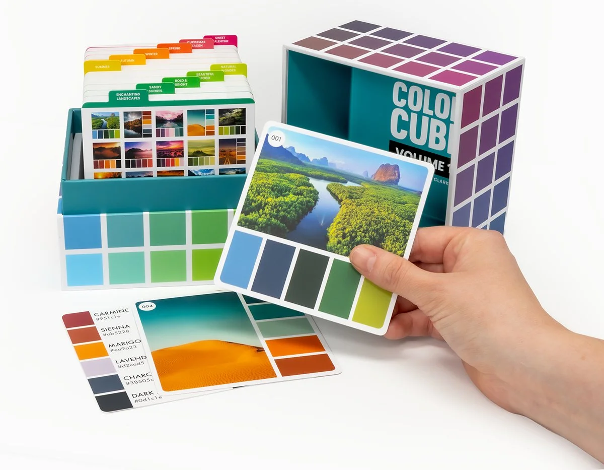
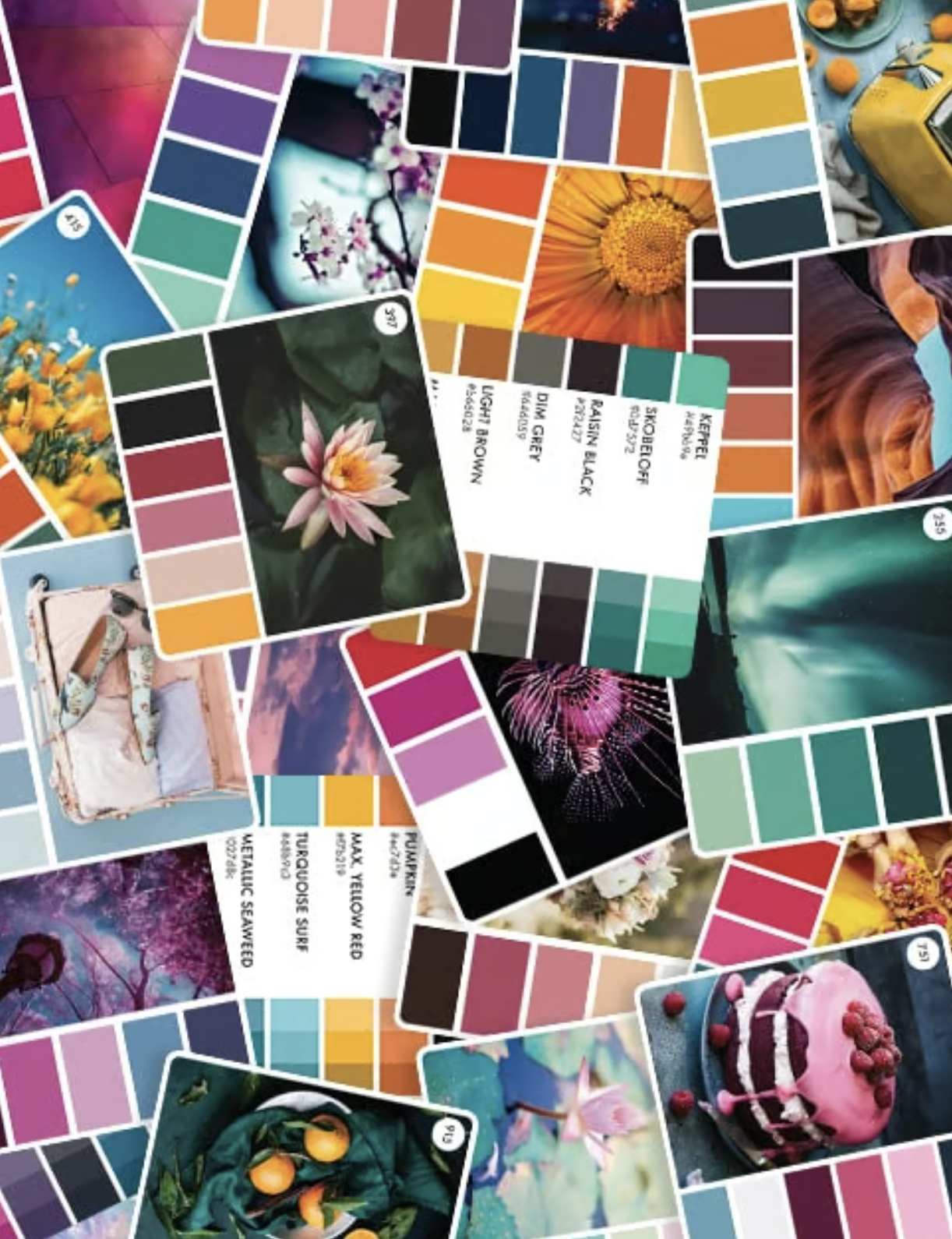
Color Cubes 2: Your Sixth Sense
Vanilla Beans Newsletter. Saturday, February 28, 2026
Thanks for taking the jump to read today’s newsletter. If you landed on this page by accident, subscribe to the Vanilla Beans Newsletter here.


We’re back to Color Cubes this week.
If you missed the beginning of the Cube series, scroll to the bottom of this page to find my previous articles. Begin with Sith, then read Detour Part 1.
Your Color Cube purchase using my affiliate link above helps to support my work here at Vanilla Beans. Every issue of Beans takes about 8 hours to write and Beans is always FREE. Without your support, there’s simply no way I can continue weekly free lessons.
I purchase most of my art supplies from Dick Blick. Shop using my affiliate link to support this free newsletter.

NOTE: I highly recommend Sarah Renae Clark’s Color Cubes. They’re one of the best time saving tools for casual colorists and an excellent way to practice color theory.
But no product is perfect.
We can like something a heck’uva lot without loving every aspect, right?
In the next few weeks, I will troubleshoot a few flaws in the Cube system. I’m not kvetching for no reason. As awesome as they are, Color Cubes have a few issues. These problems are why your Cubes are lookin’ pretty on a shelf, instead of being used daily.
The goal is to use our Color Cubes so often that we don’t need ‘em anymore!
Today’s article is a long one but I think my workaround will make Cubes easier to manage.
But I’m warning ya…
You’re gonna hate me for this.
YOUR SIXTH SENSE
Sarah knows there’s a problem.
And I know she knows because she tried to fix it.
What’s wrong?
The problem is you, me, and the entire customer base for Color Cubes. We’re the problem.
See, Sarah was super-focused colors and palettes but she wasn’t thinking about how we think.
The problem is, we don’t think normal.
You are color sensitive.
Not sensitive as in “you hurt my feelings”. Nooo, I mean the woo-woo-twilight-zone-freaky-deaky kind of sensitive.
I see colors…
And hoo-boy, do you see colors!
You wouldn’t be interested in color theory or Color Cubes if Ultramarine Blue next to Chartreuse didn’t taste slightly metallic.
I taste colors…
We feel color with a sixth sense, in ways the normies can’t understand.
We’re weird about color, okay?
I smell colors…
So to ask a Color Psychic to go digging through a big ol’ box of rainbow cards, each of them singing a seductive siren’s song?
And we’re supposed to pick just one card?
It’s cruel!
You open that cube and brain cells gush out your ears, onto the floor.
<Plop>
Color Cubes are accidentally difficult to use because they flood our brains with non-stop color. Ten cards into the box and your circuits are fried.
I like this card and this card and this card…
So I’m not kidding when I say Color Cubes make us stupid. They literally suck the IQ points out of your head.
I see colors… they’re everywhere…
So Sarah added dividers. Problem solved?
Uhhh, no. I’ll give her partial credit for creating dividers that… well… they divide?
We’ll delve deeper next week but here’s the main point for today:
The problem was never a lack of dividers.
What we actually need are blinders.
You think you’re terrible at choosing colors so you purchase color wheels, Color Cubes, or other tools to pick colors for you.
But what’s a color wheel? A rainbow of bright colors, all in your face at once.
And what’s a Color Cube? 50 bajillion color combinations triggering a neural meltdown.
You’re a victim of color abundance— paralyzed by too many choices, too many options, too many colorful opportunities to wander off and la-la-la…
See? We get stupid.
The solution isn’t to find another tool with the same atomic explosion of color.
Instead, we need to limit the number of colors you’re exposed to— because remember, you’re Color Psychic.
If we cut your color options in half, color decisions are easier and look better.
Pssttt… for those of you with every marker and colored pencil ever made? That’s another way you’re overwhelming your psychic sensors.
Right now, Color Cubes offer too many cards at once. And if you’re anything like me, you’ll sit there for hours, dreaming up projects for every card rather than finding one card to use on the project in front of you.
We color one project at a time. You don’t need the world, just a couple options.
The first step to fix your Color Cubes is to reduce the number cards we flip though to find a palette.
But card reduction isn’t enough, we also need to limit your focus to just the theme of your project.
If it’s a birthday card for a NASCAR fan, there’s no need to wade through 92 baby pink palettes
Your dinosaur project will not involve winter blues
You’ll never use neons for a calming zen mandala
Why confuse yourself?
I’ve spent years organizing my Cubes to reduce my card exposure.
Now here’s the part you’re gonna hate:
We’re going to organize your Cubes.
I know, I know… half of you are humming the Chariots of Fire theme song and doing slo-mo herkies because there’s nothing in the world you love better than organizing art supplies.
Someone says “let’s put our colors in rainbow order” and you’re ready to make a weekend wine & wellness retreat out of it. You live for this stuff.
Okay, let’s do it then.
Step One: Open all four boxes and dump your cards into a big pile on the floor.
See, I knew you were gonna hate it.
Yes, we’re mixing up the sets.
…
…
(I’m waiting for you to stop gagging…)
Feeling better?
Look, I understand mixing sets violates your moral codes. The idea of possibly putting a series 1 card into a series 3 box goes against everything you stand for…
That’s not organization, that’s chaos on crack!
Friends, we need to organize ALL your cards, not just one box.
And to be fair, this hits original Cubers hard. The new sets are numerically unique but the old ones are iffy. Once they’re mixed, it’ll be hard to un-mix ‘em.
But that’s okay.
You’re not using the cards now, so what do you have to lose?
Okay, so we’re mixing sets. Take a pill if you need to.
Step One: Dump the cards in a big pile
Step Two: Print my new Palette Dividers featuring color-theory categories
Step Three: File cards into useful groups for easy searching
Wait, what’s wrong with Sarah’s new dividers?
Well, like I said, we’ll talk more about this next week but the short answer is, she’s telling you to file color palettes based on the photograph, not the color.
Why? Why? Why-o-why???
“Under the Sea” is not a color, folks.
Yes, I’m selling the dividers instead of giving them away— but I’ve made ‘em dirt cheap. I spent at least a year figuring this out and about 15 hours designing these things. Your purchase supports more free education here in Vanilla Beans.
Okay, you’ve got your big pile of cards and my dividers.
Let’s talk about how to divide them.
And this isn’t new to my regulars. If you’ve seen my Cubes in livestreams and videos, then you’ve watched this organizational system slowly evolve. I didn’t dream this up yesterday. I’ve learned through trial, error, and lots of post-it notes how to prevent my brain from drowning in color cards.
Stress free. Zero distractions. Inspiration without crippling color confusion.
Okey-dokey. We need to set some ground rules before we organize.
There is no best category for a card. Most palettes fit multiple categories.
You will change your mind a million times.
Move a card if you don’t like where it’s at. No big deal.
I know you want to know exactly where each card truly belongs… but our sixth sense is always evolving and changing. You can file a card today and feel great about where you put it. A month later, you’ll wonder “who’s messing with my cards?”
THIS IS NORMAL. Just move the card. It ain’t worth fussin’ over.
There will be cards where you’re just guessing. “Here or here… or maybe there?”
THIS IS NORMAL. Move the card. It ain’t worth fussin’ over.
And after you’ve learned a bunch of color theory, you may will change your mind about what the divider categories mean.
THIS IS NORMAL. Just move the cards again. It ain’t worth fussin’ over.
The moral of the story: this is all iffy with no right answers.
We’re making color blinders, not filing taxes.
Okay, so next we’re going to paw through the big pile, making smaller piles until every card has a home
(acknowledging that “home” is always temporary and flexible).
Lay each divider on the floor and start dealing cards like you’re Vinny on the Vegas strip. Send each card to a pile based on gut instinct, snap judgement, and quick decisions.
Remember, you’ll be moving cards to better sections for the rest of your life, so there’s no point phoning a friend over where it goes today.
And by the way: WE DON’T CARE ABOUT THE PHOTOGRAPHS. LOOK AT THE COLORS.
Now let’s explain the categories:
The first group are throw-aways: GRADIENTS
Confession time: My GRADIENT cards have been in a zip lock bag in my bottom desk drawer for the last year. The only reason they’re out now is to test my tabs.
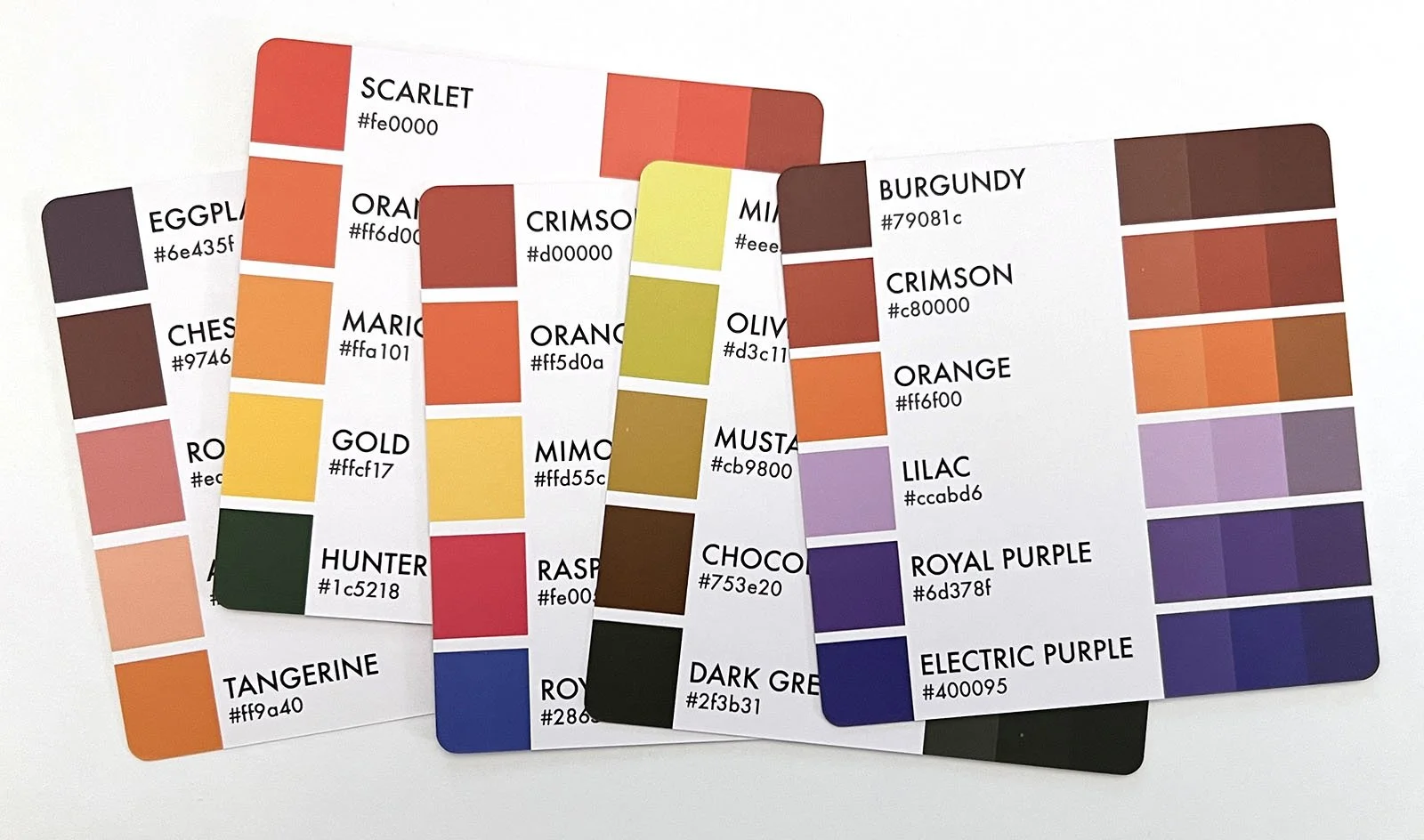
I have two Cubes and Sarah wasted 100 cards on gradients. This burns my biscuits.
Gradients are not color palettes!
These cards are easy to spot because they’re multiple values of the same darned color. If they look familiar, it’s because Copic number families are gradients. Do you really need a card to remind you to color something blue with B99 - B97 - B95?
I didn’t think so.
My dumb GRADIENTS are going back in the drawer but I made a tab if you want it.
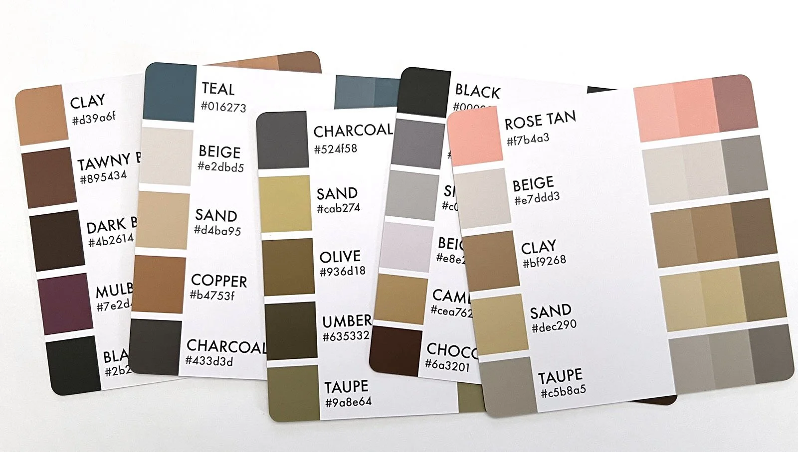
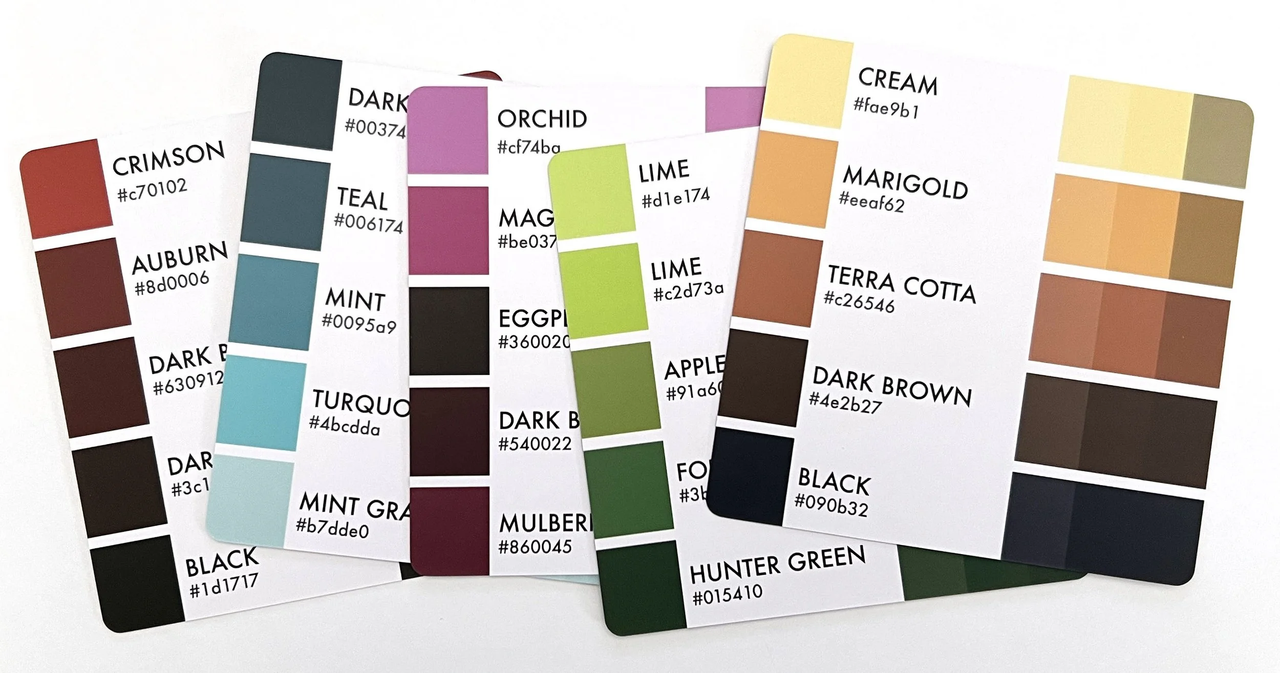
The next group are NEUTRALS
Sarah really likes brown.
Me? Not so much. So for years, I’ve been shoving brown and brownish palettes in the back of the box. Most of them are brown with a pop of something not-brown but the thing they all have in common is that I don’t use them.
Maybe you will.
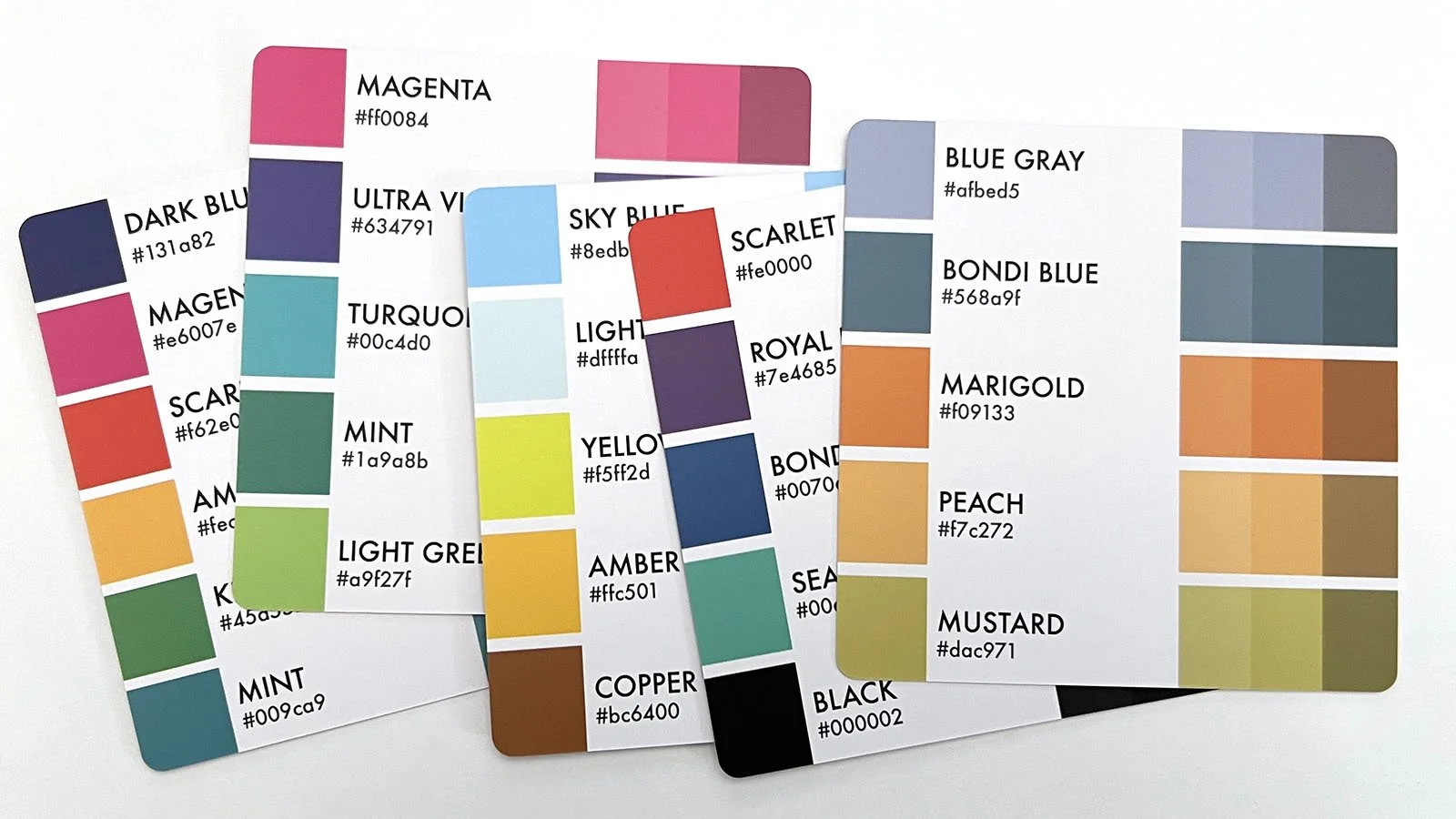
BTW, I tried to make a GRAY category but there aren’t enough to justify it. I throw anything warm gray in the NEUTRALS group and anything cool gray goes with the COOL tab.
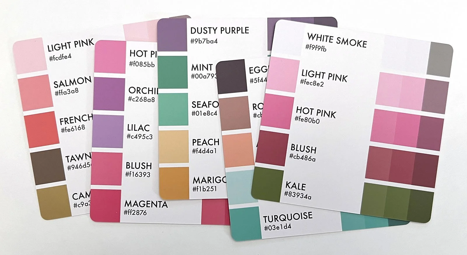
Next are the PASTELS
Now technically, pastels are pale tinted versions of a color, loaded with lots of white.
But Sarah doesn’t offer many true pastel palettes and actually, you won’t find many pastels anywhere in the box. I suspect this has something to do with the printing process. Notice the “White Smoke” swatch on the top card at right is almost invisible. I’m guessing she eliminated pastels during the prototype stage. Clearly the factory couldn’t print light colors accurately.
Anyway, many color cards give off Easter bunny vibes, even if they’re not pale. You’ll notice these girlish cards immediately and PASTELS is where they go.
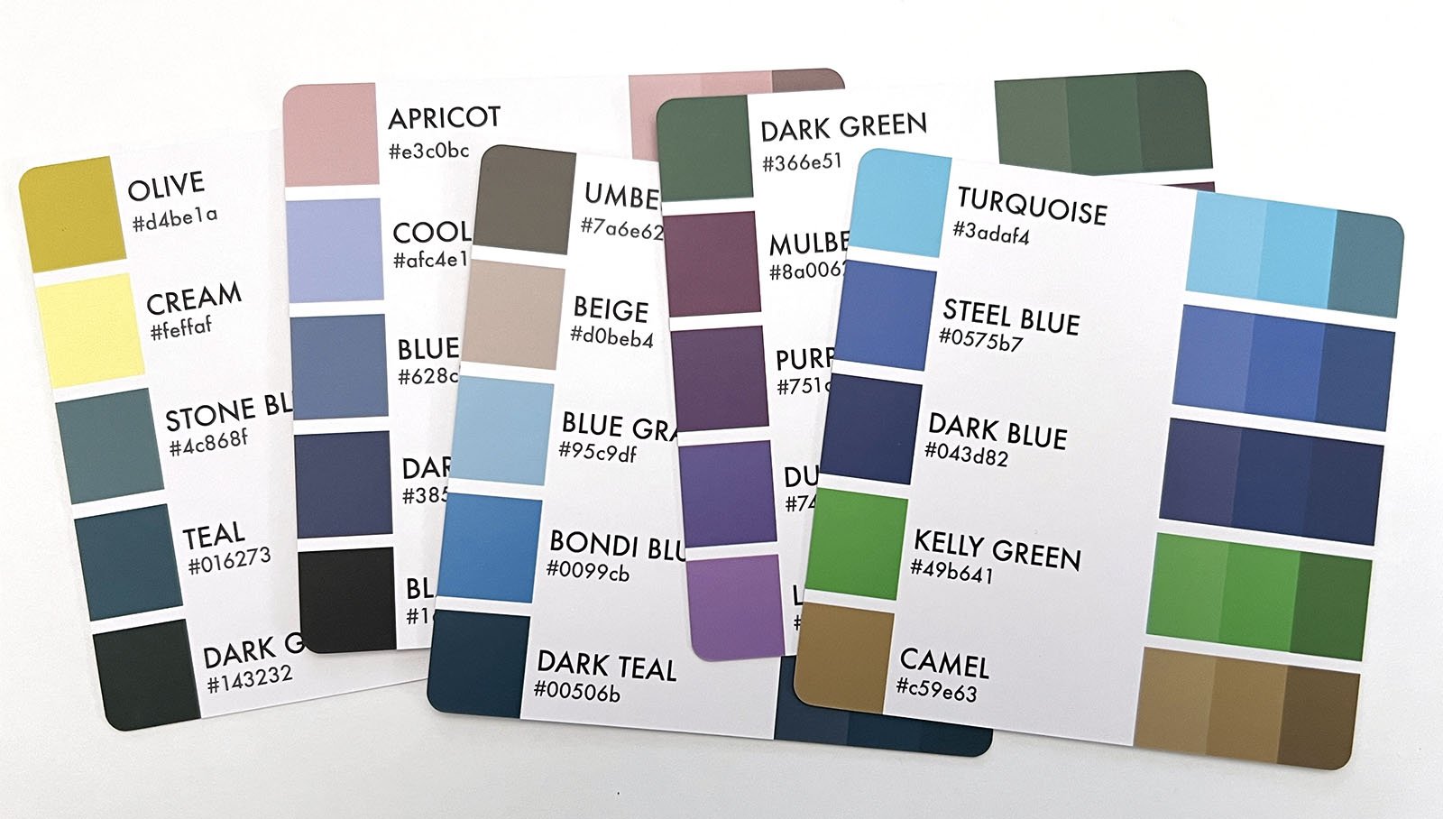
Next are the COOL palettes
This is the smallest category in Cubes 1 & 2. I hope they fixed the lack of cool palettes with sets 3 & 4 because artists use more cool colors than warms.
And by the way, COOL in Sarahworld basically means blue.
If you accidentally find purple, violet, aqua, teal, or viridian green palettes you can also file them in COOL… but honestly, she didn’t make very many.
Now don’t overthink this. COOL is a feeling or a gut instinct.
Some of the cards shown above have a few warm colors in the palette but the overall group impression is wintry, watery, and COOL.
Now for the WARM palettes.
This is the largest category and if you’re anything like me, you’ll be moving cards back and forth between WARM and NEUTRAL every time you flip through this section.
I mentioned Sarah likes brown? Well, she really-really likes orange. It’s weird (and wasteful) to use orange in so many palettes. She needed an editor to point this out.
WARM should include palettes with strong vibes of red, scarlet, orange, gold, yellow, and yellow-greens.
Like the COOL category, not every card needs all warm colors to feel WARM.
Notice the palette on the far right— it’s 3 warm orange-browns and 3 cool violets. But if you move this card to the COOL section, it’s noticeably out of place. Warm colors yell while cool colors whisper. This card is loud; so even though it’s technically half and half, it stays in my WARM group.
The last category is one of desperation, the PARTY palettes.
As you’re sorting, there will be cards which don’t fit anywhere. For years, I’ve been shifting these cards around, trying to find their home. Is it warm? Is it cool? Who knows?
But if you look closer, you’ll see we’re usually dealing with random colors which have no relationship with each other. They look good together and the general feeling is happy and energetic, but they’re all over the color map. This makes them extremely hard to categorize.
That’s a PARTY palette. What’s weird is you’ll see party cards in the Color Cube ads and when a YouTuber or TikTokker picks a random card for the challenge game, they go out of their way to pick a PARTY card.
PARTY feels fun.
From an education standpoint, I’m not a fan. PARTY palettes make good coloring look cartoonish because random colors are never balanced.
Use PARTY cards with caution.
BTW, the card on the far right— that was in my PARTY section and I included it in the photo because it didn’t look like unicorn barf. Now that I see it in context, that card belongs in the WARM section.
See? I told you. Moving cards and changing your mind is normal and eternal.
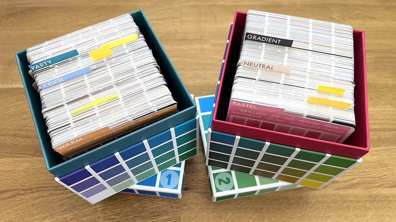
Once your cards are sorted, it’s time to rebox them.
I had to fiddle around to get the groups balanced between the two boxes.
Now when I need a palette, it’s easier to find the card I need without getting distracted by the 499 cards I don’t need.
Think about the theme or setting of the project. Realistic penguins need a COOL palette. Autumn scenes need a WARM or NEUTRAL palette. Look through PARTY for beach blanket bingo.
Only pull cards from the section you need. I deal them like playing cards into yes and no piles. Put the no’s back, then deal ‘em again until you’re down to a few cards.
Make decisions fast. You have good color instincts but your instincts get weaker the longer you debate yourself. You know at a glance when you don’t like something, that’s your sixth sense at work. Trust your gut!
Now here’s the important part:
Did you notice that I never worry whether I own a matching marker or pencil for the colors on the cards?
My art supplies don’t even factor into my decision. I may have some matches but I may have none and I really don’t care.
I’ll explain why next week.
IF YOU LIKED TODAY’S ARTICLE, SUPPORT FUTURE FREE LESSONS
READING IS NOT DOING…
Color theory is one of those things you don’t fully get until you actually do it.
That’s what Color Coach is here for — deep color experience.
In February, we’ve explored the many temperatures and tones of red, helping you ditch the kindergarten reds. No more pink highlights. No more orange skin tones. Mature and artistic reds are easier than you think.

Let’s practice coloring a leaf—
OMG, Amy! I’ve got the best stamp here covered in lots of different leaves…
Actually, no. That’s not practice, that’s repetition. There’s a difference.
Monstera reveals the futility of repeating the same leaf technique over and over. We’re deep-diving on a single leaf to a degree you didn’t think possible.
In the process, I’m showing you how to read photo references and think deeper about how you color.
This is the kind of practice you’ve been missing.
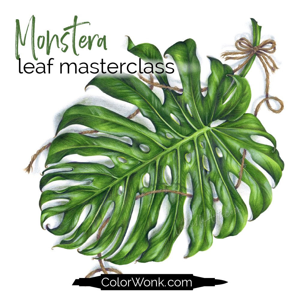
Monstera is only available through Color Wonk
Dozens of classic lessons are waiting for you. Instant access including study exercises.
Real art lessons, not novelty techniques

CURRENT PASSWORD: RubberDuckie
RECOMMENDED COLOR PALETTE PRODUCTS?
Affiliate links help support the free content here in Vanilla Beans
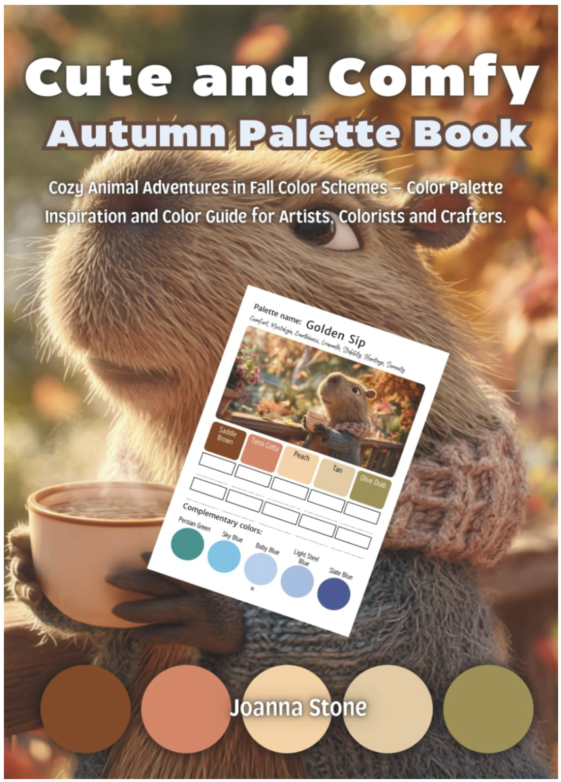
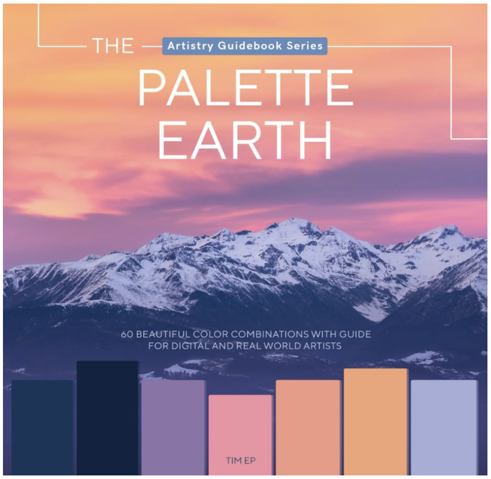
I don’t own either book but I’ve been looking at the Joanna Stone series for a while now, just never pulled the trigger. I just spotted the Palette Earth book today, looking for a Joanna Stone link. Both books give us a photo plus a color palette which is important. They also give every palette adequate breathing room. Maybe too much room? My hesitation with Joanna’s books is they look thin and you’ll need a bunch of ‘em to match what you get in just one Color Cube.