Cube 3: Needles and Haystacks
Vanilla Beans Newsletter. Saturday, March 7, 2026
Thanks for taking the jump to read today’s newsletter. If you landed on this page by accident, subscribe to the Vanilla Beans Newsletter here.


No product is perfect.
Sarah Renae Clark’s Color Cubes are a great way to learn practical color theory. But if I’m being totally honest, the Cubes have some flaws which keep us from using them effectively.
Don’t worry, we can fix ‘em!
Last week, I introduced a set of replacement dividers to organize your palette cards by color.
By the way, I finished the instruction page earlier this week. If you bought my dividers before Wednesday, be sure to click the QR code in the PDF again. Don’t miss the complete version.
This week, we’re solving the next problem—
Let’s cover why Sarah’s 2025 dividers are more hinderance than help.

Remember to use the link above when shopping at Blick. Vanilla Beans runs on affiliate earnings.
Purchase Color Cubes with the affiliate link above to support my work here at Vanilla Beans. Every issue of Beans takes about 8 hours to write and Beans is always FREE. Without your support, there’s simply no way I can keep writing weekly free lessons.
NEEDLES AND HAYSTACKS
By the by, here’s a tip I forgot last week:
I store my cards backwards and sideways.
When I leaf through a box, I want to see color palettes, not the top inch of a random photograph.
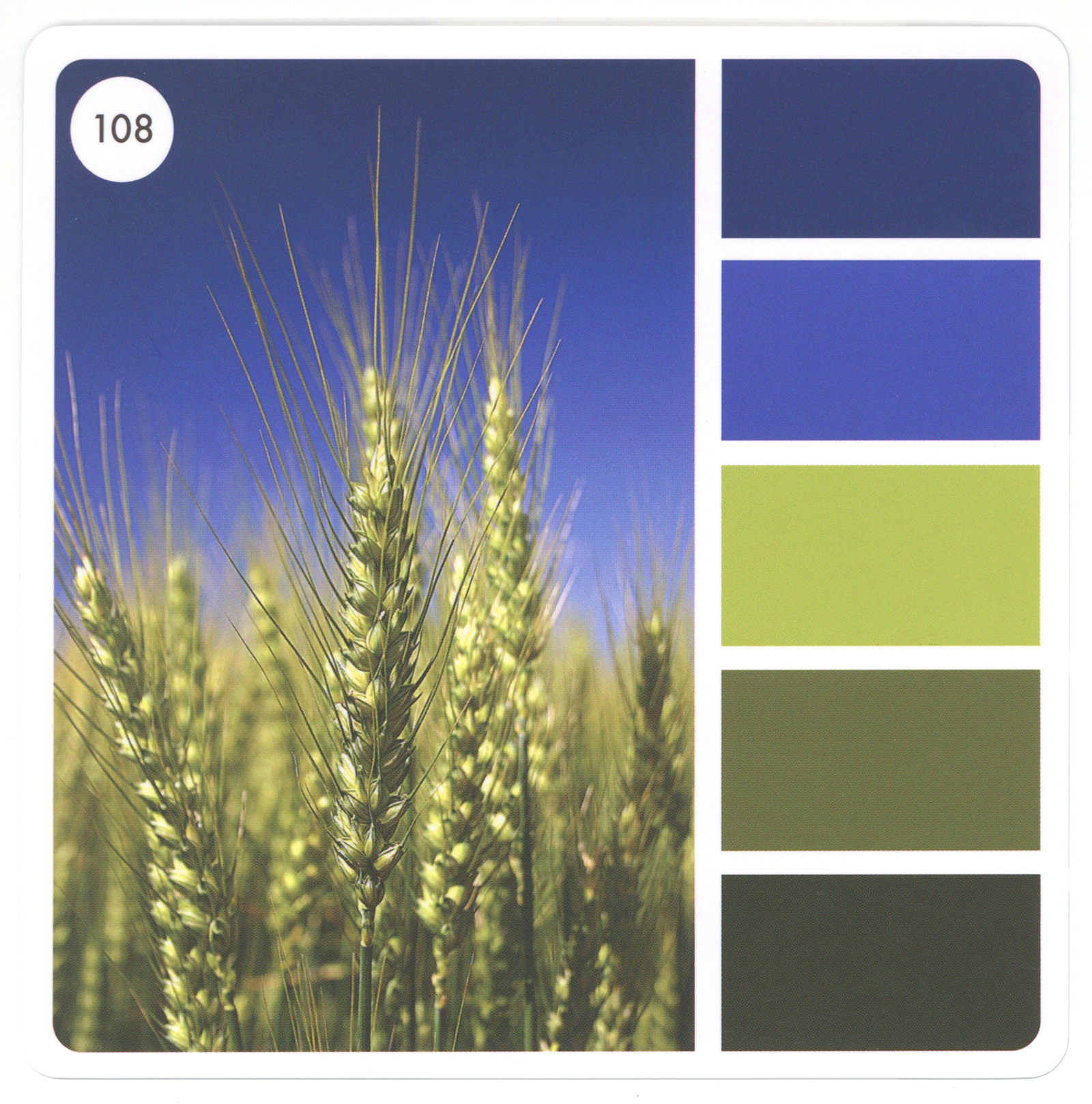
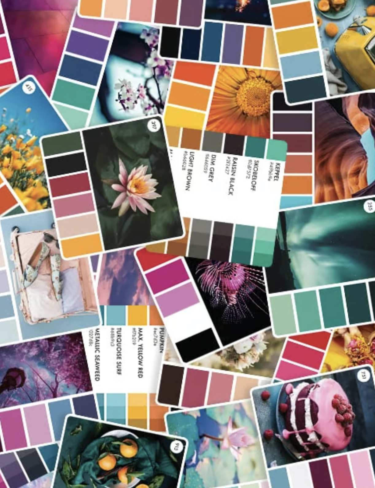
Unfortunately, Sarah modeled the card fronts on popular Pinterest-friendly palettes from me, Design-Seeds, and other such sites.
But what works on Pinterest is dumb in a box.
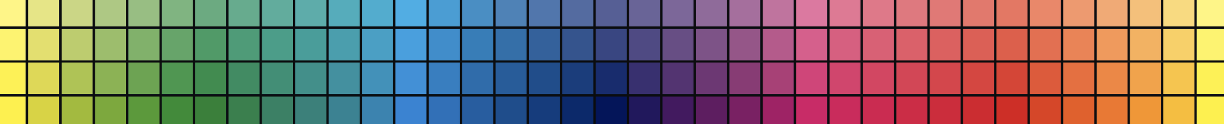
We’re looking for colors, so maybe we ought’a look at the colors?
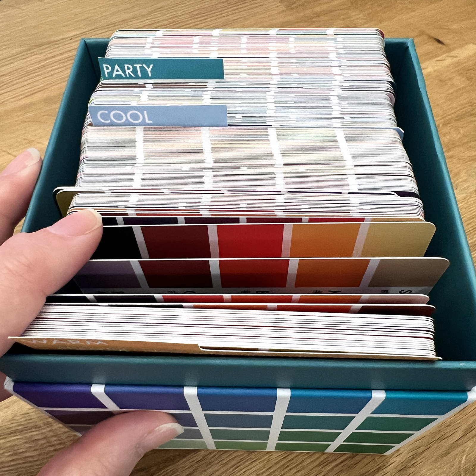
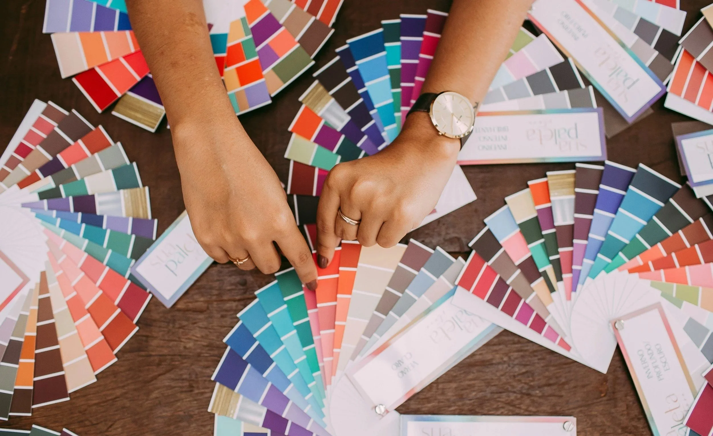
Okay, so about the dividers which now come standard in every Color Cube…
And remember, this is gentle criticism from a super fan. I’m pointing out areas for easy improvement.
I’ve been trying to organize my Color Cubes from day one. I bought Cubes 1 & 2 in the initial pre-launch sale. Over the years, I’ve stuffed my boxes full of Post-its and torn strips of paper, desperate to make sense of the chaos.
I was really excited when Sarah announced a new divider system. Then she crushed my heart with this:
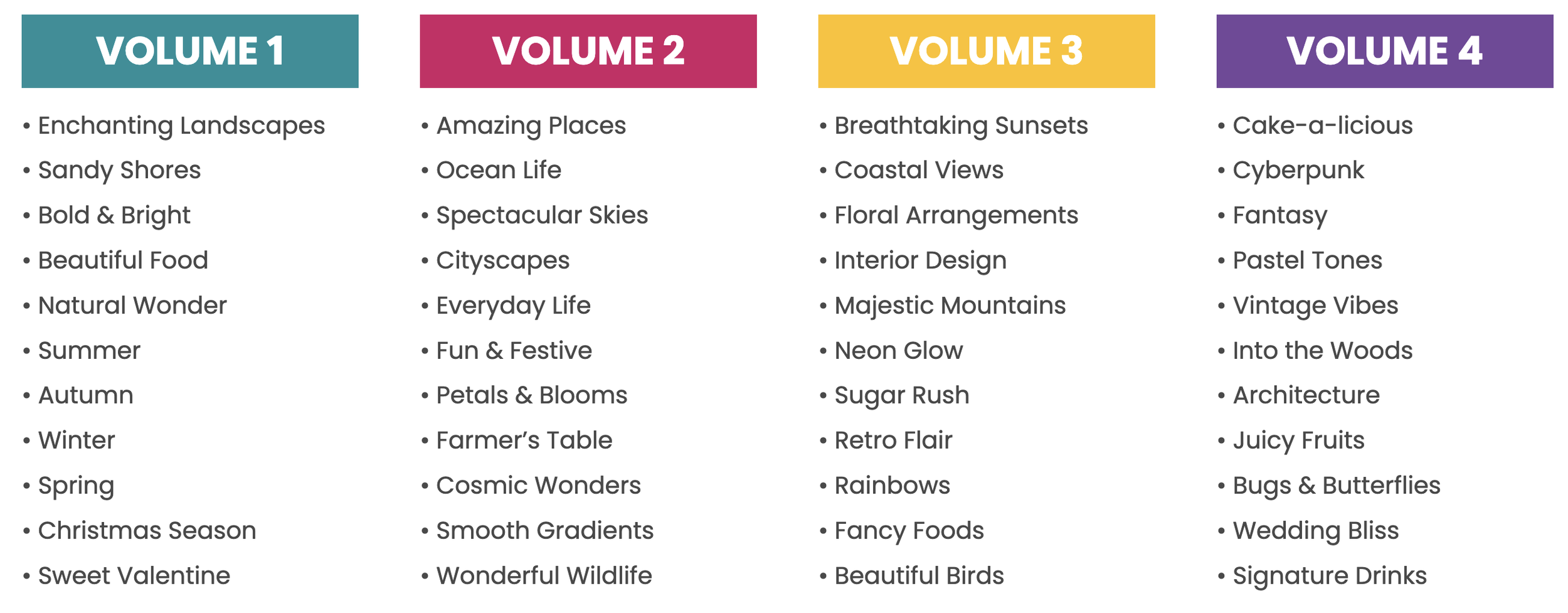
And to be fair, these categories are kinda carried over from the original iteration of Color Cubes, the digital Color Companion app.
But here’s the problem for us today— You’re about to color a baby elephant under a palm tree. Which category should you search?
Let me make it easer— just tell me which box to open.
You can’t do it, can you?
Are we actually organizing if the search gets exponentially harder?
Instead of digging through an entire box, now we’re hitting a few tabs here and there which could work but probably won’t. Then we’re giving up and searching the whole darned box anyway. And if you’ve got four boxes?
How is this helping?
But here’s the real crime against Art:
The new categories seem deliberately designed to limit creativity.
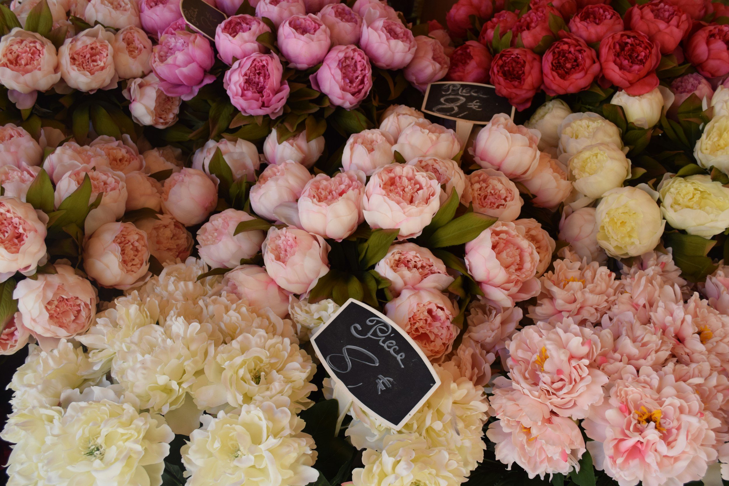
See, if you’re about to color a farm scene, the dividers tell you to shop for landscape colors in a category literally called “ENCHANTING LANDSCAPES”.
A “landscape” card will suggest green fields, a yellow sun, a red barn, and a blue sky.
Zzzzzzzzzzz…
What’s the point of wasting time and money on Color Cubes if you’re just gonna color everything the color you were gonna color it anyway?
That ain’t creativity!
This is creativity:

So I’m a big Helz-no when it comes to letting you color tropical fish with any palette filed under SPONGE BOB.
The point of palette tools are to help you think outside the box. Why are we throwing away your best hope of doing anything original and unpredictable?
Someone please stop the pain…
They’re Color Cubes, not Photo Cubes.
Why are we organizing color palettes by photograph?
Do I sound a little cranky? Well, yeah, I’m irked.
I don’t like it when time savers destroy brain cells.
So right about now, you’re probably thinking…
“Gee, Amy has a real problem with the photos. Maybe she’d rather have color cards without photographs?”
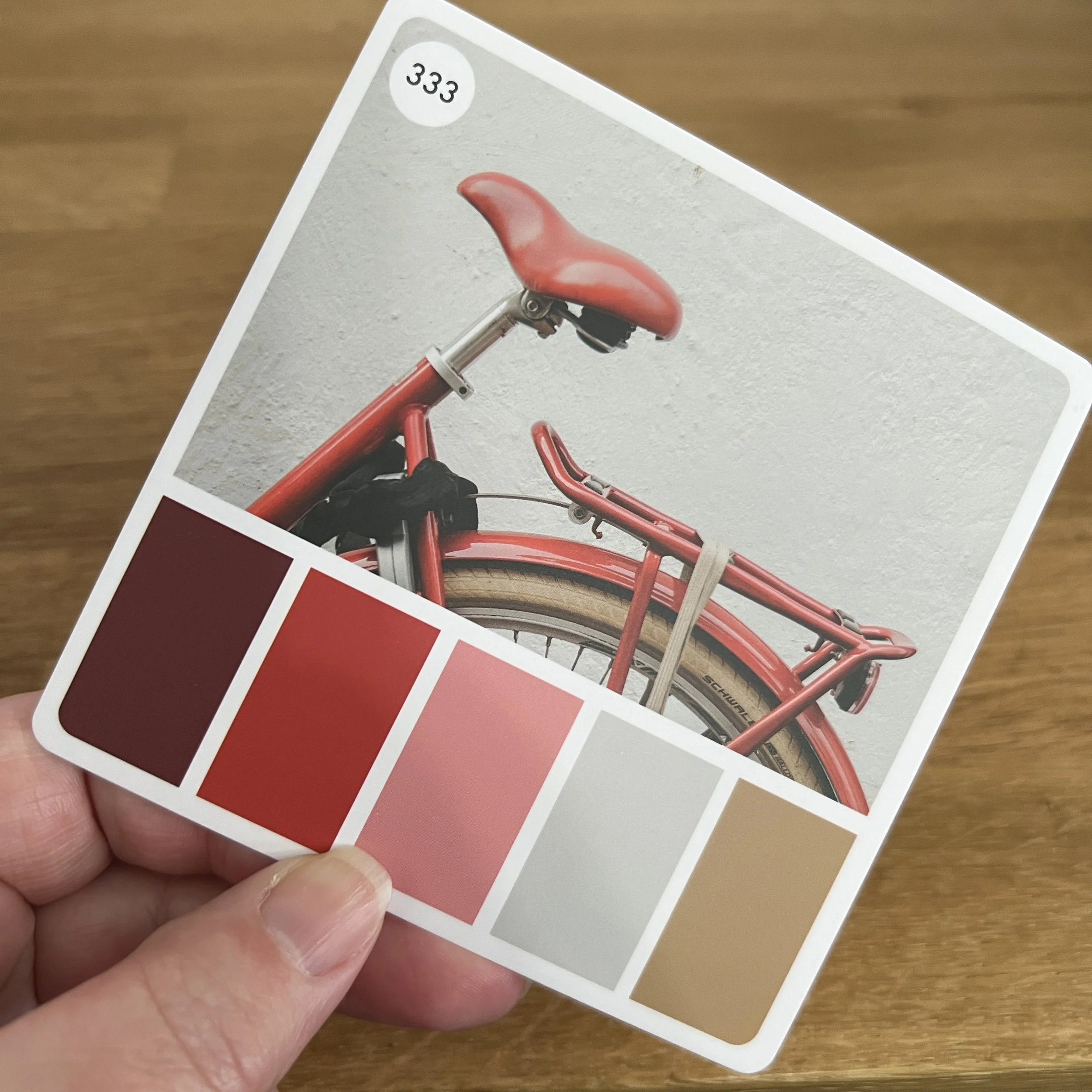
I don’t blame you for jumping to this conclusion. First, I’m filing my cards with photos to the back so I can’t see them, then I’m warning you not to group this card with other bicycle photos…
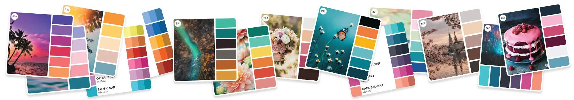
But actually, I love the photos. I need the photos.
The photos are the MOST important part of every color card.
And I wish Sarah had spent a little more money to get the photos printed at a higher quality. Please, spare no expense on the photo!
Which is actually why my palettes are digital only. I can’t afford to print the kind of photo quality I’d want. Even Sarah’s photos look too mushy for me.
Yes, I’m a mystery, wrapped in an enigma:
I may file my cards by color family…
And when I’m shopping for a palette, I only look at the colors…
But when I’m selecting markers and pencils to match the color palette?
I look at the photo, not the swatches.
And this my friends is why I don’t care if I own any markers to match the color swatches.
B99?
B66?
YG25?
YG97?
G99?
If I own them, great. If not, oh well.
Because when I sit down to color, I look at the colors in the photo, not the colors on the side.
I don’t care what “universal” name Sarah gives to each of these color swatches. I know she spent a lot of time standardizing color names but so what? She can call the middle green Cucumber Sunrise or Guacaholy-moley, it doesn’t matter tiddly bits to me.
I don’t want the hex codes or the Pantone IDs. I’ll never use ‘em.
And I sure as heck don’t need a membership to tell me how to find these colors in Polychromos or Crayola’s Fruit Scented Finger Paint.
Dust in the wind as far as I’m concerned.
I can use this color palette without using any of these colors.
I’ll show you how, next week.
IF YOU LIKED TODAY’S ARTICLE, SUPPORT FUTURE FREE LESSONS
READING IS NOT DOING
Color theory is one of those things you don’t fully get until you actually do it.
That’s what Color Coach is here for — deep color experience.
In March, we’re learning about the many temperatures and tones of green. I know you think colors are either on the warm side of the wheel or the cool side and that’s exactly why you need hands-on experience manipulating color. Talk only gets you so far.

SECOND TUESDAY STREAM
As the supply of XPI Blending Card rapidly dwindles, what will replace it?
What should you look for in the product descriptions before buying?
When you find a new paper, how do you test it?
What are we even looking for?
Join me for a dead-honest discussion about the 2026 state of marker papers. The future of this hobby is changing rapidly and this is info you’ll need to survive the storms.
Tuesday, March 10th at 2pm EDT
(recorded version will be added to our lesson library)
2nd Tuesday Streams are one of the many benefits of a Color Wonk membership. Join today for instant access to dozens of workshops, video archive, and supportive community.

Let’s color something with tons of realism…
Oh, Amy! I’ve tried, but realism feels so complicated
I used to think that too. The idea of switching my students from cartoon stamps to realistic coloring felt impossible. But together, we figured it out.
Gray Matter was my first official realism class, introducing students to an easy way to underpaint and judge colors for realism.
Hop in a time machine with me and let’s go back to the days when NOBODY was teaching marker realism.
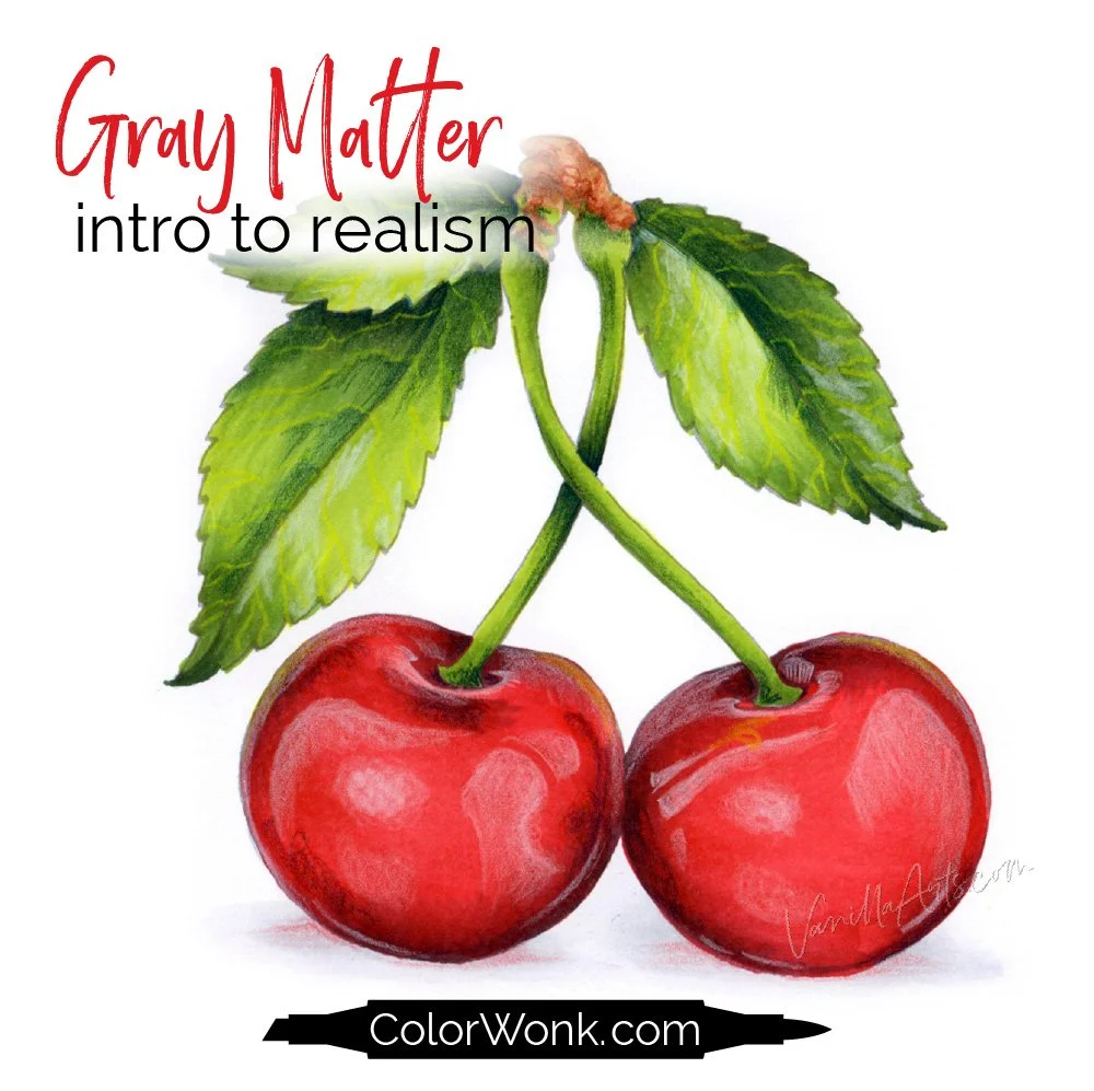
Gray Matter is only available through Color Wonk
A library full of new and classic courses is waiting for you. Instant access. No deadlines.
Real art lessons, not nifty novelty techniques

CURRENT PASSWORD: RubberDuckie
RECOMMENDED COLOR PALETTE PRODUCTS?
Affiliate links help support the free content here in Vanilla Beans
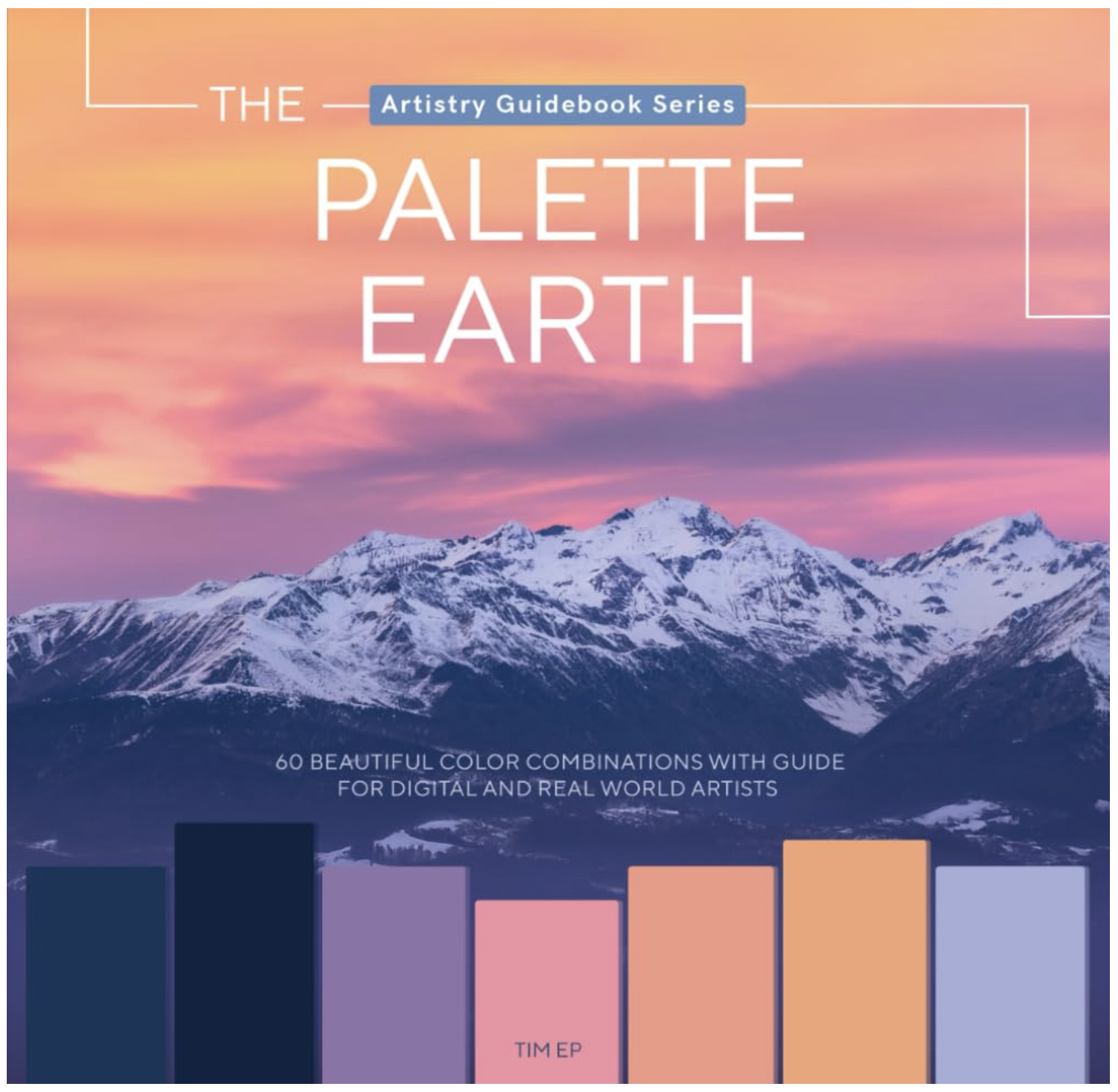
I don’t own either book but I’ve been looking at the Joanna Stone series for a while now, just never pulled the trigger. I just spotted the Palette Earth book today, looking for a Joanna Stone link. Both books give us a photo plus a color palette which is important. They also give every palette adequate breathing room. Maybe too much room? My hesitation with Joanna’s books is they look thin and you’ll need a bunch of ‘em to match what you get in just one Color Cube.