Cube 4: Pulling Your Hare Out
Vanilla Beans Newsletter. Saturday, March 14, 2026
Thanks for taking the jump to read today’s newsletter. If you landed on this page by accident, subscribe to the Vanilla Beans Newsletter here.


Today is episode 4 in our Color Cube series.
I ordered Sarah Renae Clark’s Color Cubes about two seconds after the launch email hit my inbox. Love at first sight.
“HOORAY! With these palettes, maybe I can finally teach an honest color theory course…”
The course never happened— great news for you. Everything I would’ve taught there ended up here. You’re getting bits of the course every week!

Remember to use the link above when shopping at Blick. Vanilla Beans runs on affiliate earnings.
I’ve tried to be gentle with my criticism of Color Cubes. We’re just trying to make the most of a high quality product.
But today is a touchier subject.
Because I see Color Cubes as a temporary teaching tool, not a lifetime crutch.
Color palette cards are like training wheels. Eventually, you need to not-need them.
Purchase Color Cubes with the affiliate link above to support my work here at Vanilla Beans. Every issue of Beans takes about 8 hours to write and Beans is always FREE. Without your support, there’s simply no way I can keep writing weekly free lessons.
PULLING YOUR HARE OUT
In our last episode, I left you teetering on the edge of a cliff.
We talked about the cement shoes Sarah created by encouraging you to color fish projects with OCEAN cards and bunny rabbits with palettes from the section called FURRY DEMONS WHO EAT CHERRY TREES.
Literal is the enemy of art.
But literal also makes it hard to find stuff. This is why I created alternative Cube dividers. Organizing by color makes more sense than filing by photograph.
Then came my cliff-hanger.
I mentioned that I look at the color swatches when I’m shopping for prospective palettes.
I search by color.
But once I find the right card? When I’m looking for markers and pencils to match that card?
I match the photo.
Which sounds weird, right?
You’ve been pulling your hair out, holding 22 blue markers up against the blue swatch, trying to find an exact match, right?
You squint. You hold the card out at arm’s length. This blue or that blue?
I don’t do that sheet.
The dirty secret about Color Cubes but also sites like Design-Seeds and my own Copic Color Palettes is:
Any idiot can make a color palette.
I know you’ll find a pompous blurb about how “these colors were expertly chosen by genius level color scientists using the latest in color theory technology…”
Nope.
Any dumb-arse with eyeballs can make a color palette.
Let me show you how.

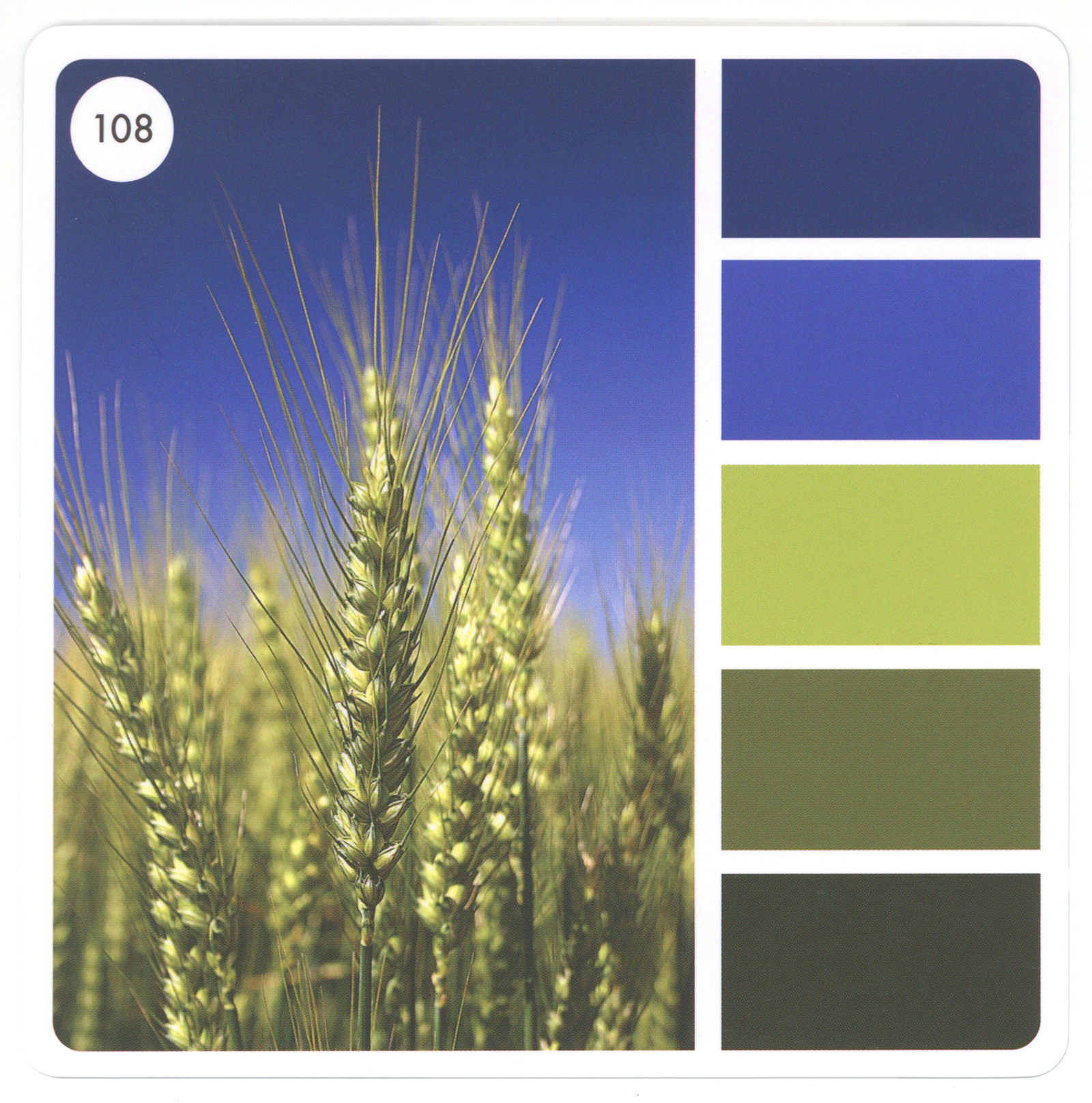
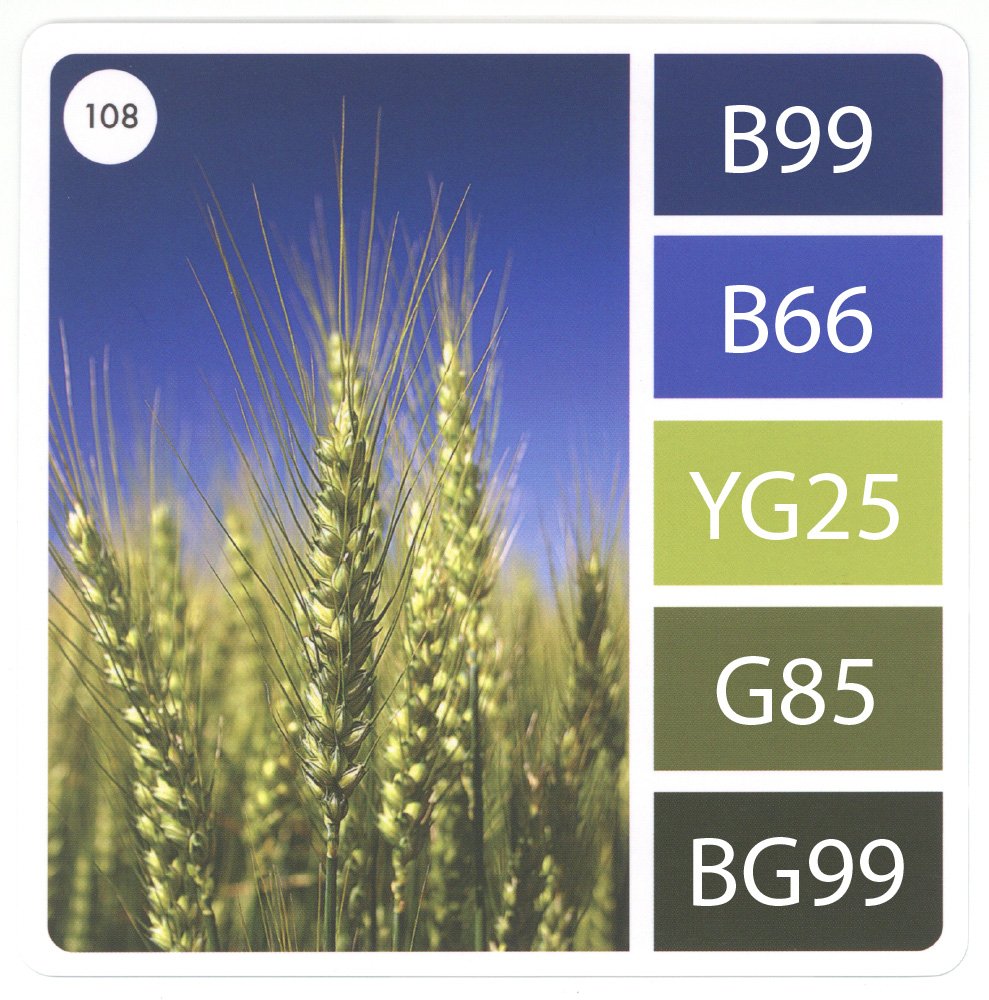
Sarah found this photo here at Pixabay.com
It starts with a pretty photograph…
Well… actually no, it doesn’t.
Starting with a professional stock photo is the beginner way to make a color palette. Once you know the trick, you’ll see beautiful color palettes all around you.
Mother Nature knows her stuff but there’s also a lot of happenstance.
Good color palettes are everywhere.
In my corporate days, we did a global campaign with a color palette based on my bathrobe and two sweatshirts hanging on the back of my bedroom door. I woke up one day and thought “gee, that’s pretty”.
Palettes are everywhere, so pay attention.
We’re color people, right? So when something makes you look twice, it’s often the color that attracted you. If you’re smart, that’s a color palette worth noting.
But I will admit, color palettes are more obvious when the photo is professionally edited and color boosted— so in the beginning, work with colors that are easy to see.
Okay, so using an Eyedropper Tool…
Eyedropper tools are a color sampling cursor-thingie found in most design or photo editing programs and apps. Click any area of the photo, it gives you a digital sample of the color in that spot.
Some eyedropper tools like Color Picker for Artists go a step farther, suggesting colored pencil matches for the color it found.
But duh. You could also just look at the photo.
Eyedroppers make it easy but I didn’t use high tech for my bathrobe on the door.
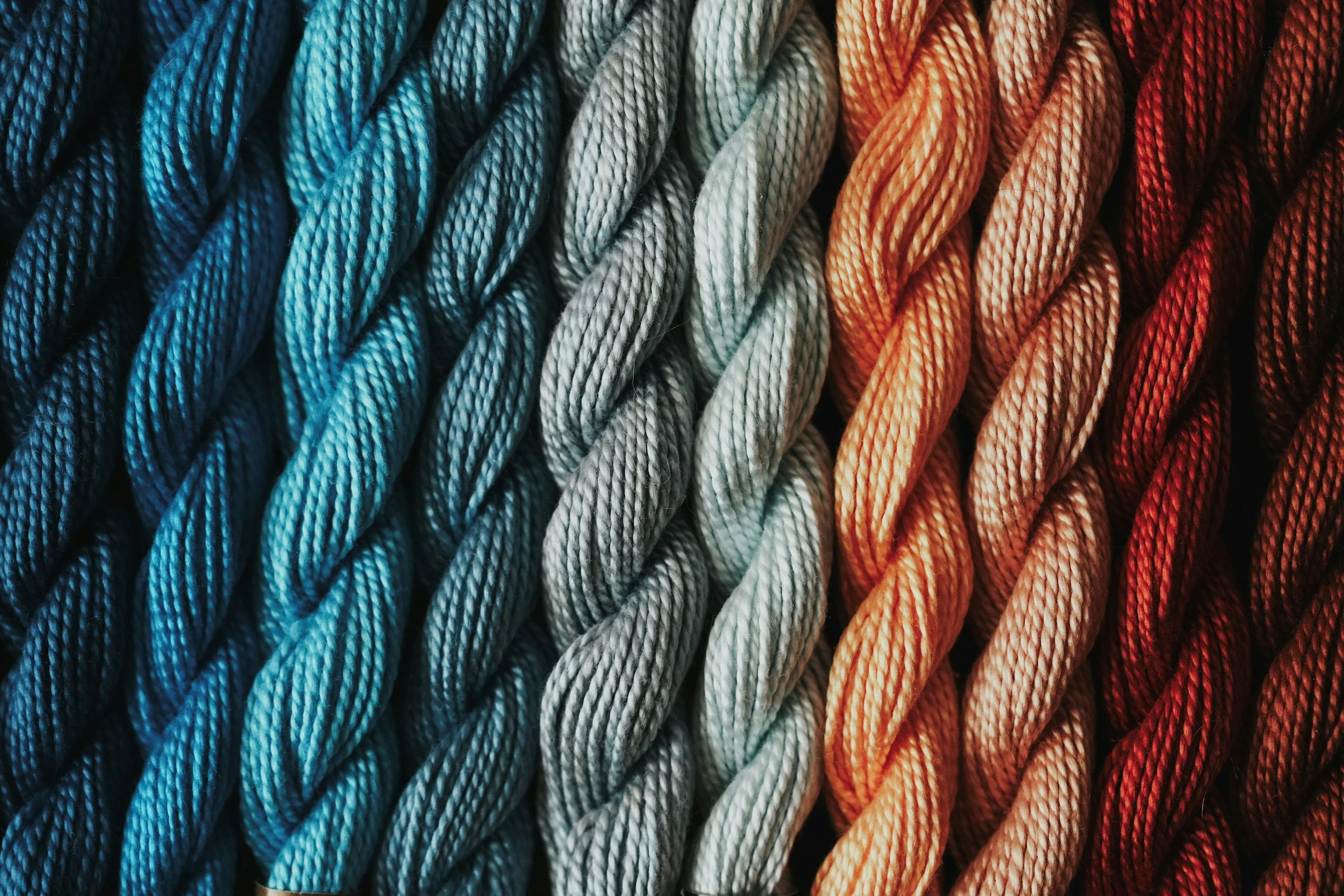
Anyway, using the eyedropper or your eyeball, let’s find a couple blues and then a few greens.
And honestly, when I do this, I kinda fiddle-fart around, sampling colors until I have five or six swatches that look good together.
This is all based on taste and whim.
If it looks good, go with it. If it looks ugly, keep sampling until you get something nice.
Voila! Instant color palette.
But here’s the thing…
Move the eyedropper a smidge in any direction and you’ll get a totally different color swatch.
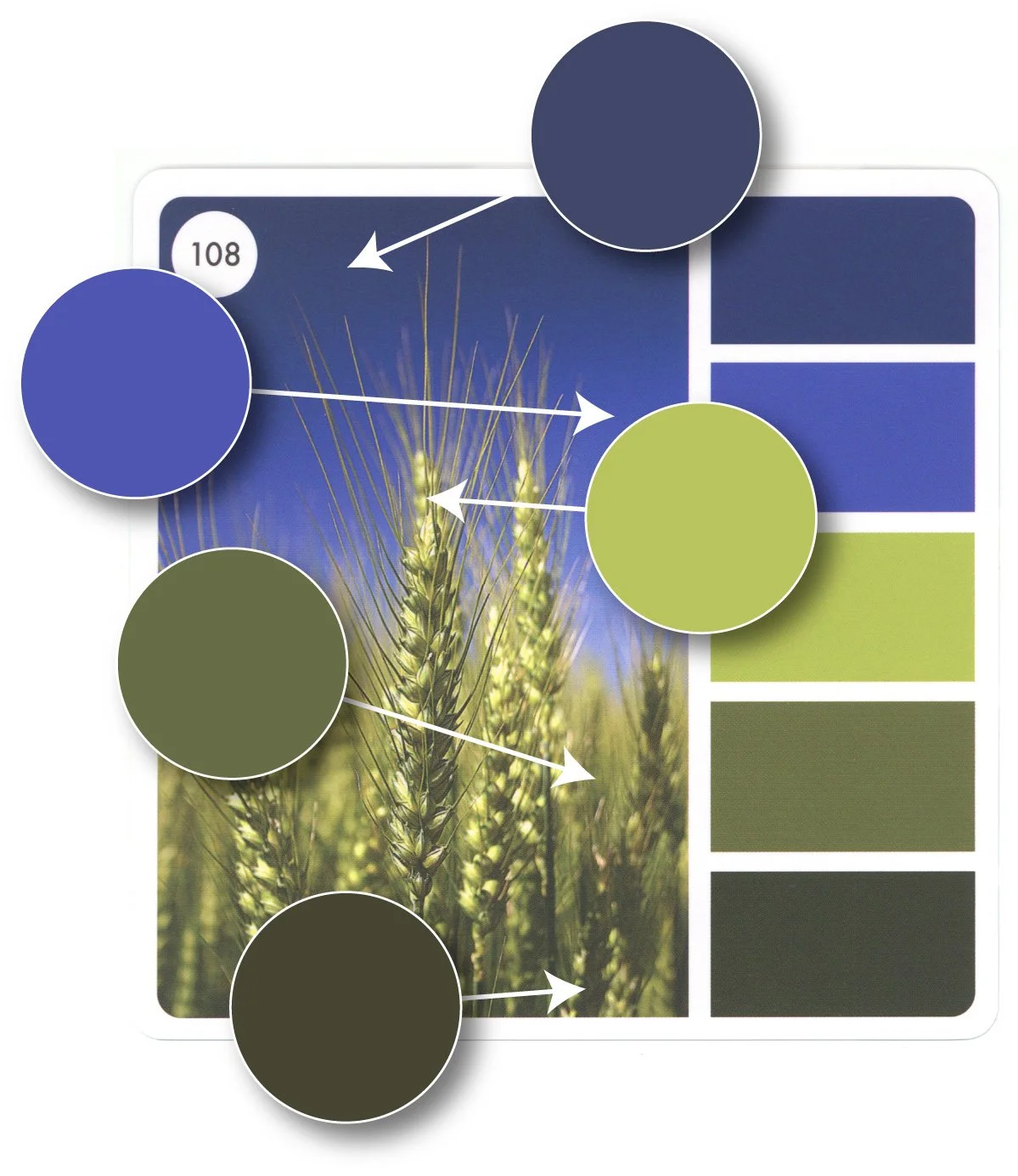
I clicked my eyedropper all around Sarah’s dark green zone. I found six different dark greens in a space smaller than my pinkie fingernail.
Same for the dark blue part of the sky. Even a slight nudge gives you a totally different shade of dark blue.
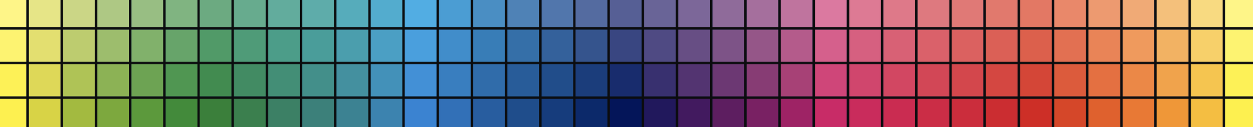
And you know what? Each dot is a different Copic Marker.
I can easily see YG97, YG99, G28, G29, G46, G85, G99, BG78, and BG99 amongst the green dots.
And I can picture B18, B29, B37, B39, B69, B79, or even B99 with the blue dots.
Sarah could’ve chosen any of these colors and they’d all be equally correct.
Which leads us here.
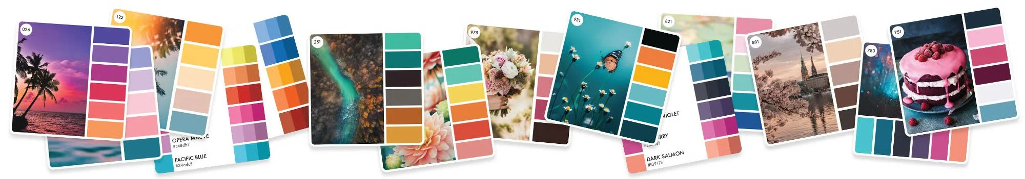
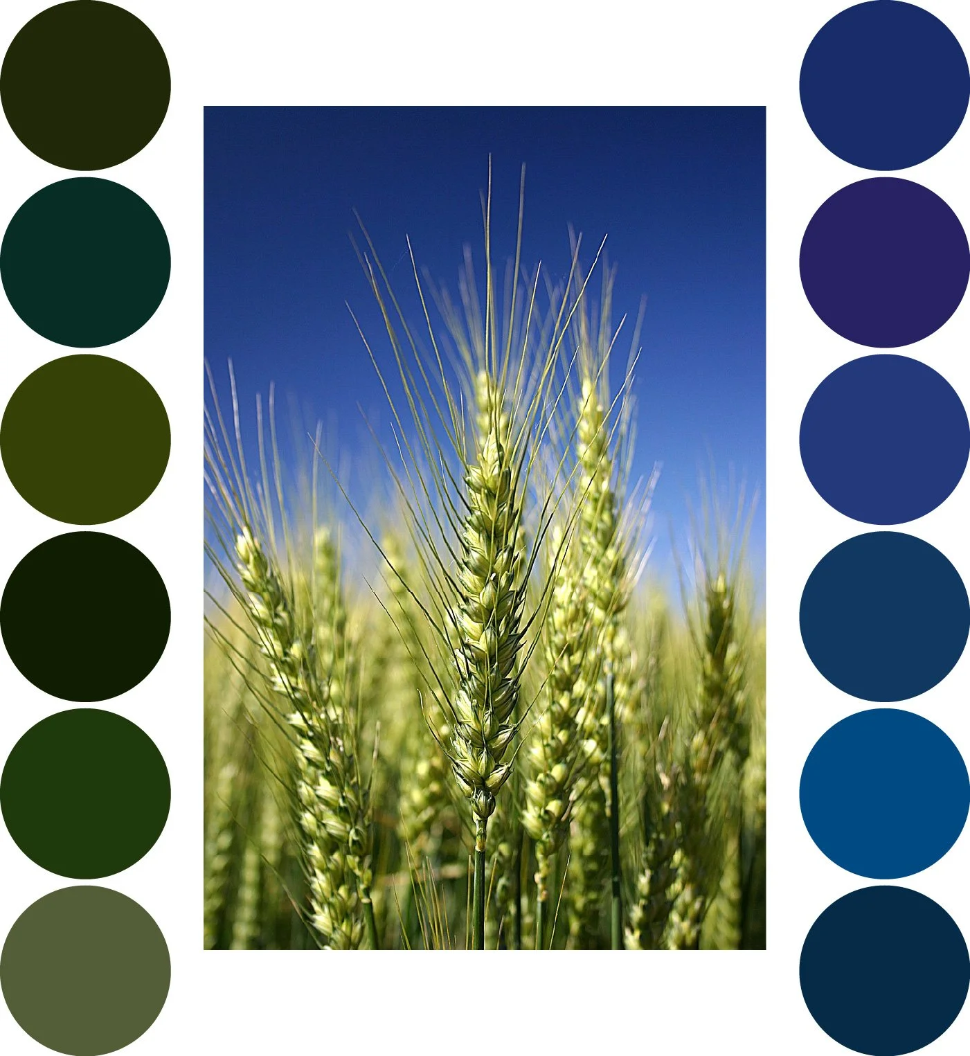
At the top is Sarah’s swatch.
But below that, using one eyedropper and zero brain cells, I created eight different color palettes from Sarah’s wheat photograph. It took me 90 seconds.

This was a smash and grab, no thinking.
Blue, blue, green, green, green. Bingo bango bongo.
And don’t assume there’s something magical about two blues and three greens. It could’ve been three blues and two greens.
If there’d been pink in the photo, I would’ve grabbed that too.
Making these color palettes was easy peasy because the photographer did the hard work for us. If a color works in the pic, it’ll probably look good in the palette. So you could easily hurl darts blindfolded and get a good palette too.
You’ve totally overthought the amount of skill required to make great color palettes.
Your dog could do this.
See, we’re always full of excuses— Amy went to art school. Annie has 50k followers. Alicia is an amazing colorist. Of course they can make their own color palettes!!!
Nooooooooo.
It looks like I’m pulling a colorful rabbit out of a hat when really, the rabbit’s been waiting in my sleeve the whole time. It’s a complete illusion.
Despite my hack attitude and not caring where I placed the eyedropper, ALL my quickie palettes look great.
Well… I don’t love the first one but again, it’s a matter of taste.
There’s nothing magical about Sarah’s color choices. It’s just where her eyedropper landed.
Now, hang on there, cowpoke…
Before you rush off to spend the afternoon on Pixabay creating color palettes…
Yes, making random palettes is stupid-simple but today’s article is specifically not a DIY tutorial. I’m gonna be upset if I hear you’ve been filling binders with fresh palettes.
Spend your time coloring, not eyedroppering.
Ultimately, that’s the curse of creativity. Just because we can do something doesn’t mean we should.
That’s kinda something we need to talk about before I close this article.
Artists and Creatives— we go down a lot of dumb rabbit holes.
Something strikes your curiosity and three weeks later, you come up for air with 92 Amazon boxes on your porch and a deep understanding of something completely useless.
And folks, Sarah is deep down a rabbit hole right now.
Even worse, she’s dragging you down with her.
Let me ask a very personal artistic question:
On a scale of 1 to 10, how skilled and talented do you feel right now?
Are you a 5? Maybe a 7.5?
Everyone will have a different answer and nobody’s right or wrong. Just give your coloring skills a general rating.
Got a number? Good.
Now scroll down a bit.
Okay, how skilled do you feel now?
Did a heavenly choir just hallelujah the heck out of you?
Does the world finally make sense?
No?
Would it help if I said Indigo, Cobalt Hue, Limepeel, Moss, and Olive?
Or let’s say Chipped Sapphire, Stormy Sky, Shabby Shutters, Peeled Paint, and Forest Moss?
Feeling smarter yet?
Maybe you need the HEX codes? Pantone GOE? Munsell? HSL?
Folks, I can throw names and numbers at you all day and it won’t make coloring easier.
Just because we can build a database matching every art supply ever made doesn’t mean anyone needs this information.
Because remember, if we jiggle the eyedropper, every color in this palette changes. So why would we ever sweat bullets over which brand makes the best version of each swatch?
You don’t need BG99 or it’s Arty-huhu equivalent to make this palette work. Use YG99. Use G99. What’cha got that’s dark and green? That’ll do.
No high-tech hyperanalysis necessary.
You don’t need conversion tools. You need color management lessons.
Folks, I have never, ever— not once in my lifetime have I wandered around my studio, searching through boxes and drawers of supplies for the perfect medium warm green with olive undertones which also picks up hints of blue in the right light.
THAT’S NOT HOW ART WORKS!
You don’t suck at coloring because you can’t find the right color.
You suck at coloring because you think there is a right color.
So to bring it all home…
That’s why I hunt for color palette cards by the color switches but I pick markers and pencils from the photo. The photo has a million color options and greater potential.
I may not own the color in the swatch but I know I’ll find something from the photograph.
Plus, I like my color ideas better than I like Sarah’s and you should like your ideas better than mine.
Art should be personal which means using colors which reflect your personality and taste.
Show us what you see, not what someone told you to see.
Loosen up.
You don’t need exact matches.
But also, swatch matching is a waste of time because nobody should be using Sarah’s swatched colors.
That’s right.
As much as I like this wheat palette and most of her other color cards, we’ve got a big problem here.
If you use these specific markers, it’s gonna screw up your project.
I’ll explain why next week.
IF YOU LIKED TODAY’S ARTICLE, SUPPORT FUTURE FREE LESSONS
READING IS NOT DOING
Color theory is one of those things you don’t fully get until you actually do it. That’s what Color Coach is here for, hands-on color theory experience.
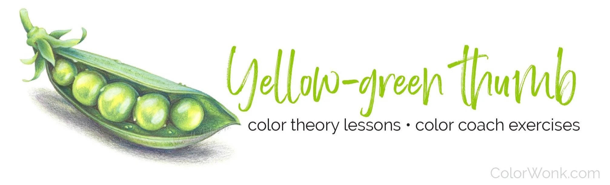
To color this peapod, I used two YG markers. I also used dusty rose, teal, pale aqua, hot pink, and sunshine yellow.
And that’s not just an Amy thing, my students are finding their own amazing artistic colors too.
Join us. Take a walk on the wild side.

SECOND TUESDAY STREAM
Ever had a pale marker go crazy on you, damaging at the beautiful blend it was supposed to make smooth?
Like that stinker ate into the dark color and left a bunch of speckle spots?
Or even worse, the pale marker left a dark bathtub ring after it dried?
Join me for a serious look at ink chemistry. It’s a total myth that you can blend with any ol’ light marker. No matter what brand of markers you use, there are hidden bombs in every color family just waiting to destroy your beautiful coloring.
Tuesday, April 14th at 2pm EDT
(recorded version will be added to our lesson library)
2nd Tuesday Streams are one of the many benefits of a Color Wonk membership. Join today for instant access to dozens of workshops, video archive, and supportive community.

Most realism lessons focus on using exact color…
Yes, Amy! If I copy all the colors in the photo reference perfectly, then my project will look photorealistic!
Uhh… maybe not.
Speckled Eggs looks real, right?
Most of these eggs are made up. Even when I use a reference, I used my own colors.
Let me introduce you to artistic realism.
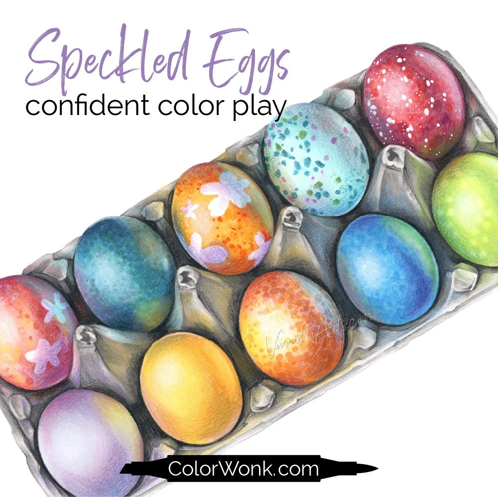
Speckled Eggs is only available through Color Wonk
A library full of new and classic courses is waiting for you. Instant access. No deadlines.
Real art lessons, not nifty novelty techniques

CURRENT PASSWORD: RubberDuckie
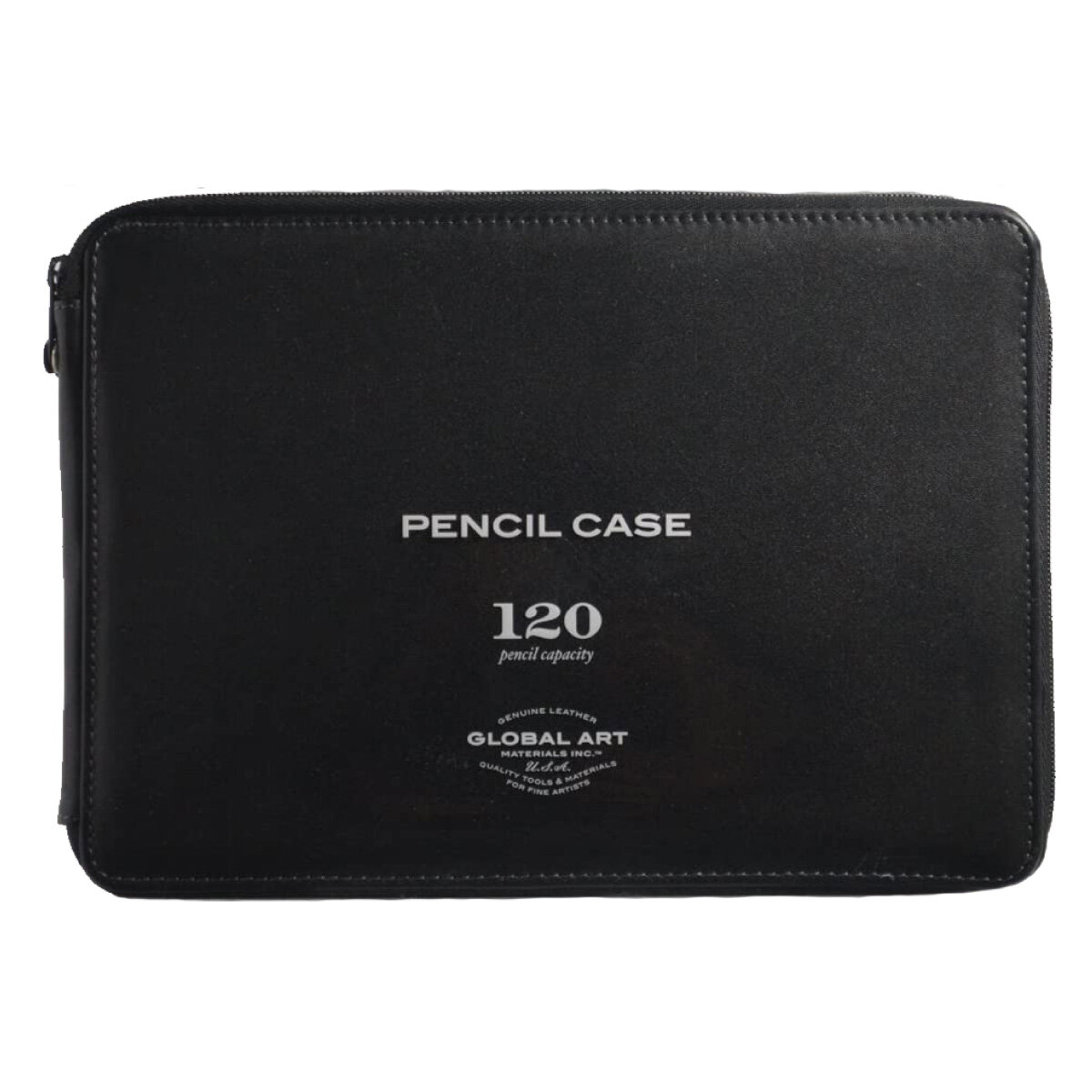
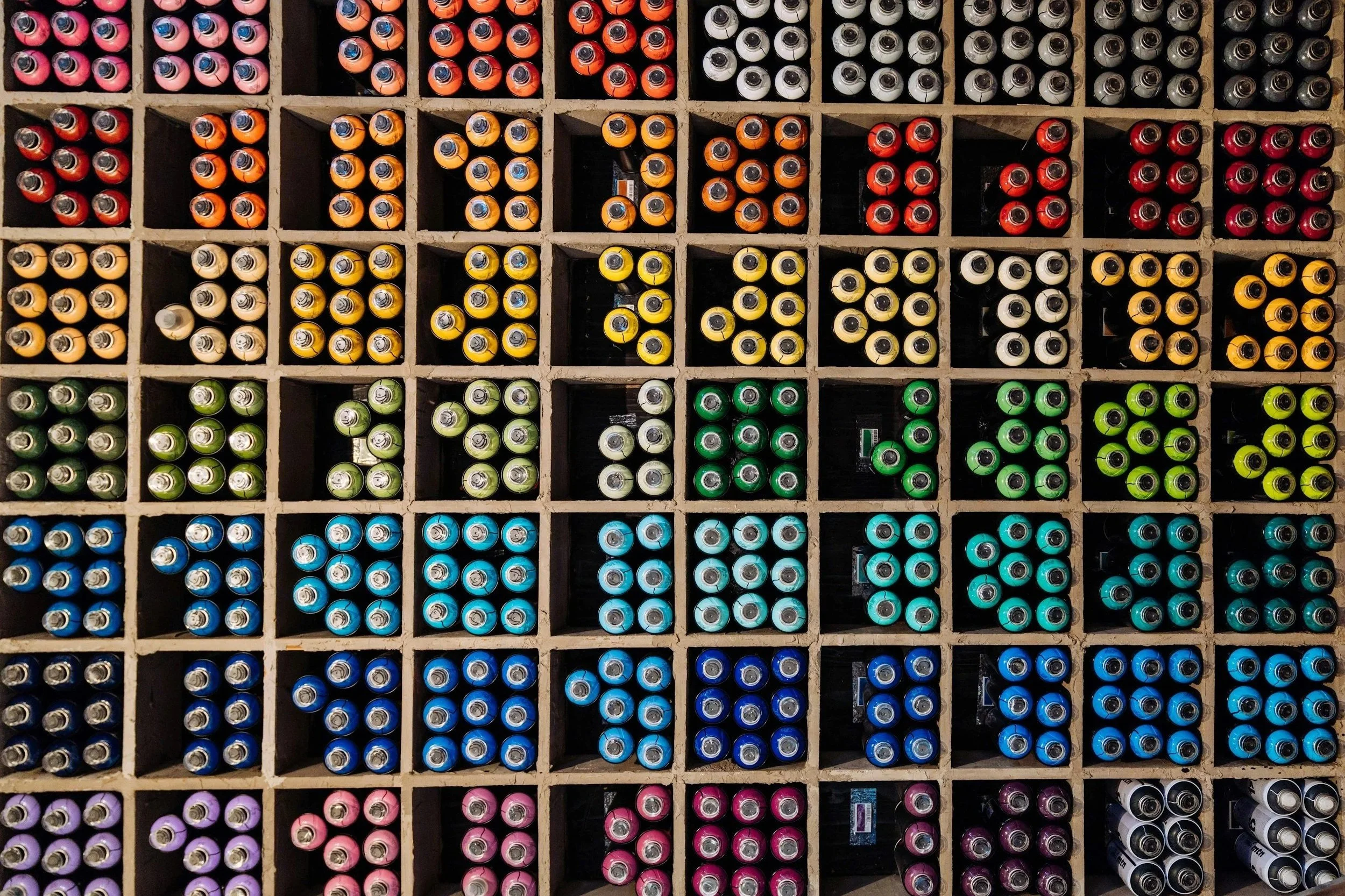
MY FAVORITE COLORED PENCIL STORAGE
Affiliate links help support the free content here in Vanilla Beans