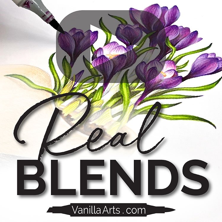
Color Magic: Video Resources for "The Problem with Blending Combinations"
Do you color with blending combinations?

Blending combinations are excellent for beginners!
Someone hands you a color recipe guaranteed to blend and you practice until you can blend it smoothly every time.
And that’s great!
But… uhm…. how do I say this gently?
Some people have been using blending combinations for years. Everything they color comes from someone else’s marker recipe.
Folks, that’s not supposed to happen.
Blending combinations are for learning how to blend!
My latest video shares the problem with blending combinations and why what started as helpful is now holding you back.
Color Magic: The Problem with Blendng Combinations
(click below to watch at YouTube)
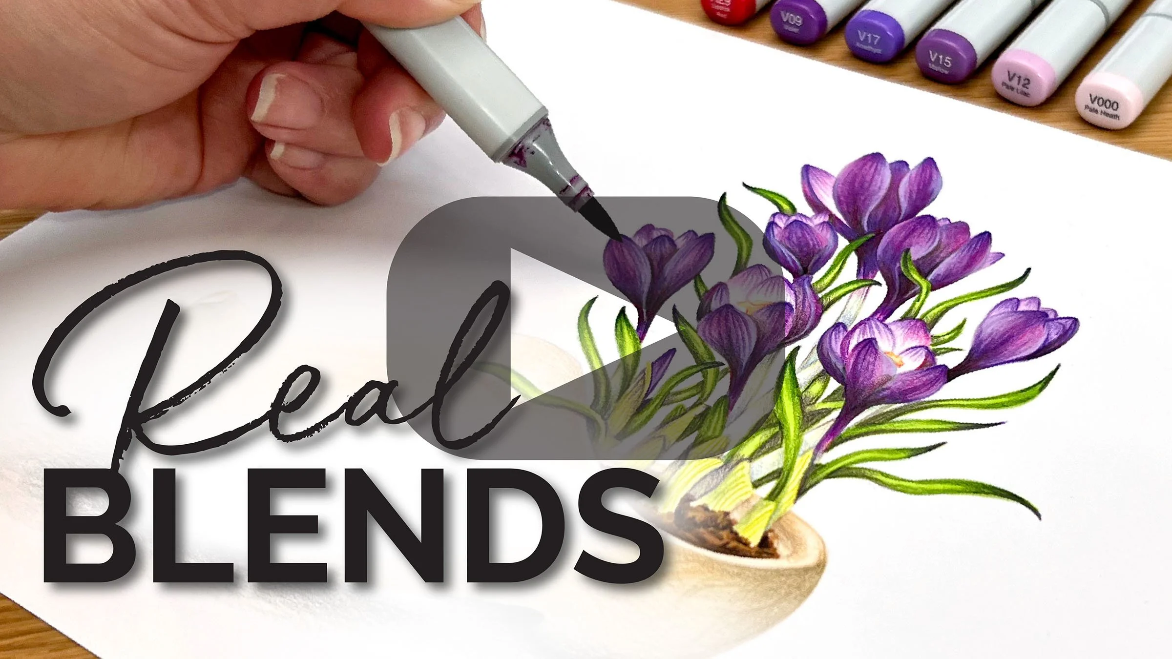
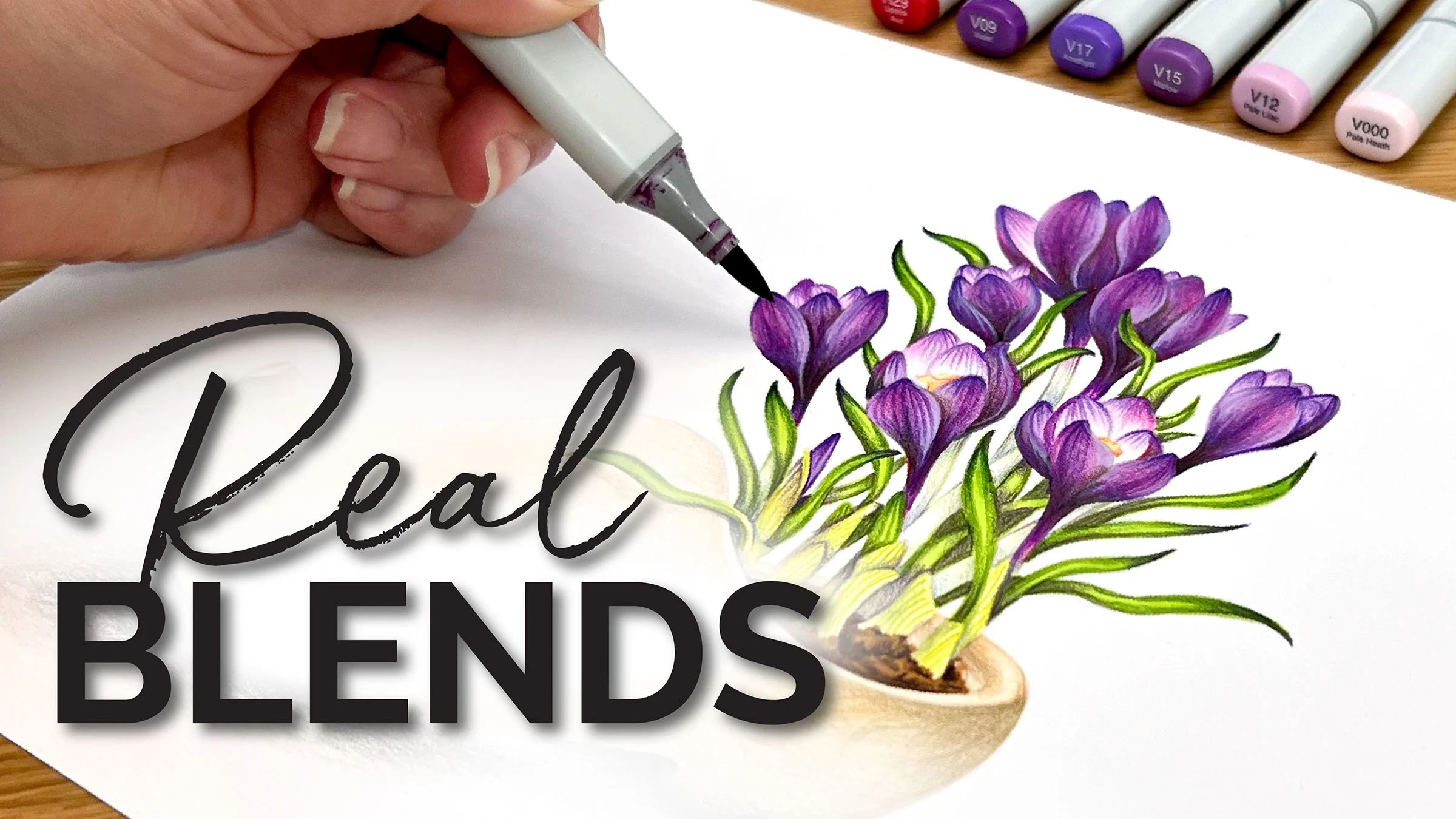
Want the Photo Reference?
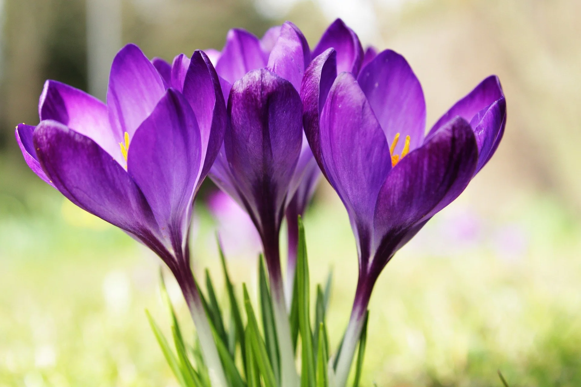
Here’s the inspiration for the purple color palette in the video. I also used the video recipe on the “Dutch Crocus” project.
You can download the same photo for FREE from Pixabay.com
Special thanks to the photographer Armannano. We really appreciate all the photographers offering their pics for creative use!
Tips for smarter use of blending combinations
TIP: Not all blending combinations are bad. The problem is when you begin with a borrowed combination.
Always start with a photo reference, not a favorite blending combo.
Photo references are vital, even if the flower or animal is posed differently than your line art.
Look at the colors in the photo reference. Familiarize yourself with what the object really looks like. THEN shop for a matching blending recipe.
Realistic color combinations look real because they’re based on realistic color.
QUESTION: Doesn’t everyone use blending combos? Even if I pick out my own colors, isn’t it still a blending combination?
True. The problem isn’t with the idea of a blending combination.
The problem happens when you default to someone else’s sense of color, relying on other people to tell you which markers look good together.
If you’re taking the time to color, why not color something from your heart? Your artistic voice is unique and special. You are the only person in the whole world who can color like you.
TIP: Modify a standard blend to better reflect what you see in a photo reference.
That’s exactly what I do in the video! Watch to see how I improve a common blend, turning it from average to realistic. It wasn’t difficult and the results are worth it.

A Touch of Spring
Line Art for Budding Artists
Wide open spaces with minimal texture marks. Ideal for coloring with alcohol markers, colored pencils, watercolor, or your favorite medium.
Dutch Crocus
Seven beautiful blossoms planted in a darling wooden shoe. Perfect for celebrating spring or banishing the winter doldrums.
Copic Marker List
Amy used Prismacolor Colored Pencils over Copic Marker. Pencils listed at the bottom of this article.
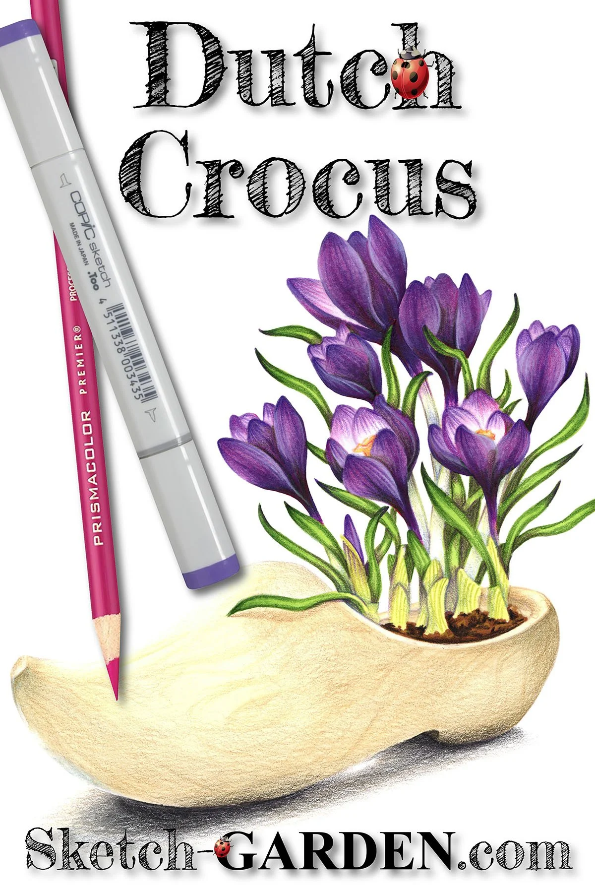
CROCUS PETALS:
R29, V09, V17, V15, V12, V000
CROCUS LEAVES:
YG67, YG03, YG21
WOODEN CLOG:
E81, E50
Related Reading
More About Purple Markers
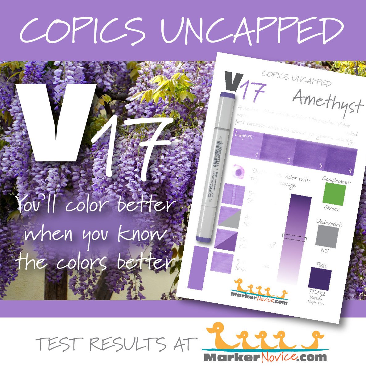
We test Copic inks. See results here.

Copic underpaint blending recipes.

Copic project palettes using color theory.
Supply List: Dutch Crocus