Cube 10: Socks First?
Thanks for taking the jump to read today’s newsletter. If you landed on this page by accident, subscribe to the Vanilla Beans Newsletter here.


And yes, Esther Williams did make it out of the pool. She just had to find the steps.

Shopping soon? Remember to use the link above when shopping at Blick. This newsletter survives on affiliate earnings.
Purchase Color Cubes with the affiliate link above to support my work here at Vanilla Beans. Every issue of Beans takes about 8 hours to write and Beans is always FREE. Without your support, there’s simply no way I can keep writing weekly free lessons.
SOCKS FIRST?
We’re at the end of the Color Cube series and my plan for today was to write a traditional summary article.
You know— refresh your memory, help you see all 10 articles as a whole, maybe give you the list of steps to screen-shot for later???
Exactly the kind of thing my ol’ creative writing instructor would’ve loved.
Restate the thesis and create closure without introducing anything new.
But as I started tippy-typing, I realized that, well… how do I say this?
Some of you really love it when I deep dive into minutiae and offer a bleep-ton of detail. Which is how an quick off-topic mention of Color Cubes turned into 10 articles, a bunch’a coloring samples, and 502 “easy” steps.
If that’s your groove, I’m your girl.
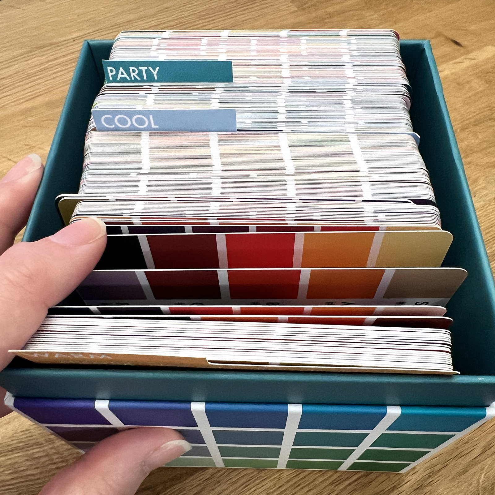
But many of you mentally checked out after the buying the dividers and sorting your Color Cube cards.
Sorting cards is easy.
Choosing near-matches for every swatch? Expanding value ranges? Spreading blends to cover an entire gamut? Adding cast shadows, desaturation, and unspecified neutrals?
Ohhh Amy, that’s just not for me!
I get it.
You want to color, not sit for hours testing samples and making decisions you feel woefully unqualified to make.
You’re not helping, Amy.
I understand, my palette modifications are not happy fun-time.
Which is exactly why you bought the Color Cubes in the first place.
You don’t want to pick colors.
You want someone else to pick the colors so you can color on a moment’s notice.
Why do I have to complicate everything?
Ha! I complicate things because you’ve been sold a colorful fantasy.
Use my easy color palettes for instant, stress-free, beautiful coloring!
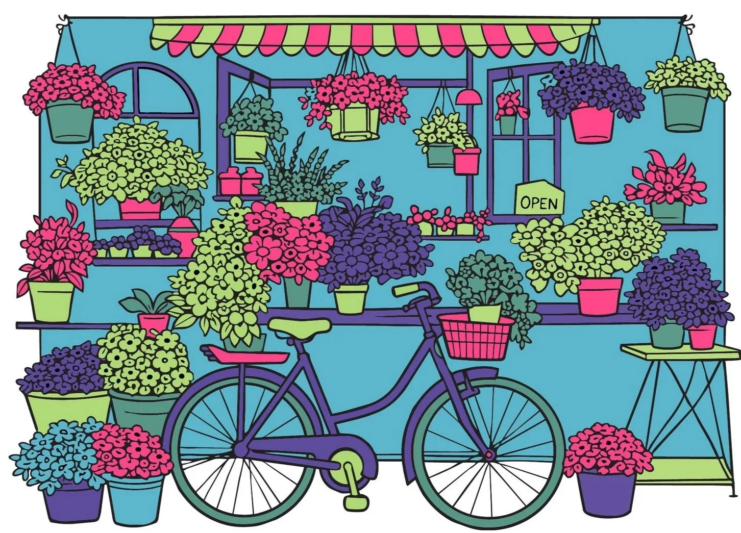
But if you buy the lie, using a color palette straight out of the Cube or fresh off a free app?
THIS is what you’ll get. Every. Time.
And I’m pretty sure this isn’t what you want.
I’ve worked with crafters and hobby creatives for 16 years now and I know what’s about to happen.
You may tolerate results like this in the beginning.
But somewhere around your 15th attempt, trying to make a freekin’ frackin’ palette card work as promised… When yet again, your coloring reflects the refined taste of a seven year old girl…
You will quit.
I know you. You have skeins of yarn to knit, paint to pour, models to assemble, beads to string, and a set of ridiculously expensive pastels you’ve never touched.
You’re not gonna keep doing something that makes you feel stupid.
You’ve got better things to do.
Stuff you’re actually good at.
My point wasn’t to overwhelm you with the process.
I just wanted to show you why the palettes aren’t really working for you right now…
And what it takes to actually make ‘em work…
But also, I wanted to show you why professional artists don’t rely on color palette tools.
By the time we get done fixing everything wrong with a commercial palette—
It would’ve been quicker to use my own idea.
There’s something else I wanted to tell you.
And I think it’ll make you feel better.
That whole expand the gamut, don’t repeat the same values, use desaturation, add 60% neutrals…
I wasn’t lying. I wasn’t exaggerating.
I really do do that.
All of it. For every project, rain or shine. All the time, all the steps. But here’s the thing you’re missing:
This morning when you got dressed— did you put on your shoes first, then your socks?
No?
Oh, so you must’ve thought really hard about it, reminding yourself like fourteen times not to stretch your socks over the top of the shoes with your feet inside?
Socks, then shoes. Don’t screw it up… Socks, then shoes!
No?
It sounds silly. There’s no universe where you’d ever wear socks over your shoes. It simply doesn’t happen.
Not because you think about it. You never have to think about it.
And that’s exactly what value separation and neutralization are like for me.
There is no world where I’d use a color palette straight off a card.
Well… unless I’m teaching you not to use a color palette straight off a card…
That’s simply not how my mind works anymore.
Experience is a wonderful thing. Stuff that once looked like a big long list of steps with intricate rules?
It becomes automatic instinct.
Zero thought, zero effort.
Just like putting on your socks first, your brain doesn’t even register that you’re doing it.
It just happens.
The thing is— remember, I know you. You have other hobbies you could be doing. And some of you are doing ‘em while you’re also learning to color.
Many of you will quit coloring before this color palette fixin’ stuff ever becomes automatic.
Some of you are soooo distracted by multi-media dabbling, you’re slowing down or even preventing the transition to automatic.
It’s not that you’re untalented. It’s not that you’re bad at coloring. And you’re not stupid.
You just haven’t logged enough hours thinking about color palettes, working with color combinations, and banging your head against the wall trying to figure out why the color is adding confusion rather than clarity.
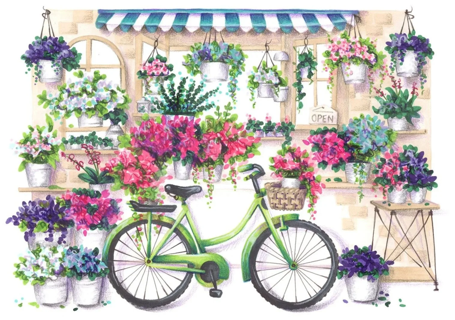
It looks so easy in videos and ads. Just use this color palette, swish-swish! Isn’t it beautiful?
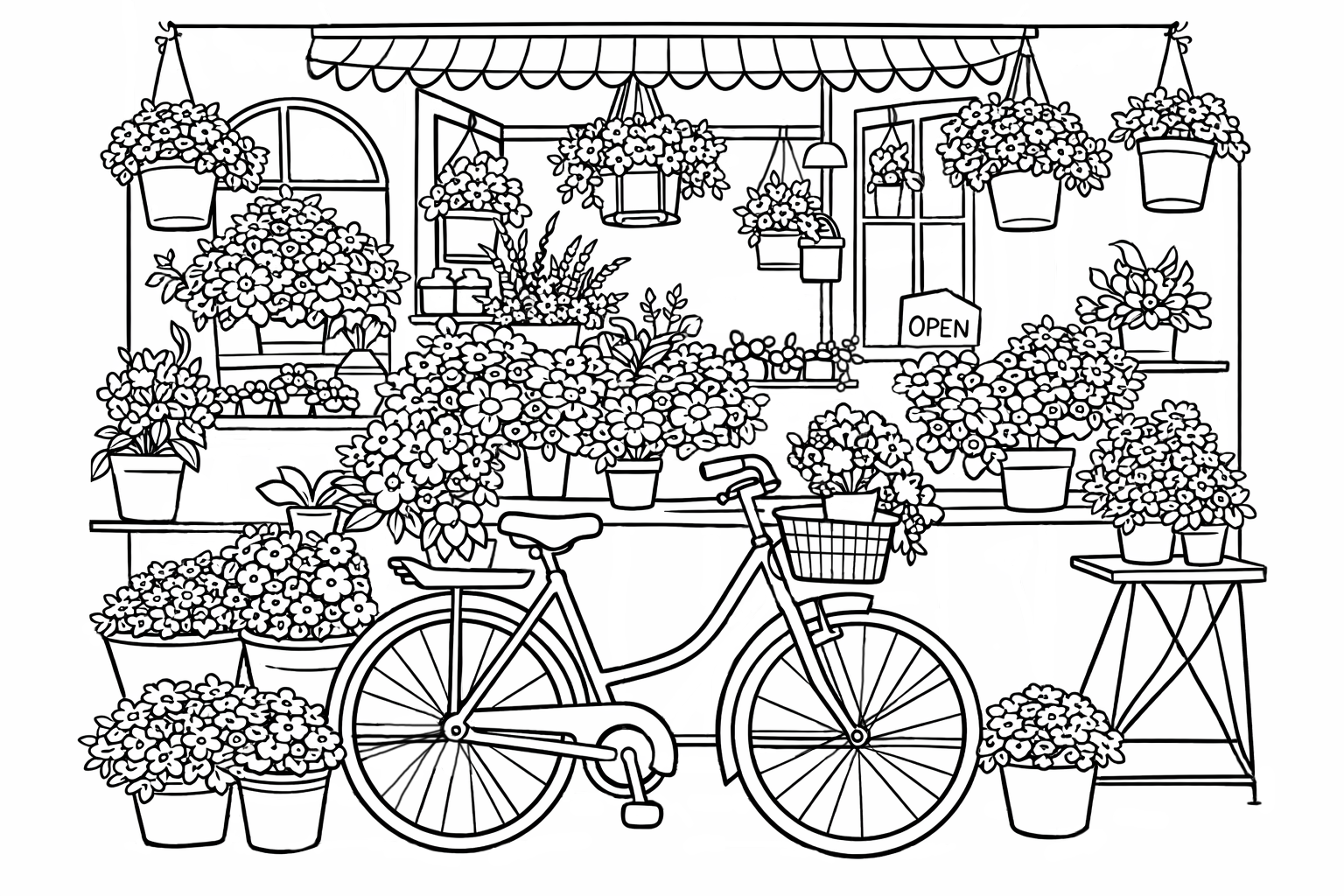
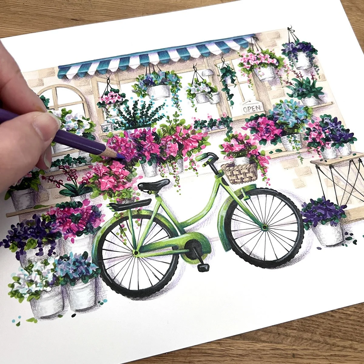
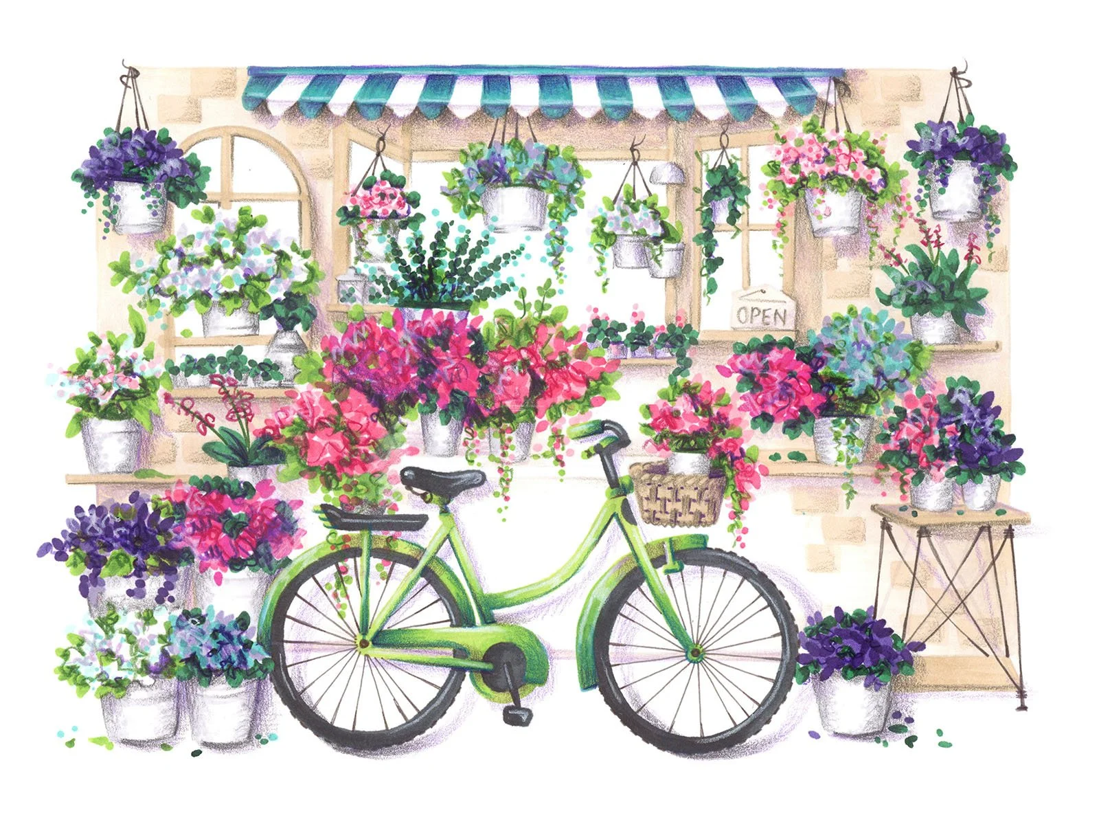
And it looks really easy in this newsletter because you don’t see me putz around on the computer for hours trying to find the right aqua for a halfway decent background— and to be honest, that white behind the bicycle took me forever to think of.
It’s harder when you’re home alone and feeling totally out of your element.
But it’s true, you are out of your element— and you will be until it gradually becomes your element.
To master color palettes, you need to work with color. Do the fixing, follow the steps.
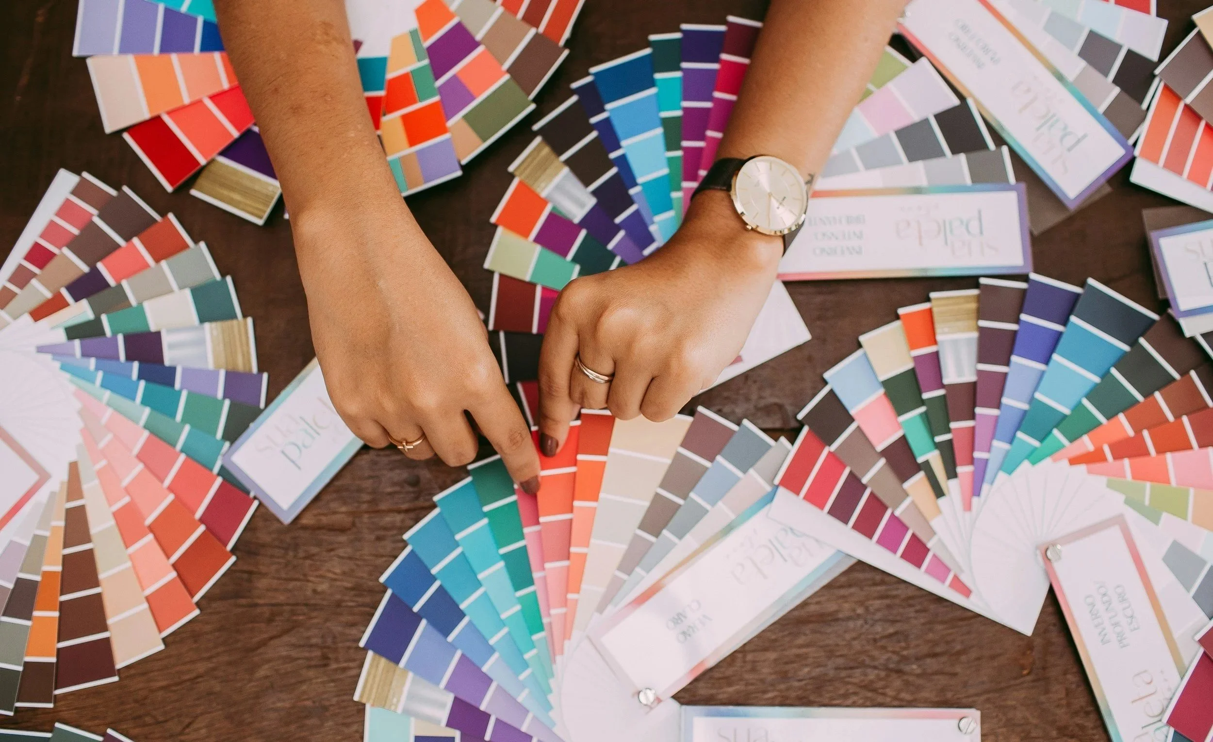
Color tools like the Color Cubes give you a head start. You don’t have to dream-up your own starting colors, you can choose from hundreds of beautiful options.
Then the real learning happens when you modify the palette and see if your fixes actually work.
The more you work with color, the easier it gets.
Eventually, it clicks for everyone,
Even you.
One fine day, off in the not-so-distant future, you’ll realize you don’t need your Color Cubes or palette apps anymore. You’re inventing workable palettes automatically in seconds, going through all my steps without even realizing it.
Just like your socks.
I want that for you. So let’s work on it.
SUMMARY:
Beforehand:
Free palette resources are often as good as paid tools and books. Remember, you’re looking inspiration, not a palette to copy literally.
Digital palettes look brighter and cleaner. Real art supplies always look dull next to digital color.
View every palette in isolation. Your color senses can be easily overwhelmed.
If you buy a collection, organize palettes into rough groups by temperature or the general color vibe. Do not organize palettes by photography themes.
Think outside the box, don’t use ocean themed palettes to color fish. Literal is the enemy of art.
Modify the palette for use:
Don’t worry about finding an exact match for every swatch. Look at where the color appears in the inspiration photo to see slightly different shades of the original color, then find a marker/pencil which fits into the photo. Close is fine. Almost-close usually works too.
If you haven’t yet developed the ability to see the value of a color, pay attention to the last numbers of the markers you’ve matched. Many palettes are all light colors, all medium, or all darks. These palettes require value adjustments.
If your palette needs value balancing, choose one blend for every swath from different value ranges. In a 5 color palette, you want one of each:
Light
Medium Light
Medium
Medium Dark
Dark
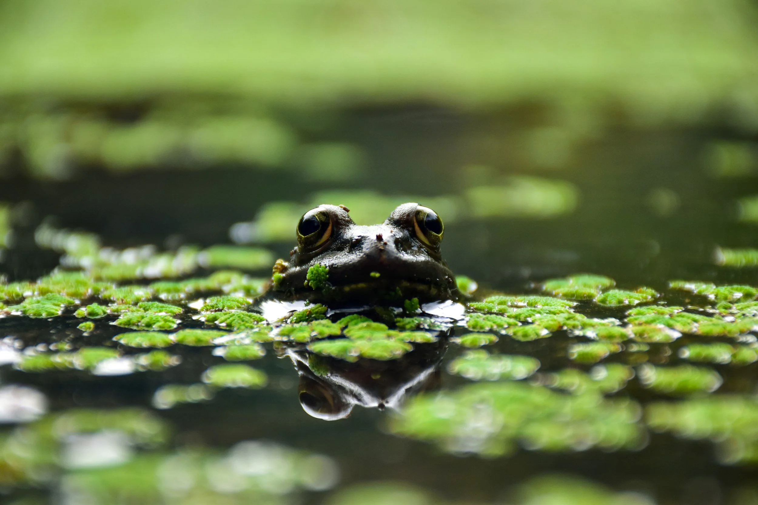
4 . Every object in your project needs to sit in one of the above five values but pay attention to the things touching each object. If the frog and the pond are both the same value, it will feel flat. Similar values visually merge together.
5 . Too much contrast is also not good. Large blending combinations are especially dangerour. When the frog is blended with every value of green from light to dark and the pond is also every value of blue, the project will be visually confusing and extremely unpleasant to look at.
6 . Apply the 60-30-10 Golden Rule to every project. 60% should be quiet and backgroundish colors. Color 30% with medium volume colors. Reserve your attention grabbing color as the pop (10%).
7 . For shade and shadow, desaturate colors with gray (or underpaint with complements to make muddy color). Shading with clean color adds a new color to the palette and skews the 60-30-10 ratio.
8 . Whenever possible make your 60% neutral. Neutrals can be grays, white, soft black, beige and browns, or even blackened gem tones.
IF YOU LIKED TODAY’S ARTICLE, SUPPORT FUTURE FREE LESSONS

Choose your own adventure…
Color Wonk is a great way to develop automatic color instincts.
Starting with a large collection of intermediate projects, you’ll learn why specific color combinations create depth, dimension, texture, and realism.
We build skills with colors that actually work.
Then as you progress to the advanced section of Color Wonk, you’ll begin choosing your own colors and fixing your own color mistakes
All with helpful guidance.
Finally, in Color Coach you’re making independent color decisions and experimenting to find your unique color voice.
The thing people misunderstand about my coloring lessons…
Is that I’m not teaching you to color like me.
You’re learning to color like YOU.
The artist you were born to be.


Color Coach gives you hands-on color theory experience with lots of encouragement.
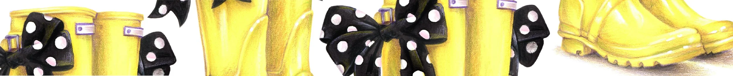
These yellow rainboots are not yellow— they’re a mix of yellow, orange, chartreuse, and violet.
You’ll never get to realism and artistry if you color the boots pure yellow.
I teach students to play with color— finding their own coloring style and unique color voice.
Copic probably sells a ton of pink markers…
OMG, yes Amy! I love coloring pink flowers, pink cupcakes, pink everything!!!
What I notice about pink projects is that very few look light and delicate. We use pale pink markers but the results are dark or bright.
The sad truth is, the longer it takes you to color something pink, the darker it gets.
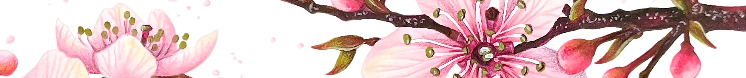
Cherry Blossom reveals the secrets to coloring the perfect baby pink which actually looks soft and delicate when you’re done. Whether you’re coloring flowers or girly-girl projects, let’s learn to end a project with the same pale pinks we started with!
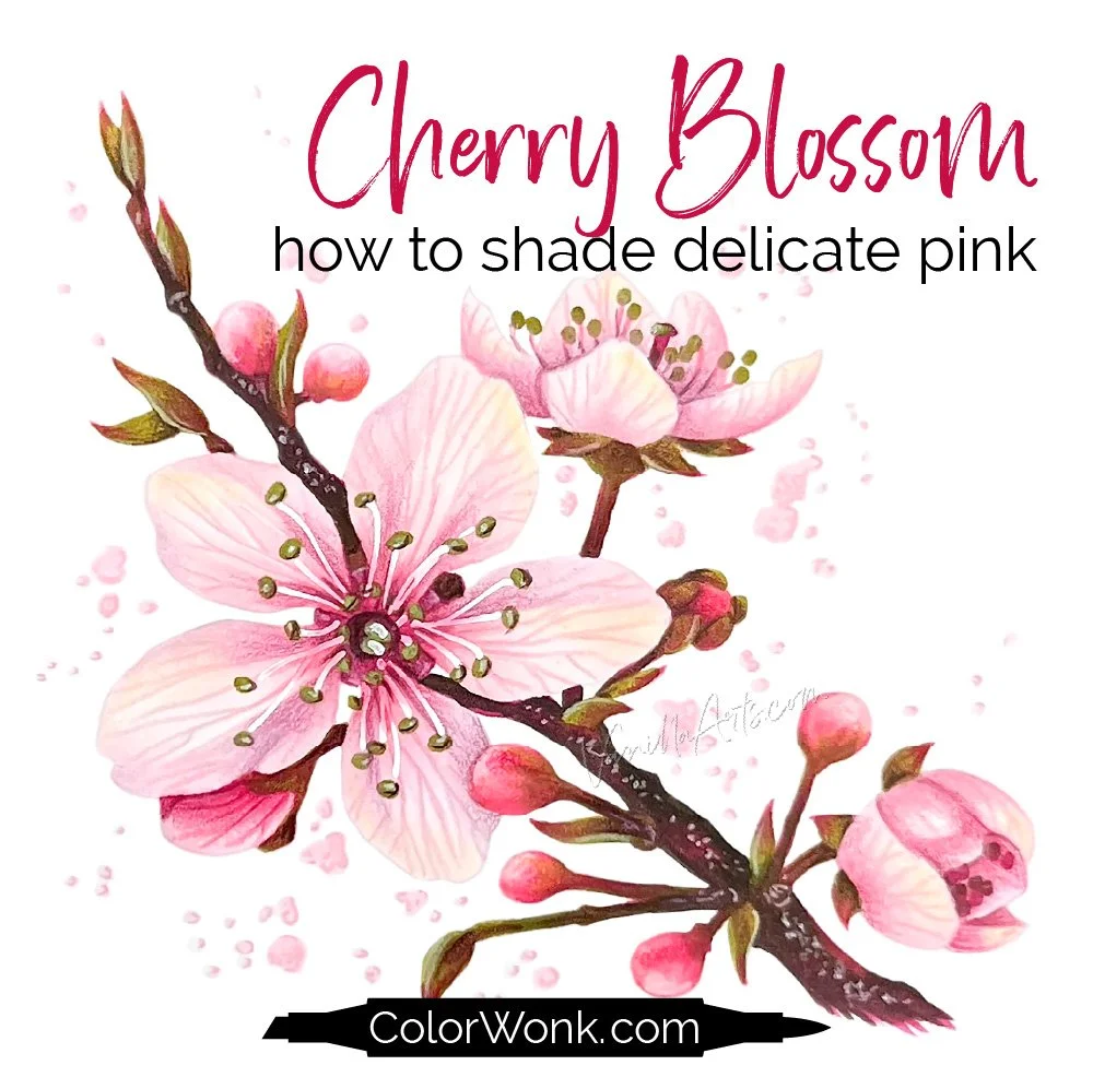
Cherry Blossom is only available through Color Wonk
A library of new and classic courses is waiting for you. Instant access. No deadlines.
Real art lessons, not nifty novelty techniques

CURRENT PASSWORD: RubberDuckie
MY MOST-USED PENCIL COLORS
Affiliate links help support the free content here in Vanilla Beans
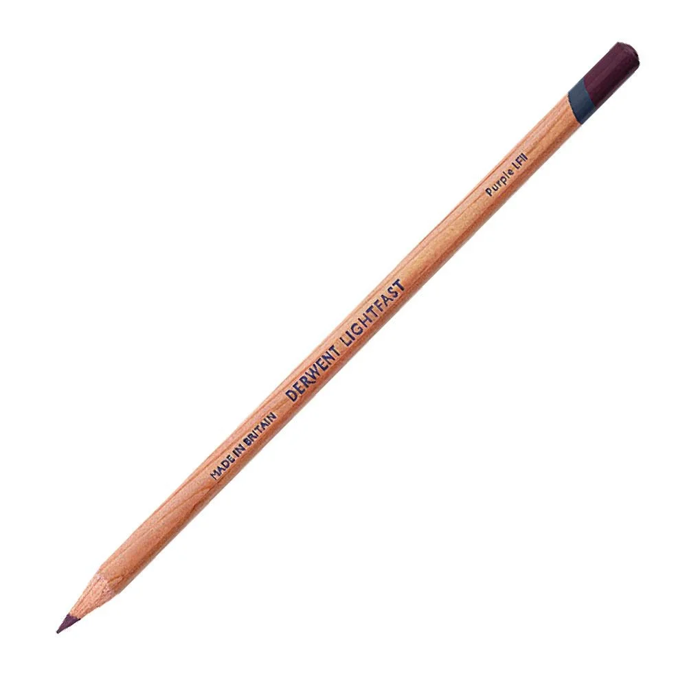
Universal shading color
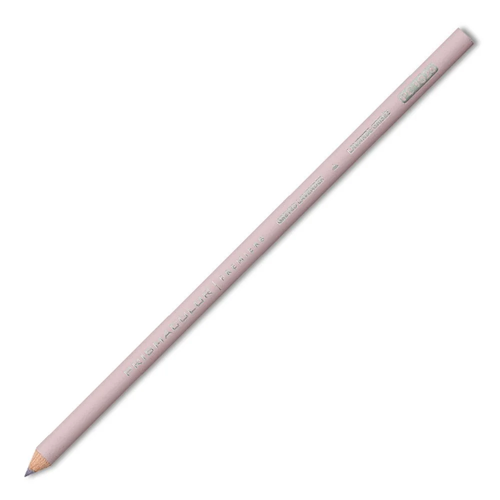
Universal shading for light colors
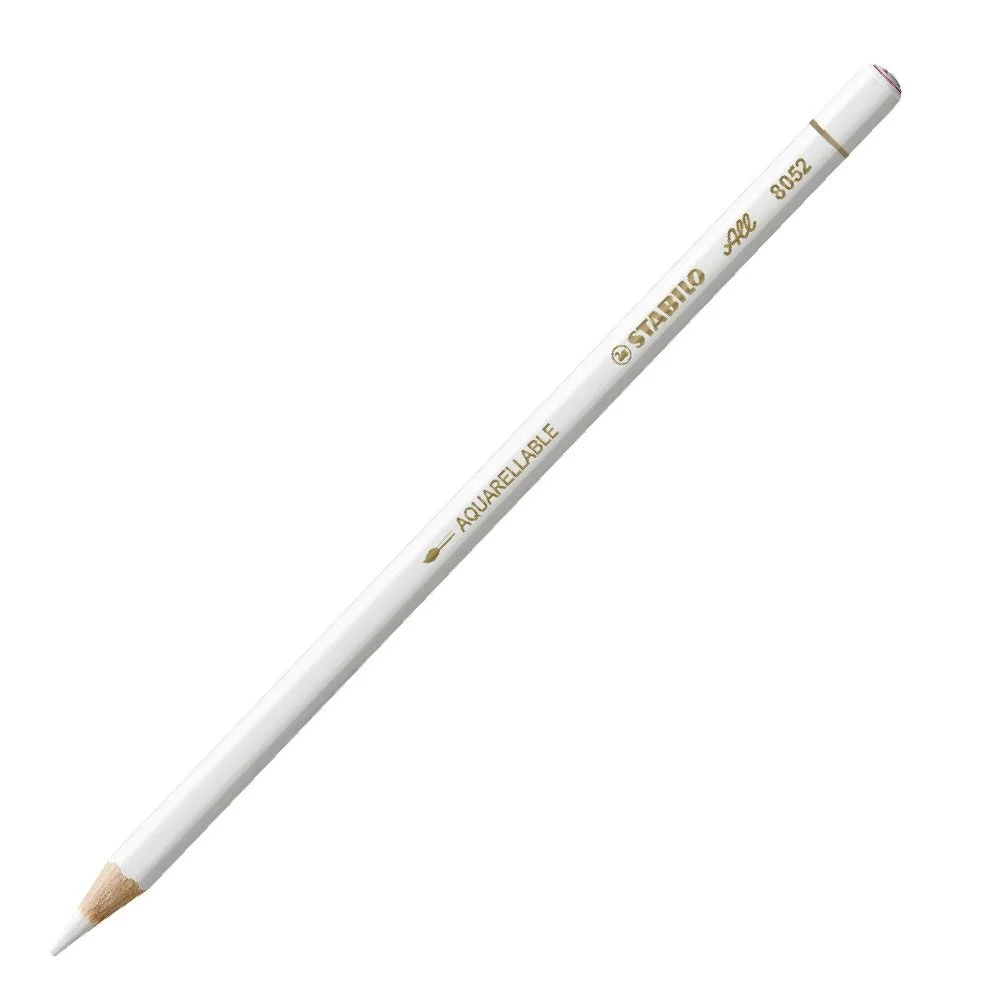
Opaque and sticks to anything