Cube 6: I Bet You Think This Song is About Hue
Thanks for taking the jump to read today’s newsletter. If you landed on this page by accident, subscribe to the Vanilla Beans Newsletter here.

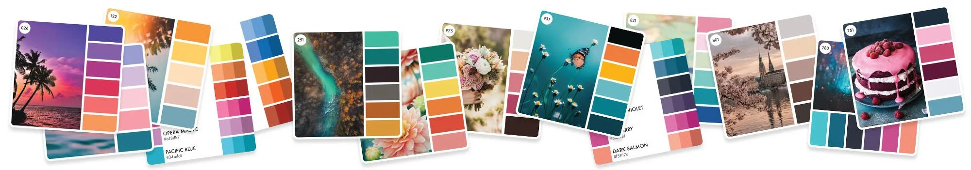
In our last Color Cube article, we explored how good color palettes tell a story and bad color palettes cause visual confusion.
I must have struck a chord because I’ve been getting some really good questions about composition and color. So instead of doing my next cube lesson, let’s head back and clarify a few things.
Remember, you can’t take Color Cube palettes literally.
Every card is an idea.
Not a supply list.

Remember to use the link above when shopping at Blick. Vanilla Beans runs on affiliate earnings.
Purchase Color Cubes with the affiliate link above to support my work here at Vanilla Beans. Every issue of Beans takes about 8 hours to write and Beans is always FREE. Without your support, there’s simply no way I can keep writing weekly free lessons.
I BET YOU THINK THIS SONG IS ABOUT HUE

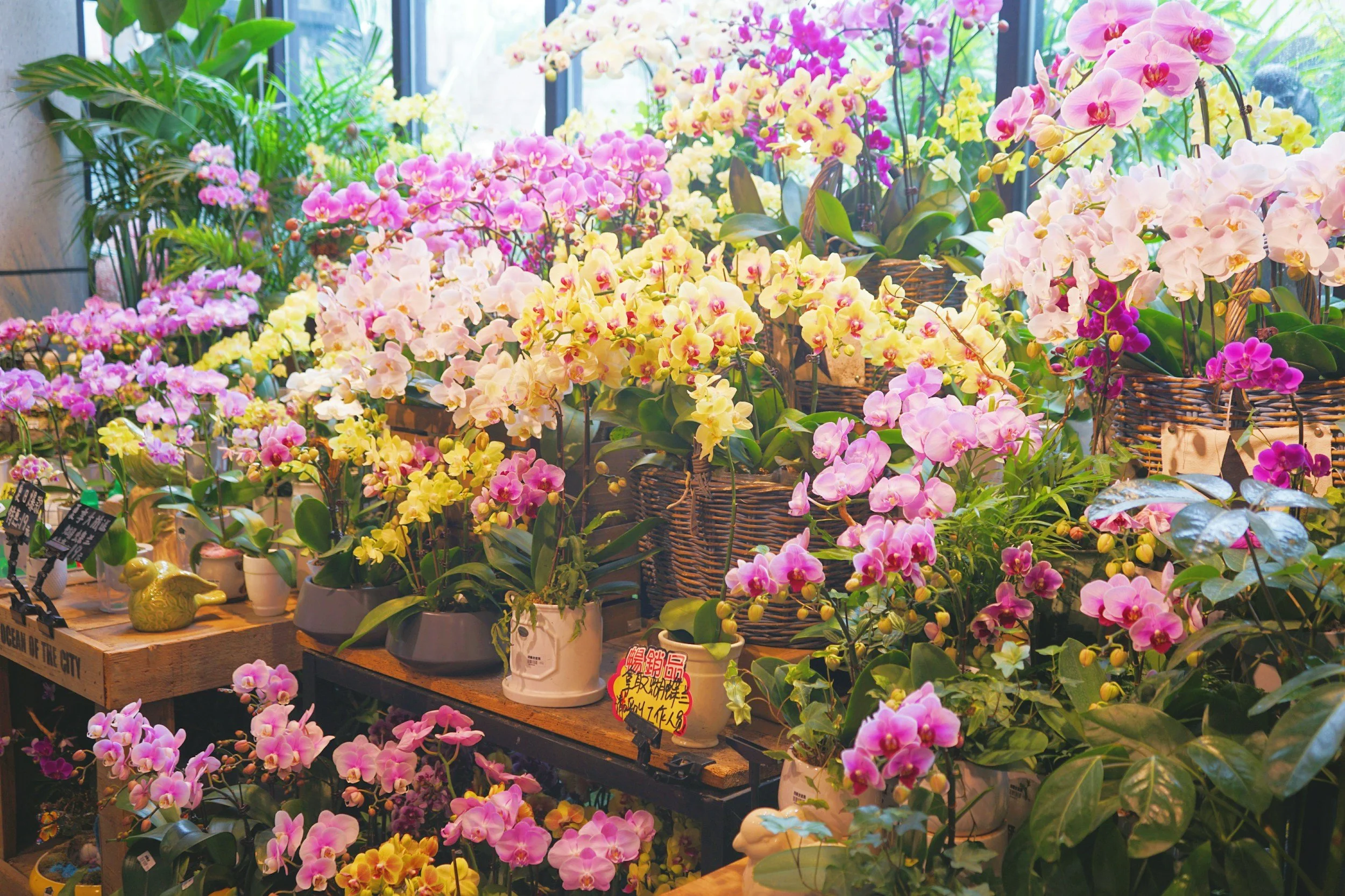
In our last episode, we talked about the problem with cozy coloring books. Every page has dozens of objects to color and people use every marker they own. The projects all start to look alike because everything’s rainbow overkill.
You know it looks like a crazy circus.
And sure, some people do the circus really well… but when you try?
Emphasis on crazy rather than circus, right?
Colorfluencers often recommend Color Cubes as the solution. Simply pick a card and use Sarah’s “professional” color selections…
But it doesn’t help.
It’s color-coordinated, but it’s still a circus.
So I showed you how the Color Cube palettes are out of balance and I gave you the fix:
Switch up the values.
And darn it! I shouldn’t have to teach anyone this.
The fact that Sarah didn’t balance these values for you? Especially before selling cubes worldwide???
Kinda skeevy.
Again, if this sounds like gibberish, you really need to go back and read the last lesson. It’s important.
Yes, the color palettes are good.
No, you shouldn’t use them without adjustment.
And I get it, the whole point of Color Cubes is to make life easier. Now you gotta think hard.
Kinda defeats the purpose, eh?
Which I guess is why some are asking:
Couldn’t I just pick a card that suits my project better? There’s nothing wrong with the blue and green palette. It just wasn’t intended for Easter.
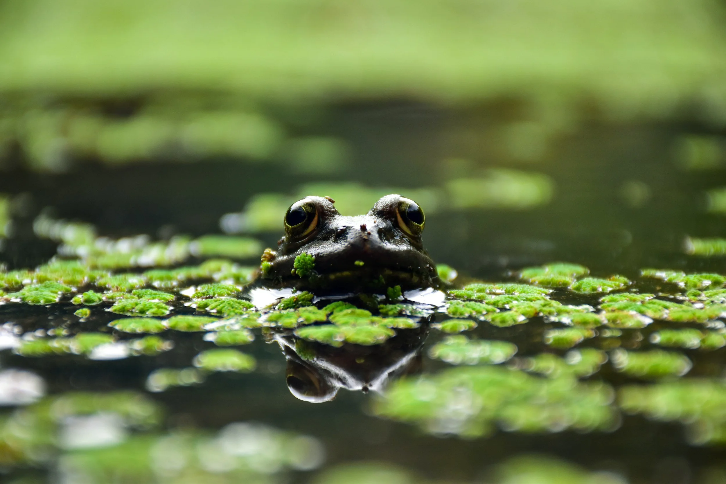
To test this theory, let’s create the perfect project for our blue and green color palette.
What could be more green than a frog sitting on a lily pad?
And what’s more blue than a summer sky over the frog pond?
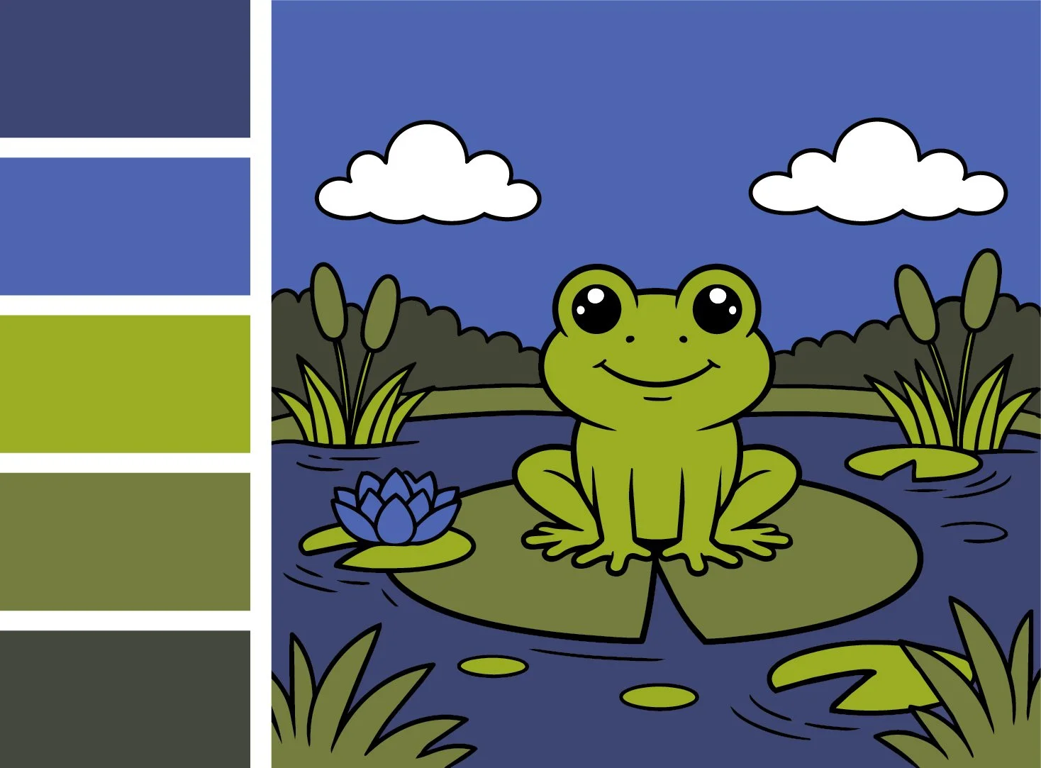
Here’s what we get.
Friends, I’d have been fried alive by art professors for this. Even the children’s illustration instructors wouldn’t accept it. No publisher would ever take this to print.
Because it’s a monotonous medium-dark value range.
Sadly, this cozy frog pretty much sums up the exact problem faced by most colorists today.
You think in terms of hue.
And because you’re learning from other colorists who also think in terms of hue, nobody notices how self-defeating this is.

What is a hue?
Hues are the bright and pretty colors on a color wheel.
Colorists are suckers for a good hue— open a box of cheap art supplies and it’s Hue City.
It’s always hue time somewhere.
But here’s the thing about hues: they’re pretty limited. You can only do so much without shade or highlight colors. Depth and dimension are darned-near impossible with only hues.
But you like the pretties, so you ask around. Maybe someone else has figured out how to make hues work.
What’s the best green for a frog? What’s the best blue for a summer sky?
That’s the hue trap— you think there’s one best hue for everything.
Frog green. Lily pad green. Grass green. Your coloring will be totally amazing when you finally find the perfect hue.
This is why you own 5,000 colored pencils.
Or why you feel deprived for not owning 5,000 pencils.
What folks in the Hueniverse miss is that human brains don’t care about hue.
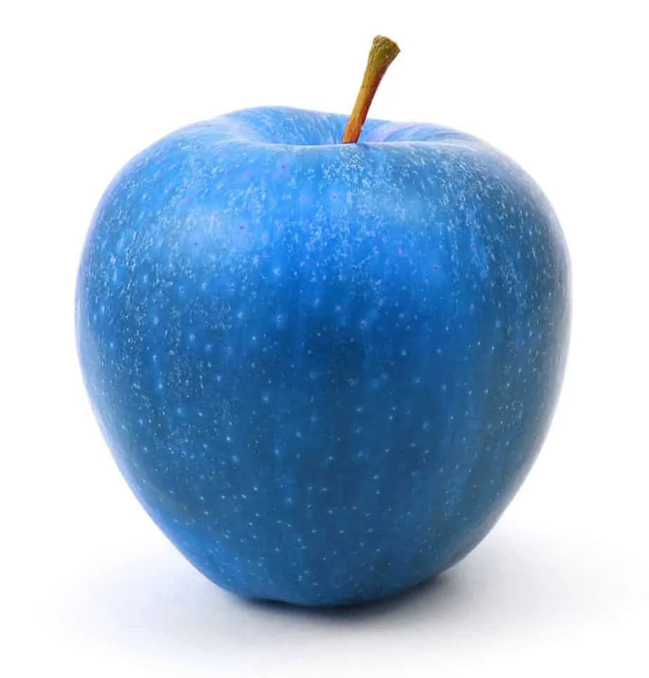
I mean, nobody thinks this is a blueberry, right?
So no, the reason your coloring looks flat and cartoonish is NOT because you don’t own the best red for an apple.
The human brain can instantly identify millions of distinct and diverse objects. Color barely plays a role in the diagnostic process.
My youngest son is red/green color blind and even he can tell Granny Smiths from Honeycrisps.
He can’t see your “best hues” and yet he’d never accidentally bite into an onion because color isn’t the driving characteristic.
How does he see?
He sees value. He sees shady desaturation. He sees texture and form. He sees all the things Huenitarians ignore.
What he can’t see is our cozy frog.
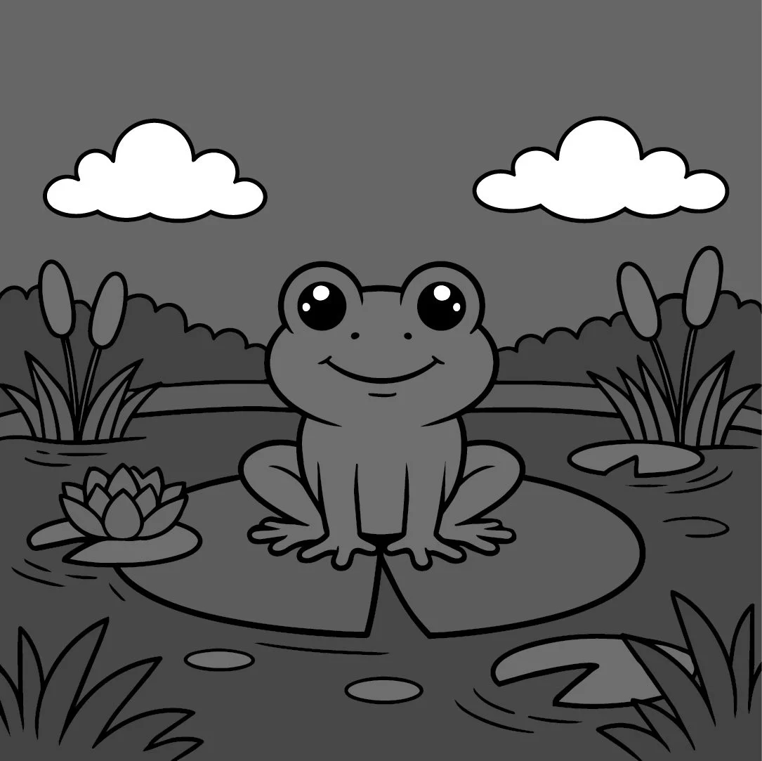
When the frog value matches the value of the sky, land, lotus and lilypads…
It doesn’t matter that you used totally different green and blue markers.
That’s not what our brain reads.
We use value to figure out whether this is a frog, a bear, or a cow on a unicycle.
Too much of the same value feels confusing. It’s visual mashed potatoes.
Everything mushes together because our brain is looking for value differences which don’t exist in cozy projects.
Cozy coloring feels wrong.
So the froggiest green marker is a total waste of time and money if you keep using it with similar values.
Other readers had a good point—
Actually, you need more contrast. The eggs and grass in your samples were very flat because you didn’t blend for depth or dimension. Dimensional coloring techniques would make the color palette cards work better.
Okay, let’s add some good ol’ blendy contrast.
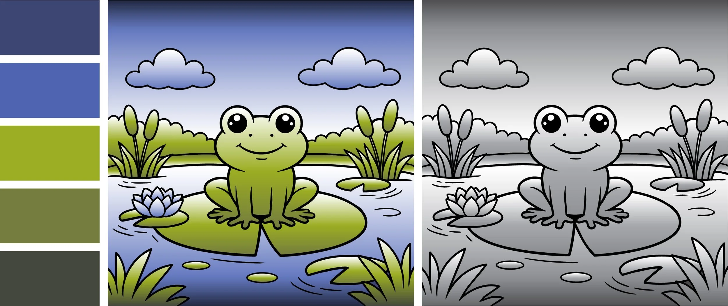
It’s cute but we kinda made the problem worse.
Mo’ blends, mo’ better?
Nope.
You can’t just slap a high contrast blend on everything in the image. That’s just more visual mashed potatoes.
The black and white version shows you exactly what’s gone wrong. Before, we saw the same value everywhere. Now we see the same gradient everywhere.
The answer isn’t to make the blends more contrasty.
You don’t need more contrast on the frog.
You need more contrast between the frog and everything else.
Okay, let’s add the right kind of contrast:
We did the same thing in the previous cube lesson but I’ll break it down for you in more detail.
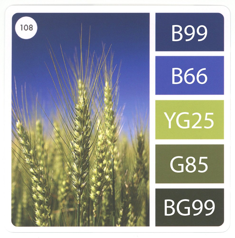
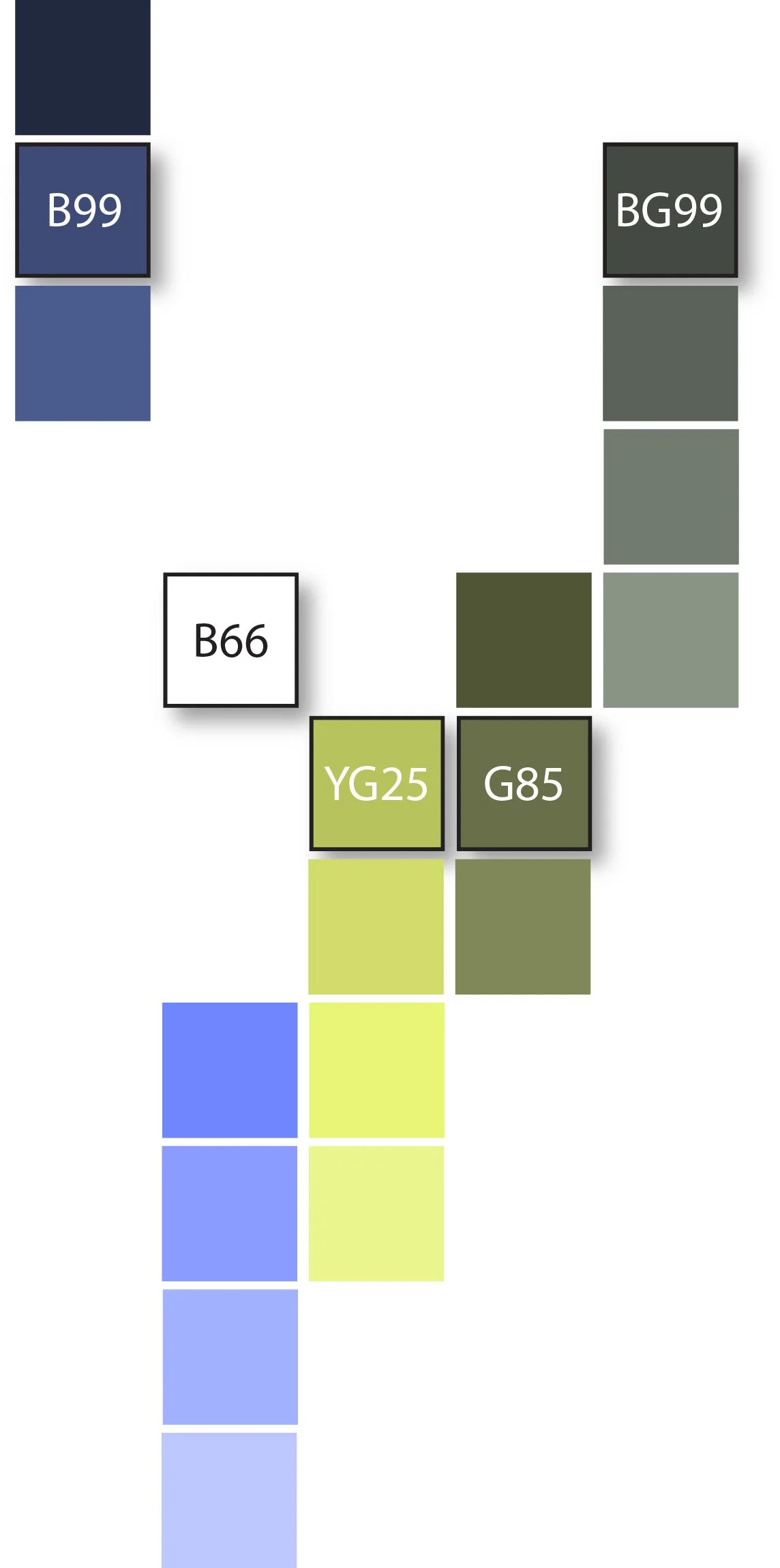
First, hold the card up to your Copic collection and match every swatch to a marker. Sometimes you won’t see a match and that’s fine. Just choose the closest color you own. Remember, there’s never one best color!
Now notice the last numbers of your five Copics. In this palette, everything ends between 5 and 9 which means we’re dealing with five markers that are all medium-dark in value.
These values are too close to provide adequate contrast. Ideally, we’d want some markers ending between 0-4 in the mix.
This is what I mean when I say Color Cube palettes are UNBALANCED. It’s not just a couple of cards. Most cards will measure 5-9, no matter which box you try.
Too many high numbers, not an even assortment of light to dark values.
You’ll always have to fix this.
3. The solution is to think of each palette color as a full range of possible values.
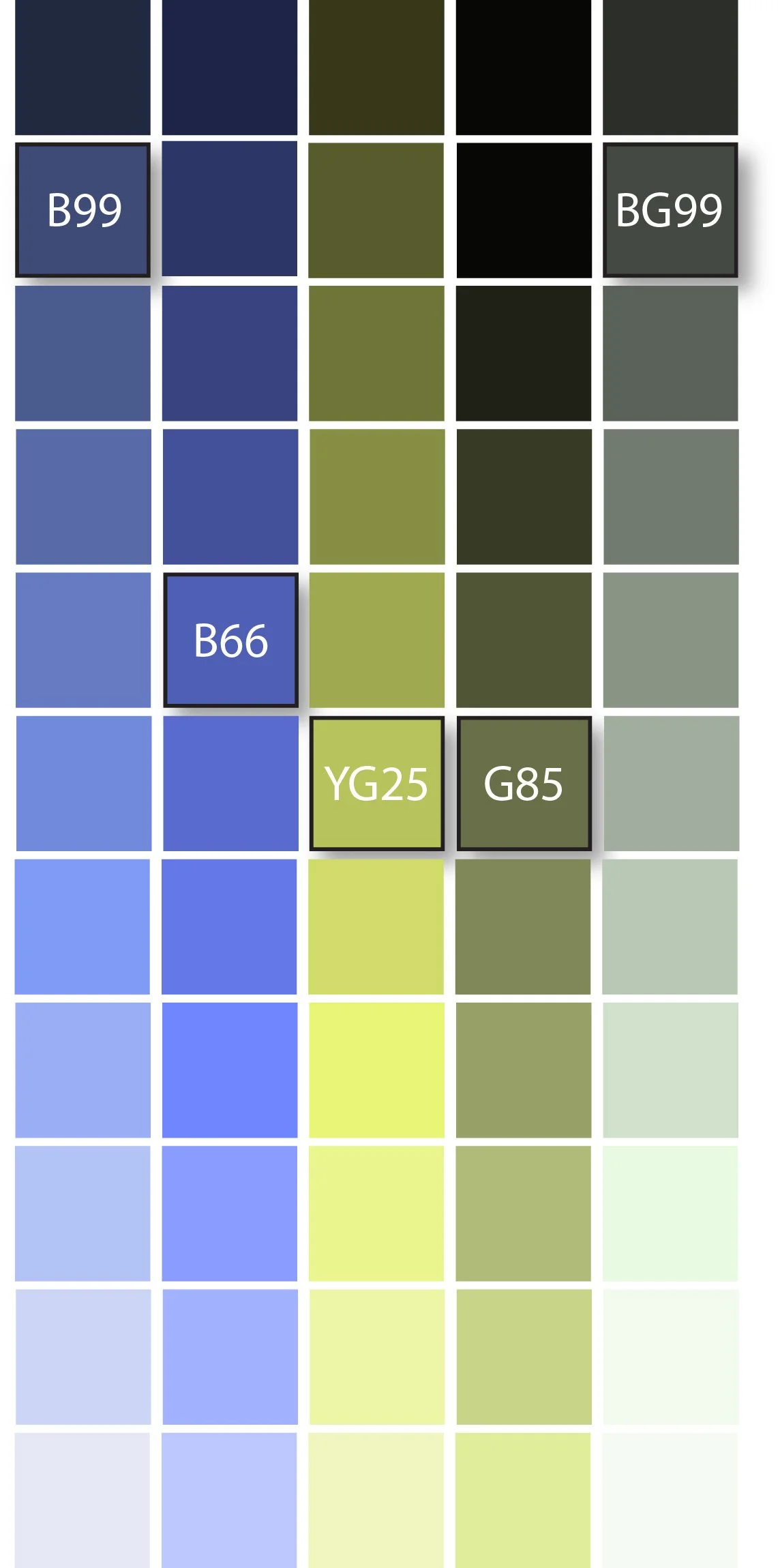
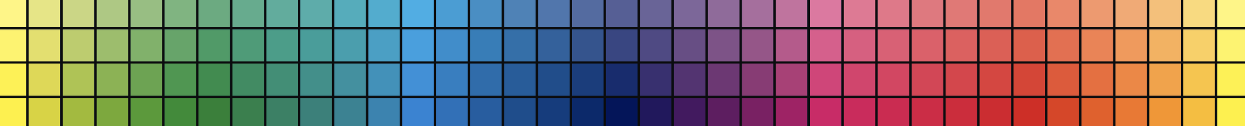
So yes, we matched the swatches to five Copic markers but there are hidden marker options.
Every marker has lighter and darker versions- they’re all different values of the same hue.
B99 can also be B97, B95, B93, or B91.
B66 could also be B69, B63, or B60.
Anything on this value chart will work on our frog project.
Now here’s where we fix the contrast problem.
Remember, we’re not adding contrast to the blends.
We need contrast between the blends.
4. Find every B-Ninety marker you own. Grab all the B-Sixties too. Pull the entire number family for every marker in the palette.
Pencil people? You’ll pick light and dark pencils with the the same general flavor. And remember, you can also decrease or increase pencil pressure to change the value.
Now let’s make some blending combinations but here’s the trick—
One blend must be very light
Create a couple of middle value blends
Then finish with at least one dark blend which darkens almost to black
Here, I chose not to use B66 even though it’s on the palette card. Instead, I’ll use lighter versions of B66 to color a light blue sky.
And here’s a mockup of the completed project.
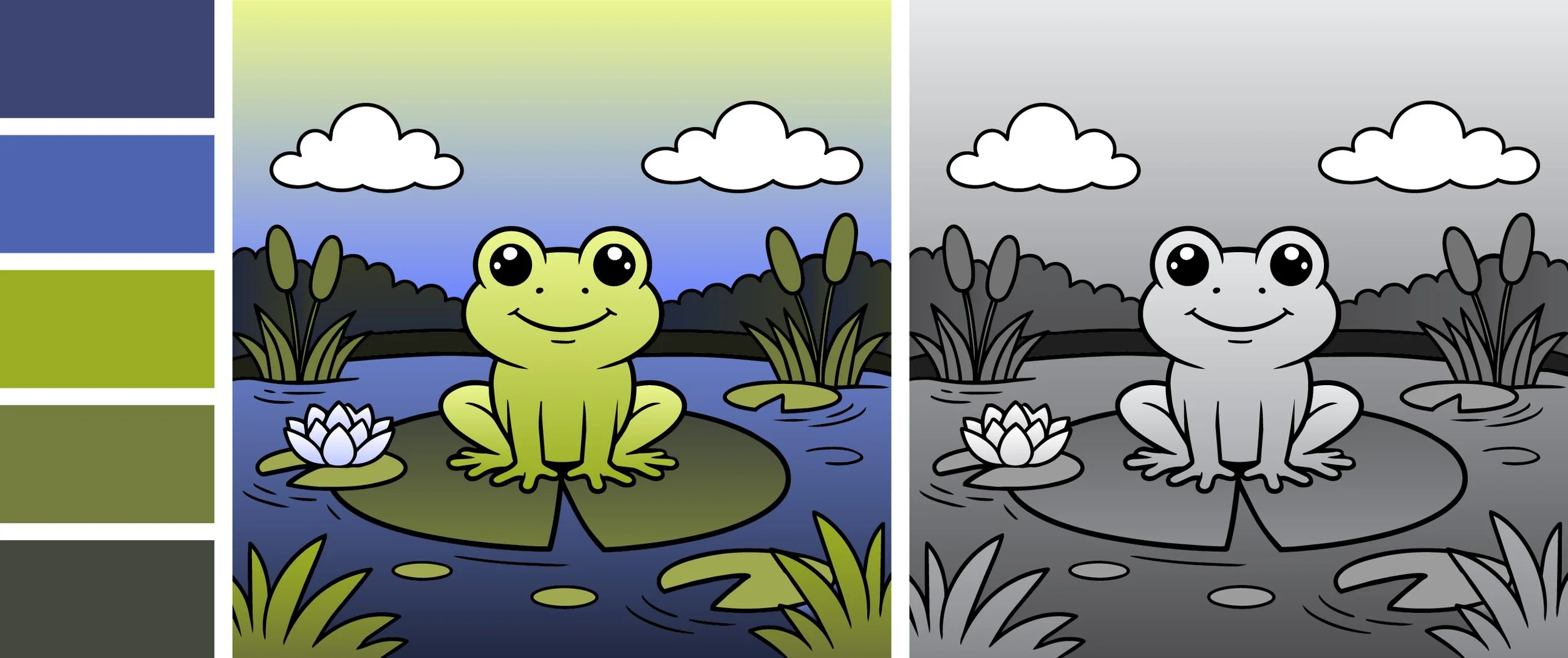
Notice that your eye goes immediately to the frog. He’s the focal point, the star of the show. I’m directing your attention to the frog by making him a light version of the brightest green and then everything behind him is darker.
And the proof is in the black and white version. When you remove the color and leave nothing but value, the color composition should still work. No mashed potatoes!
The frog pops.
But he doesn’t pop because of the hue.
He pops because of the CONTRAST between the light green and the darker lily pad and water blends.
This is what I meant by color composition— controlling your viewer’s eye. I’m literally telling you:
“Look at the frog, now look at the flower, then roam your eye around but come back to the frog. Isn’t he cute?”
Good art tells you where to look through the use of color.
Cozy coloring or that same-same-same mashed potatoes vibe happens when you don’t control the hue.
But wait! There’s more to the story of our little frog.
Yes, he pops because of value control but I’m also being very sneaky.
I’ll tell you all about it next week.
IF YOU LIKED TODAY’S ARTICLE, SUPPORT FUTURE FREE LESSONS

SPRING SESSION - BEGINS MAY 1ST
Do you get nervous with a colored pencil in your hand?
My 12 week colored pencil course takes you from barely beginner to WOW!
In The Point, we fix all the little bad habits and assumptions which make colored pencil harder. We fix your grip and your pressure. We keep going until you’re coloring with amazing realism.
My courses are lean, effective, and worth every penny.
Enrollment is via waitlist only. You must be on the waitlist to enroll.

Color theory isn’t something you read and then instantly know. It takes time to figure it out. That’s what Color Coach is here for, hands-on color theory experience.
This seahorse isn’t just a couple of aqua markers and pencils. To make blue-green look it’s best, you need a host of supporting colors… and a little contrast?
I teach students to play with color— finding their own coloring style and unique color voice.


SECOND TUESDAY STREAM
Ever had a pale marker go crazy, damaging the beautiful blend it was supposed to smooth?
Maybe that stinker ate into the dark color and left a bunch of speckle spots?
Or even worse, the pale marker left a dark bathtub ring after it dried?
Join me for a serious look at ink chemistry. It’s a total myth that you can blend with any ol’ light marker. No matter what brand of markers you use, there are hidden bombs in every color family just waiting to destroy your beautiful coloring.
Tuesday, April 14th at 2pm EDT
(recorded version will be added to our lesson library)
2nd Tuesday Streams are one of the many benefits of a Color Wonk membership. Join today for instant access to dozens of workshops, video archive, and supportive community.

The worst part about alcohol markers is that they blend so smoothly…
Wait a minute, Amy! I love smooth blends!
Exactly. That’s the problem.
Not everything in life is smooth. Blending often destroys realism.
Robin’s Nest is an introduction to hand drawn texture. Rather than fight our markers to create texture, let’s switch to colored pencil— a medium which makes beautiful texture!
Don’t be nervous, you CAN draw texture. It’s easy.
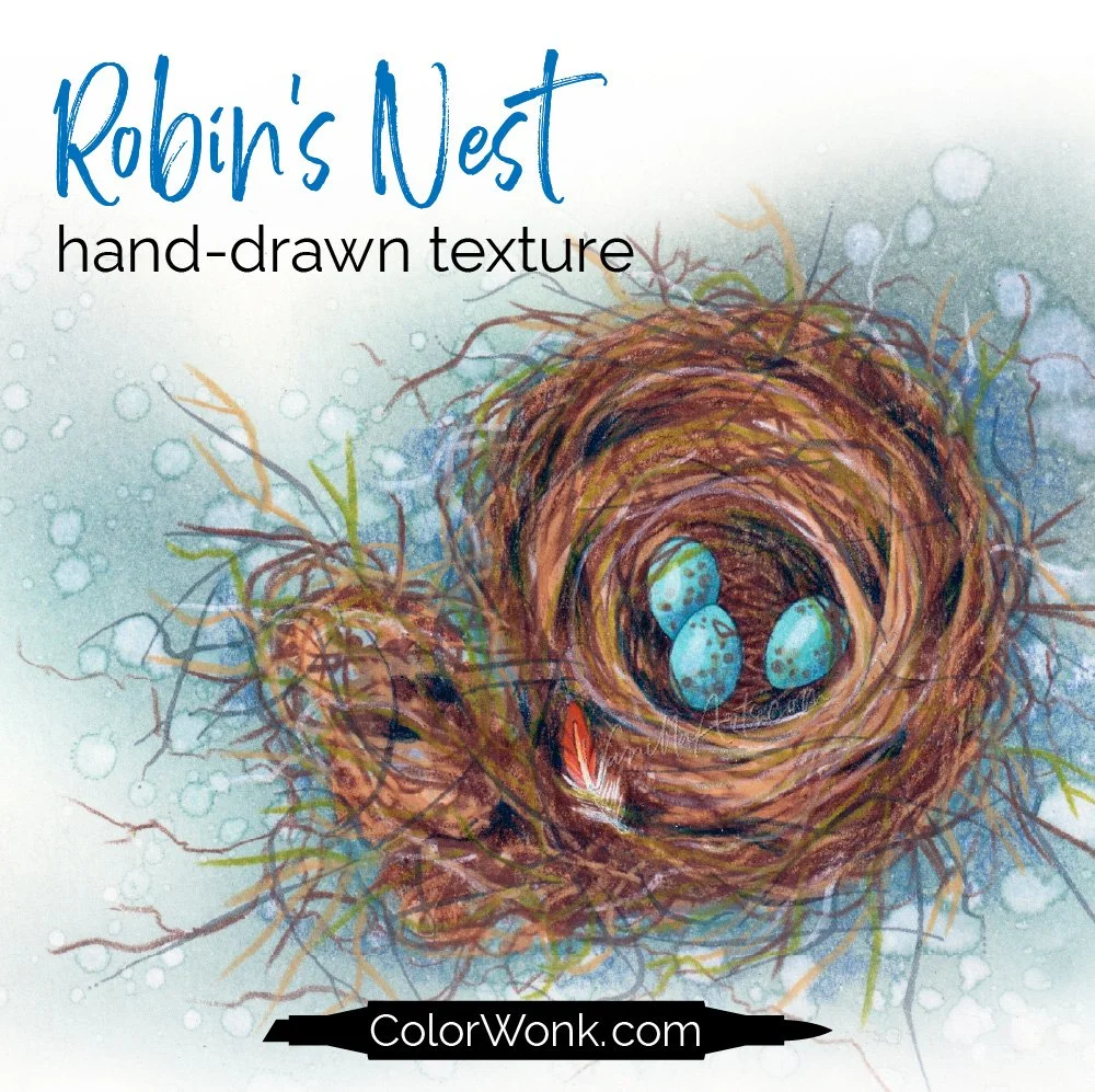
Robin’s Nest is only available through Color Wonk
A library of new and classic courses is waiting for you. Instant access. No deadlines.
Real art lessons, not nifty novelty techniques

CURRENT PASSWORD: RubberDuckie
MY FAVORITE COLORED PENCIL ERASERS
Affiliate links help support the free content here in Vanilla Beans
For light mistakes and gentle lifting. One pack lasts for years!
Erase tiny areas with maximum control, clean-up edges, or smudge
For true mistakes, can lift most of the wax back to the paper level