Cube 9: Snazzy Red Sneakers
Thanks for taking the jump to read today’s newsletter. If you landed on this page by accident, subscribe to the Vanilla Beans Newsletter here.


Gosling update:
From 14 eggs to 11 hatchlings and we lost 3 more this week. Babies exhaust themselves getting out of the egg, some never recover. To get nine Pilgrim goslings is like winning the lottery.
A lottery I didn’t want to win— but I’m glad Dolly makes healthy eggs and she’s a great mother.
I’ve sold four, so we’re down to five little girls. My goal is to keep two. I’m hoping for at least one more customer.

Shopping soon? Remember to use the link above when shopping at Blick. This newsletter survives on affiliate earnings.
Sorry, I have no good photos. Last year’s geese were hand-raised in my bathtub. I was their mother and they happily posed for pics and videos.
This year’s troop are goose-raised, practically wild. My presence triggers an Iron Dome of honks and hisses. I rarely see more than fluffy butts scampering under a wing.
Babies, don’t run from grandma!
I’ll try for real pics this week.
Purchase Color Cubes with the affiliate link above to support my work here at Vanilla Beans. Every issue of Beans takes about 8 hours to write and Beans is always FREE. Without your support, there’s simply no way I can keep writing weekly free lessons.

SNAZZY RED SNEAKERS
We’re almost done with color palette lessons— the tips and tricks, ratios and rules.
But that ain’t the whole story.
Up until this point, I’ve been giving you smart but generic advice.
“If you use a pre-made color palette, here’s how to use it better.”
Today, let me walk you through my actual process. Not what I tell you to do.
What I really do.
Because even if these were my five most beloved favorite colors…
Which they’re definitely not, but even if they were…
I would still never color everything pink, violet, aqua, and green.
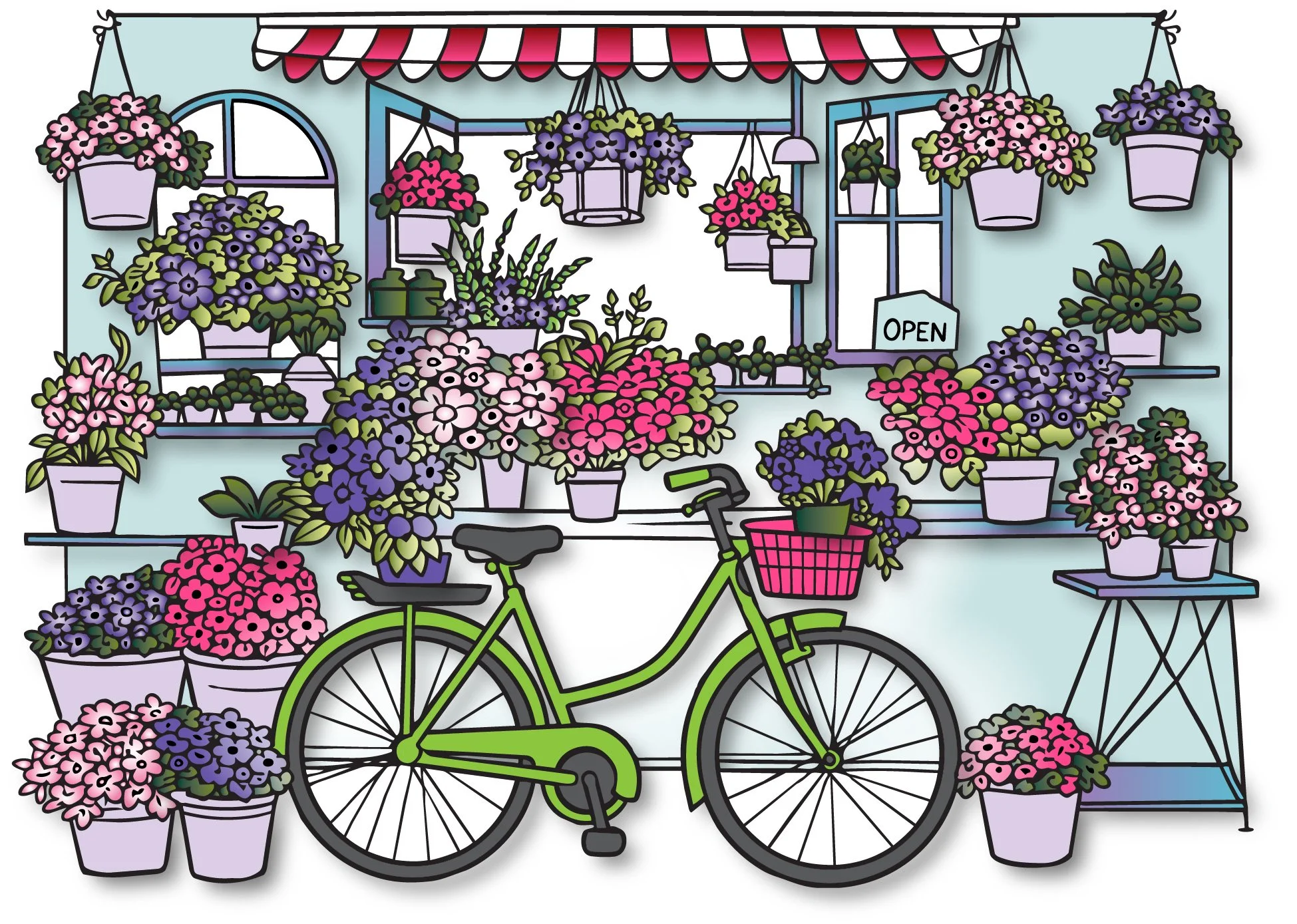
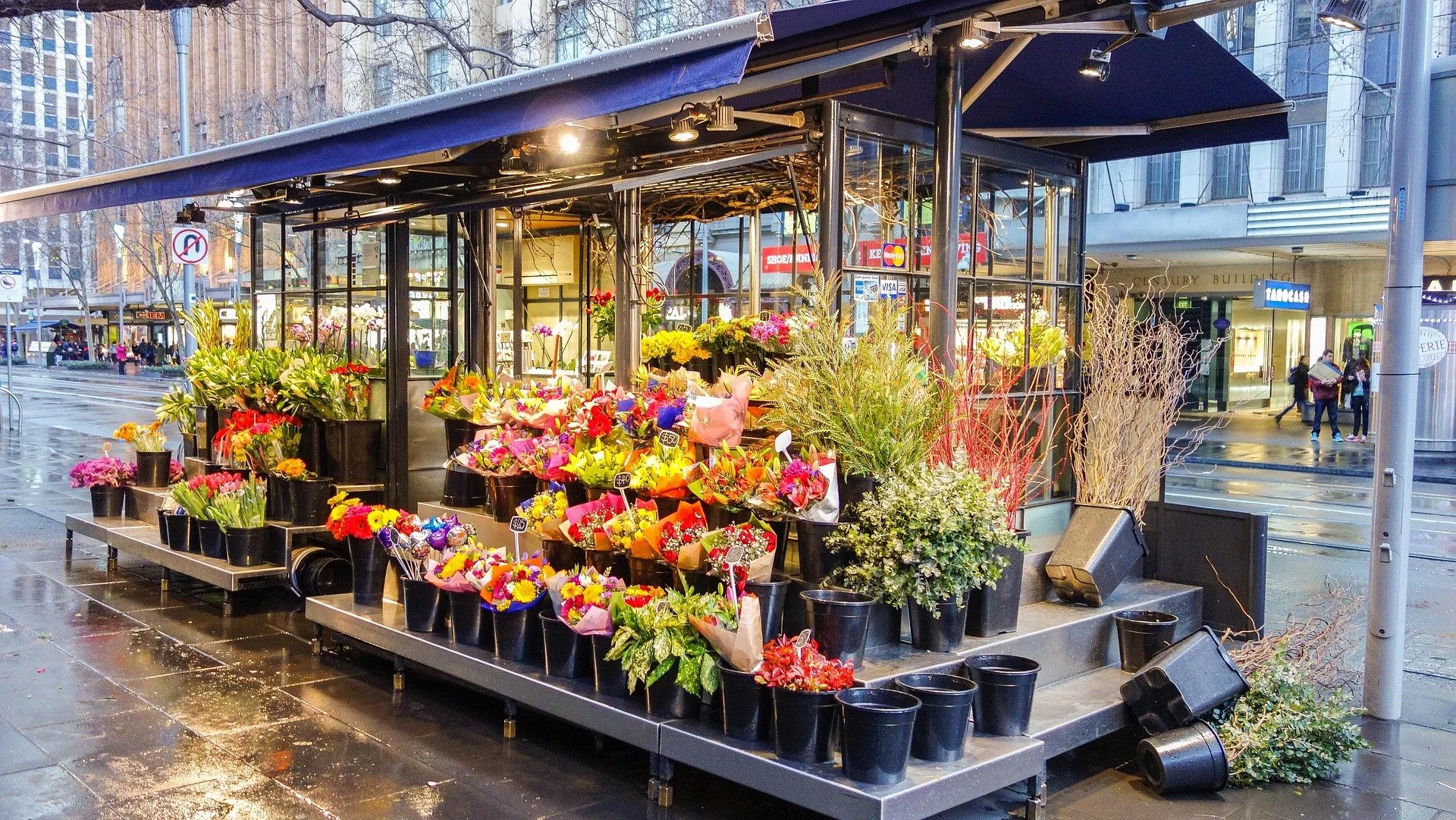
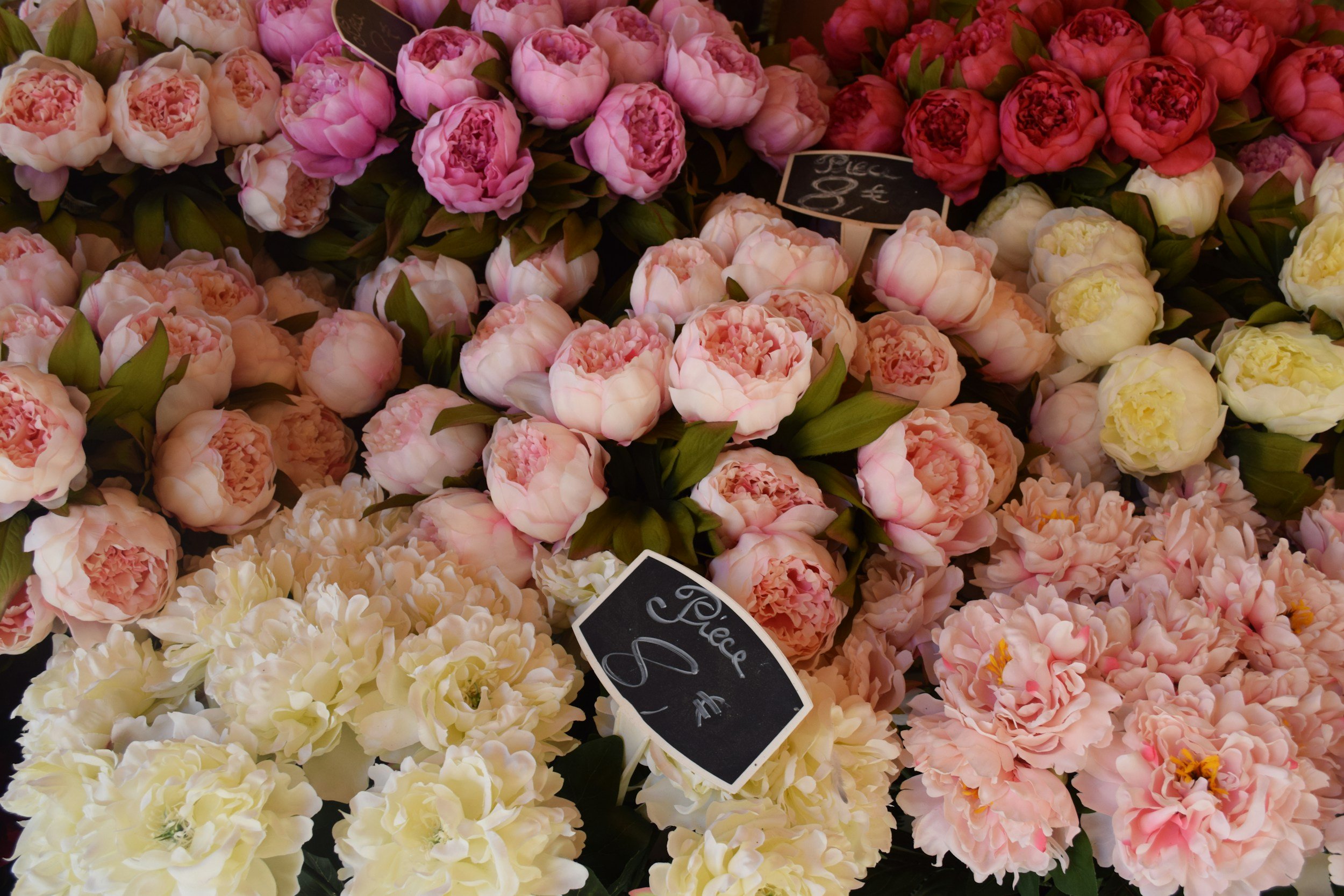
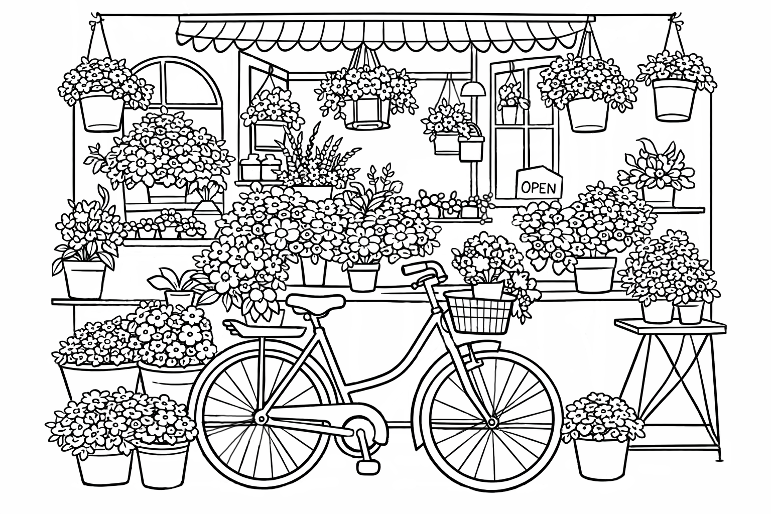
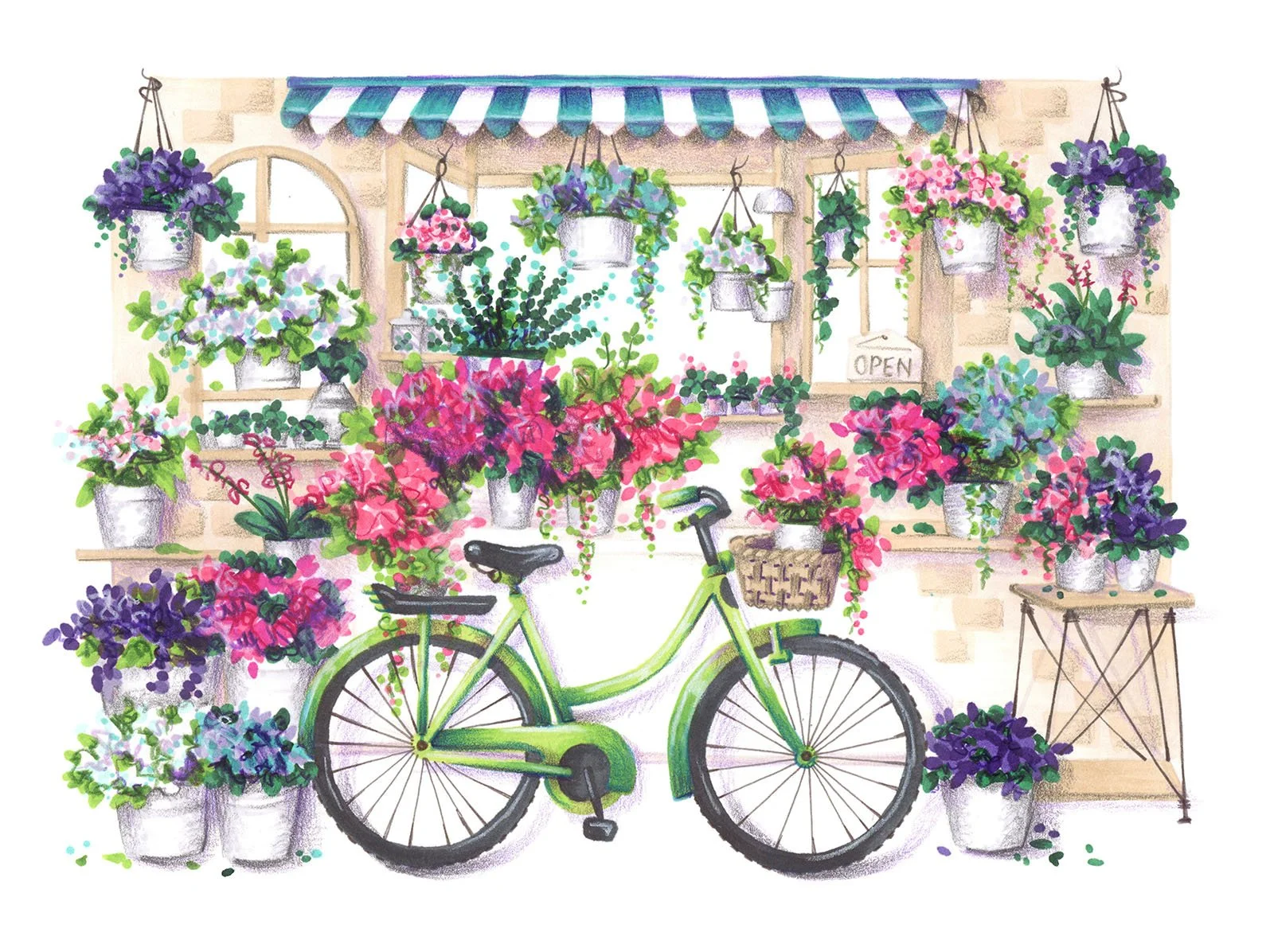
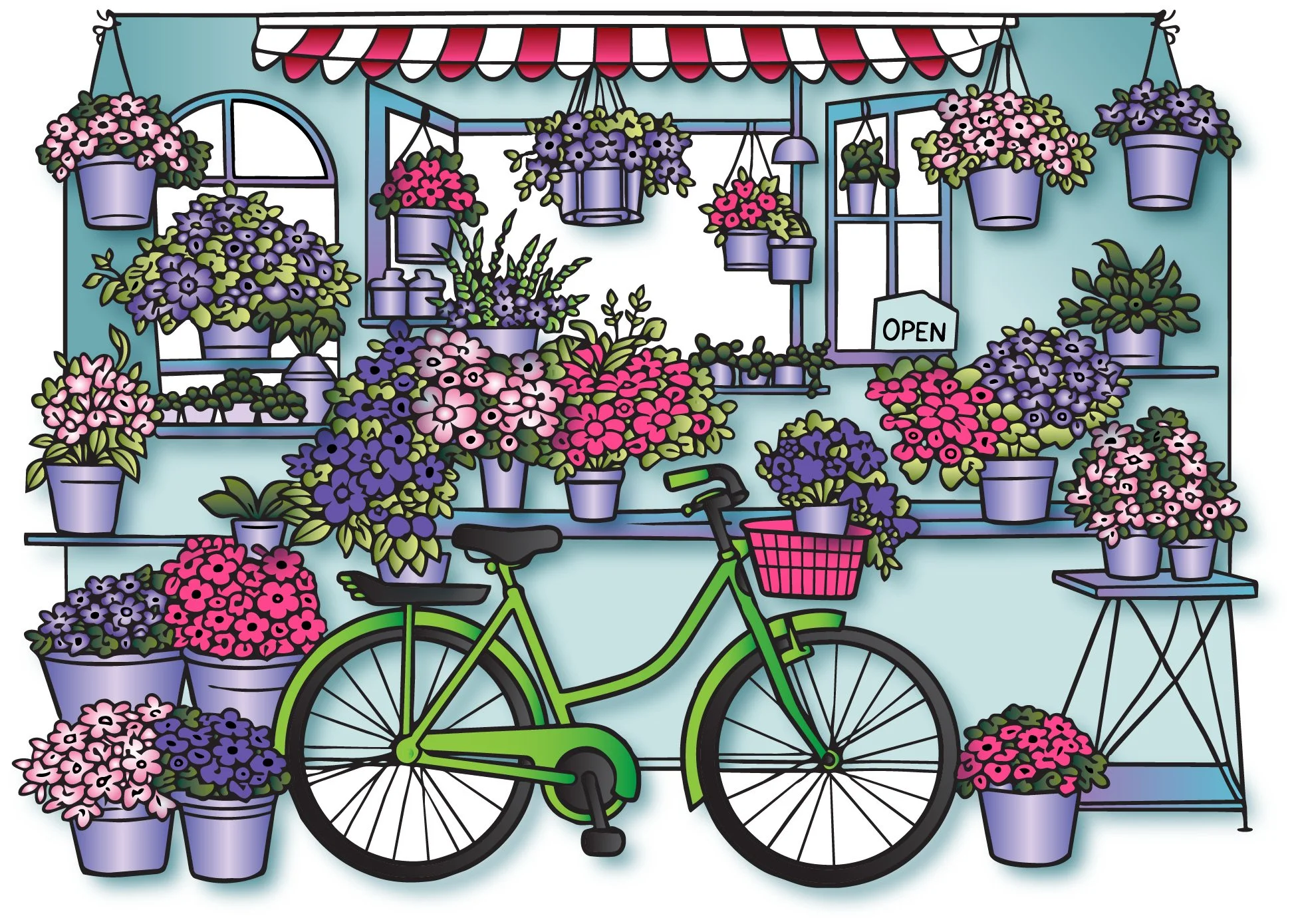
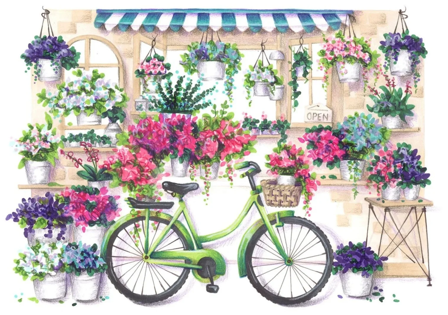
Here’s our flower shop again. I’ve colored this a million times now.
And yet not once…
Not once has this darned bicycle scene ever looked like an Amy project.
It’s not the drawing or the drawing style. It’s also not the color palette.
I mean, you’re not wrong. There’s very little about this project that says “Amy”.
But I’m a professional artist. I’m paid to draw things I’d never draw, using the client’s favorite color palette. Why is this so different???
Hang on, there’s a point to this rant.
Because you’re about to have the same problem.
Even if you follow all my palette-fixing steps.
If you use a Color Cube card, it will look like a Color Cube project.
Color palettes are amazing things.
I highly recommend using them.
But you must always remember that color palettes are incredibly artificial, even if the colors are sampled directly from real life.
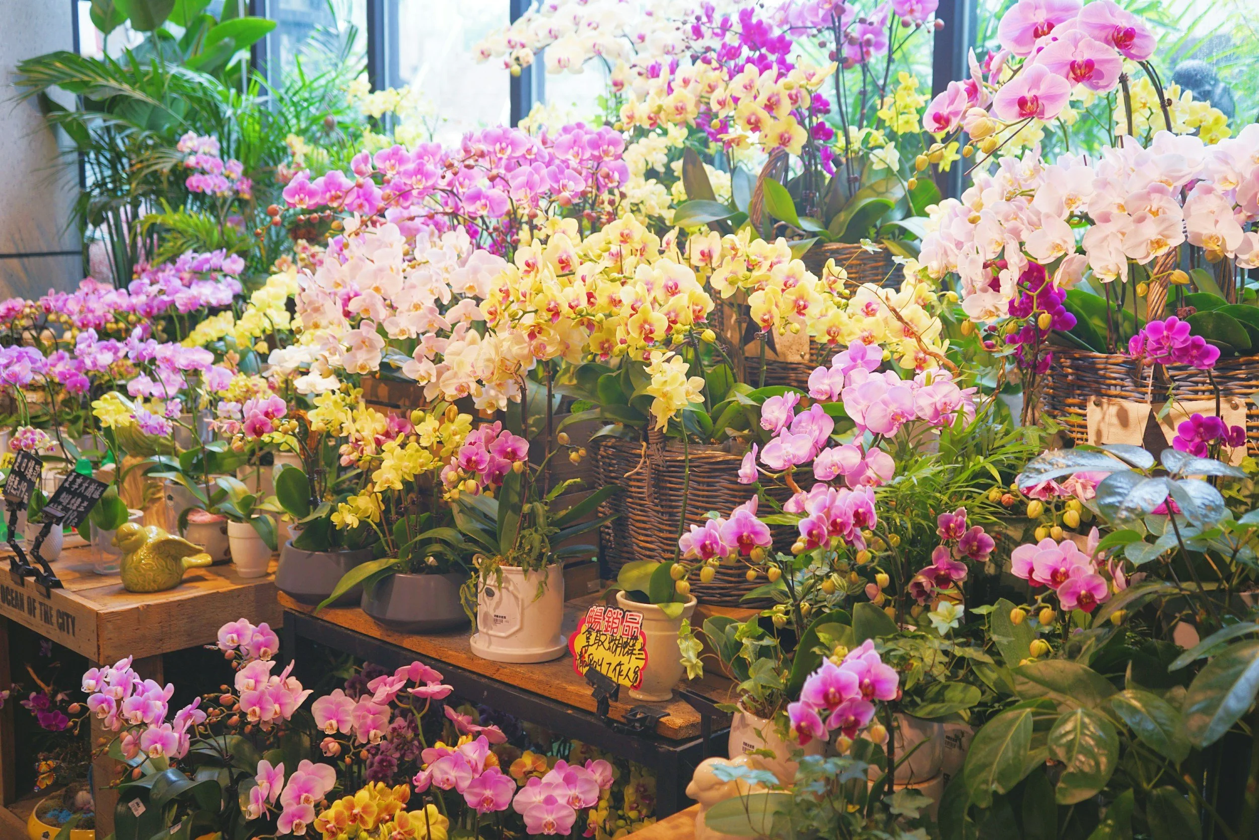
Think about it, when was the last time you walked into a flower shop and saw a perfectly color coordinated scene?
The bouquet flowers matched flowering plants which matched the ceramic pots which matched the walls which matched the shelving which matched the shopping carts which matched your shirt and pants…
Real life ain’t so matchy-matchy.
The world is a cacophony of random color.
Growing up, we had one of those perfect living rooms reserved for company. The floral couch and striped club chairs were coordinated to the shag carpeting, walls, and curtains. My mom refinished the coffee table, break front, and window trim, all in Minwax Teak.
Everything matched, including the background of our annual Olan Mills family portrait.
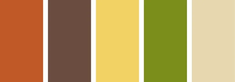
That room was as color palettey as my mother could get. Rust, chocolate, goldenrod, avocado, and antique ivory.
If it didn’t match, out it went.
And yet she couldn’t control the view out the big bay window or the fact that I’d tiptoe through wearing snazzy red sneakers.
Perfect looks artificial and artificial looks wrong.
And yet I’m telling you to use more color palettes?
To be fair, the world looks a lot like that random color-grabbing method I’m always telling you not to do.
I like pink, so I’ll color some flowers pink. Maybe a few orange flowers? Purple might look good. And blue? How about red?
That’s actually closer to real than not. Mother Nature and my mother would’ve had beef.
But I teach realism, so shouldn’t I encourage the grab & go method? Why would I ever tell you to choose a color palette and faithfully stick to it?
Ahhh, because we’re artists.
Art is a step above everyday riot and mess.
Even the artists who specialize in reality still limit the amount of color they use.
Oh my gosh, Amy! You can’t have it both ways. Either we stick to a small color palette or let me grab any ol’ color I want. There’s no in-between!
Actually, there is a middle ground.
You’re looking at it now.
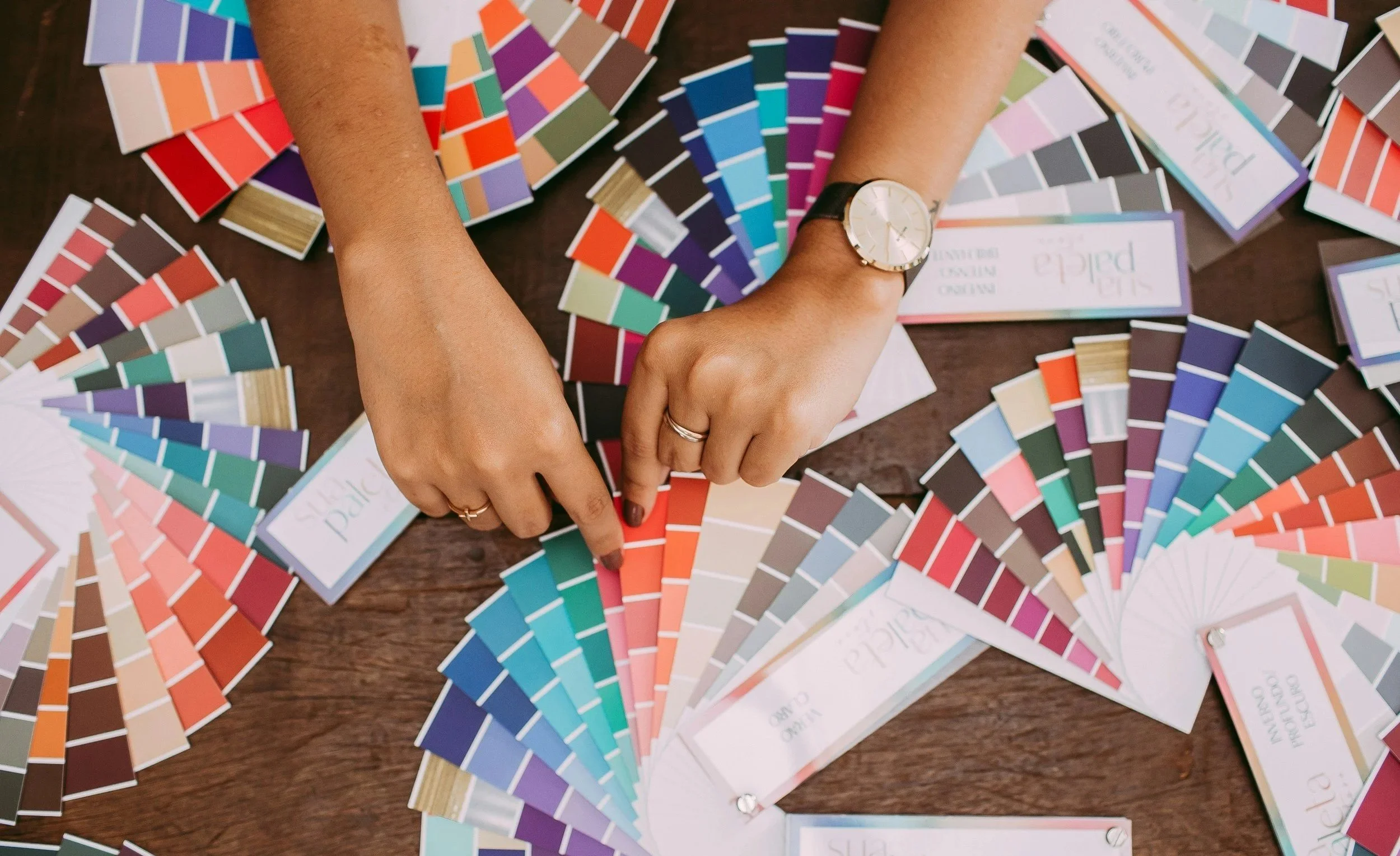
Remember back when I had you dump your Color Cube cards on the floor and organize them with my divider system?
Still recovering from shock, eh?
One of the biggest categories was NEUTRAL. I told you I never use neutral cards because they’re ugly and boring.
Well, that’s because Sarah builds entire color palettes out of neutral colors. Brown and more brown with a pop of something slightly less brown.
Zzzzzzzzz.
But that doesn’t mean I don’t use neutrals. Heck, I’d die without my daily dose of brown and gray.
Artists add neutrals to every project they touch.
Especially the party palettes.
Neutrals aren’t a category of color palettes.
They’re the hidden foundation of every color palette.
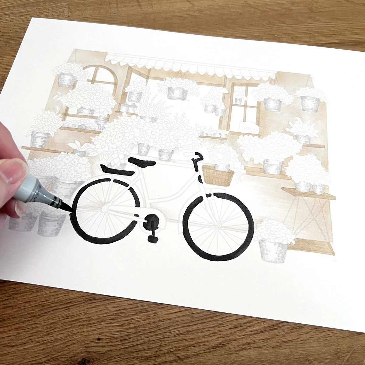
So back when I talked about 60-30-10, I kinda had to fib to you. I selected the most sedate and backgroundy colors in our palette (blue and violet), diluted them down to almost nothing, and then gave them 60% of the real estate.
When in actuality, that 60% is almost always given to neutrals.
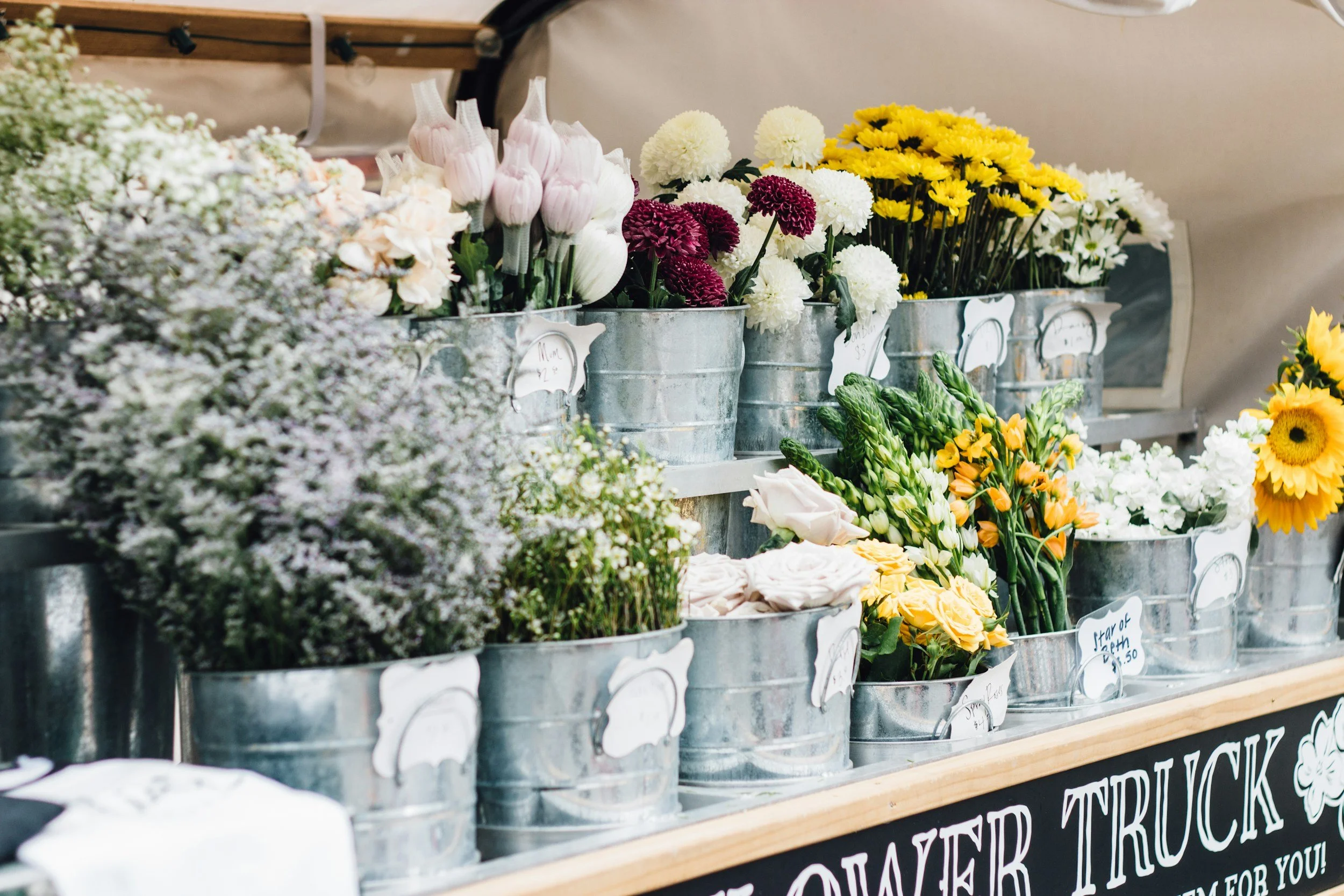
There’s an indoor farmer’s market in the next town over where vendors have permanent stands. One flower shop has walls and shelves in simple unfinished pine. Another shop keeps everything in galvanized aluminum buckets.
These real life experiences inspired the neutral choices for my hand colored flower shop.
That’s the unique me in my project.
My neutral 60% also covers my lightest lights and my darkest darks.
Ratio and balance, baby!
Then comes that eye-blinding party palette.
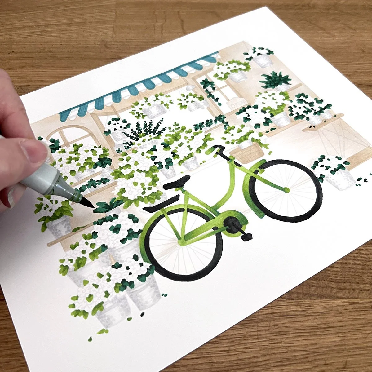
Starting with the greens, I work on building the two different versions of green from the palette. Filling half the remaining space.
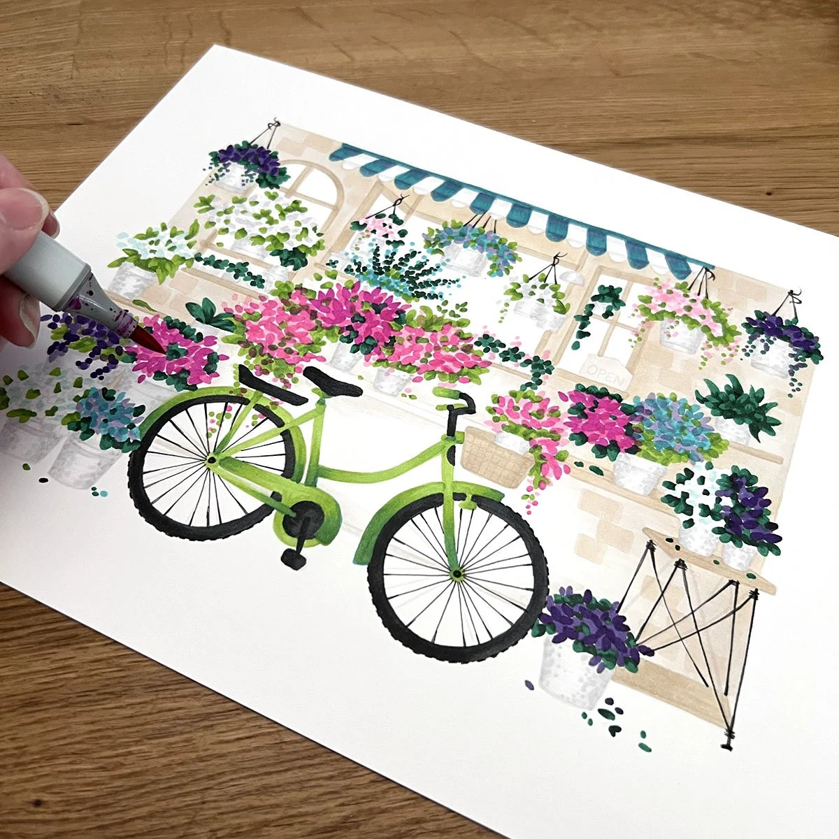
The pink is still my 10% pop and while you may be tempted to spread pink evenly around the room, I’m concentrating my popping power in the center near the bicycle.
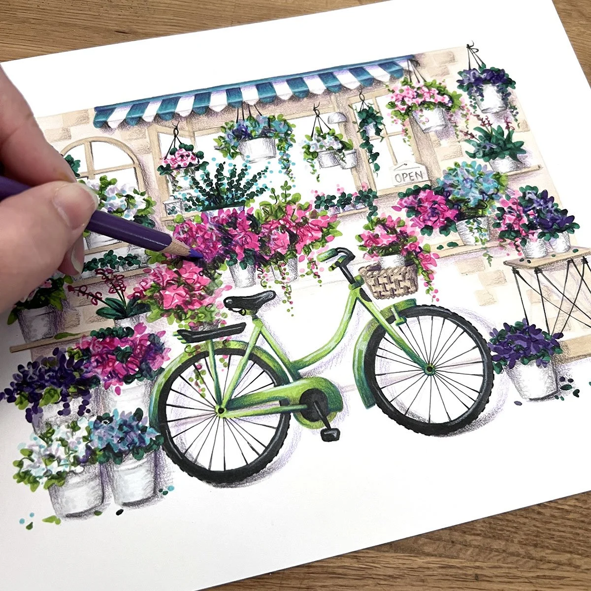
Finally I begin pushing dimension and adding cast shadows for depth with violet pencils.
Why violet? Because violet is in the color palette!
When I look at this palette, I see spring. I see flowers. This palette smells like Chanel No. 5.
So why the heck would we waste the flower power of this palette on walls, windows, and other throwaways?
When a color is used everywhere it can’t be special.
The same is true for a color palette.
Hold your punches, don’t swing at everything.
Let your neutrals make the palette special.
But which neutrals should I add, Amy? Browns? Grays? Which shades work best?
Ahhh, grasshopper, that takes us back to our earlier problem:
If you use a Color Cube card, it will look like a Color Cube project.
The reason pre-made color palettes lead to cookie-cutter coloring is because you’re not wearing snazzy red sneakers.
For a project to look unique and special, you must add bits of yourself to the project.
I told you where my beige and gray came from. My mother would’ve added Minwax Teak. Maybe you’re into Dark Academia or you’re still rockin’ that Shabby Chic vibe. Your unique neutral taste makes your coloring look like you.
Neutrals are free agents. They go with everything, so go with what you like.
When you gamut your values, include your browns and grays, whites and blacks in the palette mix.
As long as your neutrals aren’t repeating other values, they’ll fit right in at the party, as if Sarah put them there herself.
Here’s the ultimate trick to color palettes.
See, a few years back, many of you only kinda-maybe-sorta knew about color palettes. If you did, you associated them with interior design or maybe fashion.
Using color palettes in your coloring?
That was never on your radar until they started popping up on Pinterest and even then, Sarah had to demonstrate the heck out of her Color Companion and Cubes before it felt easy and doable.
Then I come stomping in declaring that artists have been using color palettes for centuries and you’re like…
Wait, how did I not know this?
That’s the trick.
Good art doesn’t scream “Hey, everybody! Here’s my color palette!”
Good color palettes look like that’s just how things look. They’re sneaky. They’re stealthy. You don’t know they’re there until you look for ‘em.
And that’s ultimately why Color Cube projects always look like Color Cube projects.
There’s nothing special about the colors on the little card.
There’s everything special about what you add.
IF YOU LIKED TODAY’S ARTICLE, SUPPORT FUTURE FREE LESSONS

There’s a problem in coloring…
You want to color better so you watch a few videos, take a few coloring classes.
A few years later, you’ve got a wall full of projects but your coloring still looks the same.
Projects are not lessons.
Read that one more time because it truly sums up the dead end you’re facing when you can color anything on earth…
But only if an instructor shows you how first.
When you’re sitting by yourself, alone at your coloring desk with a truly original idea—
Can you pick your own colors? Can you plan a technique approach? Do you know what to do when nothing looks right?
Color Wonk is my solution to the coloring problem.
Yes, you’ll have instant access to almost 60 workshop projects. Except the lesson isn’t how to color a daisy. The daisy is the instructor, not me.
Why do some colors work better than others? How to see form and light or shadow. Most importantly, training your hand to do the things your eyes want it to do.
Every workshop is a useful skill, not a project.
Join us at Color Wonk. We’re not just coloring, we’re growing as artists.


Color theory isn’t something you read and instantly understand. It takes time to figure it out.
Color Coach gives you hands-on color theory experience with lots of encouragement.
This seahorse isn’t just a couple of aqua markers and pencils. To make blue-green look it’s best, you need a host of supporting colors… and a little contrast?
I teach students to play with color— finding their own coloring style and unique color voice.

Markers were the original medium for urban sketching…
Really, Amy? Most of what I see nowadays is pen sketching with watercolor.
Watercolor may be trending but if you look closely, urban techniques are trying to look like marker.
Irish Cottage is an intro to Urban Coloring. I’ll share a stress-free approach and how to use your chisel nib for amazing texture.
Don’t worry, freehand details are easy. Your markers were literally made for this!
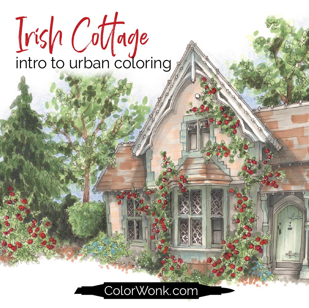
Irish Cottage is only available through Color Wonk
A library of new and classic courses is waiting for you. Instant access. No deadlines.
Real art lessons, not nifty novelty techniques

CURRENT PASSWORD: RubberDuckie
MY MOST-USED PENCIL COLORS
Affiliate links help support the free content here in Vanilla Beans
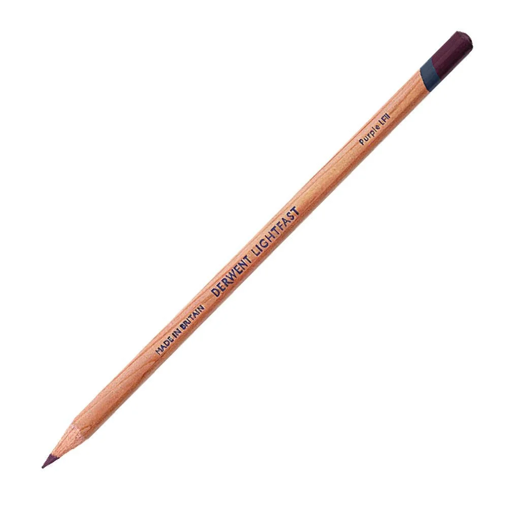
Universal shading color
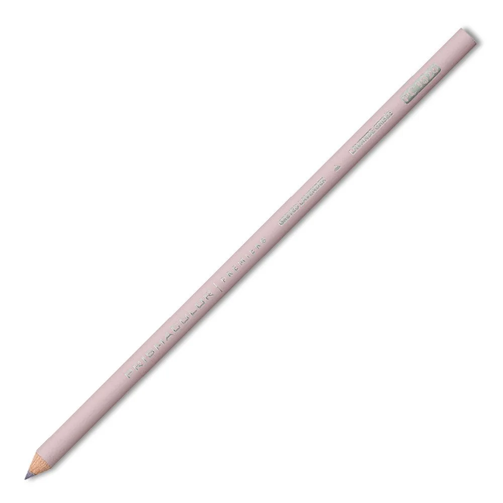
Universal shading for light colors
Opaque and sticks to anything