Cube 8: Afraid of Your Own Shadow
Thanks for taking the jump to read today’s newsletter. If you landed on this page by accident, subscribe to the Vanilla Beans Newsletter here.


So this happened…

Shopping soon? Remember to use the link above when shopping at Blick. This newsletter survives on affiliate earnings.
Purchase Color Cubes with the affiliate link above to support my work here at Vanilla Beans. Every issue of Beans takes about 8 hours to write and Beans is always FREE. Without your support, there’s simply no way I can keep writing weekly free lessons.
AFRAID OF YOUR OWN SHADOW
Before we get to today’s article, a quick word about the graphics:
Yes, the images are digital, made in Adobe Photoshop and Adobe Illustrator.
Every issue of Beans takes 8-10 hours to write. There’s no way I could hand-color every illustration too.
But also— digital color keeps you from making excuses.
When something looks amazing, you can’t write it off as Amy’s Special Magic. Conversely, you can’t accuse me of coloring bad, just to prove a point.
For the record, coloring bad on purpose is harder than you’d think.
If you’re getting tripped up by the digital art, you’re missing the forest and the trees.
Color either works or it doesn’t.
The medium doesn’t matter.
We’re talking color theory, not coloring.
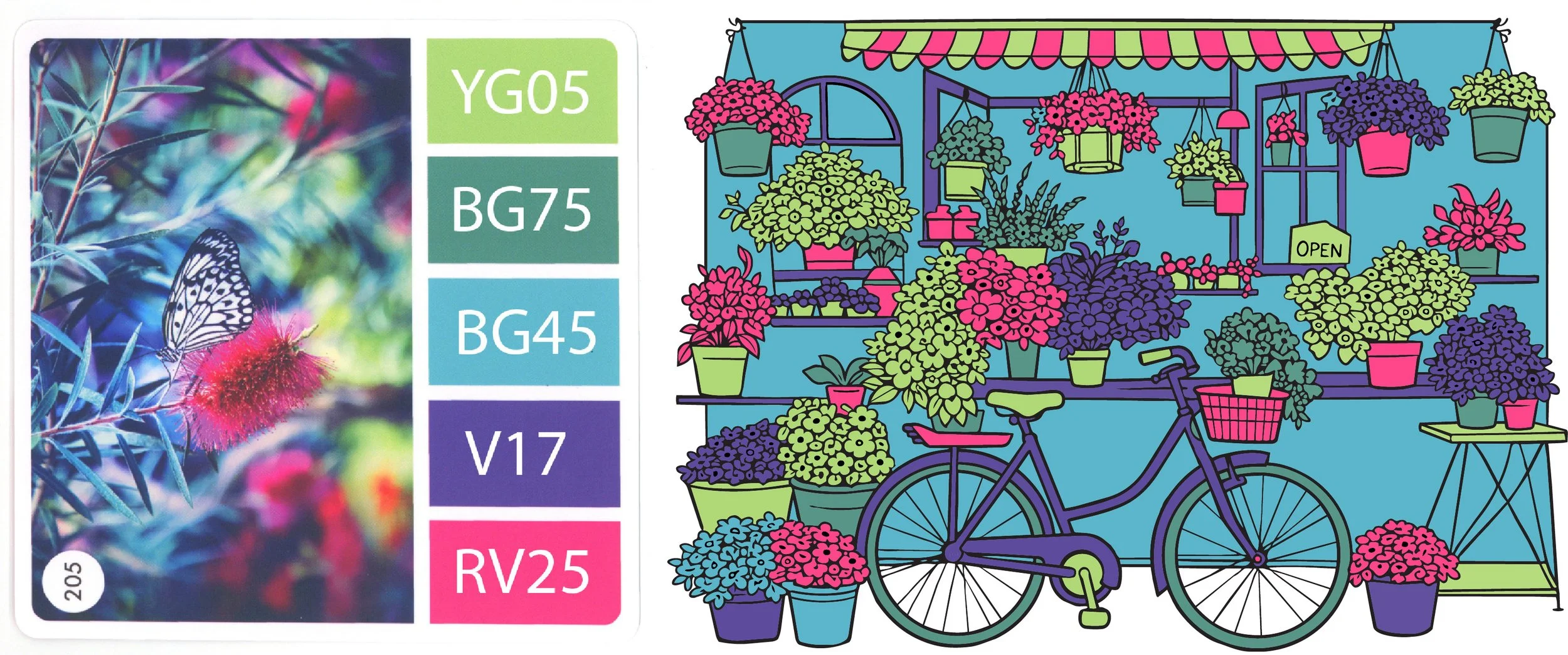
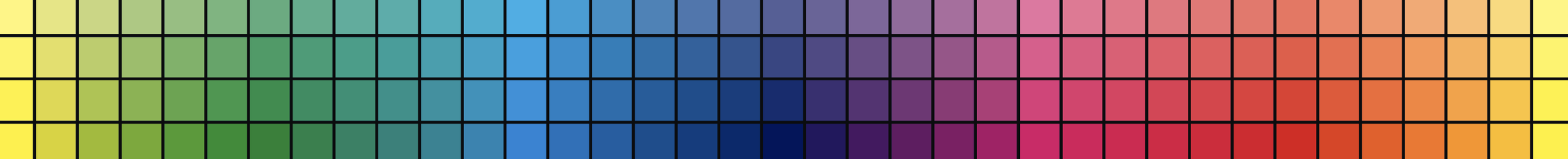
Okay, so we’re using one of the rainbow palettes which Color Cubes have become known for:
Totally random colors which look great in theory but not in application.
I call them Party Palettes in my Color Cube Organizer Kit.
As we discussed in last week’s article but really, this whole series…
Everyone assumes palettes are plug-and-play. Grab some matching markers and start coloring.
Which makes a mess.

When every color is special, no color is special.
As artists, our job is to give order and structure to the color palette. We decide which color takes the lead and which colors sing backup.
The easiest method is also the oldest— 60-30-10.
Find the most serene, backgroundiest colors and give them 60% of the space. Basically, color a little more than half of your project with quiet colors in sedate values.
Then look at what’s left and color a little more than half of the remainders with colors that are kinda moderate. 30%.
The focal point receives the brightest pop of color. 10%.
That’s what I did here.
60% blues and violets
30% greens
a 10% pop of hot pink.
But here’s the thing: That’s not all I did.
Because 60-30-10 wasn’t enough.
Even though I followed the steps I’ve been telling you about…
Expand the swatches. Isolate different light to dark value ranges. 60-30-10
It didn’t work. It needed something more.
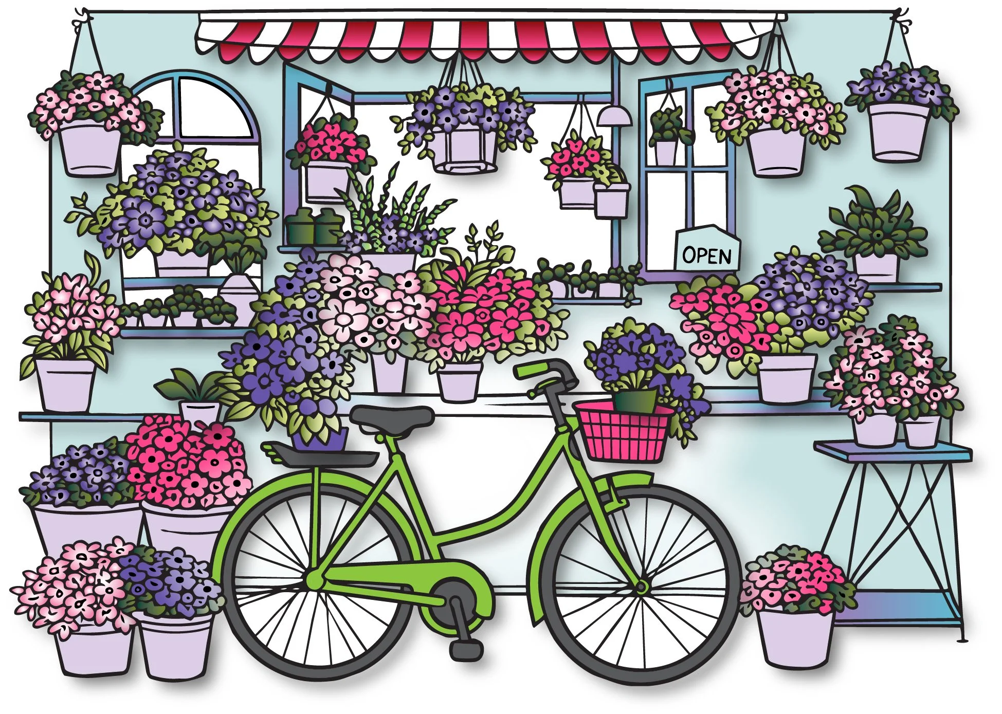
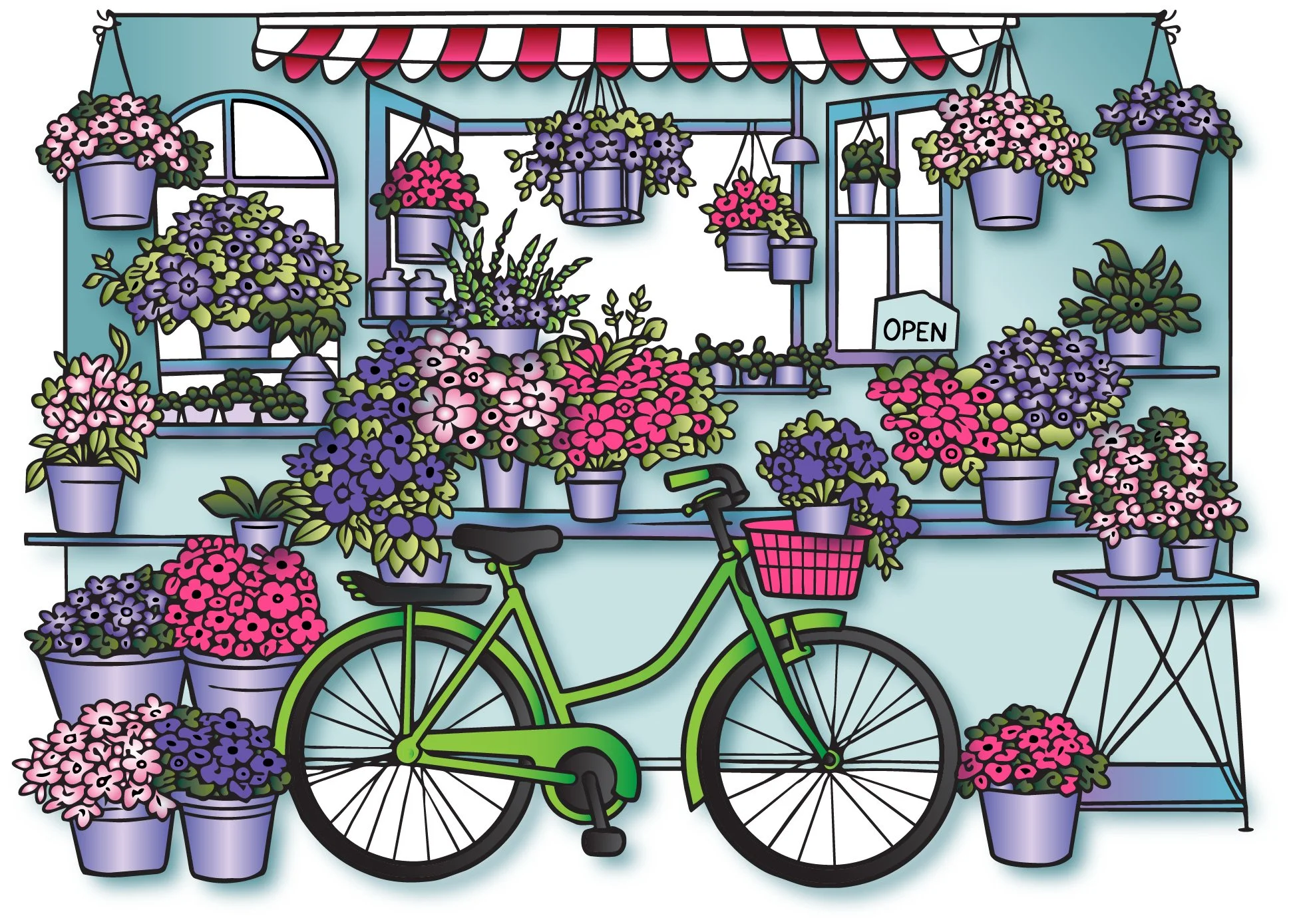
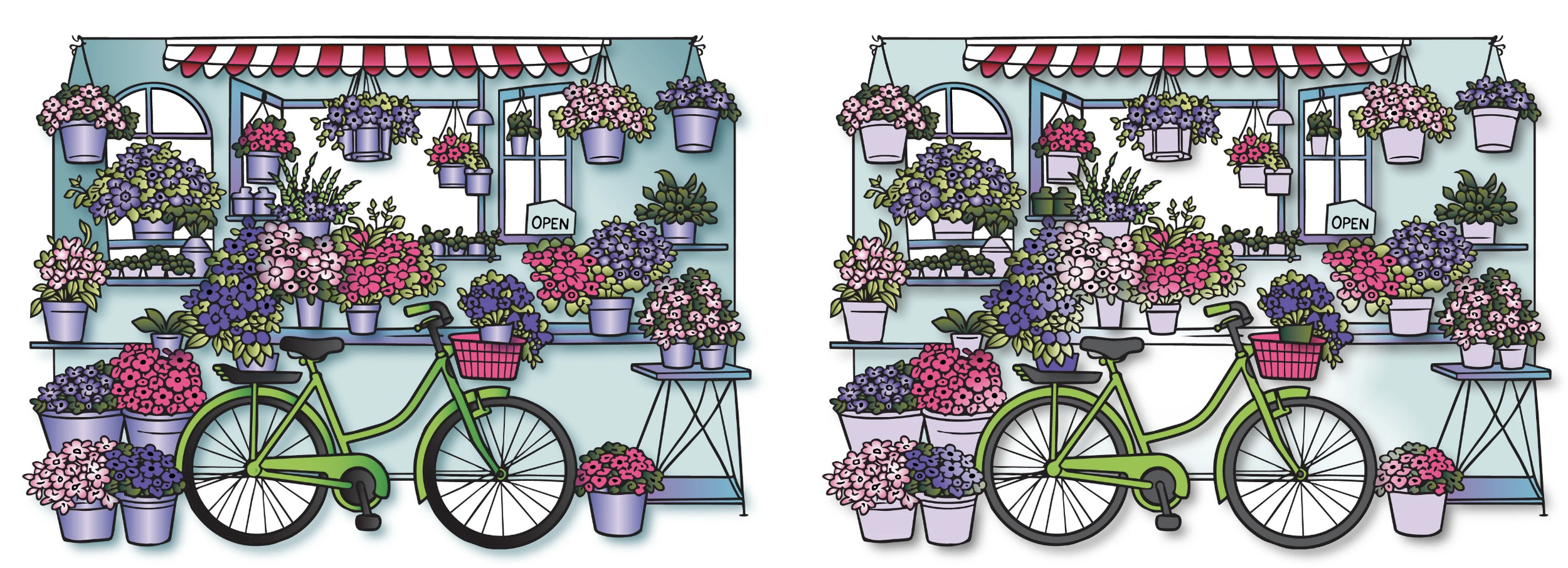
The left is what I told you to do. The right is what I actually did.
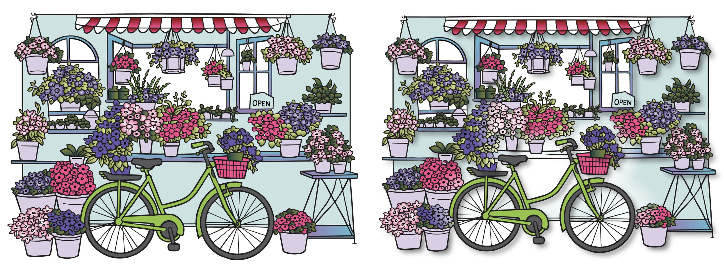
Now your eyes are bouncing back and forth. What’s the difference? Where’s Waldo?
The left isn’t bad but the right side reads better.
Why?
Colorists spend a ton of time worrying about dimension.
We shade everything with light-medium-dark blending combos expecting three markers will magically make stuff look dimensional and rounded.
Dimension is your hammer for every screw.
When really, depth is far more important than dimension.
As much as y’all use the word depth, hardly any of us actually color for depth.
Depth puts distance between objects.
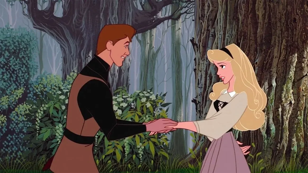
Disney Animation was really good at this. You can color everything dead flat— no blends at all. But if you shoot it on a multi-plane camera built to create depth, it feels real… or at least passably realistic.
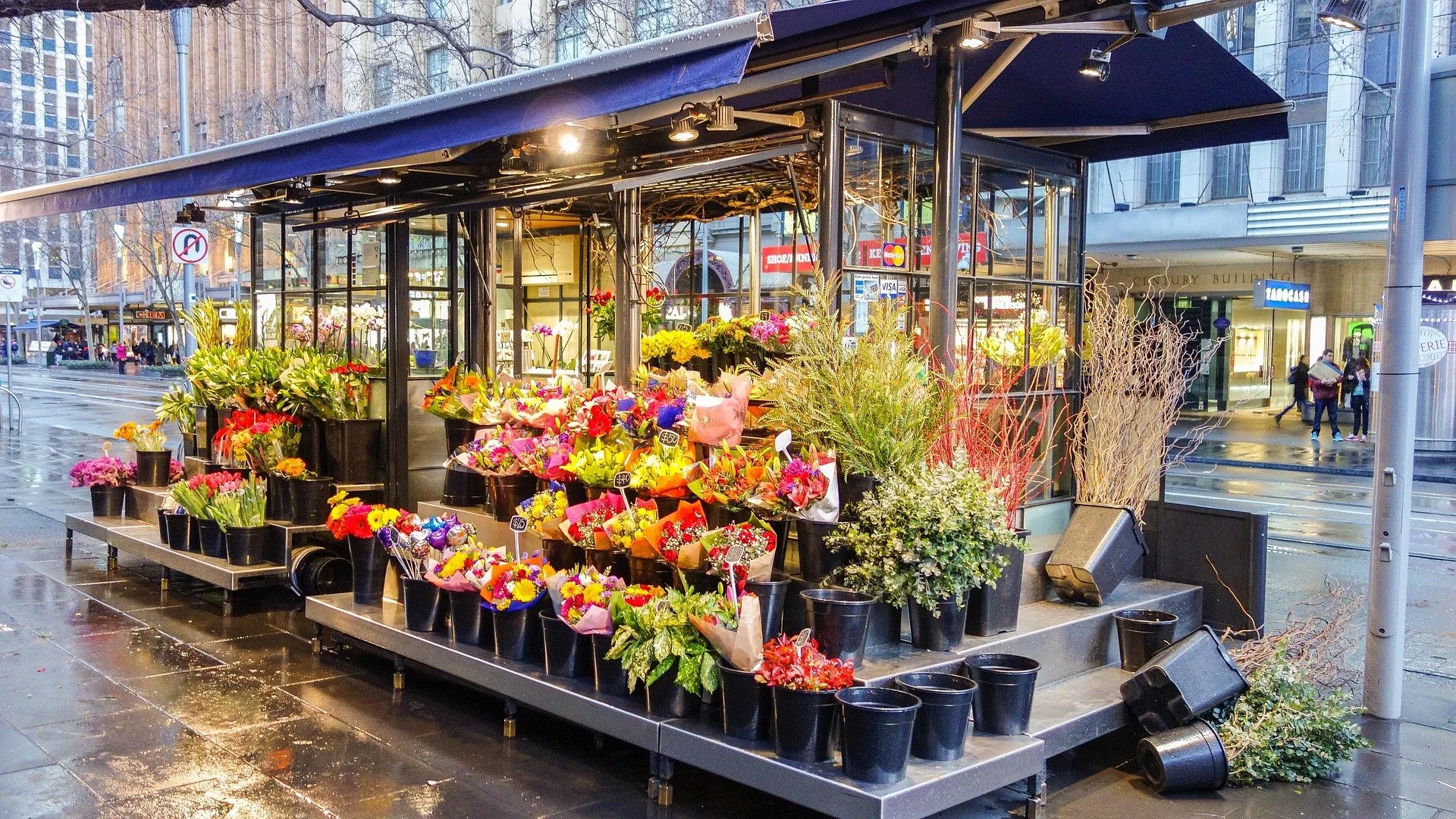
That’s the problem with our balanced bicycle project..
We’ve become so focused on the color palette that we’ve forgotten the structure.
The left is 100% focused on the color palette. The right adds depth.
Now my husband would lose his cookies if I dragged home a 900 pound multi-plane camera, so I added depth the cheap way…
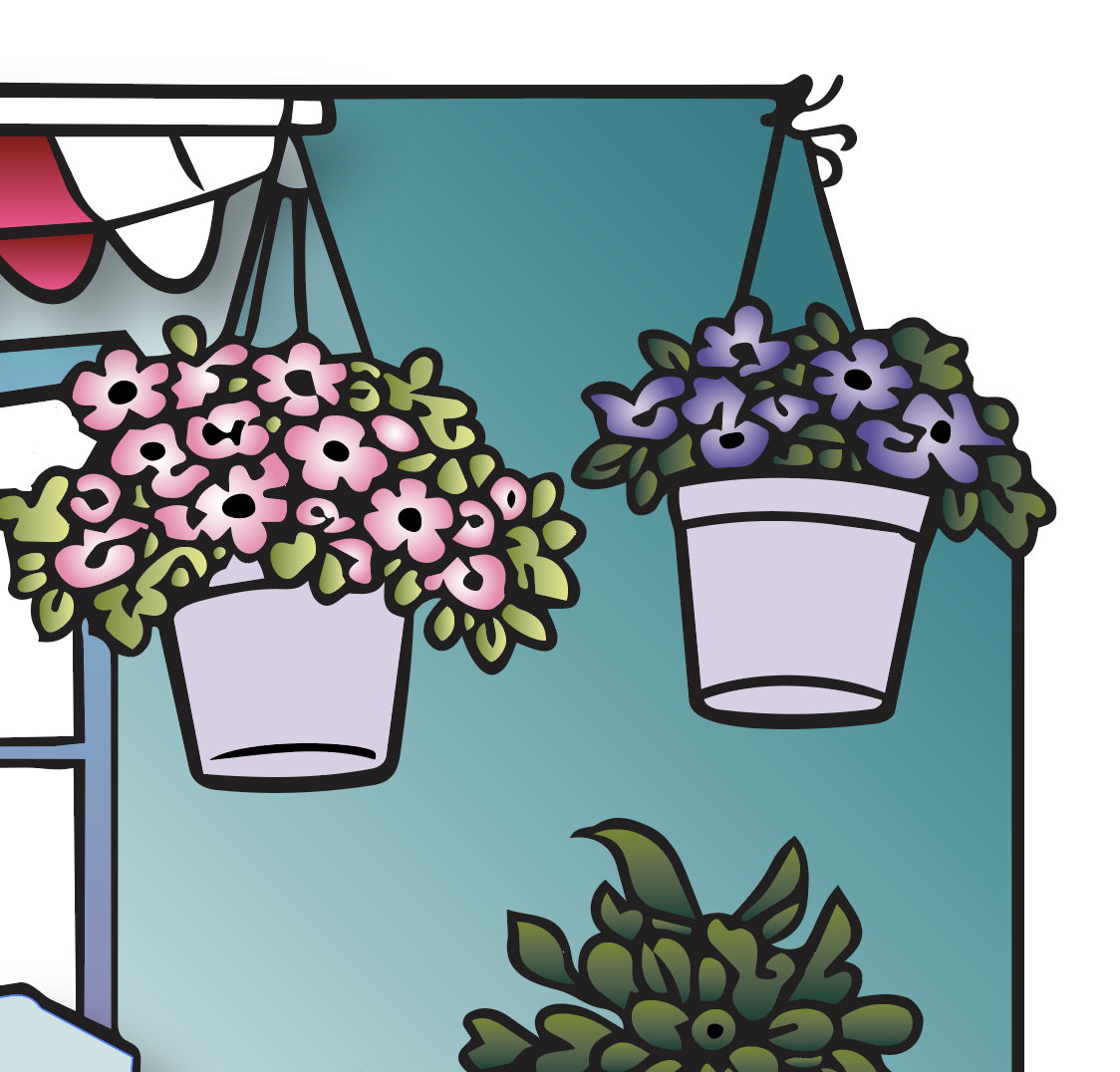
I did it by adding cast shadows.
The awning emerges towards us because of the cast shadow below it.
The pots are a variety of near and far. The cast shadows tell you how far.
The bicycle casts a tilted shadow as it leans against the wall.
Cast shadows tell your brain there’s physical space between two objects.
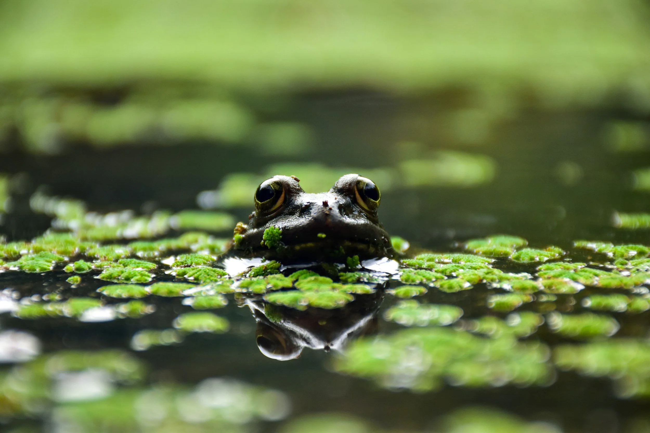
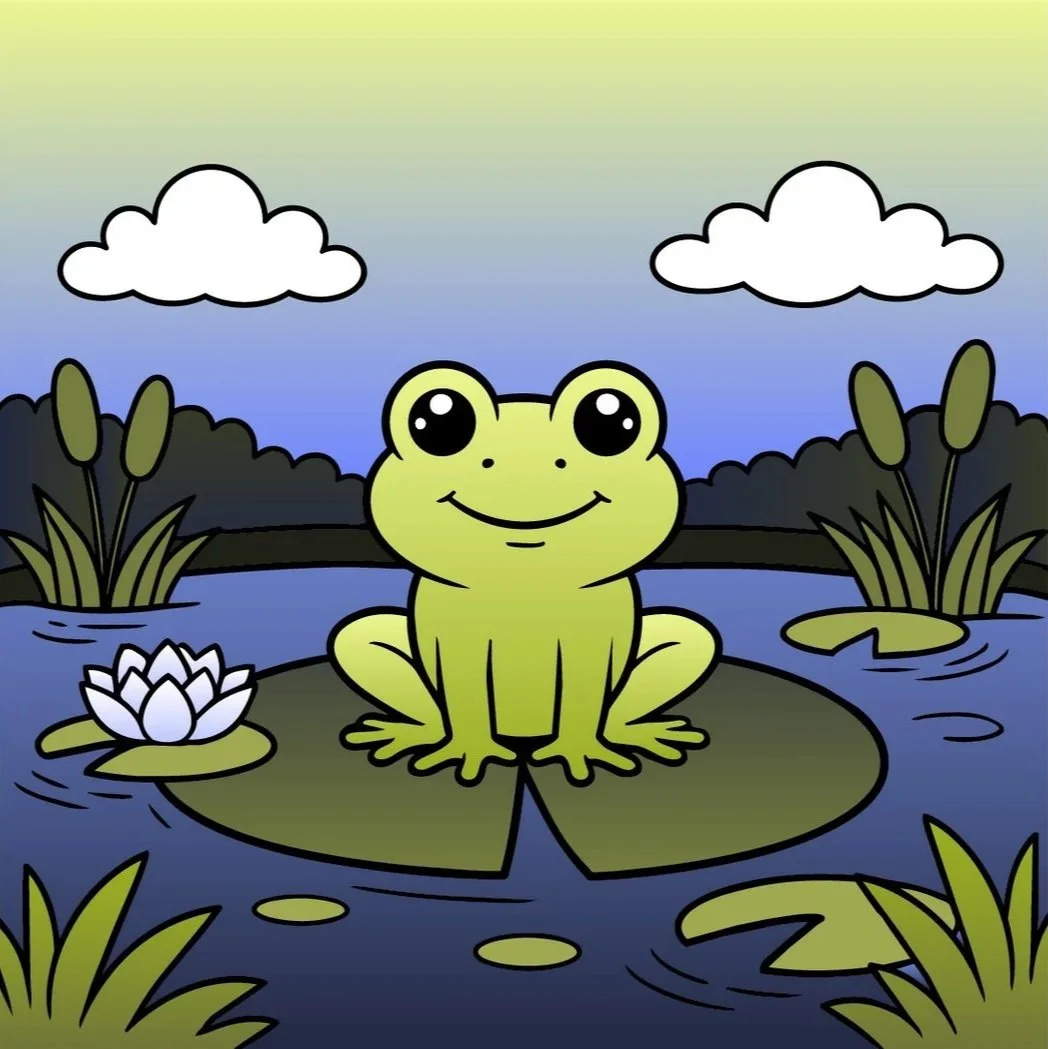
With the frog project, we separated objects with value. Last week, we used the Golden Ratio to separate objects by importance. Now we’re increasing separation with distance.
That’s depth.
But wait a minute Amy, I shade behind things all the time.
Great. But that’s shading.
Not shadowing. Two totally different things, especially in coloring.
Let me ask: What color do you use for shadows?
The darker marker in your blend, right? So if the wall is aqua, you’d use a darker aqua behind the hanging plants.
That’s just more shading. Shading changes the dimensional shape of the wall. It doesn’t move the plant.
You need a shadow, but not just any shadow.
You need a desaturated shadow.
Let’s add the dimensional gradients you love to color. AND we’ll add cast shadows using the dark marker from the wall gradient.
It’s hard to read again, isn’t it?
Honestly, this is an old problem. People who used to draw backgrounds behind La La Land stamps had this exact issue. Cozy colorists do it today.
All technique, no clarity.
Cast shadows made with the dark wall color don’t read as cast shadows.
The wall just looks darker.
But here’s the real problem: the darker aqua wall shadows stretched our pale little aqua blend to include every value.
Remember these guys? They’re toast now.
You can kinda slide by, shading for dimension with light-medium-dark combinations…
But if you add on— shadowing for depth with more of the same? It’s too much.
You’re blowing the rules we’ve set up.
Value balance: gone
60-30-10: gone
All our hard work, down the drain because “pretty!”
The reason the right side reads clearly is because I didn’t shadow with a darker marker.
That only adds more aqua.
That’s increasing saturation. Turning up the volume on an already loud party palette.
My shadows are gray. They’re not a darker aqua, they’re grayer aqua.
Desaturation.
See, we always wind up back where we started.
I’ve been preaching about desaturation for 17 years now. My first coloring class was gray under pink and the last class I teach, before heading off to the great marker factory in the sky… <sigh> it’ll probably be gray under pink.
Desaturated aqua doesn’t read as darker, it reads shadier.
So you can secretly slide desaturated colors into your color palette without affecting the value balance or throwing off the 60-30-10 ratio.
And hey,
When the bicycle didn’t pop enough, I desaturated the wall even further by adding what’s essentially a white shadow.
Desaturation for the win.
And that’s how we make color palettes work:

Pick a palette based on the color swatches, not the inspiration photo.
Don’t worry about owning an exact match for every color swatch. Close is fine.
Find the full gamut of values for each swatch.
Select blends which cover every value equally from 0-9.
Prioritize colors with the 60-30-10 ratio.
Finally, add desaturated depth.
It’s a logical process which will easily become ingrained habit when you practice it with every project. I barely even think about it now, it’s just normal.
But you know what?
I’m a lyin’ liar.
I don’t actually use color palettes this way. Next week, I’ll show you what I really do.
IF YOU LIKED TODAY’S ARTICLE, SUPPORT FUTURE FREE LESSONS

SPRING SESSION - BEGINS MAY 1ST
Do you get nervous with a colored pencil in your hand?
My 12 week colored pencil course takes you from barely beginner to WOW!
In The Point, we fix all the little bad habits and assumptions which make colored pencil harder. We fix your grip and your pressure. We keep going until you’re coloring with amazing realism.
My courses are lean, effective, and worth every penny.
Enrollment is via waitlist only. You must be on the waitlist to enroll.

Color theory isn’t something you read and instantly understand. It takes time to figure it out.
Color Coach gives you hands-on color theory experience with lots of encouragement.
This seahorse isn’t just a couple of aqua markers and pencils. To make blue-green look it’s best, you need a host of supporting colors… and a little contrast?
I teach students to play with color— finding their own coloring style and unique color voice.

It’s the perfect photo reference but the wrong color.
Let’s change it…
Are you kidding me, Amy? Every time I try changing colors, it ruins the depth and dimension!
Penny Candy shares my process for adjusting or outright changing the colors in photo-references with no loss of realism.
It’s easier than you think!
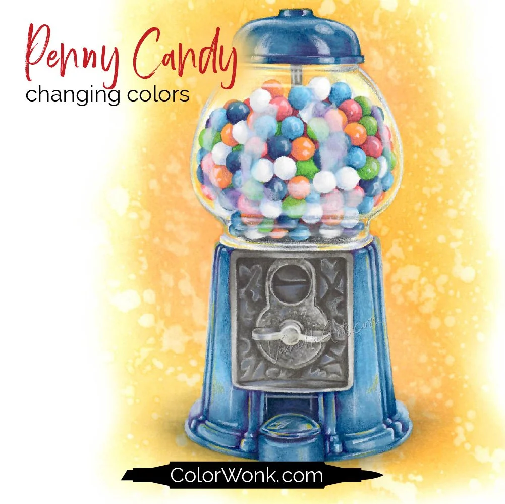
Penny Candy is only available through Color Wonk
A library of new and classic courses is waiting for you. Instant access. No deadlines.
Real art lessons, not nifty novelty techniques

CURRENT PASSWORD: RubberDuckie
MY FAVORITE COLORED PENCIL ERASERS
Affiliate links help support the free content here in Vanilla Beans
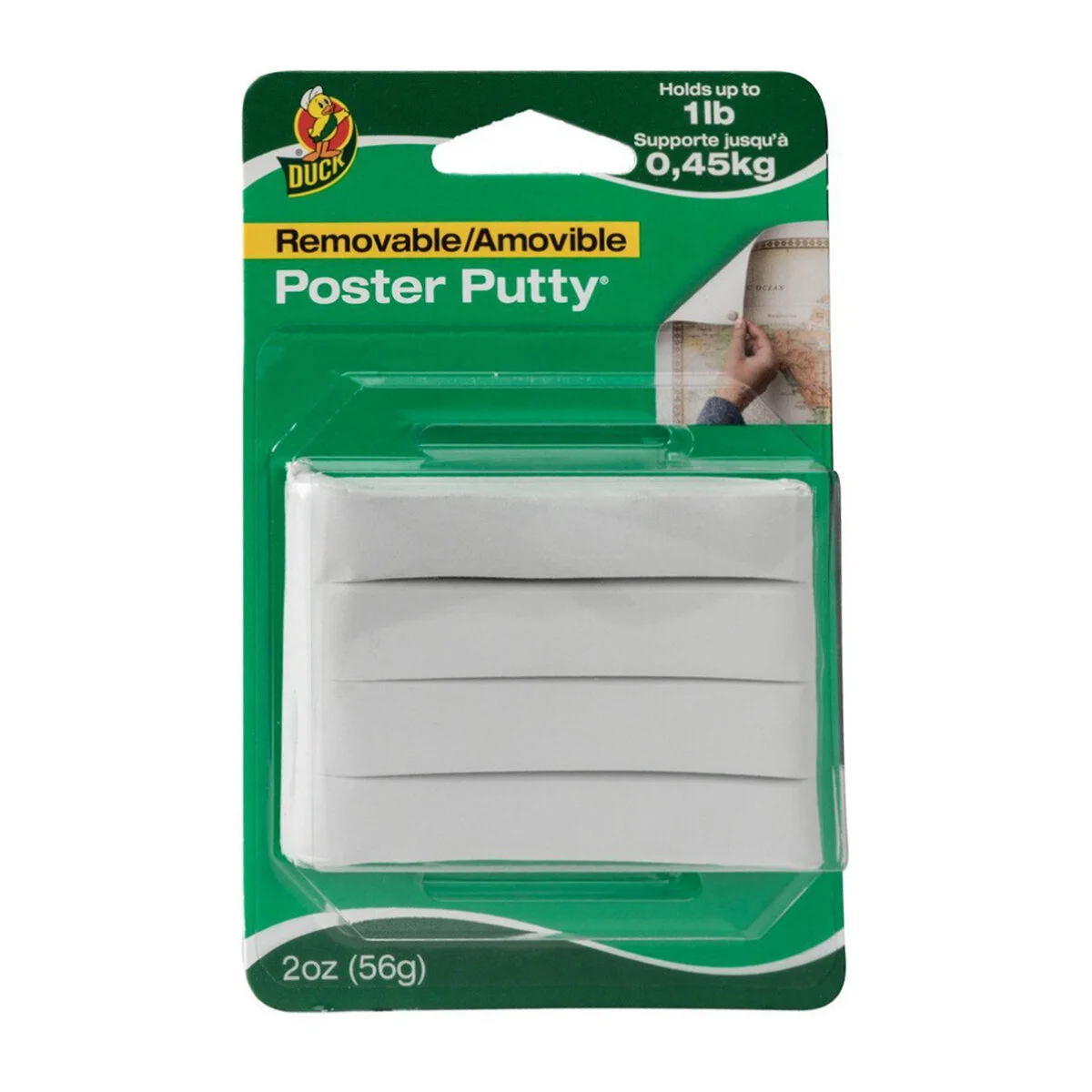
For light mistakes and gentle lifting. One pack lasts for years!
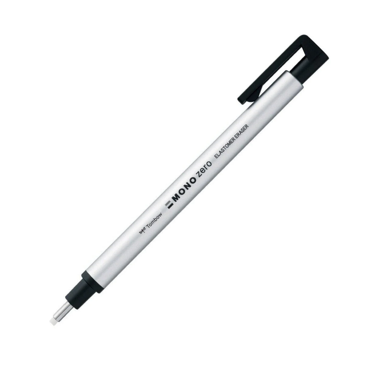
Erase tiny areas with maximum control, clean-up edges, or smudge
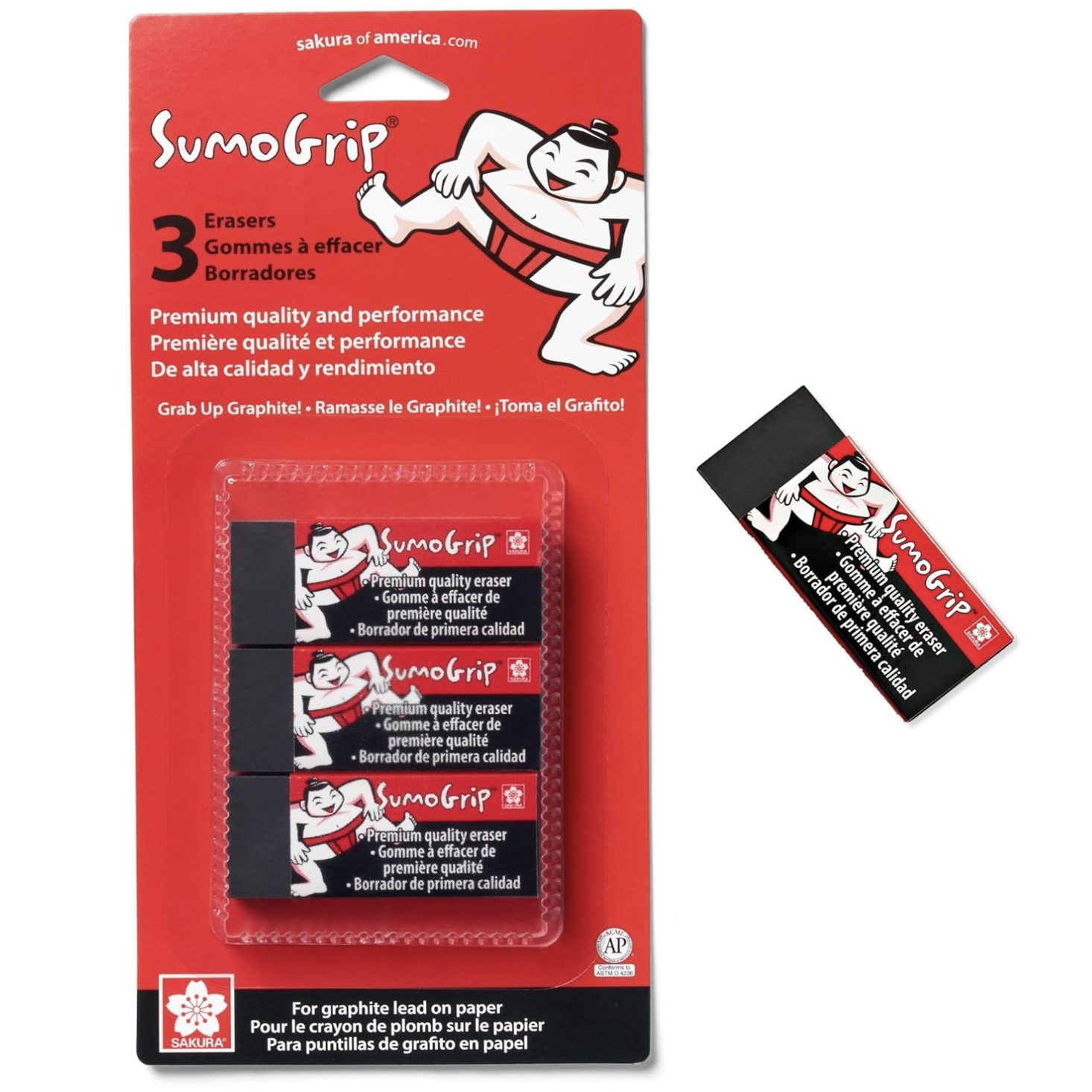
For true mistakes, can lift most of the wax back to the paper level