Cube 7: Half Plus a Smidge
Thanks for taking the jump to read today’s newsletter. If you landed on this page by accident, subscribe to the Vanilla Beans Newsletter here.


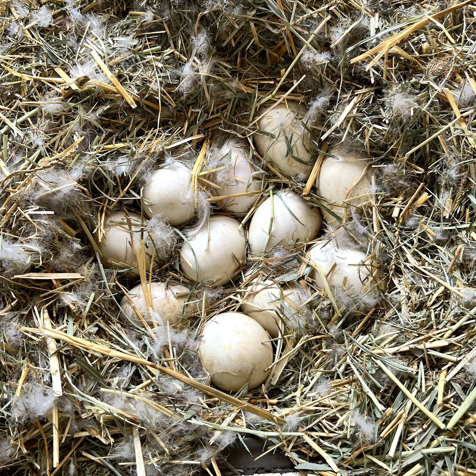
I’ve been sitting on a secret.
Well, actually Dolly’s been sitting on a secret for almost a month.
She’s a first-timer and the viability rate is pretty low for rare breed geese.
Plus, she keeps sneaking out to the pond.
I’m skeptical but we’ll see what happens.

Shopping soon? Remember to use the link above when shopping at Blick. This newsletter survives on affiliate earnings.
Purchase Color Cubes with the affiliate link above to support my work here at Vanilla Beans. Every issue of Beans takes about 8 hours to write and Beans is always FREE. Without your support, there’s simply no way I can keep writing weekly free lessons.
HALF PLUS A SMIDGE
We’re in full DIY-repair mode now in our Color Cube series. I’m sharing how to fix the inherent color problems with the cards, but also how to use palettes better.
Like last week, today will be more eggheadery.
Sarah’s color palettes are beautiful but doomed. The colors look great on a card but not in real life.
I’d love say: Match a marker to each swatch and voila! Instant perfection.
But no, every card was value-balanced by a drunken unicorn.
That’s not to say Color Cubes are bad. My beef is with the colorfluencer who told you to use a color palette like a supply list.
All color palettes require modification.
I guess you could use the colors straight off the card, maybe if you like the laser-disco look?
But if that’s the case, why are you buying Color Cubes? Just grab the colors you were gonna grab anyway and have at it.
For the rest of us normies who aren’t trying to outshine the sun…
Keep reading.
Last week, I gave you a color theory process to fix the glaring value error.
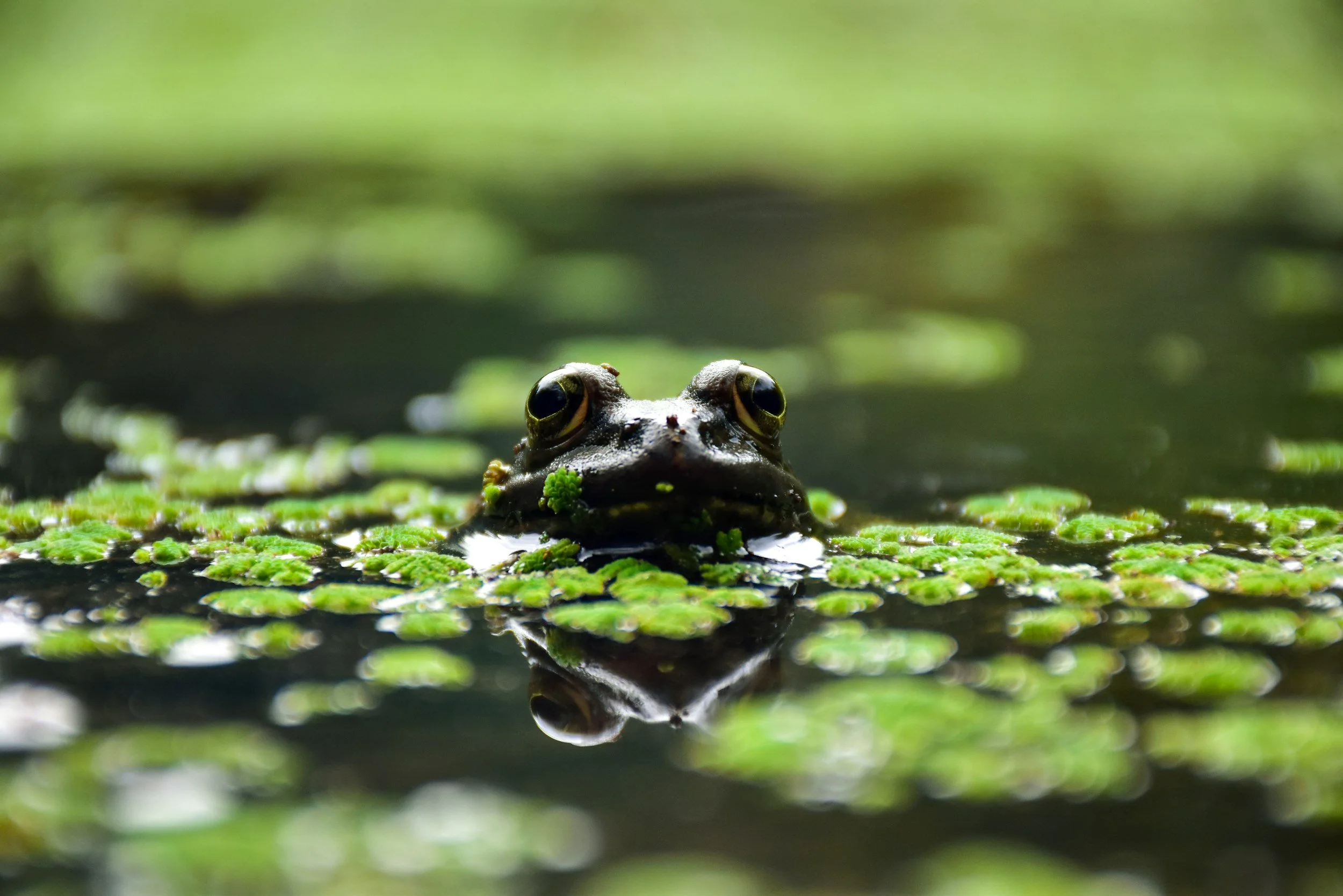
First, expand each swatch into a full light to dark value gamut.
Then create blending combinations for each color which all sit in a unique value zone.
light to almost white
light medium
medium
medium dark
dark to almost black
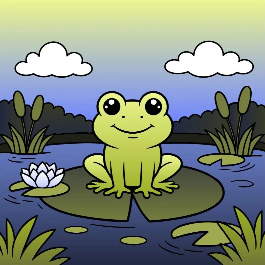
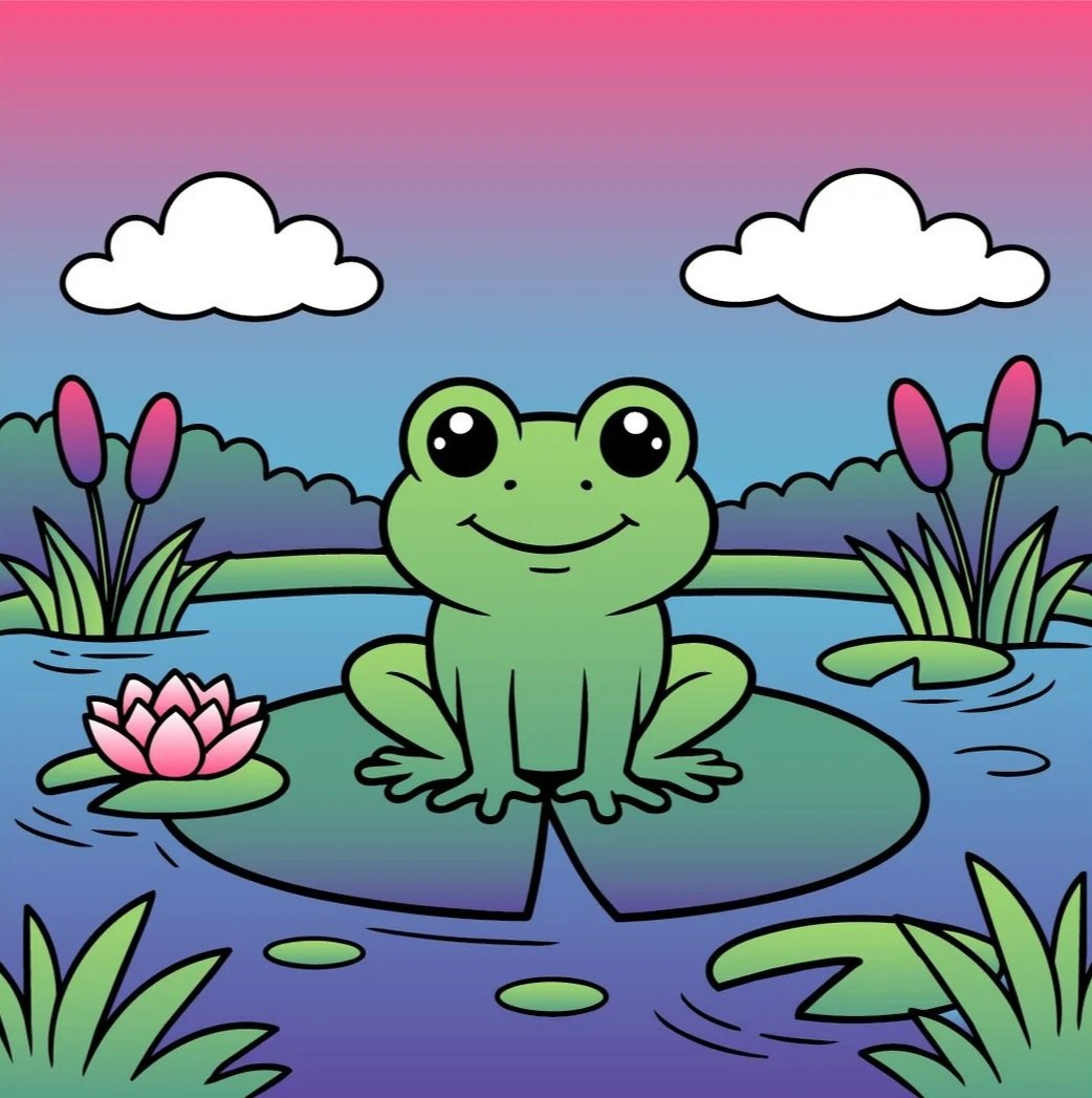
This balanced frog was the result. The frog pops forward because he’s lighter than the background. And the background isn’t mushed together because everything there also fills a different section of the value scale.
Value separation adds clarity, order, and professionalism to your work.
But then I abruptly ended last week’s article with a major tease…
Because I adjusted more than just values to fix the frog.
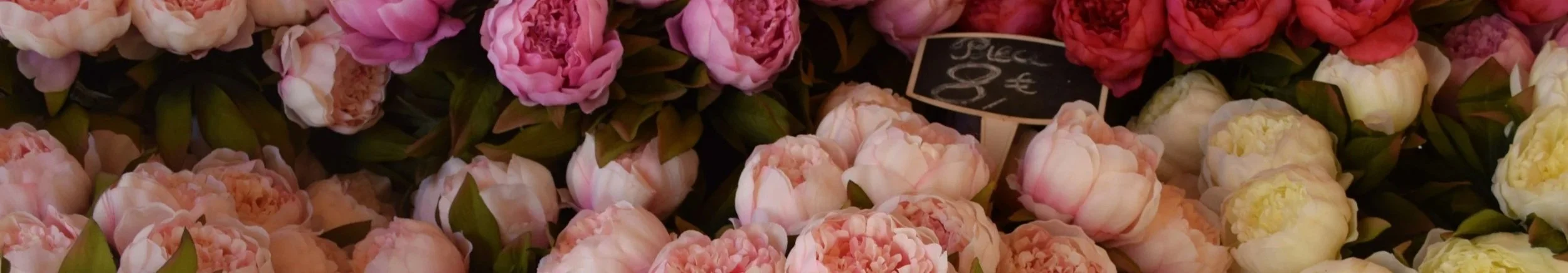
Now some of y’all don’t do cozy coloring…
And frankly, I’m the midwestern regional spokesperson for the Anti-Cozy Society for Artists.
That’s XCSA if you want to make a 501c3 donation.
So today, let’s work on something a wee more grownup, shall we?
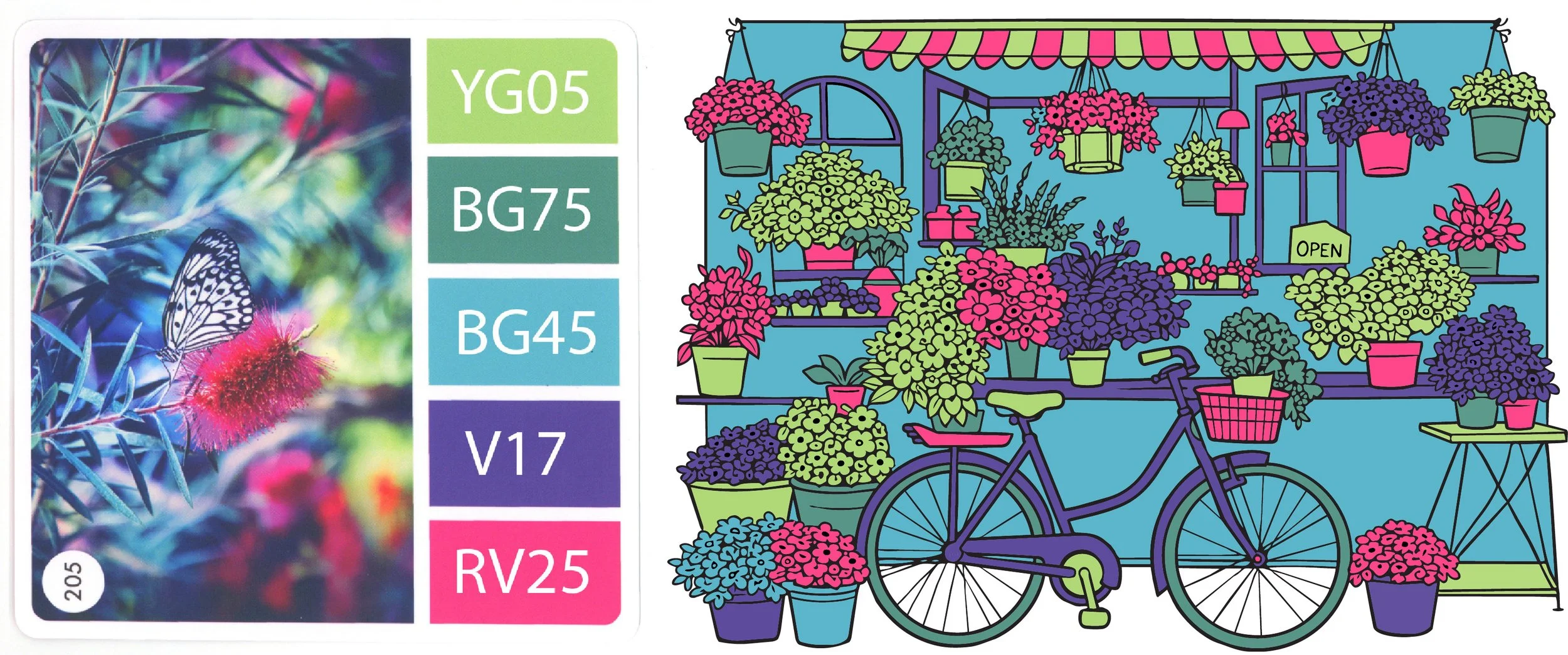
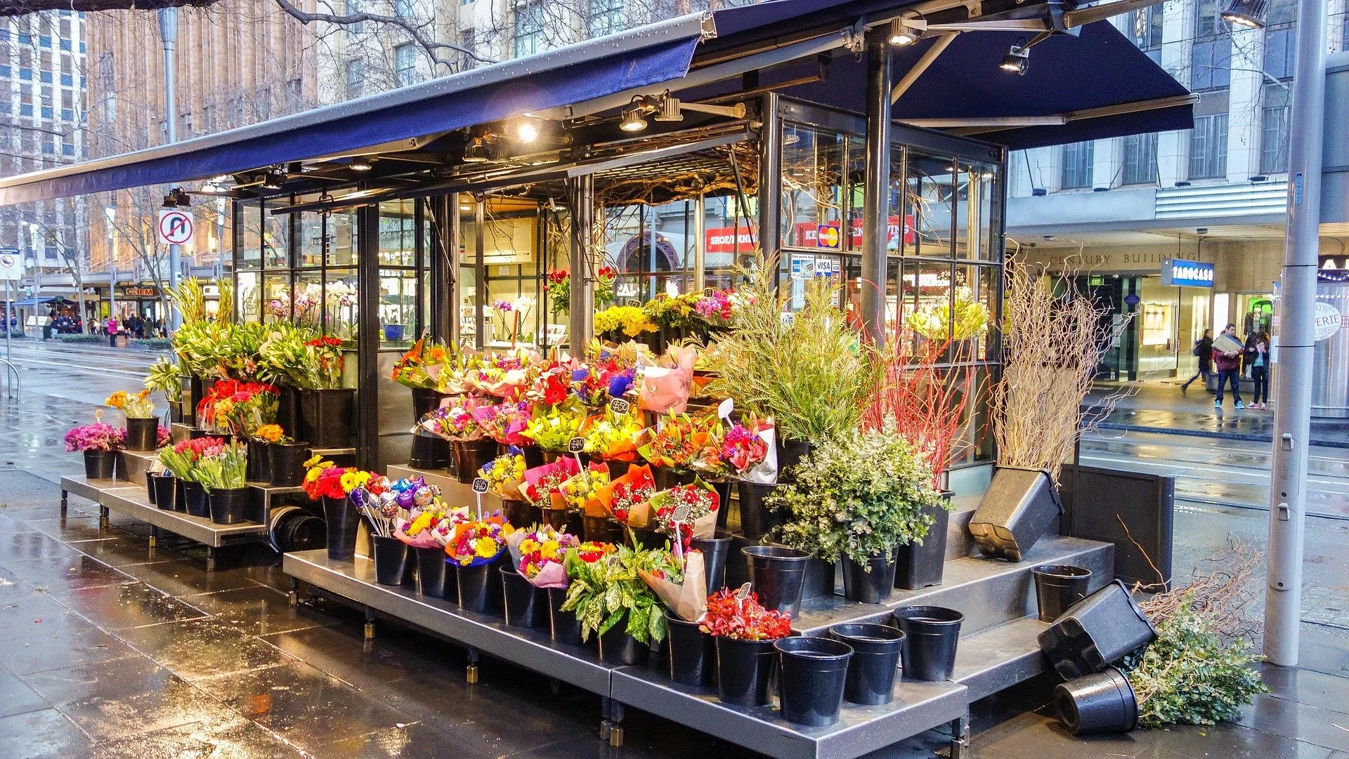
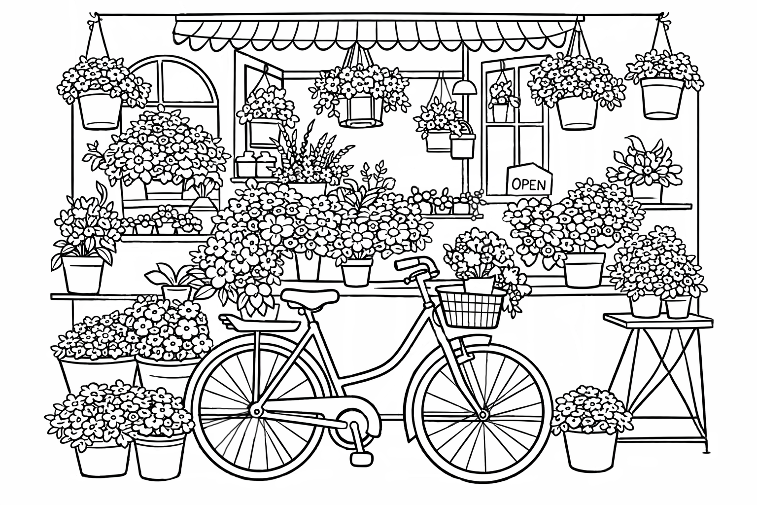
Ouch! The drunk unicorn strikes again.
C’mon admit it, you couldn’t tell what you were looking at, right? How many seconds before you even saw the bicycle?
This is why I hate working from the Party Palette section of my dividers.
Okay, enough pain. Let’s balance the values.
This is better but it’s still unicorny, isn’t it?
So we balanced the values but not much changed.
Did I give you bad advice?
As I just learned the hard way, we can break a palette into light, medium, and dark values and still come up with an utter mess.
Which is why some of you would now fussy-cut a second bicycle and pop-dot the heck out of it. You’d probably also pop-dot the awning and several select flower pots.
You know you would. Don’t deny it.
Here’s the problem: It’s still hard to read what’s happening in this image, because value isn’t everything.
Don’t get me wrong, value is a heck of a lot…
It’s just not every-everything.
We absolutely need value variety.
But the proportion of the variety matters.
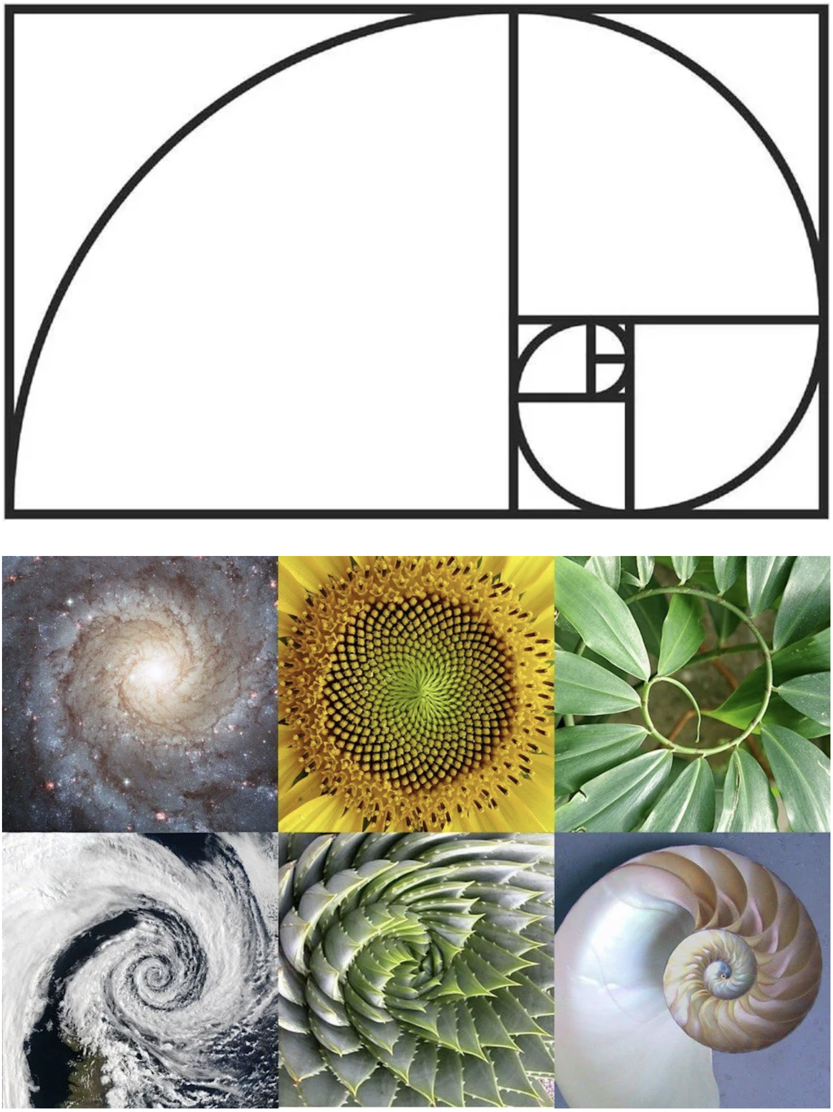
In art, we have something called The Golden Ratio.
If you’ve read The DaVinci Code, Dan Brown makes a big stinkin’ fuss about the ratio— more than Leonardo himself probably ever did.
The general idea is that mother nature doesn’t usually divide things 50/50 or exactly in half. It’s always a little more than half.
By dividing rectangles into “half plus a smidge”, mathematically, we start to create a really kickass curl.
And man, this curl sure hits the pleasure centers of our brain.
If loving this curl is wrong, I don’t wanna be right.
Artists love the look, feel, and even the smell of this curl. We heart it sooooo much that we start seeing half+smidge curls everywhere.
Now here’s the reason for the eggheadery alert earlier…
Mathematicians know half+smidge as the Fibonacci Sequence: 0, 1, 1, 2, 3, 5, 8, 13, 21, 34, 55, 89, 144, 233, etc.
Add the first two numbers to get the next number (0+1=1)
Then add the next two to get the next number (1+1=2)
Keep going, always adding the last two to get the next number (1+2=3, 2+3=5, 3+5=8)
You can keep doing this forever and a day
Or you could multiply by 1.618 which is supposedly God’s magic number.
The number of petals on a flower is usually a Fibonacci number. Same with leaves and branches on a tree. I don’t think it’s everything for sure, it’s not like I’m out there counting stuff in my yard... Anyway, it’s all this half+smidge thingie.
Now— this is all too woo-woo for me. Personally, I think most smidge sightings in nature are Pink Elephant Syndrome.
Someone suggested it, now we see it.
But here’s why I’m yammering about magic numbers and a sexy curl…
There’s a similar rule in color theory and it’s smidgy too.

Interior designers like to think they invented the ol’ 60-30-10 rule. Nope, this has been around since the first cave woman looked at her husband and said “Sandra’s husband painted a portrait of her on the cave wall. Why don’t you ever do that for me?”
60-30-10 is more of that half+smidge art stuff.
In theory, your living room walls, carpeting, and couch should all be from one color family.
That’s about 60% of the stuff in your room.
Your side chairs, curtains, and other large goods should be in a secondary color.
30%
Bold accents like throw pillows, knick knacks, and wall art are the last 10%.
It’s not pure Fibonacci but it’s pretty darned close. And dang if it doesn’t work on everything in your house…
And everything you color.
It’s not enough to balance the values.
When we use all the new values in the same amount?
It’s a zoom meeting where nobody’s muted.
Every color is telling you something at the same time.
That’s why you can’t find the bike.
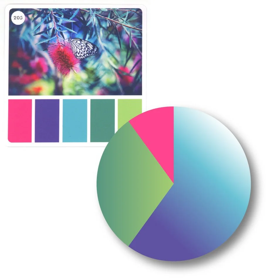
60% 30% 10%
It’s an order of hierarchy.
An artistic built-in structure to tell your viewers what to look at, when, and why.
What’s not so important? What’s in the background? Make that the 60%.
What’s more interesting? 30%
What’s your focal point? What’s the star of the show?
10% baby!
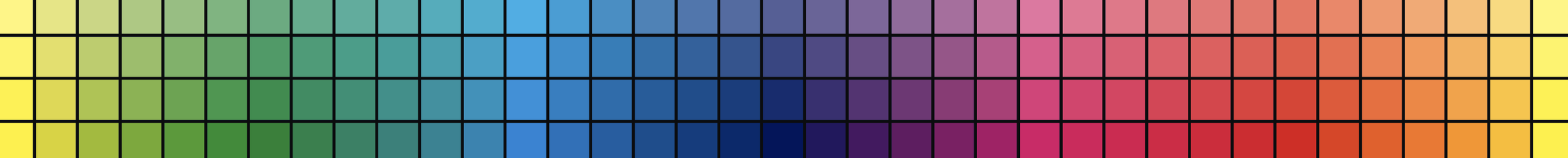
Color Cubes give you five colors of equal value and importance.
That’s just the starting point, not the finished project palette.
Your job is to structure Sarah’s palette idea into something which doesn’t feel like getting kicked in the head by a unicorn.
Okay, let’s start with a fresh page.
Based on last week’s lesson, we’ll start by developing a range of light, medium, and dark values for pink, violet, aqua, green, and chartreuse.
We may not use them all but it’s good to have ‘em handy.
Now moving into this week’s 60-30-10 rule, let’s make a few decisions:
Blue and violet are soft but they also recede nicely into a background. I’m making them the foundation of our 60% group. I’ll use blue or violet for the walls, windows, and anything that doesn’t feel important.
We have two greens in our palette and lots of plants in this project. Let’s make greens our 30% group. I’ll bet with just the leaves alone, that’s probably 30% already.
Nothing pops more than pink, so that’ll be our 10% group. We can’t make every flower pink or that’ll be more than 10%. So we’ll have to make some flowers blue or violet.
At this point, I’m not sure whether the bicycle will “pop” more in pink or chartreuse. Both are excellent pop colors and I’ll try them both. I think it’ll depend upon how many pink flowers I end up with.
By the way, we’re not pulling out a calculator to make sure we get exactly 60-30-10. If you’re a little over or under, that’s fine. You do 52-35-13 or 67-25-8 if it makes you feel better.
Color a smidge more than half and then look at what’s left on the page. Now color a smidge more than half of that. Don’t over think it.
And here’s the thing:
This is a totally normal planning process for artists.
Any artist who tells you they don’t plan is lying.
I may not verbalize every part of the plan but this all runs through my head before I touch a marker or pencil to the paper. Sometimes it comes to me at lightning speed, sometimes it’s like the bicycle were I’ll sit down and sample-swatch the colors to see what pops.
And now a special message for you:
I’ve worked with so many talented colorists over the years— many of them could’ve gone into art instead of nursing or engineering or whatever. You wouldn’t be coloring today if you weren’t artistic.
So please believe me when I tell you— sometimes it’s not a lack of talent or training holding you back.
Sometimes the only difference between you and professional level art is the fact that you don’t think ahead or plan before you begin coloring.
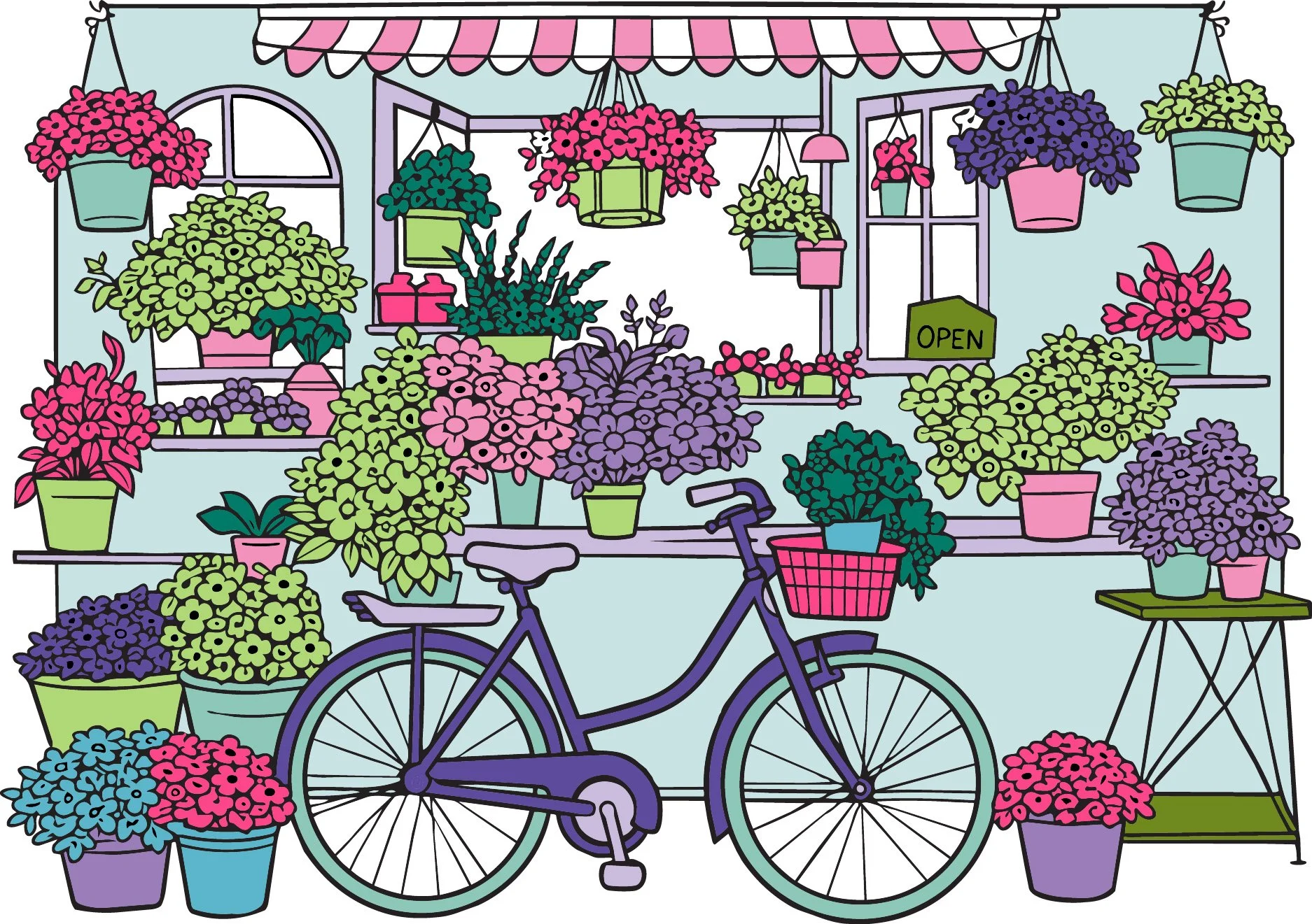
Okay, so after some playing around, here’s my grown up version of our party palette.
My values cover the entire range from dark-dark to white.
And I’ve followed a rough 60-30-10 rule.
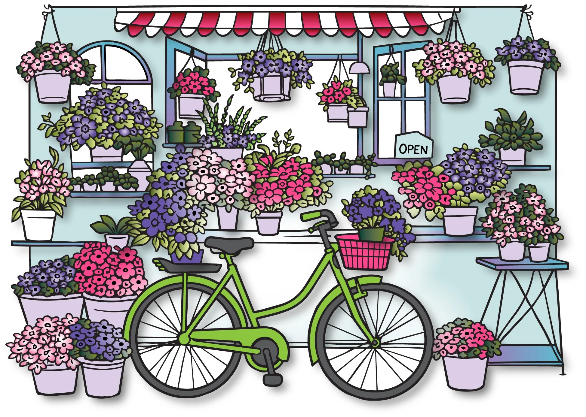
And here’s the wonderful thing about Sarah’s Color Cubes: You and I can both use the same card and same coloring page but come up with a totally different flower shops.
Heck, if I color this shop again tomorrow, it’ll look completly different.
Same palette, same rules, totally different interpretations.
That’s style. That’s taste. That’s artistic voice.
You’re just a smidge and a half away.
Uhm… did you notice anything else about my finished flower shop?
Yes, I balanced the values and I totally rocked the 60-30-10 rule.
But there’s more going on up there.
I’ll meet you back here next week with more secrets.
IF YOU LIKED TODAY’S ARTICLE, SUPPORT FUTURE FREE LESSONS

SPRING SESSION - BEGINS MAY 1ST
Do you get nervous with a colored pencil in your hand?
My 12 week colored pencil course takes you from barely beginner to WOW!
In The Point, we fix all the little bad habits and assumptions which make colored pencil harder. We fix your grip and your pressure. We keep going until you’re coloring with amazing realism.
My courses are lean, effective, and worth every penny.
Enrollment is via waitlist only. You must be on the waitlist to enroll.
Color theory isn’t something you read and then instantly know. It takes time to figure it out.
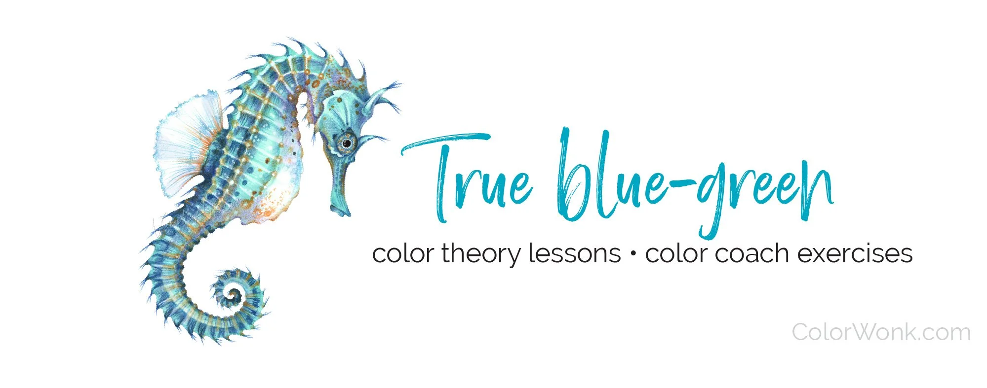
Color Coach gives you hands-on color theory experience and lots of encouragement.
This seahorse isn’t just a couple of aqua markers and pencils. To make blue-green look it’s best, you need a host of supporting colors… and a little contrast?
I teach students to play with color— finding their own coloring style and unique color voice.

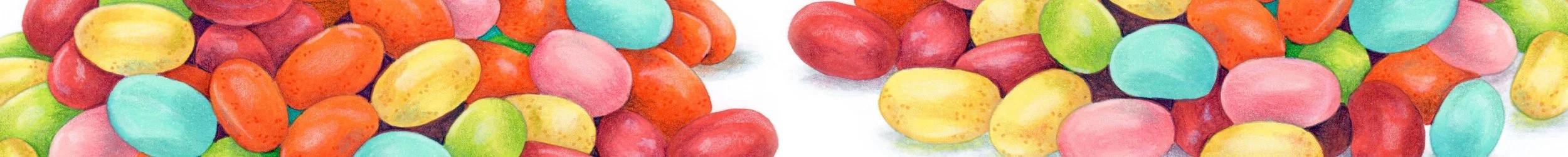
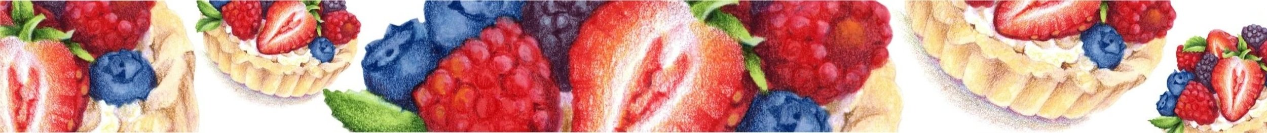
Let’s color some jellybeans…
That sounds like fun, Amy! Teach me the technique and I’ll repeat it over and over and over and over…
Nope. There is no jellybean technique.
Jellybeans is an introduction to how artists see.
You can color anything you want without waiting for special instructions when you understand how to visually investigate the dimensional shape of objects.
This class will literally change how you see the world.
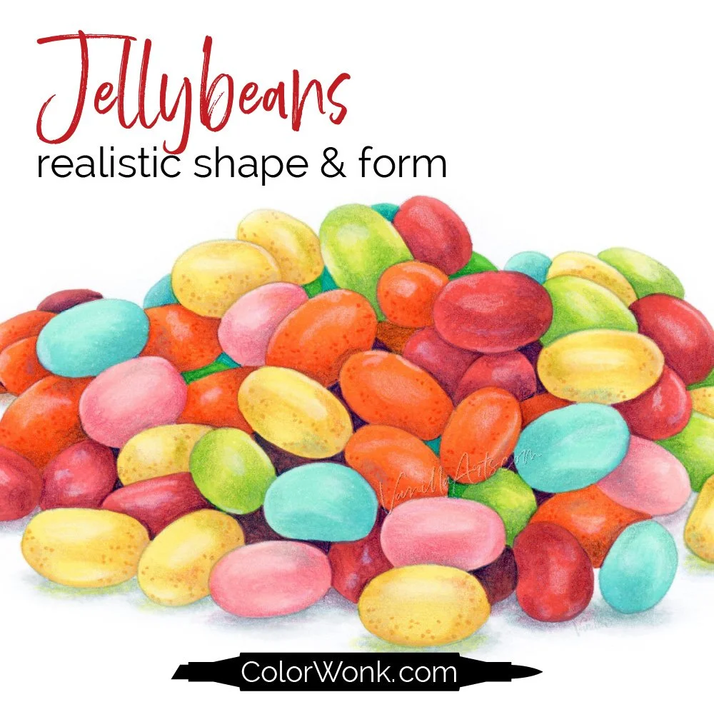
Jellybeans is only available through Color Wonk
A library of new and classic courses is waiting for you. Instant access. No deadlines.
Real art lessons, not nifty novelty techniques

CURRENT PASSWORD: RubberDuckie
MY FAVORITE COLORED PENCIL ERASERS
Affiliate links help support the free content here in Vanilla Beans
For light mistakes and gentle lifting. One pack lasts for years!
Erase tiny areas with maximum control, clean-up edges, or smudge
For true mistakes, can lift most of the wax back to the paper level